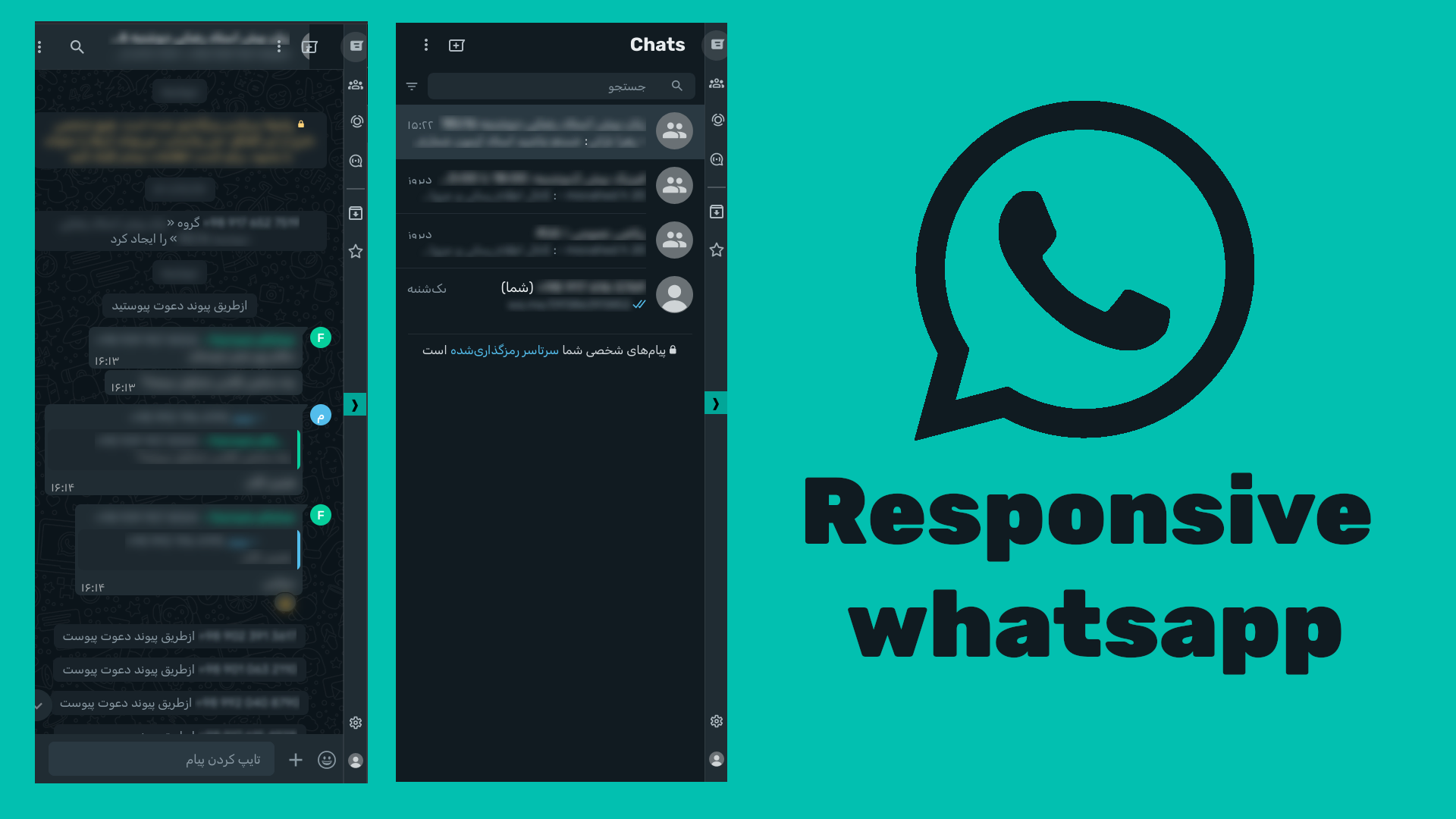
responsive whatsapp
RESPONSIVE whatsapp web by mimvahedi
Details
Authormimvahedi
LicenseUnlicense
Categorywhatsapp
Created
Updated
Code size1.8 kB
Code checksum7876762e
Statistics
Learn how we calculate statistics in the FAQ.
Failed to fetch stats.
Description
Notes
⚠️ install userscript !important
Source code
/* ==UserStyle==
@name           RESPONSIVE whatsapp web
@namespace      whatsapp
@version        0.1
@description    responsive whatsapp
@author         mimvahedi
@var text z "install this userscript" "https://gist.github.com/mimvahedi/a3f8bce852e720afda19a883e242e023/raw/65b0e8fc191451afd0d4319ea7f00b75d9599041/whatsappresponsive.user.js"
==/UserStyle== */
@-moz-document domain("web.whatsapp.com") {
  :root {
    --side-w: 0%;
    --navbar-width: 30px;
  }
  body {
    overflow: hidden
  }

  /*smaller right bar*/
  header {
    margin: 0 !important;
  }
  ._aigu + header {
    padding-left: 2px !important;
    padding-right: 2px !important;
  }
  ._aigu + header svg {
    width: 20px;
    height: 20px;
  }

  /*fix more than screen width*/
  .two._aigs {
    min-width: 0;
  }


  /*side panel*/
  header + :is(.two ._aigv._aigw) {
    width: var(--side-w);
    flex: 1 1 var(--side-w);
    max-width: var(--side-w);
  }

  /*chat content*/
  ._aigv._aigz {
    width: calc(100% - var(--side-w));
    flex: 0 0 calc(100% - var(--side-w));
  }

  @media screen and (max-width: 900px) {
    .two ._aigw {
      flex: 0 0 100%;
      max-width: 100%;
    }
  }
  .show-side {
    --side-w: 100%;
  }

  /*  ._aigv._aigw h10 {
    position: fixed;
    bottom: 0;
    left: 0;
    background: hsl(218.5, 79.2%, 5%);
    z-index: 100;
    width: 100%;
    height: 100%;
    writing-mode: vertical-rl;
    font-size: 20px;
    padding: 10px 0;
    color: cornflowerblue;
  }
  ._aigv._aigw:has(h1:hover),
  ._aigv._aigw:hover,
  ._aigv._aigw:has(:hover) {
    --side-w: 100%;
    flex: 100%;
  }
  ._aigv._aigw:hover,
  ._aigv._aigw:has(:hover) >  h1,
  h1:hover {
    pointer-events: none;
    opacity: 0;
  }*/
}