Light mode for File Garden
File Garden Light Mode by Avistella
Details
AuthorAvistella
LicenseCC-BY-NC-SA-4.0
Categoryfilegarden.com
Created
Updated
Code size4.2 kB
Code checksume12837ab
Statistics
Learn how we calculate statistics in the FAQ.
Failed to fetch stats.
Description
Notes
Userstyle doesn't have notes.Source code
/* ==UserStyle==
@name File Garden Light Mode
@namespace File Garden Light Mode | Avistella
@version 1.0.0
@description Light mode for File Garden
@author Avistella
@license CC-BY-NC-SA-4.0
@preprocessor stylus
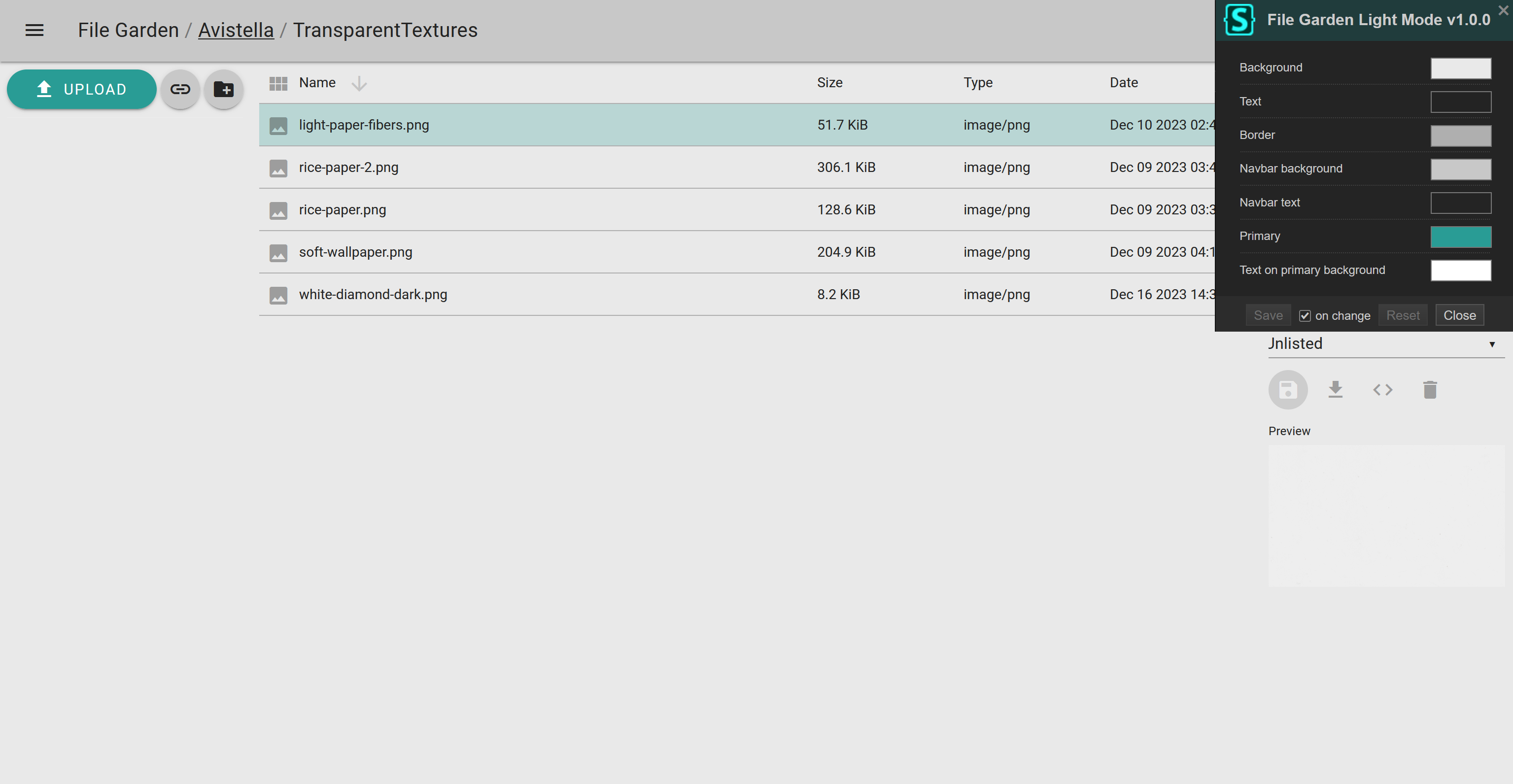
@var color mbg "Background" "#e9e9e9"
@var color txt "Text" "#232323"
@var color brd "Border" "#afafaf"
@var color nbg "Navbar background" "#c8c8c8"
@var color ntxt "Navbar text" "#242424"
@var color prm "Primary" "#299c95"
@var color prmtxt "Text on primary background" "#fff"
==/UserStyle== */
@-moz-document domain("filegarden.com") {
body, main, #header, .mdc-dialog .mdc-dialog__surface, .mdc-select:not(.mdc-select--disabled) .mdc-select__native-control option, #externalContainer #externals, #panel, .mdc-text-field:not(.mdc-text-field--disabled) {
background-color:mbg;
color:txt;
}
main.mdc-elevation--z3 {
box-shadow:none;
}
#properties, .mdc-text-field:not(.mdc-text-field--disabled) .mdc-text-field__input, .mdc-select:not(.mdc-select--disabled) .mdc-select__native-control, .mdc-dialog .mdc-dialog__title, .mdc-dialog .mdc-dialog__content, .mdc-button:not(:disabled), .mdc-form-field {
color:txt;
}
.mdc-checkbox__native-control:not(:checked):not(:indeterminate):not(:disabled) ~ .mdc-checkbox__background, .mdc-text-field--textarea:not(.mdc-text-field--disabled), .mdc-text-field--textarea:not(.mdc-text-field--disabled) .mdc-text-field__input:focus {
border-color:rgba(txt,.54);
}
.mdc-icon-button:not(:disabled) {
color:rgba(txt,.38)
}
:not(.mdc-text-field--textarea):not(.mdc-text-field--fullwidth).mdc-text-field:not(.mdc-text-field--disabled):not(.mdc-text-field--invalid) .mdc-floating-label, .mdc-select:not(.mdc-select--disabled) .mdc-floating-label {
color:rgba(txt,.75);
}
.mdc-snackbar, .mdc-top-app-bar, .mdc-drawer, .mdc-button--raised:not(:disabled), .mdc-button--unelevated:not(:disabled) {
background-color:nbg;
color:ntxt;
}
.mdc-snackbar__text, .mdc-top-app-bar, .mdc-top-app-bar .mdc-top-app-bar__action-item, .mdc-top-app-bar .mdc-top-app-bar__navigation-icon, .mdc-drawer .mdc-list-item, .mdc-text-field:not(.mdc-text-field--disabled) .mdc-floating-label {
color:ntxt;
}
.mdc-drawer .mdc-list-item .mdc-list-item__graphic, .mdc-drawer .mdc-list-item--activated .mdc-list-item__graphic {
color:rgba(ntxt,.6);
}
.mdc-drawer .mdc-drawer__title, .mdc-drawer .mdc-drawer__subtitle {
color:rgba(ntxt,.87);
}
:not(.mdc-text-field--textarea):not(.mdc-text-field--fullwidth).mdc-text-field:not(.mdc-text-field--disabled):not(.mdc-text-field--invalid) .mdc-text-field__input, .mdc-select:not(.mdc-select--disabled) .mdc-select__native-control {
border-color:rgba(txt,.42);
}
#header, .mdc-drawer, .item {
border-color:brd;
}
hr {
border-color:rgba(ntxt,.12) !important;
}
:not(.mdc-text-field--textarea):not(.mdc-text-field--fullwidth).mdc-text-field:not(.mdc-text-field--disabled):not(.mdc-text-field--invalid) .mdc-text-field__input:hover, .mdc-text-field--focused:not(.mdc-text-field--disabled).mdc-text-field--textarea, .mdc-text-field--focused:not(.mdc-text-field--disabled).mdc-text-field--textarea .mdc-text-field__input:focus {
border-color:prm;
}
.mdc-text-field .mdc-line-ripple, .mdc-select:not(.mdc-select--disabled) .mdc-select__native-control:focus ~ .mdc-line-ripple {
background-color:prm;
}
.mdc-select:not(.mdc-select--disabled) .mdc-select__native-control:focus ~ .mdc-floating-label, .mdc-text-field--focused:not(.mdc-text-field--disabled):not(.mdc-text-field--invalid) .mdc-floating-label {
color:prm;
}
#addFiles {
background-color:prm;
color:prmtxt;
}
.item.selected {
background-color:rgba(prm,.25);
}
}