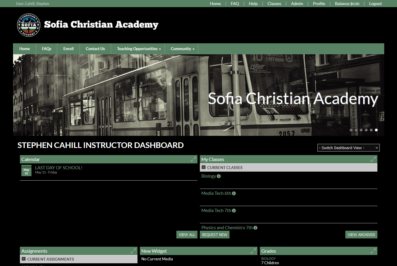
A black style with light green highlights for the SCA website
Gideon and Mirella’s theme by LilLiteralist
Details
AuthorLilLiteralist
LicenseNo License
Categoryhttps://www.sofiachristianacademy.org/
Created
Updated
Code size17 kB
Code checksum5ce22f1a
Statistics
Learn how we calculate statistics in the FAQ.
Failed to fetch stats.
Description
Notes
Userstyle doesn't have notes.Source code
Source code has over 10K characters, so we truncated it. You can inspect the full source code on install link./* ==UserStyle==
@name Gideon and Mirella’s dark mode
@namespace github.com/openstyles/stylus
@version 1.0.0
@description A black style with light green highlights for the SCA website
@author Gideon and Mirella
==/UserStyle== */
@-moz-document url-prefix("https://www.sofiachristianacademy.org/") {
:root {
--color1:#78A083;
--color2:#5B8867;
--editor-button:#4c4c4c;
}
* {
scrollbar-color: var(--color1) #222;
}
select[name=setCategory] {
background-color: #000;
}
.subHead td {
background-color: var(--color2);
border-bottom: 1px solid #999;
border-top: 1px solid #fff;
}
.widgetContainer .evtDate {
color: #fff;
background-color: var(--color2);
}
.cal a {
color: #fff;
}
td[style="background-color:#ffc;"] {
background-color: var(--color2) !important;
}
td.calendarEmpty {
background-color: #333 !important;
}
td[style="background-color:#fff;"] {
background-color: #50727b !important;
}
td[style="background-color:#eee;"] {
background-color: #344955 !important;
}
/* Alternate colors
.cal a {
color: #444;
}
td[style="background-color:#ffc;"] {
background-color: #50727b !important;
}
td.calendarEmpty {
background-color: #344955 !important;
}
td[style="background-color:#fff;"] {
background-color: var(--color2) !important;
}
td[style="background-color:#eee;"] {
background-color: #808080 !important;
}
*/
#pgControlsTy label {
color: #fff;
}
#topNav,
#switchClass,
#topNav ul,
#topNav-mobile,
#menu-mobile div,
.preheadernav,
footer {
background-color: var(--color2);
}
div.preheadernav {
background-color: var(--color2) !important;
}
select,
.line {
background-color: #100f0f !important;
}
a,
.ui-widget-content a {
color: var(--color1);
}
.ui-state-active a {
color: var(--color1) !important;
}
table.sortable td {
color: var(--color1);
}
ul.topTextLinks,
.alphaBrowse a.sel{
background-color: var(--color2);
}
i.fa,
a i.fa,
a i.fas,
a i.fa-solid {
color: var(--color1);
}
input[type=”submit”],
input[type=”reset”],
input[type=”button”],
button {
background-color: var(--color2) !important;
text-transform: uppercase;
padding: 6px 8px;
}
.alphaBrowse,
.input,
#resourceFile,
.topTextlinks {
background-color: var(--color2);
}
.ui-state-default a,
.ui-state-default a:link,
.ui-state-default a:visited,
a.ui-button,
a:link.ui-button,
a:visited.ui-button,
.ui-button {
color: var(--color1);
}
wid button,
#loginForm input[type=submit] {
color: #ffffff;
background-color: var(--color2);
border: none !important;
}
div.nivo-controlNav {
background-color:#f0f0ff00
}
#mm-0,
.pagecontent,
.row,
.widgetItem,
.wid,
#wid164284,
.contentBox {
background-color: #000 !important;
}
/* Select, input could be other colors. */
div,
select {
color: #fff;
}
div.footerTemplate.footerTemplate2.clearfix {
background-color: var(--color2);
}
.wid h3,
.widgetContainer .tabContainer.ui-tabs .ui-tabs-nav {
background-color: var(--color2);
}
.fa-sticky-note {
color: var(--color1);
}
#logo img {
content:url(https://raw.githubusercontent.com/LilLiteralist/SCA-dark-mode/main/SCA-logo%2Bname24-white.png);
width:500px;
}
.ui-accordion .ui-accordion-header {
background-color: #595252 !important; /* Add some hover thing like they did. */
color: #fff;
}
body {
background-color: #000000 !important;
accent-color: #038026;
}
table.sortable td {
color: #ffffff;
}
.fa-sticky-note {
color: #044104;
}
.sortable > tbody > tr > td {
border-top-color:#555;
}
table.sortable>tbody>tr:nth-child(odd):hover,
table.sortable>tbody>tr:nth-child(even):hover {
background-color: #000;
}
table.sortable>tbody>tr:nth-child(odd),
tr.odd td,
tr.odd th {
background-color: #191919;
}
table.sortable>tbody>tr:nth-child(even),
tr.even td,
tr.even th {
background-color: #202020;
}
.sortable>tbody>tr>td:last-child {
border-right: 1px solid #404040;
}
.sortable>thead>tr>th {
background-color: #242424;
border-color: #444;
}
input[step=".01"] {
appearance: textfield;
text-align:right;
padding-right:8px !important;
}
.footer {
background-color: var(--color2) !important;
}
.footerTemplate2 .footerTemplateHost,
#loginBar {
display:none;
}
#footer .footerTemplate {
padding-bottom:20px;
}
img[src="/sysfiles/site_uploads/footer/logoimg_footer3724.png"] {
content:url(https://raw.githubusercontent.com/LilLiteralist/SCA-dark-mode/main/SCA-logo%2Bname24-white.png);
height:60px;
}
.ui-widget-content a.defColor,
a.defColor,
a.defColor i,
.hcIcon {
color: var(--color1) !important;
}
body {
font-size: 10pt;
margin: 0 auto;
padding: 0;
color: #000;
}
#loginBox {
padding:0px!important;
border-radius:5px!important;
}
#loginBox,
#loginBox a {
color: #fff;
}
#loginArrow {
filter:brightness(0.5);
}
.wid button {
background-color: var(--color2) !important;
}
#pgControlsTray a,
a.aBtn {
border: 1px solid #aaaaaa;
background-color: #080808;
}
#pgControlsTray, #pgControlsTray a, a.aBtn {
color: var(--color1);
}
#mm-0,
.content,
.clearfix,
h3,
#setCategory,
.topNav,
publicHome {
background-color: #000;
color: #fff;
}
#logoblock {
/*background-color: #282828;*/
background-color:#000;
}
.subHead td {
background-color: #f3f3f3;
border-bottom: 1px solid #999;
border-top: 1px solid #fff;
}
.sortable .expandEpoch .fa-plus-square {
color: var(--color1);
}
.error {
color: #f00 !important;
}
/* Begin text editor modifications */
/* BEGIN TEXT EDITOR SECTION 1: Buttons and features visible on the main part of the text editor */
.cke_button_icon {
/* To change the icons from light mode to dark mode */
filter: invert(1) brightness(2);
}
.cke_reset_all,
.cke_reset_all * {
color: #fff;
}
.cke_top {
/* banner which all of the buttons are on */
border-bottom: 1px solid #727272;
background: #565656;
}
a.cke_button,
.cke_toolgroup {
background-color: #000;
}
a.cke_button_off:hover,
a.cke_button_off:focus,
a.cke_button_off:active,
.cke_combo_off a.cke_combo_button:hover {
background: #646464;
border-color:#565656;
}
a.cke_button_on,
.cke_combo_off a.cke_combo_button:active {
background: #535353;
}
a.cke_button_on:hover,
a.cke_button_on:focus,
a.cke_button_on:active {
background: #7a7a7a;
}
/* Begin subsection for the four buttons along the bottom-left */
.cke_toolgroup {
border-color: #727272;
border-bottom-color: #9b9b9b;
}
.cke_combo_button {
border-top: 1px solid #727272;
border-bottom: 1px solid #9b9b9b;
background: #000;
}
.cke_combo_arrow {
border-top-color: #fff;
}
.cke_combo_on a.cke_combo_button {
background-color:#3e3e3e;
border-top-color:#575757;
}
.cke_combo_on a.cke_combo_button:hover,
.cke_combo_on a.cke_combo_button:focus {
background-color:#606060;
border-top-color:#4a4a4a;
}
.cke_combo_text {
color: #fff;
text-shadow: 0 1px 0 #0008;
}
/* End subsection for the four buttons along the bottom-left */
.cke_toolbar_separator {
background-color: #808080;
}
.cke_button_arrow {
/* This is for the little drop-down arrow on some of the buttons */
border-top-color: #fff;
}
/* END TEXT EDITOR SECTION 1*/
/* BEGIN TEXT EDITOR SECTION 2: The bottom part */
body.cke_editable {
/* The field where you type */
background-color: #fff !important;
color: #000;
}
.cke_editable a {
/* Necessary to make links look like a normal color */
color: #0782c1;
}
.cke_bottom {
/* Strip along the bottom */
border-top: 1px solid #858585;
background: #565656;
}
span a.cke_path_item,
span a.cke_path_empty {
color: #fff;
text-shadow: 0 1px 0 #0008;
}
.cke_path_item {
border-right: 1px solid #aeaeae;
}
.cke_resizer {
/* Triangle in the bottom-right corner of the editor */
border-color: transparent #8c8c8c transparent transparent;
}
a.cke_path_item:hover,
a.cke_path_item:focus,
a.cke_path_item:active {
background-color: #797979;
color: #fff;
text-shadow: 0 1px 0 #0008;
}
/* END TEXT EDITOR SECTION 2 */
/* BEGIN TEXT EDITOR SECTION 3: The drop-down menus which are actually pop-up boxes */
.cke_panel {
border: 1px solid #4a4a4a;
border-bottom-color: #3a3a3a;
}
.cke_panel_block {
background-color: #000;
color:#fff;
}
/* Begin subsection for four "select" buttons */
.cke_panel_block > h1 {
background-color:#4a4a4a;
color:#fff;
border-bottom: 1px solid #e5e5e5;
}
.cke_panel_block ul li a {
border-color:transparent;
}
.cke_panel_grouptitle {
text-shadow:0 1px 0 #000;
}
.cke_panel_listItem a:hover,
.cke_panel_listItem a:hover h3,
.cke_panel_...