Patreon website is more suitable for wide screens.
Patreon responsive + customizations by breat
Mirrored from https://gitlab.com/breatfr/patreon/-/raw/main/css/patreon-responsive-customizations.user.css
Details
Authorbreat
LicenseAGPL-3.0-or-later; https://www.gnu.org/licenses/agpl-3.0.txt
Categorypatreon.com
Created
Updated
Code size14 kB
Code checksum17a09d34
Statistics
Learn how we calculate statistics in the FAQ.
Failed to fetch stats.
Description
Notes
Support me on:
- ko-fi: https://ko-fi.com/breatfr
- PayPal: https://www.paypal.me/breat
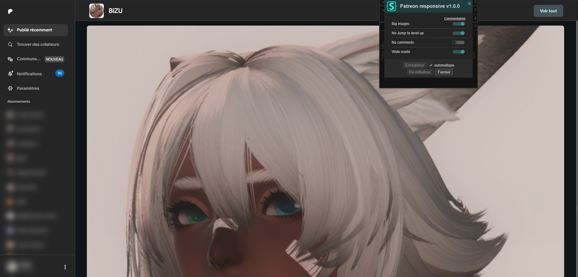
List of available customizations
- big images (no more grid view)
- custom font size
- no jump to level up and no get application button
- no comments
- wide mode
How to use in few steps
-
Install Stylus browser extension
- Chromium based browsers link: https://chrome.google.com/webstore/detail/stylus/clngdbkpkpeebahjckkjfobafhncgmne
- Brave
- Chromium
- Google Chrome
- Iridium Browser
- Microsoft Edge
- Opera
- Opera GX
- SRWare Iron
- Ungoogled Chromium
- Vivaldi
- Yandex Browser
- many more
- Firefox based browsers link: https://addons.mozilla.org/firefox/addon/styl-us/
- Mozilla Firefox
- Mullvad Browser
- Tor Browser
- Waterfox
- many more
- Chromium based browsers link: https://chrome.google.com/webstore/detail/stylus/clngdbkpkpeebahjckkjfobafhncgmne
-
Install the UserStyle.
-
To update the theme, open the
Stylus Managementwindow and click onCheck for updateand follow the instructions or just wait 24h to automatic update -
Enjoy :)
Source code
Source code has over 10K characters, so we truncated it. You can inspect the full source code on install link./* ==UserStyle==
@name Patreon responsive + customizations
@version 1.1.8
@description Patreon website is more suitable for wide screens.
@author BreatFR (https://breat.fr)
@namespace https://gitlab.com/breatfr
@homepageURL https://gitlab.com/breatfr/patreon
@supportURL https://discord.gg/Q8KSHzdBxs
@license AGPL-3.0-or-later; https://www.gnu.org/licenses/agpl-3.0.txt
@preprocessor stylus
@var checkbox bigimages "Big images" 1
@var text fontsize "Custom font size" 1.2rem
@var checkbox nojump "No Jump to level up" 1
@var checkbox nocomments "No comments" 0
@var checkbox widemode "Wide mode" 1
==/UserStyle== */
/* === Credits ===
Website https://breat.fr
facebook https://www.facebook.com/breatfroff
mastodon https://mastodon.social/@breat_fr
telegram https://t.me/breatfr
vk https://vk.com/breatfroff
X (twitter) https://x.com/breatfroff
=== Credits === */
@-moz-document domain("patreon.com") {
:root {
--fontsize: fontsize;
}
/* Loved */
[data-tag="like-button"][aria-checked="true"] > div > svg path {
fill: #c6374d;
}
/* No double scrollbar */
#__next > .sc-uiqay7-0.cnwZin {
overflow: hidden;
}
/* Custom font size */
:root,
button,
div,
input,
label,
[data-tag*="settings"],
li,
p,
p span,
[data-tag="chats-send-message-form"] textarea,
[data-tag="comment-field"],
.cuiKYE,
.cQjDCC,
.fxePXf,
.jYEggK {
font-size: fontsize !important;
}
.vWGl {
font-size: calc(var(--fontsize) - .2rem)!important;
}
span > .vWGl {
font-size: inherit !important;
}
.gxOVkK {
font-size: calc(var(--fontsize) - .4rem)!important;
}
if nocomments {
[data-tag="content-card-comment-thread-container"],
.bmnjsr {
display: none !important;
}
}
if nojump {
.sc-jrQzAO.bAzCwM,
.sc-o4u8m1-2 > div > div:nth-child(2),
[data-tag="upgrade-incentive-description"],
[data-tag="upgrade-free-membership-button"],
[data-tag="free-membership-upgrade-cta"] {
display: none !important;
height: 0 !important;
max-height: 0 !important;
}
}
if widemode {
[data-tag="account-menu"] {
max-width: max-content;
}
}
}
@-moz-document url("https://www.patreon.com/home") {
if bigimages {
* {
aspect-ratio: auto !important;
}
.dofSdt img {
min-width: 100% !important;
object-fit: cover !important;
}
[data-tag="launcher-post-card"] > div > div > div > [elevation="subtle"] div:not([data-tag="post-details"] div,[data-tag="content-card-comment-thread-container"] div,div[width="fluid"] div,[data-tag="locked-badge-button"] div,[data-tag="chip-container"],.jhLQmG,.jhLQmG div,.dgQBHC) {
display: flex !important;
flex-basis: 100% !important;
flex-direction: column !important;
max-width: 100% !important;
}
img,
div[elevation="subtle"] > div,
.djipQD > .image-grid {
display: block !important;
height: auto !important;
max-height: 100% !important;
min-width: 100% !important;
object-fit: contain !important;
}
img[loading="eager"] {
width: auto !important;
}
.image-grid + .image-grid {
margin-top: 2px;
}
.image-carousel {
height: 112px;
object-fit: contain;
width: auto !important;
}
/* Little unblur */
.dgyaSI {
background: transparent !important;
opacity: 0 !important;
}
.image-grid > img {
background: transparent !important;
object-fit: contain !important;
min-width: 100% !important;
}
[data-tag="locked-badge-button"] p {
padding-right: 3em;
}
[width="fluid"] a {
max-width: 96% !important;
overflow: hidden !important;
}
header {
height: 0 !important;
}
a,
img,
.jQZWvF {
overflow: hidden !important;
}
}
if widemode {
main > div > section > div {
max-width: 100% !important;
}
}
}
@-moz-document regexp("https://www\\.patreon\\.com/[^/]+/home"), regexp("https://www\\.patreon\\.com/[^/]+/home\\?[^/]*") {
if widemode {
[data-tag="about-patron-view"] {
max-width: 100% !important;
}
}
}
@-moz-document regexp("https://www\\.patreon\\.com/[^/]+/posts") {
if bigimages {
* {
aspect-ratio: auto !important;
}
.dofSdt img {
min-width: 100% !important;
object-fit: cover !important;
}
[data-tag="post-card"] > div > div > [elevation="subtle"] div:not([data-tag="post-details"] div,[data-tag="content-card-comment-thread-container"] div,div[width="fluid"] div,[data-tag="locked-badge-button"] div,[data-tag="chip-container"],.jhLQmG,.jhLQmG div,.dgQBHC) {
display: flex !important;
flex-basis: 100% !important;
flex-direction: column !important;
max-width: 100% !important;
}
img,
div[elevation="subtle"] > div,
.djipQD > .image-grid {
display: block !important;
height: auto !important;
max-height: 100% !important;
max-width: 100% !important;
min-width: 100% !important;
object-fit: contain !important;
}
img[loading="eager"] {
aspect-ratio: 1 / 1 !important;
height: 100% !important;
object-fit: cover !important;
}
.image-grid + .image-grid {
margin-top: 2px;
}
.image-carousel {
height: 112px;
object-fit: contain;
width: auto !important;
}
/* Little unblur */
.dgyaSI {
background: transparent !important;
opacity: 0 !important;
}
.image-grid > img {
background: transparent !important;
object-fit: contain !important;
min-width: 100% !important;
}
[data-tag="locked-badge-button"] p {
padding-right: 3em;
}
[width="fluid"] a {
max-width: 96% !important;
overflow: hidden !important;
}
header {
height: 417px !important;
}
a,
img,
.jQZWvF {
overflow: hidden !important;
}
}
if widemode {
main > div > div > div > div > div:nth-of-type(4) > div:nth-of-type(2) {
max-width: 100% !important;
}
main > div > div > div > div > div > div:nth-of-type(2) > div > div {
grid-template-columns: 1fr auto auto !important;
}
}
}
@-moz-document regexp("https://www\\.patreon\\.com/[^/]+/collections") {
if widemode {
main > div > div > div > div > div:nth-of-type(4) > div {
max-width: 100% !important;
}
}
}
@-moz-document regexp("https://www\\.patreon\\.com/[^/]+/membership") {
if widemode {
main > div > div > div > div > div:nth-of-type(4) > div {
max-width: 100% !important;
}
}
}
@-moz-document regexp("https://www\\.patreon\\.com/[^/]+/about") {
div.sc-xac35p-1.jhLQmG {
display: flex !important;
flex-direction: row !important;
justify-content: space-between !important;
width: 100% !important;
}
header {
height: 417px !important;
}
.sc-gIBqdA.hVkHgO > div > div.sc-jrQzAO.bmnjsr {
padding-right: 2em;
}
if widemode {
main > div > div > div > div > div:nth-of-type(4) > div {
max-width: 100% !important;
}
}
}
@-moz-document regexp("https://www\\.patreon\\.com/messages/[^?]+\\?mode=user&tab=direct-messages") {
if widemode {
[data-tag="chat-message"] > div {
max-width: 100% !important;
}
[data-tag="chat-message"] > div > div {
max-width: 100% !important;
}
}
}
@-moz-document url-prefix("https://www.patreon.com/notifications") {
if widemode {
#__next > div:nth-child(5) > div {
max-width: 100% !important;
}
}
}
@-moz-document url-prefix("https://www.patreon.com/settings") {
if widemode {
#__next > div:nth-child(5) > div,
main > div > div > div {
max-width: 100% !important;
}
}
}
@-moz-document url-prefix("https://www.patreon.com/posts") {
if bigimages {
* {
aspect-ratio: auto !important;
}
.dofSdt img {
min-width: 100% !important;
object-fit: cover !important;
}
[data-tag="post-card"] > div > div > [elevation="subtle"] div:not([data-tag="post-details"] div,[data-tag="content-card-comment-thread-container"] div,div[width="fluid"] div,[data-tag="locked-badge-button"] div,[data-tag="chip-container"],.jhLQmG,.jhLQmG div,.dgQBHC) {
display: flex !important;
flex-basis: 100% !important;
flex-direction: column !important;
max-width: 100% !important;
}
img,
div[elevation="subtle"] > div,
.djipQD > .image-grid {
height: auto !important;
max-height: 100% !important;
max-width: 100% !imp...