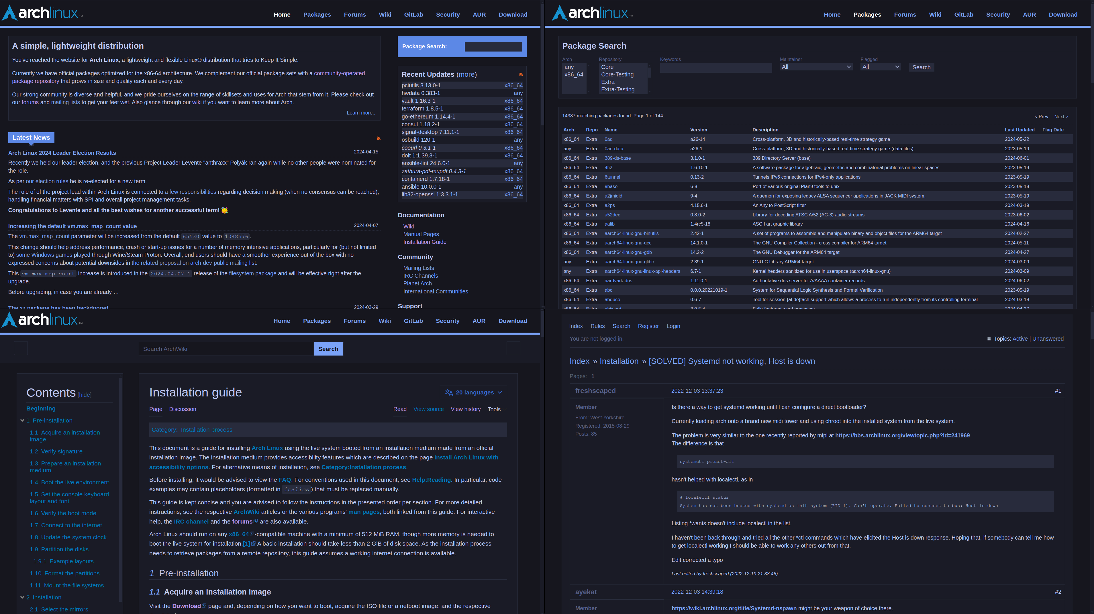
Tokyo Night for archlinux.org!
Arch Linux Tokyo Night (tokyonight) by JoshuaMarkle
Details
AuthorJoshuaMarkle
LicenseCC Zero
Categoryarchlinux.org
Created
Updated
Code size13 kB
Code checksum92e5fccc
Statistics
Learn how we calculate statistics in the FAQ.
Failed to fetch stats.
Description
Notes
I have attempted to capture all of the aspects of archlinux.org including the wiki, package finder, forums, and all the pages that relate to archlinux.org somehow. There's a lot so I probably didn't see all the sites but this config pretty much covers everything :3
Source code
Source code has over 10K characters, so we truncated it. You can inspect the full source code on install link./* ==UserStyle==
@name Arch Linux Tokyo Night (tokyonight)
@namespace github.com/openstyles/stylus
@version 1.1.1
@description Tokyo Night for archlinux.org!
@author JoshuaMarkle
==/UserStyle== */
@-moz-document domain('archlinux.org') {
:root {
--bg-dark: #16161E;
--bg-code: #12121a;
--bg: #1A1B26;
--bg-2: #282B3C;
--bg-3: #3F4256;
--bg-4: #444B6A;
--bg-blue: #547BCE;
--bg-green: #1AA88E;
--bg-red: #C34547;
--highlight-1: #1E202E;
--highlight-2: #2E3448;
--blue-accent: #89ddff;
--text: #c0caf5;
--text-dark: #565f89;
--cyan: #7dcfff;
--blue: #7aa2f7;
--blue-dark: #5C88E6;
--orange: #ff9e64;
--orange-dark: #e3a144;
--red: #f7768e;
--red-dark: #db4b4b;
--green: #9ece6a;
--green-dark: #1abc9c;
--purple: #bb9af7;
--background-color-base: var(--bg);
}
* {
border-color: var(--bg-2) !important;
box-shadow: none !important;
scrollbar-color: var(--bg-2) var(--bg);
}
a:link, a:visited { color: var(--blue); }
::selection {
background-color: var(--blue);
}
input,
textarea {
&::placeholder {
color: var(--bg-dark) !important;
}
}
#content table,
#content h1,
#content h2,
#content h3,
#content h4,
#content h5,
#content pre,
#content p,
#content code,
#content tt {
color: var(--text) !important;
}
#archnavbar {
background-color: var(--bg-dark) !important;
border-bottom-color: var(--blue) !important;
}
.mw-parser-output {
background-color: var(--bg) !important;
}
.mw-page-container {
background-color: var(--bg-dark) !important;
}
.vector-header-container {
background-color: var(--bg) !important;
}
.vector-pinnable-header-toggle-button { background: var(--bg); }
#content,
header.mw-header li:not(.new),
#mw-panel-toc,
#mw-navigation li:not(.new),
#mw-panel li:not(.new),
#column-one li:not(.new),
#footer {
a:not([role="button"], .new) {
color: var(--blue) !important;
}
a:not([role="button"], .new):hover {
color: var(--blue-dark) !important;
}
div.archwiki-template-box.archwiki-template-box-note a { color: var(--cyan) !important; }
div.archwiki-template-box.archwiki-template-box-tip a { color: var(--green) !important; }
div.archwiki-template-box.archwiki-template-box-tip a:hover { color: var(--green) !important; }
div.archwiki-template-box.archwiki-template-box-warning a { color: var(--orange) !important; }
div.archwiki-template-box.archwiki-template-box-warning a:hover { color: var(--orange-dark) !important; }
}
@media screen {
html.client-darkmode {
background-color: var(--bg);
}
}
.vector-feature-zebra-design-disabled,
body {
background-color: var(--bg);
}
.cdx-text-input__input:enabled:focus {
border-color: var(--blue);
box-shadow: var(--blue) !important;
}
.firstHeading {
color: var(--blue) !important;
}
#content {
border-color: var(--bg-2);
}
#content pre:not([class*="CodeMirror"]),
#content code,
#content tt {
background-color: var(--bg-2);
color: var(--text);
border-color: var(--bg-2);
border-radius: 5px;
}
div.archwiki-template-box.archwiki-template-box-tip,
div.archwiki-template-box.archwiki-template-box-tip li {
color: white !important;
background: var(--bg-green);
border: none;
}
div.archwiki-template-box.archwiki-template-box-note,
div.archwiki-template-box.archwiki-template-box-note li {
color: white !important;
background: var(--bg-blue);
border: none;
}
div.archwiki-template-box.archwiki-template-box-warning,
div.archwiki-template-box.archwiki-template-box-warning li {
color: white !important;
background: var(--bg-red);
border: none;
}
.vector-pinned-container {
border-color: var(--bg-2) !important;
}
.vector-pinnable-header-label {
color: var(--text);
}
.vector-pinnable-header-toggle-button,
.vector-pinnable-header-unpin-button {
color: var(--blue);
}
.wikitable {
background-color: var(--bg);
}
.wikitable > tr > th,
.wikitable > tr > td,
.wikitable > * > tr > th,
.wikitable > * > tr > td {
color: var(--text);
border-color: var(--bg-3);
}
.wikitable > tr > th,
.wikitable > * > tr > th {
background-color: var(--bg-dark);
color: var(--text);
}
.pre {
color: var(--bg-dark);
}
.mw-headline {
color: var(--text);
}
.plainlinks,
.archwiki-template-man,
.external text {
color: var(--blue);
}
.cdx-button:enabled.cdx-button--weight-quiet,
.cdx-button.cdx-button--fake-button--enabled,
.cdx-button.cdx-button--fake-button--enabled.cdx-button--weight-quiet,
.diff-context,
.oo-ui-dropdownWidget.oo-ui-widget-enabled .oo-ui-dropdownWidget-handle,
.oo-ui-checkboxInputWidget [type="checkbox"] + span {
color: var(--text);
}
.diff-deletedline,
.mw-message-box-warning {
background-color: var(--orange);
color: var(--bg-dark);
}
.diff-addedline {
background-color: var(--blue);
color: var(--bg-dark);
}
.mw-message-box-error {
background-color: var(--red);
border-color: var(--bg-dark);
color: var(--bg);
}
div.archwiki-template-message {
background: var(--bg-2);
}
.mw-number-text {
color: var(--text);
}
.oo-ui-checkboxInputWidget.oo-ui-widget-enabled[type="checkbox"]:checked
+ span,
.cdx-checkbox__input:enabled:checked + .cdx-checkbox__icon,
.cdx-button:enabled.cdx-button--weight-primary.cdx-button--action-progressive {
background-color: var(--blue);
border-color: var(--blue);
color: var(--bg-dark) !important;
}
#archnavbar ul li.anb-selected a {
color: var(--blue) !important;
}
.archwiki-template-message {
background-color: var(--bg);
}
.catlinks {
background-color: var(--bg-2);
}
.mw-parser-output p {
color: var(--text) !important;
}
.archwiki-template-meta-related-articles {
background-color: var(--bg);
}
.archwiki-template-meta-related-articles p {
color: var(--text);
border-bottom-color: var(--blue);
}
.archwiki-template-meta-related-articles ul li a {
color: var(--blue) important;
}
.mw-plusminus-neg,
a.new {
color: var(--text-dark) !important;
}
.mw-plusminus-pos {
color: var(--green);
}
.oo-ui-textInputWidget .oo-ui-inputWidget-input,
.mw-widget-dateInputWidget-handle,
.oo-ui-buttonElement-framed.oo-ui-widget-enabled
> .oo-ui-buttonElement-button,
#pagehistory li.selected {
background-color: var(--bg-2) !important;
color: var(--text) !important;
outline-color: var(--bg-3);
}
.oo-ui-menuOptionWidget.oo-ui-widget-enabled.oo-ui-optionWidget,
.comment {
color: var(--text);
}
.mw-footer-container {
color: var(--text) !important;
}
#archnavbarlist li a {
color: var(--blue) !important;
}
.mw-footer li {
color: var(--text);
}
.vector-main-menu,
.vector-pinnable-element {
background-color: var(--bg) !important;
}
#p-navigation ul li a {
color: var(--blue) !important;
}
.archwiki-template-box-note a {
color: var(--blue) !important;
}
.archwiki-template-box-note a:visited {
color: var(--purple) !important;
}
.mw-page-title-main {
color: var(--text);
}
.vector-tab-noicon mw-list-item a {
color: var(--blue);
}
.mw-footer li a {
color: var(--blue);
}
.mw-body {
background-color: var(--bg) !important;
color: var(--text);
}
.cdx-text-input__input:enabled {
background-color: var(--bg-dark) !important;
color: var(--text) !important;
border-color: var(--bg-2);
padding-left: 10px !important;
}
.cdx-text-input__input::placeholder { color: var(--text-dark) !important; }
body.skin-vector-2022 .vector-header-container span { display: none !important; }
.cdx-button:enabled,
.cdx-button.cdxbutton--fake-button--enabled {
color: var(--bg-dark);
background-color: var(--blue);
border-color: var(--bg);
}
.cdx-menu:hover {
background-color: var(--bg) !important;
}
.anb-home {
color: var(--text) !important;
}
.vector-dropdown-content {
background-color: var(--bg) !important;
}
.mw-headline::before {
color: var(--blue) !important;
}
body, html,
.vector-feature-zebra-design-disabled, #vector-toc-pinned-container, .vector-toc::after,
.pun {
color: var(--text);
background: var(--bg-dark) !important;
}
.vector-feature-zebra-design-disabled .vector-pinnable-header-label {
font-size: 28.8px;
color: var(--text);
}
/* Other Arch Pages */
div.box {
background: var(--bg);
border: 1px solid var(--bg-2);
}
input, select, option, button {
color: var(--text);
background: var(--bg-2);
border: 1px solid var(--bg-2);
}
label { color: var(--text-dark); }
li { color: var(--text); }
dl dt { color: var(--text-dark); }
.results .flagged, .error, .red { color: var(--red); }
.orange { color: var(--orange-dark...