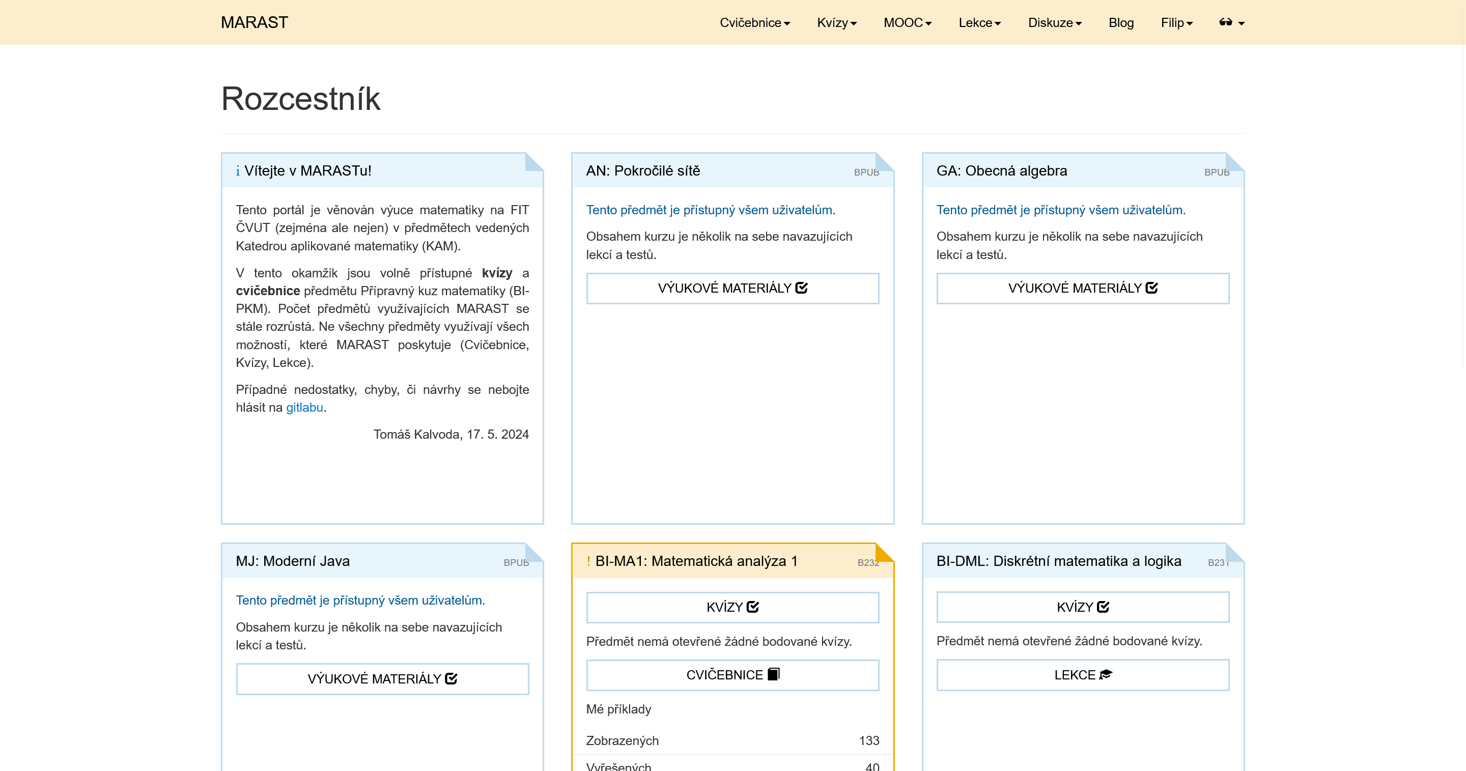
An attempt to give Marast a style consistent with FIT CTU website. Choose from three styles in style selection menu. See also ProgTest FIT style
Marast FIT Style (now with Pacalvod-Man) by 316filip
Details
Author316filip
LicenseNo License
Categorymarast.fit.cvut.cz
Created
Updated
Code size31 kB
Code checksum77e001c8
Statistics
Learn how we calculate statistics in the FAQ.
Failed to fetch stats.
Description
Notes
Still in development, currently focused on light mode
Source code
Source code has over 10K characters, so we truncated it. You can inspect the full source code on install link./* ==UserStyle==
@name Marast FIT Style (now with Pacalvod-Man)
@namespace github.com/openstyles/stylus
@version 0.3.5
@description An attempt to give Marast a style consistent with FIT CTU website. Choose from three styles in style selection menu. Still in development, currently focused on light mode. See also ProgTest FIT style
@author Filip Rund
==/UserStyle== */
@-moz-document domain("marast.fit.cvut.cz") {
/* cross-theme layout modifications */
@import url('https://fonts.googleapis.com/css2?family=Roboto:ital,wght@0,100;0,300;0,400;0,500;0,700;0,900;1,100;1,300;1,400;1,500;1,700;1,900&display=swap');
html > body {
min-height: 100vh;
padding: 0;
position: relative;
}
html > body > .container {
padding-top: 50px !important;
min-height: 100vh;
position: relative;
display: flex;
flex-direction: column;
}
html > body > .container > .container-fluid {
width: 100%;
}
html > body > .container > footer {
flex-grow: 1;
display: flex;
align-items: end;
padding-bottom: 15px;
border-top: none;
}
html > body:has(.quiz) > .container > footer {
margin-top: 15px !important;
}
html > body > .container > footer > small {
flex-grow: 1;
font-size: inherit;
padding-top: 15px;
border-top: 1px solid #eaeaea;
}
html > body > .container > footer > small:after {
flex-grow: 1;
}
html > body > .container > footer > ul {
padding: 0;
margin: 0;
padding-top: 15px;
border-top: 1px solid #eaeaea;
}
html > body > .container > footer {
margin-top: 0;
}
@media (min-width: 768px) {
nav > .container {
padding: 0 !important;
}
}
html > body > .container > .row > div > .table-responsive > table {
margin-top: 40px !important;
}
html > body > .container > .row > div > .table-responsive > table > tbody > tr:nth-child(1) {
display: none;
}
html > body > .container > .row > div > .table-responsive > table > tbody > tr > td {
min-width: 60px;
}
html > body > .container > .row > div > .table-responsive > table > tbody > tr:nth-child(2) > td {
position: relative;
}
html > body > .container > .row > div > .table-responsive > table > tbody > tr:nth-child(2) > td:before {
display: block;
position: absolute;
top: -30px;
font-weight: bolder;
}
html > body > .container > .row > div > .table-responsive > table > tbody > tr:nth-child(2) > td:nth-child(1):before {
content: "Název";
}
html > body:has(a[href="/?locale=en"]) > .container > .row > div > .table-responsive > table > tbody > tr:nth-child(2) > td:nth-child(1):before {
content: "Title";
}
html > body > .container > .row > div > .table-responsive > table > tbody > tr:nth-child(2) > td:nth-child(2):before {
content: "Stav";
}
html > body:has(a[href="/?locale=en"]) > .container > .row > div > .table-responsive > table > tbody > tr:nth-child(2) > td:nth-child(2):before {
content: "Status";
}
html > body > .container > .row > div > .table-responsive > table > tbody > tr:nth-child(2) > td:nth-child(3):before {
content: "Otevřen od";
}
html > body:has(a[href="/?locale=en"]) > .container > .row > div > .table-responsive > table > tbody > tr:nth-child(2) > td:nth-child(3):before {
content: "Open at";
}
html > body > .container > .row > div > .table-responsive > table > tbody > tr:nth-child(2) > td:nth-child(4):before {
content: "Otevřen do";
}
html > body:has(a[href="/?locale=en"]) > .container > .row > div > .table-responsive > table > tbody > tr:nth-child(2) > td:nth-child(4):before {
content: "Close at";
}
html > body > .container > .row > div > .table-responsive > table > tbody > tr:nth-child(2) > td:nth-child(5):before {
content: "Zbývá";
}
html > body:has(a[href="/?locale=en"]) > .container > .row > div > .table-responsive > table > tbody > tr:nth-child(2) > td:nth-child(5):before {
content: "Time left";
}
html > body > .container > .row > div > .table-responsive > table > tbody > tr:nth-child(2) > td:nth-child(6):before {
content: "Body";
}
html > body:has(a[href="/?locale=en"]) > .container > .row > div > .table-responsive > table > tbody > tr:nth-child(2) > td:nth-child(6):before {
content: "Points";
}
html > body > .container > .row > div > .table-responsive > table > tbody > tr:nth-child(2) > td:nth-child(7):before {
content: "Splnění";
}
html > body:has(a[href="/?locale=en"]) > .container > .row > div > .table-responsive > table > tbody > tr:nth-child(2) > td:nth-child(7):before {
content: "Finished";
}
#navbar {
padding: 0;
}
.navbar-right {
margin: 0 !important;
}
.dropdown-menu {
opacity: 0;
display: block !important;
pointer-events: none;
transition-duration: .1s;
}
.open > .dropdown-menu {
opacity: 1;
pointer-events: auto;
}
.dropdown-menu a {
transition-duration: .1s;
}
div.boxed {
display: flex;
flex-direction: column;
}
div.boxed .panel-body {
flex: 1;
}
div.boxed .panel-body > :last-child * {
margin-bottom: 0;
}
#question-body .container-fluid {
padding: 0 !important;
}
#question-body > .container-fluid > .form-group {
margin-bottom: 0;
}
#question-body .bottom-buffer:last-child {
margin-bottom: 0 !important;
}
#question-body .row {
display: flex;
}
#question-body .row > :first-child {
padding-right: 0;
width: auto;
}
#question-body .row > :last-child {
align-content: center;
width: 100%;
}
#question-body .row .btn-group {
width: max-content;
}
div.boxed .panel-footer {
position: static;
}
div.boxed .panel-body > .btn-group {
margin: 0 0 10px;
}
div#question-container {
padding-bottom: 0;
}
div#question-container > :last-child > .well {
margin-bottom: 0;
}
div.collapsing {
padding-bottom: 0 !important;
}
div.panel-body {
padding: 0 !important;
}
div.panel-body > :not(table):first-child {
padding-top: 15px !important;
}
div.panel-body:not(:has(:not(br):not(i):not(b):not(strong))) {
padding: 15px !important;
}
div.panel > p:last-child:empty {
margin: 0;
}
div.panel-body > :not(table):not(#lock-container):last-child {
padding-bottom: 15px;
}
div.panel-body > :not(table):not(#lock-container):not(ol) {
padding-left: 15px !important;
padding-right: 15px !important;
}
div.panel-body > ol {
padding-left: 30px !important;
padding-right: 15px !important;
}
div.panel-body table:first-child tr:first-child td {
padding-top: 15px !important;
}
div.panel-body tr td:first-child {
padding-left: 15px !important;
}
div.panel-body tr td:last-child {
padding-right: 15px !important;
text-align: end !important;
}
div.panel-body tr:last-child td {
padding-bottom: 15px !important;
}
div.panel-body > :last-child {
margin: 0 !important;
}
div.panel-body table {
margin: 0 !important;
}
div.panel-body table tr:first-child > * {
border: none !important;
}
div.panel-body .alert {
margin: 15px !important;
margin-top: 0 !important;
}
div.panel-body .alert strong {
font-weight: normal !important;
}
div.panel-body > form:not(:first-child) {
margin-top: -5px;
}
#lock-container .progress {
margin: 0;
}
#notes > form > :last-child {
display: flex;
position: relative;
}
#notes > form > :last-child > .pull-left > label {
margin: 0;
}
#notes > form > :last-child > .pull-right {
flex: 1;
}
form.edit_note :last-child .pull-right {
margin: 0;
}
form.edit_note :last-child .pull-right > .img-ajax-loader {
height: 35px;
width: 35px;
}
form.edit_note :last-child .pull-right > #btn-save-note {
position: absolute;
right: 0;
}
div.exercise-question {
padding: 0;
}
div.row > div.col-xs-4:first-child, div.row > div.col-xs-5:first-child {
padding-left: 0;
}
div.row > div.col-xs-4:last-child, div.row > div.col-xs-5:last-child {
padding-right: 0;
}
.btn {
padding: 6px 12px !important;
}
input.btn-sm {
padding: 6px 12px !important;
}
.form-group.form-buttons {
padding: 0 !important;
margin: 0 !important;
}
.row form.form-horizontal > .container-fluid.fat-container > .row {
display: flex;
}
img.img-ajax-loader {
width: 45px;
height: 45px;
background-image: url("https://i.postimg.cc/HLGn038B/ezgif-com-animated-gif-maker.gif");
background-size: contain;
background-repeat: no-repeat;
box-sizing: border-box;
padding-left: 100px;
}
.fat-container {
min-height: auto;
}
#question-response > div {
margin-bottom: 0;
}
.discussion-container {
padding: 15px !important;
margin: 0 -15px;
}
.comment-container {
padding: 15px;
display: flex;
}
#filter-container > ...