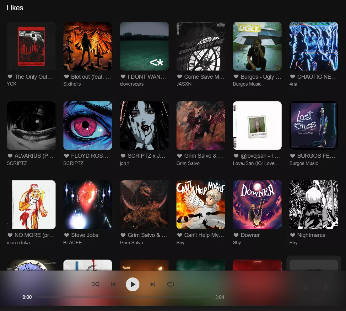
Soundfy is a theme that aims to make the soundcloud UI closer to Spotify's UI — now, updated to the new version of site.
SoundFy v4 — UPDATED! by Desynci
Details
AuthorDesynci
LicenseGNU GPL
Categorysoundcloud
Created
Updated
Size97 kB
Statistics
Learn how we calculate statistics in the FAQ.
Failed to fetch stats.
Description
Notes
About:
This is an updated version of the now-abandoned SoundFy v3. It fixes the main bugs caused by the redesign of SoundCloud and slightly improves the appearance. Sadly, the code is in a very deplorable state.
Credits:
All credits are still going to the original author of Soundfy — Bliwi. Legally, all code also belongs to him.
Recent changes:
[ 08 Jan 2025 ] - Fixed comments.
Bliwi's addon:
Pair it with this Tampermonkey script for Shortcuts on the sidebar! Playlists on the Side
Source code
Source code has over 10K characters, so we truncated it. You can inspect the full source code on install link./* ==UserStyle==
// All credits are going to bliwi
@name Soundfy v4
@version v4.2.5
@namespace 1337
@description Soundfy is a theme that aims to make the soundcloud UI closer to Spotify's UI — now, updated to the new version of site.
@author bliwi & idesync
@license GNU GPL
@preprocessor stylus
@var select theme "Theme" {
'Default (recommended)': "Default",
'Floating App': "floating-app",
'Floating App Custom': "floating-app-custom",
'Accent Color (WIP)': "floating-app-accent",
'The Other Fy':"the-other-fy",
'Nomanssky': "Nomanssky",
'OLED': "oled",
'Florest': "Florest",
'Abstract Waves': "Abstractwaves",
'Classic': "sc-classic",
}
@var select sidebar "Sidebar" {
'Auto': "auto",
'Static': "static",
'Compact': "compact",
}
@var range auto-trigger "Autochange Sidebar on" [1200,0,7680,80,"px"]
@var text bg-image "Background Image (wrap in quotes)" ""Example""
@var checkbox logo "Show Logo" 1
@var checkbox animations "Show Subtle Animations" 1
@var checkbox bottom-bar "Bottom Bar (Full/Compact)" 1
@var checkbox blur "Add Blur Effect" 1
@var checkbox bottom-bar-blur "+ Bottom Bar" 0
@var range blur-radius "Blur Ammount" [15,0,30,1,"px"]
@var checkbox upload "Show Upload Text" 0
@var checkbox shadows "Show Extra-Shadows" 0
@var checkbox invert-icon "Invert Icons" 1
@var color bg-color "Background" #121212
@var color sidebar-color "Sidebar" #070707
@var color sidebar-text "Sidebar Text" #fff
@var color bottom-bar-color "Bottom Bar" #181818
@var color link-color "Link Text" #fff
@var color link-light "secondary Link Text Color" #999
@var color header-color "Headers Text" #f0f0f0
@var color sub-text "Sub Text" #999
@var color menus-bg "Menu / Flyout Background" #121212
@var color accent-color "Accent" #f50
@var color button-color "Buttons" #222
@var color shadow-color "Shadows" #101010
@var range icon-hue "Icons Color" [0,0,360,1,"deg"]
@var range waveform-hue "Waveform Color" [0,0,360,1,"deg"]
@var range track-bg-contrast "Track Background Contrast" [100,0,200,2,"%"]
==/UserStyle== */
@-moz-document domain("soundcloud.com") {
/*A big thanks to Mikey for converting the code to Stylus for me :)
Soundfy
/*default sidebar #333 / default bottom bar #f2f2f2 */
.sc-classic .l-fluid-fixed {
margin-left: 20px;
}
/*Promotion banners - Thanks to Junki for allowing me to reference his code for this and other snipets(search for Junki for credits where due)*/
.l-product-banners {
display: none;
}
/*Cookies - Junki*/
#onetrust-consent-sdk {
display: none;
}
.sc-classic .header {
background: var(--sidebar-color);
box-shadow: 0 0 10px var(--shadow-color);
}
.pinbutton:hover {
background: var(--accent-color);
cursor: pointer;
}
.sc-classic .playControls__bg {
background: none;
}
.sc-classic .playControls__inner {
background: var(--bottom-bar-color);
}
.playControls.m-visible .playControls__inner {
box-shadow: 0 0 5px var(--shadow-color);
}
.sc-classic .playbackTimeline__timePassed {
color: var(--link-color);
}
.container {
overflow-y: clip;
overflow-x: clip;
height: calc(100vh - var(--bottom-width) - 290px);
}
/*Margins and spacings*/
.l-container {
width: auto !important;
margin-left: var(--sidebar-width);
margin-right: 0px;
display: grid;
animation: more-actions .3s;
}
#content {
overflow-x: clip;
}
.sc-classic .l-container.l-content {
padding: 0px;
}
/* .modular-home-mixed-selection{
padding-left: 20px;
} Margin left backup*/
.l-three-column .listen-about {
padding-left: 20px;
}
.l-fluid-fixed .l-sidebar-right .l-footer,
.sc-classic .l-fluid-fixed .l-sidebar-right .l-footer {
padding-bottom: calc(var(--bottom-width) + 20px);
}
.sc-classic .l-footer.standard {
padding: 20px 20px;
}
/*loading*/
.sc-classic .loading {
background: transparent url(https://icon-library.com/images/loading-icon-transparent-background/loading-icon-transparent-background-11.jpg) no-repeat 50% 50%;
min-height: 40px;
background-size: 30px;
filter: invert(var(--invert-icon));
animation: header-in linear 0.3s,
rotation 2s infinite linear;
}
/* Buttons */
.sc-button-next.sc-button-focus,
.sc-button-next:focus,
.sc-button-next:hover,
.sc-button-pause.sc-button-focus,
.sc-button-pause:focus,
.sc-button-pause:hover,
.sc-button-play.sc-button-focus,
.sc-button-play:focus,
.sc-button-play:hover,
.sc-button-prev.sc-button-focus,
.sc-button-prev:focus,
.sc-button-prev:hover,
.uiEvoButton--isSelected,
.uiEvoButton.uiEvoButton--isSelected:hover,
.sc-button-nostyle:active,
.sc-button-nostyle:hover
{
background: var(--accent-color);
}
input {
color: var(--sub-text) !important;
}
.sc-classic .sound__soundActions {
background: none;
}
.sc-button {
border-radius: 30px;
background: var(--button-color);
border: none;
}
.sc-button-icon {
background: none;
}
.sc-button-small:not(.sc-button-cta) {
color: var(--link-light-color) !important;
}
.sc-button-dropdown:after {
top: 11px;
}
/* Comments */
.uiEvoButton--isLight.commentItem__likeButton {
color: var(--header-color);
background-color: var(--menus-background) !important;
}
.commentItem__like .uiEvoButton--isLight.commentItem__likeButton:hover {
color: var(--accent-color);
background-color: var(--menus-background);
}
.commentItem__body {
color: var(--header-color) !important;
}
.commentItem__usernameLink {
color: var(--sub-text) !important;
}
.commentItem__creatorLink,
.commentItem__creatorLink:hover,
.commentItem__creatorLink:visited,
.commentItem__username,
.commentItem__usernameLink:hover,
.commentItem__usernameLink:visited {
color: var(--accent-color);
}
.commentItem__replyButton,
.commentItem__replyButton:visited {
color: var(--link-light-color) !important;
}
.commentItem__replyButton:hover {
color: var(--accent-color) !important;
}
.sc-classic .commentForm .commentForm__input {
background: var(--bottom-bar-color);
}
.sc-classic .tabs__headingContainer {
background: var(--menus-background);
border: none;
}
/* Profile Likes */
.l-fixed-top-one-column > .l-top {
width: 1240vmax;
top: 0px;
}
.sc-classic .l-fixed-top-one-column > .l-top {
background: var(--menus-background)
}
.userNetworkInfo .userAvatarBadge {
margin: 0 20px 10px 8px;
}
/* User Portrait & Track Pictures (on-click) Fixes */
.sc-classic .g-modal-title-h1 {
padding-bottom: 0px;
border-bottom: none;
}
.sc-classic .modal__modal {
background: none;
}
.g-overflow-hidden {
overflow: visible;
}
/* Track & user description fixes */
.sc-classic .truncatedAudioInfo.m-overflow.m-collapsed .truncatedAudioInfo__wrapper:after, .sc-classic .truncatedUserDescription.m-overflow.m-collapsed .truncatedUserDescription__wrapper:after {
background: linear-gradient(transparent, var(--shadow-color) 95%, var(--background-color));
}
.truncatedAudioInfo.m-overflow .truncatedAudioInfo__collapse, .truncatedUserDescription.m-overflow .truncatedUserDescription__collapse {
display: inline;
}
/* Playlists Selection Fix */
.sc-classic .compactTrackListItem.clickToPlay.active,
.sc-classic .compactTrackListItem.clickToPlay:focus,
{
background-color: var(--bottom-bar-color);
border-radius: 5px;
}
.sc-classic .compactTrackListItem.clickToPlay:hover {
background-color: var(--bottom-bar-color);
border-radius: 5px;
}
.sc-classic .compactTrackList__moreLink, .sc-classic .compactTrackList__moreLink:focus, .sc-classic .compactTrackList__moreLink:hover {
background: none;
outline: none;
}
/* Playlist-Partner Link Fix */
.sc-classic .fullHero__parentLink {
margin-top: 2px;
margin-left: 65px;
}
/* Remove Tag for Views Counter on Track */
.sc-classic .compactTrackListItem.clickToPlay.active .compactTrackListItem__additional,
.sc-classic .compactTrackListItem.clickToPlay:focus .compactTrackListItem__additional,
.sc-classic .compactTrackListItem.clickToPlay:hover .compactTrackListItem__additional
{
background: unset;
}
.selectLinkMenu__container {
z-index: 200 !important;
}
.waveform__emptyMessage {
color: var(--sub-text-color);
text-shadow: none;
}
.waveform.loaded {
transition: opacity 1.9s;
}
/* Repost overlay */
.sc-classic .repostOverlay__container {
background-color: var(--background-color);
border: none;
}
.repostOverlay__form {
display: block;
}
.repostOverlay__formInput {
padding-right: 42px;
background-color: unset;
}
.repostOverlay__formButtonContainer {
gap: 5px;
}
/* Small Icons Fix */
.sc-classic .l-fluid-fixed .sound .sc-button-responsive:before {
left: 2px;
}
/* Icons rev...