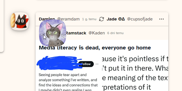
"Zooms" user avatars when you hover your mouse over them.
cohost.org - avatar peek by yellowafterlife
Details
Authoryellowafterlife
LicenseNo License
Categorycohost.org
Created
Updated
Code size1.7 kB
Code checksum6510c717
Statistics
Learn how we calculate statistics in the FAQ.
Failed to fetch stats.
Description
Notes
Pretty sure that I made this after seeing this post from @blep and had it lying around ever since.
Works in common spots? (feed, comments, notifications)
Perhaps there's a better way of doing this effect.
Source code
/* ==UserStyle==
@name           cohost.org - avatar peek
@namespace      github.com/openstyles/stylus
@version        1.0.1
@description    A new userstyle
@author         YellowAfterlife
==/UserStyle== */

@-moz-document domain("cohost.org") {
    .co-post-header > div.mask > img,
    .co-comment-box article a.mask > img,
    .renderIfVisible > div > a.mask > img,
    .co-embedded-ask > div.mask > img {
        pointer-events: none;
        transition: all 0.1s ease-in-out;
        position: relative;
        transform: scale(1);
    }
    .co-post-header > div.mask:hover > img,
    .co-comment-box article a.mask:hover > img,
    .co-embedded-ask > div.mask:hover > img {
        transform: scale(3);
        z-index: 100;
    }
    .renderIfVisible > div > a.mask:hover > img {
        transform: scale(2);
    }
    .co-post-header > div.mask > img {
        transform-origin: left;
    }
    .co-embedded-ask > div.mask > img {
        transform-origin: top left;
    }
}
@-moz-document url("https://cohost.org/rc/project/notifications") {
    *.co-notification-card svg + div.mask > img,
    a[title].mask > img {
        pointer-events: none;
        transition: all 0.1s ease-in-out;
        position: relative;
        transform: scale(1);
    }
    *.co-notification-card svg + div.mask:hover > img,
    a[title].mask:hover > img {
        transform: scale(3);
        z-index: 100;
    }
    *.co-notification-card > .flex-row > img.aspect-square {
        transition: all 0.1s ease-in-out;
    }
    *.co-notification-card > .flex-row > img.aspect-square:hover {
        transform: scale(3);
        z-index: 100;
    }
}