Graphite
Graphite Mojeek by osirisgothra
Details
Authorosirisgothra
LicenseGGPL 2
Categorywww.mojeek.com
Created
Updated
Code size2.4 kB
Code checksum6d5e31a4
Statistics
Learn how we calculate statistics in the FAQ.
Failed to fetch stats.
Description
Notes
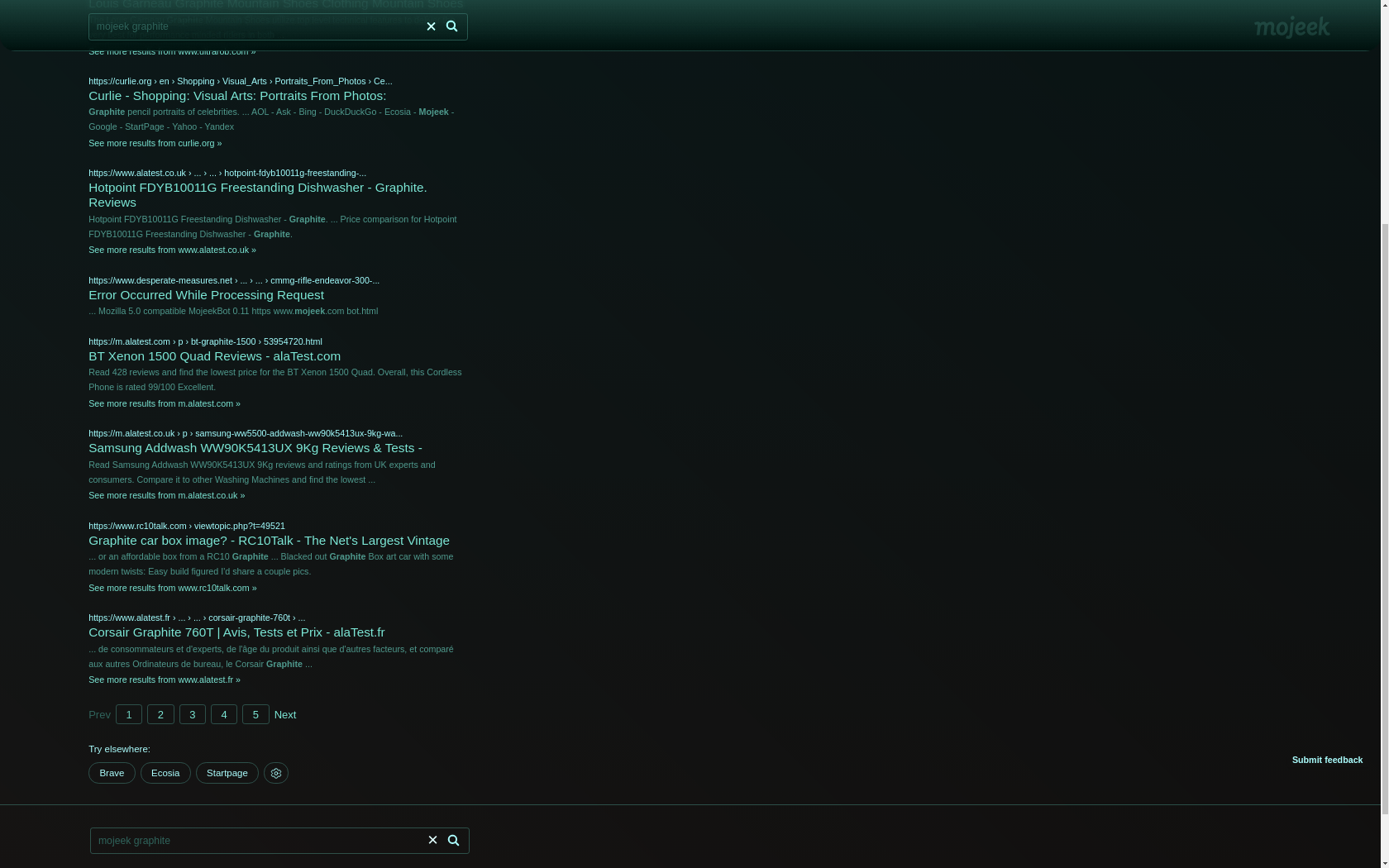
Graphite!
Source code
/* ==UserStyle==
@name           Graphite Mojeek
@namespace      github.com/openstyles/stylus
@version        1.0.0
@description    Graphite
@author         osiris
==/UserStyle== */

@-moz-document url-prefix("https://www.mojeek.com") {


*
{
    border-color: #722a2a80 !important;

    background: transparent !important;
}

body
{
    background: linear-gradient(45deg,#c4cf7142,#0000007d), linear-gradient(#122526,#1d1a19)!important;
    background-blend-mode: color-burn;
    background-attachment: fixed !important;
	filter: sepia(100.125%) hue-rotate(120.2deg) saturate(140.241%) contrast(112.345%) brightness(177.7%);
}

body > div.large-footer > div.container.serp-results > div.result-col > div.results > ul > li:hover
{
    border: #2b2b2b0f solid 1px;
    border-radius: 16px;
    filter: brightness(200%);
    text-shadow: #000 1px 1px 4px;
}
body > div.large-footer > div.container.serp-results > div.result-col > div.results > ul > li:hover::after
{
    background: linear-gradient(185deg,white,black) !important;
    z-index: -1;
    width:100%;
    opacity: 10%;
    margin: -10px;
    height: 100%;
    content: "";
    position: fixed;
    filter: blur(2px);
    top: 0px;
    border-radius: 16px;

}


body > div.large-footer > div.header.nb > div > div.header-logo > a > img
{

	display: block;
	position: absolute;
	right: 80px;
	opacity: 9%;
	top: 25px;
	transition: all 1250ms;
	animation: wobble 250ms 5;
	animation-play-state: running;
}

body > div.large-footer > div.header.nb > div > div.header-logo > a > img:hover
{
	transition: all 1250ms;
    background: black;
     box-shadow: #aaa 0px 0px 12px;
	border-radius: 12px;
	padding: 4px;
	animation: wobble 250ms infinite;
}

body > div.large-footer > div.header.nb
{
    z-index: 1;
    border-radius: 0px 0px 24px 24px;
    opacity:100%;
    backdrop-filter: blur(5px);

    position: sticky;
    top: 0px;
    left: 0px;
    width: 100% !important;
    display: block;
    background: linear-gradient(0deg,#060e32f0 ,#481c00e8 ) !important;
}
body > div.large-footer
{
    backdrop-filter: blur(10px);
}
@keyframes wobble
{
	0% { right: 80px; transform: rotate(0deg);  filter: blur(1.125px); }
	50% { right: 100px;transform: rotate(-10deg); filter: blur(2.025px); }
	100% { right: 80px;transform: rotate(0deg);  filter: blur(1.125px);  }
}

}