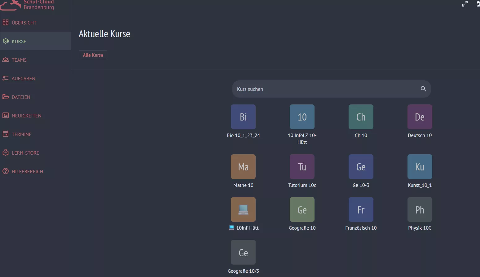
Nord Palette for Brandenburg Cloud
Cloud Nord by IchMagSchokolade
Details
AuthorIchMagSchokolade
LicenseNo License
Categorybrandenburg.cloud
Created
Updated
Code size4.2 kB
Code checksumd1c6e481
Statistics
Learn how we calculate statistics in the FAQ.
Failed to fetch stats.
Description
Notes
Userstyle doesn't have notes.Source code
/* ==UserStyle==
@name           Cloud Nord
@namespace      github.com/openstyles/stylus
@version        1.0.0
@description    Nord Palette for Brandenburg Cloud
@author         Daniel Lehmann (https://github.com/IchMagSchokolade)
@supportURL     https://github.com/IchMagSchokolade/Style/issues
==/UserStyle== */
@-moz-document domain("brandenburg.cloud") {
    :root {
        --background: #2e3440;
        --background-accent: #3b4252;
        --border: #434c5e;
        --text: #e5e9f0;
        --text-darker: #d8dee9;
        --color: #bf616a;
        --color2: #a3be8c;
    }
    * {
        box-shadow: none !important;
        border-color: var(--border) !important;
    }
    .mb-1,
    .input-group-addon *,
    .sc-card .tag,
    .sidebar .icon-btn,
    .topbar .icon-btn {
        background: transparent !important;
    }
    .sc-card-footer,
    .sc-card-body {
        border: none !important;
    }
    .v-card:hover {
        filter: none !important;
    }
    aside hr.divider {
        display: none !important;
        margin: 0 !important;
    }
    .sidebar ul {
        padding: 0;
    }
    /*

    *-------------------------------------------

    */
    body,
    aside,
    .sticky,
    #main-content,
    .top-bar-actions,
    .card,
    footer,
    .v-expansion-panels *,
    .tabContainer .tabs .tab {
        background: var(--background) !important;
    }
    .cloud-logo,
    .logo {
        filter: invert(70%) sepia(99%) saturate(3301%) hue-rotate(313deg) brightness(82%) contrast(77%) !important;
    }
    .form-control,
    .input-group-addon,
    body #loginarea .btn,
    .dropdown-menu,
    .sidebar .contents .list .list-item.active,
    .sidebar .contents .list .list-item:hover,
    .v-field--variant-solo,
    .v-skeleton-loader__bone,
    .v-skeleton-loader,
    .v-card,
    a.active,
    .v-overlay__content .v-list,
    .section-homework .btn,
    .section-teams .btn-primary,
    .sidebar-list li a.active {
        background: var(--background-accent) !important
    }
    form.login-form button {
        border: none !important;
    }
    .card,
    .sc-card,
    .v-card {
        border: 1.5px solid var(--border) !important;
        border-radius: 5px !important;
    }
    .v-divider {
        background: var(--border) !important;
        opacity: 1 !important;
    }
    h1,
    h2,
    h3,
    h4,
    h5,
    h6,
    .h1,
    .h2,
    .h3,
    .h4,
    .h5,
    .h6,
    body #loginarea .btn,
    .v-field--variant-solo * {
        color: var(--text) !important
    }
    .form-control,
    .form-control::placeholder {
        color: var(--text-darker) !important;
    }
    a,
    .text-danger,
    .alert-button.danger i,
    .sidebar-list,
    .sidebar ul li .sidebar-item:not(a.active),
    .sidebar .icon-btn,
    .topbar .icon-btn,
    #top-navbar li {
        color: var(--color) !important;
    }
    a.subitem svg {
        fill: var(--color) !important;
    }
    .fa.fa-eye-slash,
    .text-muted *,
    .sidebar .contents .list .list-item.active *,
    .text-primary,
    .sidebar-list a.active,
    .tab.active span,
    .tab.active i {
        color: var(--color2) !important;
    }
    .sidebar-list a.subitem.active svg {
        fill: var(--color2) !important;
    }
    .v-tab__slider {
        background: var(--color2) !important;
    }
    .sc-card .tag,
    .alert-date.text-nowrap.text-muted {
        border: 1.5px solid;
        color: var(--color2) !important;
    }
    .alert-date.text-nowrap.text-muted {
        border: none !important;
    }
    .border {
        border-bottom: 1.5px solid var(--border) !important
    }
    .room-avatar .v-avatar,
    .sc-card-header,
    .v-list-item .v-icon {
        filter: saturate(35%) opacity(70%) !important;
    }
    .room-avatar .v-avatar:hover,
    .sc-card-header:hover,
    .v-list-item .v-icon:hover {
        filter: saturate(70%) opacity(100%) !important;
    }
    footer {
        display: grid !important;
        margin: 0 !important;
        padding-bottom: 25px !important;
    }
    footer:after {
        content: "Style by Daniel Lehmann - based on Nord color palette" !important;
        color: var(--text) !important;
        justify-self: center !important;
    }
}