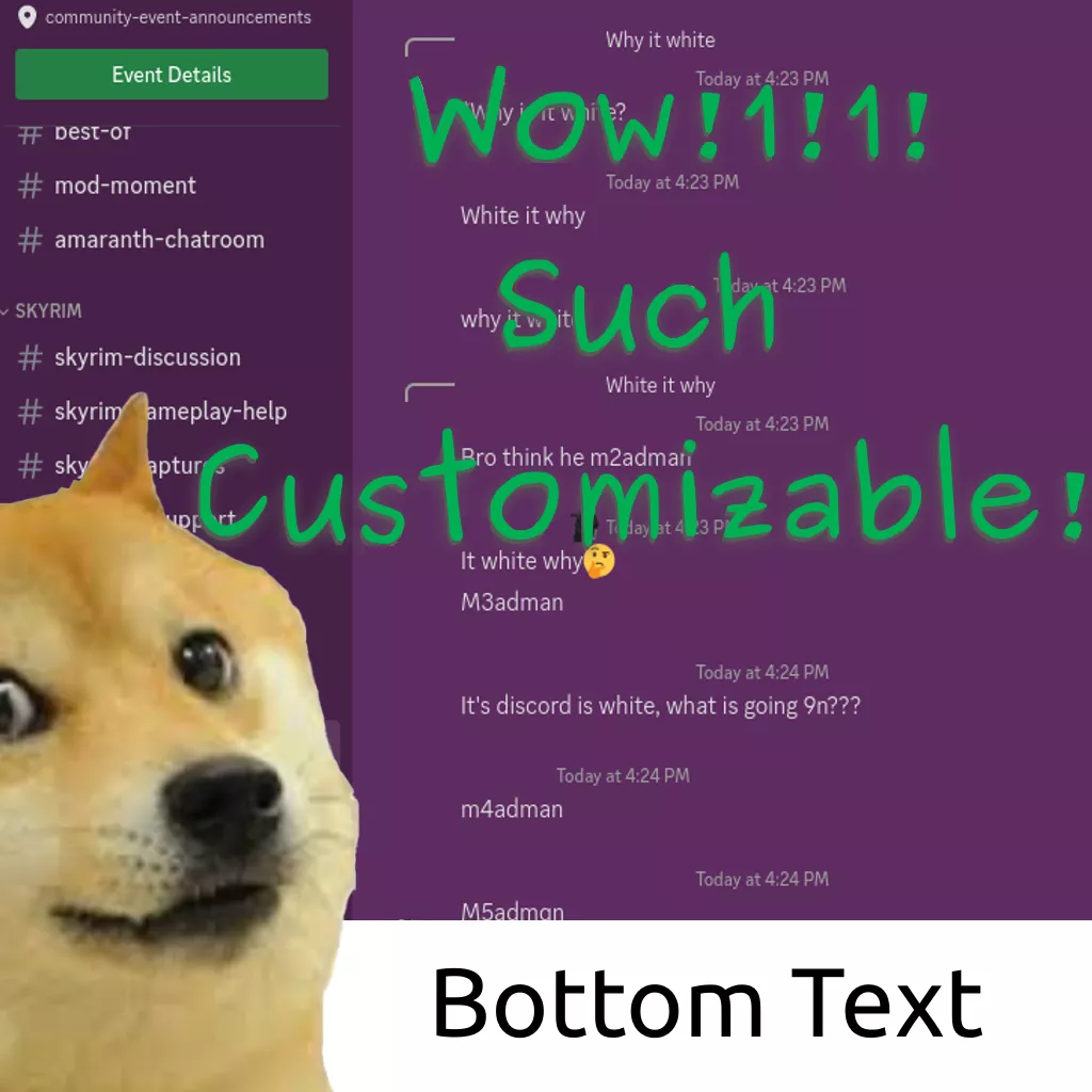
A fork that adds some extra QoL, customization features & visual improvements to the excellent "Customizable Discord" theme by birb-naise.
Customizable Discord - Fork by anony548679
Details
Authoranony548679
LicenseCC0-1.0
Categorydiscord
Created
Updated
Code size9.0 kB
Code checksum18c42fee
Statistics
Learn how we calculate statistics in the FAQ.
Failed to fetch stats.
Description
Notes
Forked from: https://uso.kkx.one/style/175085 (Customizable Discord)
Features
- Customizable background color
- Color offsets for various elements
- Transparency effects
- Support for color overlay on background images
- Automatically adjusted colors based on your background color
Image Credits
- Noelle - Cupoi (Pixiv ID 12890391)
- Ai - @Yoizuki_nema_
- Chiaki - 散散 (Pixiv ID 15027662)
- Chika - @gumimecv
Useful links
Changelog
2025-01-31
- Fixed popup theme not applying to sticky headers
- More descriptive options for the text box highlight option
- Removed rounding mode (reasoning: no plans to finish it & it's ugly)
2024-09-15
- Backdrop filters are now a toggle
2024-09-06
- Linux/Firefox friendly font options
- Removed some redundant code
- Added more backdrop filter options
20240603.23.01-custom-2024-08-09
- Added popup background to all listboxes
- Added popup background to the server roles sticky header
20240603.23.01-custom-2024-08-08
- Bug fixes
20240603.23.01-custom-2024-08-07.3
- Fixed highlight color affecting entire screen with transparent background color
20240603.23.01-custom-2024-08-07.2
- Migrated away from aria labels. Theme should work in all languages now
- Removed some redundant code
20240603.23.01-custom-2024-08-07.1
- Removed redundant settings
- Replaced user area independent color control with a similar highlighting system as everything else for more consistency
- Changed default background to none
- Some reorganization of the configuration menu
- Fixed some minor issues
20240603.23.01-custom-2024-08-07
- Fixed background color not applying when background image is selected
- Optimizations
- Refinements/bug fixes for brightness and highlight settings
- Independent highlight color control
- Independent user area color control
- Other minor bug fixes
20240603.23.01-custom-2024-08-01.1
- Temporary workaround for user area highlight not being the same as general highlight at the same value
- Added image credits (from upstream) in description
- Added link to Customizable Discord in description
20240603.23.01-custom-2024-08-01
- Highlight color option added
- More comments
- Some reorganization for better readability
20240603.23.01-custom-2024-07-30
- Extra highlighting options
- Fixed font not applying
20240603.23.01-custom-2024-07-29.1
- Improved highlighting system
20240603.23.01-custom-2024-07-29
- Added experimental rounding support
- Fixed popup theme not applying to edit and delete message icons
- Highlights now apply to search results
20240603.23.01-custom-2024-07-28.1
- Removed an unnecessary line
- Sane defaults
20240603.23.01-custom-2024-07-28
- Initial release
Source code
/* ==UserStyle==
@name         Customizable Discord - Fork
@namespace    USO Archive
@author       uname4586, birb-naise
@description  A fork that adds some extra QoL, customization features & visual improvements to the excellent "Customizable Discord" theme by birb-naise.
@version      2025-01-31
@license      CC0-1.0
@preprocessor uso
@advanced dropdown bg "Background" {
    bg-none "None*" <<<EOT EOT;
    noelle "Noelle" <<<EOT background: url("https://i.imgur.com/pWKivE4.jpeg"); EOT;
    a "Chika" <<<EOT background: url("https://i.imgur.com/tpkDRFf.png"); EOT;
    aibg "Ai" <<<EOT background: url("https://i.imgur.com/KK08VK2.png"); EOT;
    b "Chiaki" <<<EOT background: url("https://i.imgur.com/9rdTjS1.png"); EOT;
	bg-custom-dropdown "Custom" <<<EOT background: url(/*[[bg-custom]]*\/); EOT;
}
@var text bg-custom "Background (Imgur links only) (Custom)" "https://example.com/image.png"
@var color bg-color "Background Color" #000
@var color h-color "Highlight Color" #000
@var color themecolor "Theme Color" #505574
@var range bg-opacity "Background Opacity" 100
@var range h-opacity "Highlights Opacity" 0
@var range h-amount "Highlight Amount" 30   //This is a convenience feature
@var range h-server-bar "Server Bar Highlight" 50
@var range h-user-area "User Area Highlight" 0
@var range bg-brightness "Brightness" 100
@advanced dropdown font "Font" {
    ggsans "gg sans (Default)*" <<<EOT gg sans EOT;
    arial "Arial" <<<EOT Arial EOT;
    cambria "Cambria" <<<EOT Cambria EOT;
    couriernew "Courier New" <<<EOT Courier New EOT;
    garuda "Garuda" <<<EOT Garuda EOT;
    freesans "FreeSans" <<<EOT FreeSans EOT;
    ubuntu "Ubuntu" <<<EOT Ubuntu EOT;
    urwgothic "URW Gothic" <<<EOT URW Gothic EOT;
}
@advanced dropdown h-text-box "Text Box Highlight" {
    ga "Highlight color*" <<<EOT var(--theme-highlight-transparent) EOT;
    gb "Discord-like" <<<EOT var(--special-highlight-2-transparent) EOT;
}   //Option added for parity with discord's theme

@advanced dropdown theme "Theme (switch theme on discord too)" {
    ba "Dark*" <<<EOT
/*------------ DARK MODE COLORS ------------*\/
:root {
    --theme-text: #dcddde;
    --theme-muted: #9d9d9d;
    --theme-bg-color-theme: #fff 50%;
    --brand-500-color-theme: #fff 30%;
    --theme-popup-color-theme: #000 30%
} EOT;
    bb "Light" <<<EOT
/*------------ LIGHT MODE COLORS ------------*\/
:root {
    --theme-text: #24273d;
    --theme-muted: #4c4f69;
    --theme-bg-color-theme: #000 50%;
    --brand-500-color-theme: #000 30%;
    --theme-popup-color-theme: #000 30%

} EOT;
}

/*----------BACKDROP FILTERS----------*\/
@advanced dropdown bgf-toggle"Backdrop filters"{
    bgf-off"Off*" <<<EOT EOT;
    bgf-on"On" <<<EOT backdrop-filter: blur(var(--bgf-blur)) contrast(var(--bgf-contrast)) grayscale(var(--bgf-grayscale)) invert(var(--bgf-invert)) sepia(var(--bgf-sepia)) saturate(var(--bgf-saturate)) hue-rotate(var(--bgf-hue-rotate)) /*Backdrop Filters*\/;--bgf-blur: /*[[bgf-blur]]*\/px;--bgf-contrast: /*[[bgf-contrast]]*\/%;--bgf-grayscale: /*[[bgf-grayscale]]*\/%;--bgf-invert: /*[[bgf-invert]]*\/%;--bgf-sepia: /*[[bgf-sepia]]*\/%;--bgf-saturate: /*[[bgf-saturate]]*\/%;--bgf-hue-rotate: /*[[bgf-hue-rotate]]*\/deg EOT;}
@var number bgf-blur"Blur" 0
@var number bgf-contrast"Contrast" 100
@var range bgf-grayscale"Grayscale" 0
@var range bgf-invert"Invert" 0
@var range bgf-sepia"Sepia" 0
@var number bgf-saturate"Saturate" 100
@var number bgf-hue-rotate"Hue-Rotate" 0
==/UserStyle== */
@-moz-document domain("discord.com") {
/*////////////// DARK/LIGHT MODE COLORS //////////////*/
/*[[theme]]*/

:root {
    /*[[bg]]*/
    background-size: cover;
    --theme-color: /*[[themecolor]]*/;
    --theme-font: /*[[font]]*/;
    --theme-bg-color: color-mix(in srgb, var(--bg-color), var(--theme-bg-color-theme));    /*Setting the colours to be used in transparency settings*/
    --theme-popup-color: color-mix(in srgb, var(--bg-color), var(--theme-popup-color-theme));
    --brand-500-color: color-mix(in srgb, var(--bg-color), var(--brand-500-color-theme));  /*DM icon's background color*/

    /*Highlight colors*/
    --h-color-no-a: rgb(from /*[[h-color]]*/ r g b / calc(alpha + (1 - alpha)));
    --theme-highlight-color: color-mix(in srgb, var(--bg-color-no-a), var(--h-color-no-a) /*[[h-amount]]*/%);    /*General highlights*/
    --theme-highlight-transparent: color-mix(in srgb, var(--theme-highlight-color) /*[[h-opacity]]*/%, #0000);
    --special-highlight-color: color-mix(in srgb, var(--bg-color-no-a), var(--h-color-no-a) /*[[h-server-bar]]*/%); /*Server bar highlight*/
    --special-highlight-transparent: color-mix(in srgb, var(--special-highlight-color) /*[[h-opacity]]*/%, #0000); /*Adding back the alpha*/
    --special-highlight-2-color: color-mix(in srgb, var(--bg-color), #fff 5%);
    --special-highlight-2-transparent: color-mix(in srgb, var(--special-highlight-2-color) /*[[h-opacity]]*/%, #0000);

    /*Other colors*/
    --theme-bg: color-mix(in srgb, var(--theme-bg-color) 20%, #0000);
    --theme-popup: color-mix(in srgb, var(--theme-popup-color) 80%, #0000);
    --theme-bg-dim: #0000;
    --brand-500: color-mix(in srgb, var(--brand-500-color) 80%, #0000);    /*DM icon's background transparency*/
    --bg-color-no-a: rgb(from /*[[bg-color]]*/ r g b / calc(alpha + (1 - alpha)));
    --bg-color: color-mix(in srgb, var(--bg-color-no-a) /*[[bg-brightness]]*/%, #000);
    --background-secondary-alt-color: color-mix(in srgb, #0000, var(--h-color-no-a) /*[[h-user-area]]*/%)
}

body {
    background: color-mix(in srgb, var(--bg-color) /*[[bg-opacity]]*/%, #0000); /*Background color*/
    /*[[bgf-toggle]]*/}

/*////////////// BACKGROUND COLORS //////////////*/
.theme-dark,
.theme-light{
    --background-primary: #0000;
    --background-secondary: #0000;
    --background-tertiary: #0000;
    --background-floating: var(--theme-popup);
    --background-secondary-alt: color-mix(in srgb, var(--background-secondary-alt-color) /*[[h-opacity]]*/%, #0000); /*User area*/

    --modal-background: var(--theme-bg);
    --modal-footer-background: #0000;
    --input-background: var(--theme-bg);
    --channeltextarea-background: /*[[h-text-box]]*/;

    --background-modifier-hover: var(--theme-bg);
    --background-modifier-selected: var(--theme-bg);

    --elevation-low: #0000;                       /* shadows */
    --primary-630: var(--theme-bg);                       /* Active Now activities */
    --profile-gradient-primary-color: var(--theme-bg)    /* default profile bg */
}

::selection {background: var(--theme-color);text-shadow: 2px 2px 3px rgba(0, 0, 0, .3)} /*Selected Text*/

div[class*="stickyHeader_"]{
    background: var(--theme-popup)
}

/*////////////// TEXT //////////////*/
:root {
    --header-primary: var(--theme-text);
    --header-secondary: var(--theme-text);
    --text-normal: var(--theme-text);
    --text-muted: var(--theme-muted);
    --channels-default: var(--theme-muted);
    --interactive-normal: var(--theme-muted);
    --interactive-hover: var(--theme-text);
    --interactive-active: var(--theme-text);
    --interactive-muted: var(--theme-muted)
}

/*////////////// POP-UP //////////////*/
[role=dialog] > div:not([class*="userPopout"]),     /* general pop-ups (-profiles)*/
div[class^="topicsDropdown"] > div,                 /* summaries pop-up */
div[class^="topicsPillContainer"]                   /* summaries bar */
{
    background: var(--theme-popup) !important
}


/*////////////// THEME COLOR //////////////*/
.theme-dark,
.theme-light{
    --text-link: var(--theme-color);
    --text-brand: var(--theme-color);
    --brand-experiment: var(--theme-color);
    --brand-experiment-560: var(--theme-color);   /* option press bg */
    --brand-experiment-600: var(--theme-color);
    --button-secondary-background: var(--theme-color);
    --status-danger: var(--theme-color);          /* ping counter / new mentions */
    --background-accent: var(--theme-color);      /* You're viewing older messages */
}


/*////////////// FONT //////////////*/
body {
    --font-primary: var(--theme-font);
    --font-display: var(--theme-font)
}


/*////////////// MISC FIXES //////////////*/
/* push summary divider above label */
div[class^=summary] {
    padding-top: 1rem;
}

/*Highlights*/

div[class^=content_][role=list],   /*Members panel*/
section[class^=searchResultsWrap_], /*Search results*/
main[class^=container_],
section[class^=title_],
div[class^=sidebar]{    /*All sidebars*/
    background: var(--theme-highlight-transparent) !important
}

[role=listbox]{
    background: var(--theme-popup)
}

[data-list-id=guildsnav]{   /*Server bar*/
    background: var(--special-highlight-transparent)
}

/*Comment actions*/
[class^=buttonsInner_]{
    background: var(--theme-popup-color)
}
}