A Rainbow Talkomatic Theme!
talkomatic.co Rainbow by NINJACLUBREAL
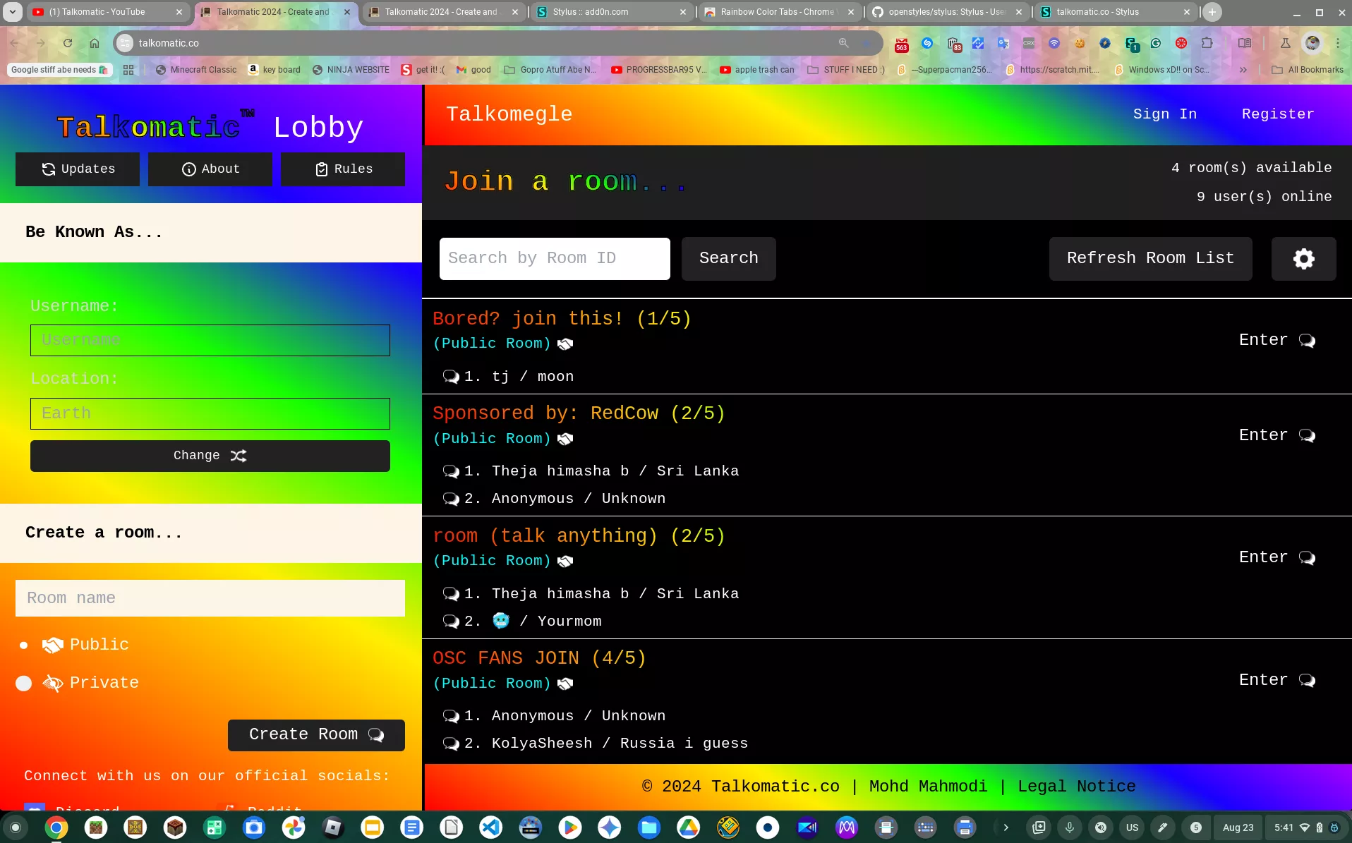
Details
AuthorNINJACLUBREAL
LicenseNo License
Categorytalkomatic.co
Created
Updated
Code size24 kB
Code checksumdcafb9b5
Statistics
Learn how we calculate statistics in the FAQ.
Failed to fetch stats.
Description
Notes
Userstyle doesn't have notes.Source code
Source code has over 10K characters, so we truncated it. You can inspect the full source code on install link./* ==UserStyle==
@name talkomatic.co
@version 20240823.21.40
@namespace ?
==/UserStyle== */
@-moz-document domain("talkomatic.co") {
/* Variables */
:root {
--gradient: linear-gradient(29deg, rgb(255, 0, 0), rgb(255, 123, 0), rgb(255, 238, 0), rgb(21, 255, 0), rgb(25, 0, 255), rgb(166, 0, 255) );
--font1: "Consolas";
--font2: monospace;
--font3: "Courier New";
--font4: Courier;
--bg: var(--gradient);
--custom-orange: var(--gradient);
--banner-bg: #FDF5E6;
--white: #FFFFFF;
--black: #000000;
--info-item-color: #D6D6D6;
--radio-checkmark-bg-color: #EEEEEE;
--radio-checkmark-hover-bg-color: #CCCCCC;
--right-column-header-bg-color: #202020;
--public-room-info-color: #00FFFF;
--learn-more-link-bg-color: #333333;
--version-color: #DDDDDD;
--button-bg-color: #222222;
--button-bg-color-hover: #444444;
--button-bg-color-active: #666666;
--modal-bg-color: #00000099;
--modal-content-bg-color: #393937;
--modal-content-box-shadow-color: #00000033;
--logout-button-bg-color: #F44336;
--auth-modal-bg-color: #00000066;
--auth-modal-content-bg-color: #2C2C2C;
--auth-modal-box-shadow-color: #0000001A;
--auth-modal-input-bg-color: #3D3D3D;
--auth-modal-button-bg-color: #FF7043;
--auth-modal-button-bg-color-hover: #FF5722;
--discord-blue: #465ba8;
--auth-button-bg-color-hover: #F57C00;
--auth-button-box-shadow-color-focus: #FF980080;
--footer-bg-color: var(--gradient);
--navbar-bg-color: var(--gradient);
}
.left-column {
background-color: var(--bg);
color: var(--bg);
}
/* General Styles */
body, h4, h5, h6 {
font-family: var(--font1), var(--font2);
background-color: var(--bg);
background-image: var(--bg);
}
/* Typography */
.custom-orange, .custom-white {
font-family: var(--font1), var(--font2);
}
.custom-orange, .header-left {
-webkit-text-stroke: 1px var(--black);
background-image: var(--custom-orange) !important;
color: transparent;
background-clip: text;
font-weight: bold;
}
.custom-white {
color: var(--white);
font-weight: 100;
}
.italic-k {
font-family: var(--font1), var(--font2);
font-style: italic;
display: inline-block;
transform: skewX(10deg);
margin-right: 1px;
}
/* Layout */
.custom-bg {
background-image: var(--bg);
}
.header-text {
font-size: 1.8rem;
color: var(--white);
margin-top: 4px;
margin-bottom: 0px;
}
.custom-link {
color: var(--white);
margin-top: 4px;
font-size: 16px;
text-decoration: underline;
}
.custom-link-hover:hover {
color: var(--white);
}
/* Banners */
.full-width-banner {
width: 100%;
background-color: var(--banner-bg);
color: var(--black);
font-size: 16px;
padding: 16px 0;
display: flex;
align-items: center;
justify-content: flex-start;
font-weight: bold;
}
.banner-text {
margin-left: 25px;
}
/* Info Box */
.info-box {
margin: 15px;
border: 1px solid var(--custom-orange);
display: flex;
flex-direction: column;
padding: 15px;
}
.info-item {
display: flex;
flex-direction: column;
margin-bottom: 10px;
width: 100%;
}
.info-item label {
color: var(--info-item-color);
padding-bottom: 5px;
}
.info-item input {
width: 100%;
height: 30px;
background-color: var(--bg);
color: var(--white);
border: 1px solid var(--black);
padding: 0 10px;
}
.button-style {
background-color: var(--black);
color: var(--white);
border: 1px solid var(--custom-orange);
cursor: pointer;
font-size: 12px;
padding: 10px;
display: flex;
align-items: center;
justify-content: center;
border-radius: 5px;
height: 30px;
width: 100%;
}
/* Buttons */
.join-room-button {
background-color: var(--black);
color: var(--white);
border: 1px solid var(--custom-orange);
cursor: pointer;
font-size: 12px;
padding: 10px;
display: flex;
align-items: center;
justify-content: center;
border-radius: 5px;
height: 30px;
}
.join-room-button {
font-size: 16px;
justify-content: space-between;
align-self: flex-end;
margin-top: 10px;
width: auto;
}
.button-icon {
height: 15px;
width: auto;
margin-left: 10px;
}
/* Room Creation */
.room-creation {
width: 100%;
display: flex;
flex-direction: column;
padding: 8px 16px 0px 16px;
background-color: var(--bg);
margin-bottom: 0px;
}
.room-name-input {
height: 35px;
background-color: var(--banner-bg);
border: 1px solid var(--white);
margin-bottom: 15px;
padding: 5px 10px;
color: var(--black);
}
/* Radio Buttons */
.radio-container {
display: flex;
align-items: center;
position: relative;
padding-left: 25px;
margin-bottom: 12px;
cursor: pointer;
font-size: 16px;
user-select: none;
color: var(--white);
}
.radio-checkmark {
position: absolute;
top: 50%;
left: 0;
transform: translateY(-50%);
height: 15px;
width: 15px;
background-color: var(--radio-checkmark-bg-color);
border-radius: 50%;
}
.radio-container:hover input ~ .radio-checkmark {
background-color: var(--radio-checkmark-hover-bg-color);
}
.radio-container input {
position: absolute;
opacity: 0;
cursor: pointer;
height: 15px;
width: 15px;
margin-right: 8px;
}
.radio-container input:checked ~ .radio-checkmark {
background-color: var(--custom-orange);
}
.radio-checkmark:after {
content: "";
position: absolute;
display: none;
top: 4px;
left: 4px;
width: 7px;
height: 7px;
border-radius: 50%;
background: var(--white);
}
.radio-container input:checked ~ .radio-checkmark:after {
display: block;
}
.radio-icon {
height: 20px;
width: auto;
margin-right: 6px;
vertical-align: middle;
}
/* Right Column */
.right-column-header {
color: var(--custom-orange);
font-size: 28px;
padding: 12px 20px;
margin: 0;
font-family: var(--font1), var(--font2);
background-color: var(--right-column-header-bg-color);
display: flex;
align-items: center;
justify-content: space-between;
height: auto;
}
.header-left {
display: flex;
align-items: center;
}
.header-right {
display: flex;
flex-direction: column;
align-items: flex-end;
gap: 8px;
}
#roomsCount, #usersCount {
color: var(--white);
font-size: 13px;
font-family: var(--font1), var(--font2);
margin: 0;
border: none;
}
/* Room Details */
.room-details-container {
display: flex;
border-top: 1px solid var(--white);
padding-top: 5px;
}
.room-details {
width: 70%;
display: flex;
flex-direction: column;
color: var(--white);
}
.room-info {
font-size: 16px;
margin-bottom: 10px;
}
.room-header {
font-size: 18px;
background-image: var(--custom-orange) !important;
color: transparent;
background-clip: text;
margin: 0 0 0 10px;
}
.public-room-info {
display: flex;
align-items: center;
font-size: 14px;
color: var(--public-room-info-color);
margin-left: 10px;
}
.public-room-info .room-icon {
margin-left: 5px;
height: 15px;
width: auto;
}
.user-info div {
display: flex;
align-items: center;
margin-bottom: 5px;
margin-left: 20px;
}
.user-detail {
font-size: 14px;
color: var(--custom-orange);
display: flex;
align-items: center;
}
.user-detail .details-icon {
margin-right: 5px;
height: 15px;
width: auto;
}
.chat-button-container {
width: 30%;
display: flex;
justify-content: flex-end;
align-items: start;
}
.enter-chat-button {
padding: 10px;
font-size: 16px;
background-color: var(--black);
color: var(--white);
border: 1px solid var(--custom-orange);
cursor: pointer;
border-radius: 5px;
display: flex;
align-items: center;
justify-content: center;
margin: 12px 12px 12px 0;
}
/* Miscellaneous */
.version-n {
color: var(--white);
}
.no-rooms-message {
color: var(--white);
font-size: 24px;
text-align: center;
padding: 50px 50px 0;
}
.learn-more-link {
background-color: var(--learn-more-link-bg-color);
color: var(--white);
padding: 4px 16px;
text-decoration: none;
margin-left: 110px;
margin-bottom: 0px;
font-size: 14px;
}
.bottom-left {
margin-top: 10px;
margin-bottom: 0px;
}
.social-color {
color: var(--white);
margin-top: 6px;
}
.utility {
border-bottom: 1px solid var(--white);
}
/* Media Queries */
@media (min-width: 768px) {
.left-column {
height: 100%;
overflow-y: auto;
}
.right-column {
height: 100vh;
overflow-y: auto;
}
.left-column::-webkit-scrollbar {
width: 0;
background: transparent;
}
.md\:w-383 {
width: 400px; /* Increased from 350px to 383px */
}
#searchRoomId {
width: 250px;
}
.button-style1 {
margin-top: 10px;
}
.info-item input,
.button-style {
width: 100%;
}
}
@media (max-width: 767px) {
.md\:w-350 {
width: 100%;
}
.md\:h-screen {
height: auto;
}
.left-column, .right-column {
height: auto;
overflow-y: visible;
}
}
@media (max-width: 768px) {
.no-rooms-message {...