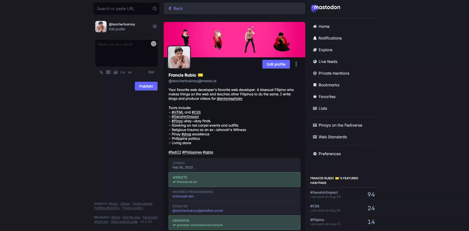
A minimal theme for Mastodon that reduces the clutter of borders and cards.
Minimastodon by teacherbuknoy
Details
Authorteacherbuknoy
LicenseMIT
Categorymasto.ai
Created
Updated
Code size28 kB
Code checksum3402e054
Statistics
Learn how we calculate statistics in the FAQ.
Failed to fetch stats.
Description
Notes
Userstyle doesn't have notes.Source code
Source code has over 10K characters, so we truncated it. You can inspect the full source code on install link./* ==UserStyle==
@name MInimastodon
@version 20250304.15.14
@namespace https://userstyles.world/user/teacherbuknoy
@description A minimal theme for Mastodon that reduces the clutter of borders and cards.
@author teacherbuknoy
@license MIT
==/UserStyle== */
@-moz-document domain("masto.ai"), domain("mas.to") {
@import url('https://fonts.googleapis.com/css2?family=Material+Symbols+Outlined:opsz,wght,FILL,GRAD@20..48,100..700,0..1,-50..200');
:root,
body {
font-family: 'InterVariable', sans-serif;
font-feature-settings: "tnum" 1, "ss01" 1, "ss03" 1, "cv08" 1, "cv11" 1;
--primary-color: #6364ff;
--shadow-opacity: 5%;
--dropdown-shadow: 0 2px 4px hsl(0 0% 0% / var(--shadow-opacity, 3%)),
0 4px 8px hsl(0 0% 0% / var(--shadow-opacity, 3%)),
0 8px 16px hsl(0 0% 0% / var(--shadow-opacity, 3%));
}
.display-name__html {
font-weight: 700;
color: inherit !important;
font-size: 1rem;
}
.status__line {
display: none;
}
.detailed-status,
.column-inline-form,
.column > .scrollable,
.getting-started,
.regeneration-indicator {
border: none;
background: transparent;
}
.status__wrapper {
padding-inline: 1rem;
}
.status__wrapper::after {
content: '';
display: block;
aspect-ratio: 1/1;
height: 5px;
width: auto;
border-radius: 100%;
margin-inline: auto;
margin-block-start: 1.5rem;
background-color: #ccd7e0;
}
.status__prepend {
width: 100%;
position: relative;
}
:is(.status__wrapper, .detailed-status__wrapper):has(.status__prepend):has(.status__prepend-icon.fa-at) {
margin: 3px;
border-radius: 8px;
--bg-color: color-mix(in hsl, var(--primary-color), transparent 95%);
background: radial-gradient(circle at top left, var(--bg-color), transparent 45%);
}
.reply-indicator__display-avatar .account__avatar,
.reply-indicator__display-avatar {
outline: none !important;
border: none !important;
}
.notification.unread::before {
height: calc(100% + 5px + 2rem);
top: calc(-5px - 2rem)
}
.scrollable {
overflow: visible;
}
.scrollable > :first-child .status__wrapper {
padding-block-start: 1rem;
}
.detailed-status__wrapper {
padding: 1rem;
overflow: visible;
}
:is(.detailed-status__wrapper, .status__wrapper).focusable:focus {
background: transparent;
}
.status,
.detailed-status {
border-radius: 0.5rem;
border: none;
}
.detailed-status {
--shadow-opacity: 3%;
background-color: transparent !important;
--box-shadow: 0 2px 4px hsl(0 0% 0% / var(--shadow-opacity, 3%)),
0 4px 8px hsl(0 0% 0% / var(--shadow-opacity, 3%)),
0 8px 16px hsl(0 0% 0% / var(--shadow-opacity, 3%));
.status__content {
font-weight: 240;
font-variation-settings: 'opsz' 14;
}
}
.detailed-status {
margin-block-end: 1rem;
}
.focusable:is(.detailed-status__wrapper, .status__wrapper):focus :is(.detailed-status, .status) {
outline: 5px solid var(--primary-color);
}
.detailed-status__action-bar {
border: none;
background: transparent !important;
}
.account--panel__button,
.detailed-status__button,
.detailed-status__action-bar-dropdown,
.detailed-status__action-bar-dropdown span:not([class]) {
display: flex;
justify-content: center;
align-items: stretch;
}
:is(.account--panel__button, .detailed-status__button, .detailed-status__action-bar-dropdown) :is(.icon-button, span:not([class])) {
flex: 1;
padding-block: 0.5rem;
height: auto !important;
}
.detailed-status__action-bar-dropdown span:not([class]) {
padding: 0;
}
.load-gap {
border: none;
}
.load-more {
border-radius: 0.5rem;
background-color: color-mix(in hsl, var(--primary-color), white);
padding: 0.5rem 1rem;
width: auto;
margin-inline: auto;
font-weight: bold;
color: color-mix(in hsl, var(--primary-color), black 45%);
font-size: 1rem;
}
.load-more:hover {
background-color: color-mix(in hsl, var(--primary-color) 60%, white);
}
a.status-card {
border: none !important;
align-items: unset;
border-radius: 8px;
}
.status-card__content {
width: 100%;
flex: 1;
background-color: color-mix(in hsl, var(--primary-color), white 80%);
border: 1px solid color-mix(in hsl, var(--primary-color), white 70%);
}
.status-card.expanded .status-card__content {
border-radius: 0 0 8px 8px;
border-top: none;
}
.status-card:not(.expanded) .status-card__content {
border-radius: 0 8px 8px 0;
border-inline-start: none;
align-content: center;
}
.status-card:is(:hover, :focus) * {
color: #282c37 !important;
}
.status-card:hover .status-card__content {
background-color: color-mix(in hsl, var(--primary-color), white 70%);
border-color: color-mix(in hsl, var(--primary-color), white 60%);
}
.hashtag-bar {
gap: 1rem;
&::before {
color: var(--primary-color);
content: 'label';
font-family: 'Material Symbols', sans-serif;
font-size: 1rem;
font-variation-settings: 'FILL' 1,
'wght' 400,
'GRAD' 0,
'opsz' 24;
}
> a {
color: color-mix(in hsl, var(--primary-color), black 45%);
font-weight: bold;
}
}
.reply-indicator__content a.unhandled-link,
.status__content a.unhandled-link {
color: color-mix(in hsl, var(--primary-color), black 45%);
font-weight: 500;
}
.column-back-button,
.column-header__wrapper {
--box-shadow: 0 2px 4px hsl(0 0% 0% / var(--shadow-opacity, 3%)),
0 4px 8px hsl(0 0% 0% / var(--shadow-opacity, 3%)),
0 8px 16px hsl(0 0% 0% / var(--shadow-opacity, 3%));
border: none;
box-shadow: none !important;
border-radius: 8px;
}
.announcements,
.column-header__collapsible,
.column-header__collapsible-inner,
.column-header {
border: none !important;
border-bottom: none;
}
.column-back-button,
.column-header {
box-shadow: var(--box-shadow) !important;
margin-inline: 1ch;
border-radius: 8px;
overflow: hidden;
z-index: 999;
background-color: var(--surface-background-color);
}
.column-header__collapsible {
z-index: 2;
}
.column-header__collapsible:not(.collapsed) {
border-radius: 0 0 8px 8px !important;
margin-inline: 0.5rem;
}
.announcements,
.column-header__collapsible {
overflow: auto;
margin: 0.5rem;
border-radius: 0 0 8px 8px !important;
box-shadow: var(--box-shadow);
--offset: 2rem;
margin-block-start: calc(var(--offset) / -2);
padding-block-start: var(--offset);
}
.column-header__collapsible {
margin: 0;
margin-block-start: calc(var(--offset) / -1);
box-shadow: none;
}
.announcements {
margin-inline: 1rem;
}
.column-header__collapsible-inner {
background-color: #fafafa;
}
.search__input {
border-radius: 8px;
background-color: #fff;
border-color: color-mix(in hsl, var(--primary-color), white 60%);
border: none;
}
.active .search__input {
border-radius: 8px 8px 0 0
}
.search__popout {
border-radius: 0 0 8px 8px;
--shadow-opacity: 5%;
--box-shadow: 0 2px 4px hsl(0 0% 0% / var(--shadow-opacity, 3%)),
0 4px 8px hsl(0 0% 0% / var(--shadow-opacity, 3%)),
0 8px 16px hsl(0 0% 0% / var(--shadow-opacity, 3%));
box-shadow: var(--box-shadow);
}
.search {
margin-inline: auto;
width: 95%;
}
.compose-form .spoiler-input.spoiler-input--visible {
margin-bottom: 0;
border-radius: 8px 8px 0 0;
overflow: hidden;
}
.compose-form .spoiler-input__input {
border: none;
border-radius: 0;
height: 100%;
}
.compose-form .spoiler-input {}
.compose-form__highlightable {
border-radius: 0 !important;
}
.compose-panel {
.compose-form__autosuggest-wrapper {
background: transparent;
border-radius: 8px;
border: none;
}
&:has(.spoiler-input--visible) .compose-form__autosuggest-wrapper {
border-radius: 0 0 8px 8px;
border-top-right-radius: 0;
border-top-left-radius: 0;
}
}
.compose-form {
.autosuggest-textarea__textarea {
border-radius: 0 !important;
}
.autosuggest-textarea__suggestions {
border-radius: 0 0 8px 8px;
--shadow-opacity: 5%;
--box-shadow: 0 2px 4px hsl(0 0% 0% / var(--shadow-opacity, 3%)),
0 4px 8px hsl(0 0% 0% / var(--shadow-opacity, 3%)),
0 8px 16px hsl(0 0% 0% / var(--shadow-opacity, 3%));
box-shadow: var(--box-shadow);
.display-name__html {
font-weight: 600;
}
}
}
.emoji-picker-dropdown__menu {
border-radius: 8px;
--shadow-opacity: 5%;
--box-shadow: 0 0px 0 1px hsl(0 0% 0% / var(--shadow-opacity, 3%)),
0 0px 4px hsl(0 0% 0% / var(--shadow-opacity, 3%)),
0 0px 8px hsl(0 0% 0% / var(--shadow-opacity, 3%)),
0 0px 16px hsl(0 0% 0% / var(--shadow-opacity, 3%));
box-shadow: var(--box-shadow);
.emoji-mart {
width: 100% !important;
height: 100% !important;
}
.emoji-mart-bar {
border: none;
border-top-left-radius: 8px;
border-top-right-radius: 8px;
}
.emoji-mart-scroll {
height: auto !important;
}
.emoji-mart-no-results {
padding: 1rem;
}
}
.compose-form .compose-form__buttons-wrapper {
background: transparent;
border: none;
}
.compose-form__uploads-wrapper:empty {
display: none;
}
.privacy-dropdown.active .privacy-dropdown__value.active .icon-button {
color: var(--primary-color);
}
.compose-form__modifiers {
display: grid;
overflow-x: hidden;
}
.compose-form__poll-wrapper {
margin: 0.5rem;
background-color: color-mix(in hsl, var(--primary-color), white 90%);
padding: 0.5rem;
border-radius: 4px;
}
.compose-form__poll-wrapper,
.compose-form__poll-wrapper .poll__footer {
border: none;
}
.compose-form__poll-wrapper .poll__footer,
.compose-form__poll-wrapper ul {
padding: 0;
}
.compose-form__poll-wrapper li .poll__option {
width: 100%;
flex: 1...