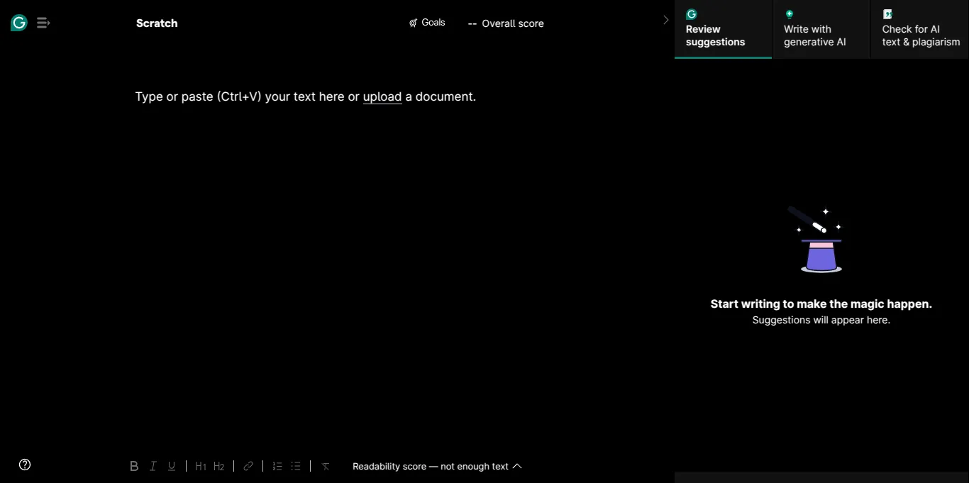
Dark mode for Grammarly
Grammarly Dark by aruncveli
Imported from https://github.com/aruncveli/userstyles/raw/main/grammarly/grammarly.user.styl
Mirrored from https://raw.githubusercontent.com/aruncveli/userstyles/refs/heads/main/sites/grammarly/grammarly.user.css
Details
Authoraruncveli
LicenseMIT
Categorygrammarly
Created
Updated
Code size6.6 kB
Code checksumf94dde94
Statistics
Learn how we calculate statistics in the FAQ.
Failed to fetch stats.
Description
Notes
Only the document page. Redoing from scratch due to maintenance issues with the previous work.
Source code
/* ==UserStyle==
@name           Grammarly Dark
@namespace      github.com/aruncveli/userstyles
@version        25.3.3
@description    Dark mode for Grammarly
@author         Arun Chandanaveli <aruncveli@gmail.com> (https://github.com/aruncveli)
@homepageURL    https://github.com/aruncveli/userstyles
@supportURL     https://github.com/aruncveli/userstyles/issues
@license        MIT
@preprocessor   default
@var color fg "Foreground" white
@var color bg "Background" black
@var color bg1 "Background lightened 1" #111
@var color bg2 "Background lightened 2" #222
==/UserStyle== */
@-moz-document url-prefix("https://app.grammarly.com/ddocs") {
	:root {
		color-scheme: dark;
		--color-background-base-default: var(--bg);
		--color-background-base-subdued: var(--bg1);
		--button-secondary-background-hover: var(--bg1);
		--button-secondary-text-hover: var(--fg);
		--button-secondary-border-default: var(--bg);
		--button-secondary-text-default: var(--fg);
		--color-text-base-default: var(--fg);
		--button-secondary-background-active: var(--bg2);
		--button-secondary-text-active: var(--fg);
		--color-border-base-subdued: var(--bg);
		--button-tertiary-background-hover: var(--bg1);
		--button-tertiary-background-active: var(--bg2);
		--color-icon-base-default: var(--fg);
		--color-text-base-subdued: var(--fg);
		--color-border-base-default-f5: var(--bg);
		--color-elevation-outline-default-1: var(--bg);
		--color-border-base-default-f3: var(--bg);
	}

	.fqelrj5 /* Editor text */,
	.f1rx9jzm /* Goals modal header title */,
	.fal6plv /* Goals modal header text */,
	.fjlhwhm /* Goals modal row title */,
	.itemDescription_feum94j /* Goals modal row text */,
	.checkboxText_flxiwmr /* Goals modal footer checkbox text */,
	.f1riuydc /* Performance modal header title */,
	.fq061rn /* Performance modal section header */,
	.f10buadf /* Performance modal section text */,
	.f1vn8v6g /* Performance modal readability slider */,
	.f1aunnt9 /* Left menu text */,
	.feu4lv1 /* Correctness suggestion text */,
	.fc6omth /* Pro suggestion text */,
	.f1lo3unn:not(
			[data-disabled="true"]
		)[data-hovered="true"] /* Link tooltip buttons */,
	.fvnnys1:not([data-disabled="true"]):not(
			[aria-disabled="true"]
		)[data-hovered="true"] /* Review suggestions category filter buttons */,
	.fvnnys1:not([data-disabled="true"]):not(
			[aria-disabled="true"]
		)[data-active="true"],
	.fvnnys1:not([data-disabled="true"]):not([aria-disabled="true"]):active,
	.fvnnys1:not([data-disabled="true"]):not([aria-disabled="true"]):hover {
		color: var(--fg);
	}

	.editorContentWrap_fme0niz /* Editor background */,
	.modalHeader_ffbp2bq,
	.modal-body_f1orqs7k,
	.modalHeader_ffbp2bq:after,
	.f10wkw6u .f113r6od:not([data-active="true"]) /* Goals modal row button */,
	.f113r6od /* Goals modal row button 2 */,
	.modal-footer_f1l98qk9,
	.document-view-horizontalEditorWrapper_ffc8rcx,
	.f1dyakn9 /* Pro suggestion */,
	.fe88rpf /* Suggestion category icon background */ {
		background-color: var(--bg);
	}

	.f113r6od:not(
			[data-disabled="true"]
		)[data-hovered="true"] /* Goals modal row button hover */,
	.f13s55f1:not(
			[data-disabled="true"]
		)[data-hovered="true"] /* Performance modal Download PDF report */,
	.f1aunnt9:not([data-disabled="true"])[data-hovered="true"] /* Left menu */,
	.synonyms-wrapper_f1u08us1 /* Synonyms tooltip */,
	.synonyms-emptyResultWrapper_fhq484e,
	.f1u61vn1:not([data-disabled="true"]):not(
			[aria-disabled="true"]
		)[data-hovered="true"] /* Correctness suggestion info button */,
	.f1u61vn1:not([data-disabled="true"]):not(
			[aria-disabled="true"]
		)[data-active="true"],
	.f1u61vn1:not([data-disabled="true"]):not([aria-disabled="true"]):active,
	.fsk4xi:not([data-disabled="true"]):not(
			[aria-disabled="true"]
		)[data-hovered="true"],
	.fsk4xi:not([data-disabled="true"]):not([aria-disabled="true"]):hover,
	.fsk4xi:not([data-disabled="true"]):not(
			[aria-disabled="true"]
		)[data-active="true"],
	.f1todjtg:focus /* Correctness Kebab menu item */,
	.f1nnpij3 /* Correctness popover */,
	.triggerButton_f1l4zisq[data-active="true"] /* Metrics bottom center */,
	.popover_f1nnpij3,
	.formatting-link-wrapper_fihlfwi,
	.formatting-link-delimiter_fi62vqz,
	.fvnnys1:not([data-disabled="true"]):not(
			[aria-disabled="true"]
		)[data-hovered="true"],
	.fvnnys1:not([data-disabled="true"]):not([aria-disabled="true"]):active,
	.fvnnys1:not([data-disabled="true"]):not([aria-disabled="true"]):hover {
		background-color: var(--bg1);
	}

	.row_fmjb5au:not(:last-child) /* Goals modal row */,
	.sectionHeaderUnderline_fs3keob /* Performance modal */,
	.sectionHeaderWrapper_f10kg88j {
		border-bottom-color: var(--bg);
	}

	.gds-icon-inherit [stroke],
	.f1todjtg:hover i /* Correctness Kebab menu item */ {
		stroke: var(--fg);
	}

	.f1todjtg:hover i /* Correctness Kebab menu item */ {
		fill: var(--fg);
	}

	.fsk4xi:not([data-disabled="true"]):not(
			[aria-disabled="true"]
		)[data-hovered="true"] /* Write with AI buttons */,
	.f1u61vn1:not([data-disabled="true"]):not(
			[aria-disabled="true"]
		)[data-hovered="true"],
	.f1u61vn1:not([data-disabled="true"]):not(
			[aria-disabled="true"]
		)[data-active="true"],
	.fsk4xi:not([data-disabled="true"]):not(
			[aria-disabled="true"]
		)[data-active="true"],
	.f1todjtg:hover /* Correctness Kebab menu item */ {
		box-shadow: inset 0 0 0 1px var(--bg1);
	}

	.document-settings-menuHead_f12mqzd3 /* Document settings modal header */ {
		box-shadow: 0 0 10px 10px var(--bg);
	}

	.f1aunnt9:focus-visible {
		box-shadow: unset;
	}

	/* Suggestions */
	@keyframes fd4lfih {
		/* Correctness */
		100% {
			background-color: var(--bg1);
		}
	}
	@keyframes f14nvp94 {
		/* Clarity */
		100% {
			background-color: var(--bg1);
		}
	}
	@keyframes f12ab1sv {
		/* Engagement and Pro suggestions */
		100% {
			background-color: var(--bg1);
		}
	}
	@keyframes f1flb63c {
		/* Some purple suggestions, probably delivery */
		100% {
			background-color: var(--bg1);
		}
	}
	@keyframes fw30ui5 {
		/* Vocabulary */
		100% {
			background-color: var(--bg1);
		}
	}

	.f1todjtg:hover /* Correctness Kebab menu item */,
	.menuItem_ffsq1m9:focus /* Metrics item */,
	.menuItem_ffsq1m9:hover,
	.formatting-link-urlInput_f109vv3n /* Link tooltip */,
	.f1lo3unn:not([data-disabled="true"])[data-hovered="true"] {
		background-color: var(--bg2);
	}

	.menuItem_ffsq1m9:focus {
		box-shadow: 0 0 0 1px var(--bg1), 0 0 0 3px var(--bg1);
	}

	.f1todjtg:focus,
	.f1todjtg:focus-visible {
		box-shadow: 0 0 0 1px var(--color-background-base-default), 0 0 0 3px
			var(--bg1);
	}

	.yellow_f16pxtey span /* Pro try for free button text */ {
		color: var(--bg);
	}
}