Layout/custom colors for the Spacebar client Jank Client
Spaceybar for Jank Client by ygg2
Details
Authorygg2
LicenseAGPL
Categorysb-jankclient.vanillaminigames.net -> jankclient
Created
Updated
Code size14 kB
Code checksumc89f77d3
Statistics
Learn how we calculate statistics in the FAQ.
Failed to fetch stats.
Description
Notes
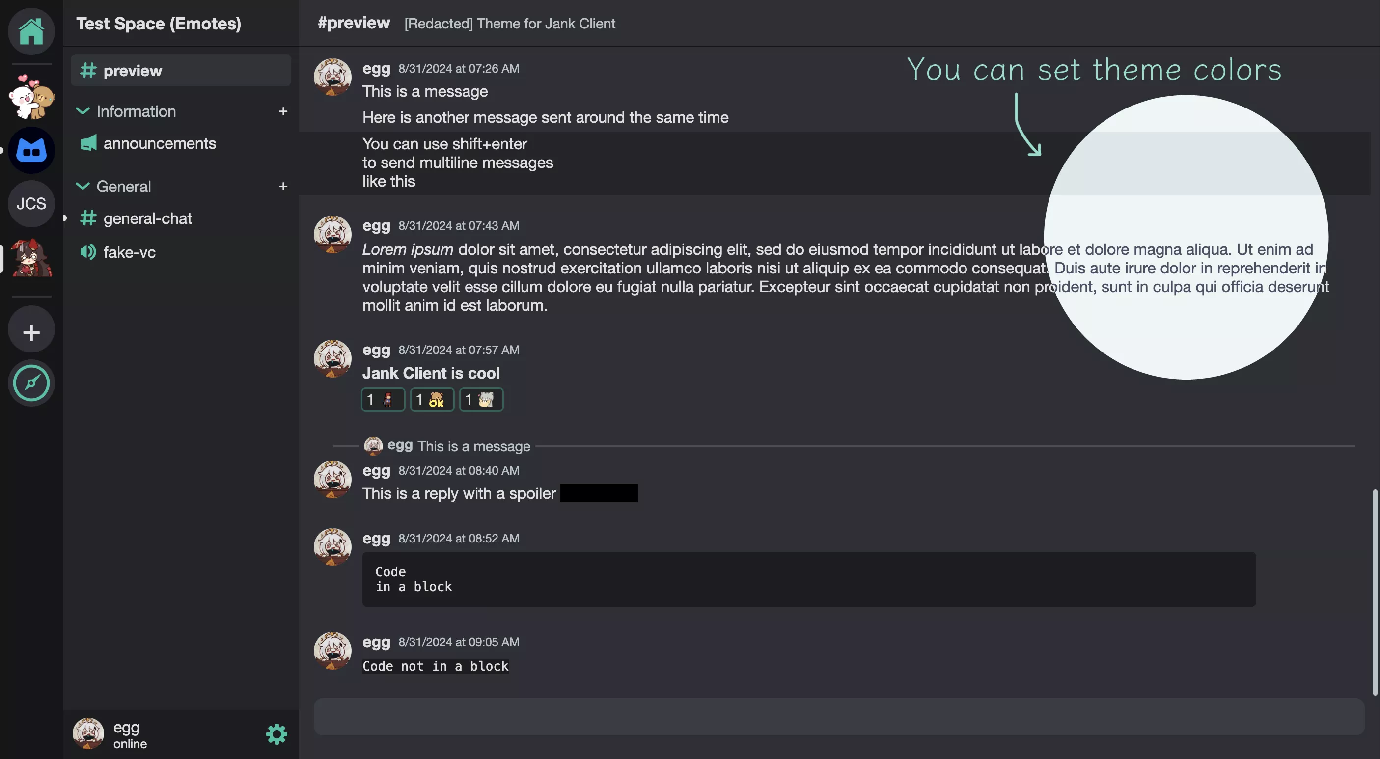
A layout for the Spacebar client Jank Client. Currently runs for localhost as the official host is down.
It overrides Light Theme with custom colors.
Not mobile friendly.
Source code
Source code has over 10K characters, so we truncated it. You can inspect the full source code on install link./* ==UserStyle==
@name Spaceybar
@namespace ygg2.github.io
@version 1.0.1
@description Layout/custom colors for the Spacebar client Jank Client
@author ygg
@license AGPL
@preprocessor default
@var color color-bg-primary "Primary" #2d3036
@var color color-bg-primary-hover "Primary Hover" #262a2f
@var color color-bg-secondary "Secondary" #141718
@var color color-accent "Accent Color" #19c2a6
@var color color-bg-server-list "Server List" #141718
@var color color-bg-panel "Panel" #232628
@var color color-bg-textarea "Textarea" #393d44
@var color color-bg-message-highlight "Highlighted Message" #141718
@var color color-text-primary "Primary Text" #e0e0e0
@var color color-text-primary-soft "Soft Primary Text" #bac4c5
@var color color-text-secondary "Secondary Text" #e0e0e0
@var color color-text-secondary-soft "Soft Secondary Text" #bac4c5
@var color color-spoiler "Spoiler" #000000
@var color color-link "Link" #44cfbf
@var color color-button-bg "Button" #545967
@var color color-button-bg-hover "Button Hover" #393d44
@var color color-panel-button-bg-hover "Panel Button Hover" #393d44
@var color color-black "Black" #000000
@var color color-red "Red" #ff5555
@var color color-yellow "Yellow" #f4e770
@var color color-green "Green" #22a696
==/UserStyle== */
@-moz-document url-prefix("http://localhost:8080/") {
/* General */
button, select {
font-size: 1rem;
padding: 0.2em 0.5em;
border-style: solid;
box-shadow: none;
}
fieldset input[type="radio"] {
margin-right: 0.5em;
}
input {
box-shadow: none;
}
input[type=text], input[type=password], input[type="date"] {
width: 100%;
padding: 0 0.8em;
box-sizing: border-box;
}
input[type=color] {
display: block;
width: .4in;
}
textarea {
width: 100%;
padding: 0.8em;
border: none;
box-sizing: border-box;
}
input[type="text"]:focus-visible,
input[type="password"]:focus-visible,
input[type="date"],
textarea:focus-visible,
#typebox:focus-visible {
outline-offset: -2px;
}
hr {
border-width: .015in;
}
.title {
text-shadow: none;
}
/* Login */
#logindiv {
height: auto;
width: 6in;
min-height: auto;
min-width: auto;
max-width: 90%;
padding: .2in 0;
}
#logindiv label, #TOSbox {
display: inline-block;
margin: .16in 0 .05in 0;
}
#logindiv br {
line-height: 0;
}
#logindiv button {
margin-top: .2in;
}
/* Server List */
#servers {
width: .67in;
max-width: .67in;
padding: .085in .085in 0 .085in;
margin: 0;
box-sizing: border-box;
}
.servericon {
margin-bottom: .07in;
}
.unread {
transform: translate(-.2in, .2in);
border-color: var(--server-list);
}
.notiunread {
transform: translate(-.14in, .2in);
}
.serveropen .unread {
transform: translate(-0.14in, 0.1in) !important;
}
.servernoti:hover .unread {
transform: translate(-.14in, 0.15in);
}
/* Channels Area */
#serverName {
padding-left: 0.14in;
}
.servertd {
height: .5in;
border: none;
border-bottom-style: solid;
border-bottom-width: .02in;
border-bottom-color: color-mix(in srgb, var(--black) 50%, transparent);
}
.channels {
padding: 0;
}
.channel {
min-height: 2em;
padding: 0;
margin: 0 .08in;
}
.channeleffects {
margin-top: 0.6em;
color: var(--reply-text);
box-shadow: none;
}
.channeleffects:hover {
background: inherit;
color: var(--primary-text);
}
#channels p2 {
font-weight: normal;
margin-left: 0.3em;
}
#channels > div > div:first-child:is(.channel) {
margin-top: .08in;
}
#channels > div > div:first-child .capsflex .channeleffects {
margin-top: .08in;
}
.space {
margin: 0.3em 0.2em 0 0.4em;
vertical-align: -.02in;
}
.addchannel {
height: .17in;
margin: 0.6em .08in 0 0;
line-height: 0.9em;
}
.addchannel:hover {
background: var(--channel-hover);
}
.cunread {
position: relative;
box-shadow: none;
}
.cunread:after {
content: '';
height: .075in;
width: .075in;
position: absolute;
left: -.115in;
top: .13in;
background: var(--primary-text);
border-radius: 50%;
}
/* User */
#userdock {
height: .52in;
}
#userinfo {
min-width: 50%;
margin-left: .05in;
background: none;
color: var(--markdown-timestamp);
}
#userinfo:hover {
background: var(--user-info-bg);
}
#userpfp {
height: 32px;
width: 32px;
}
#user-actions {
margin-right: .05in;
}
/* Messages Area */
.channelnamediv {
display: inline-block;
padding-top: .125in;
}
#channelname {
display: inline-block;
}
#channelTopic {
font-size: 0.9rem;
color: var(--reply-text);
}
.messagediv {
padding: .03in .16in 0 .16in;
}
.topMessage {
padding-top: .05in;
margin-top: 1em;
}
.pfprow {
width: .54in;
}
.username {
margin-bottom: 0.05in;
}
.membererror {
font-size: 0.7em;
background: transparent;
border-color: var(--red);
}
.timestamp {
padding-left: 0.5rem;
}
.spoiler {
background: var(--spoiler-open-bg);
color: var(--spoiler-open-bg);
}
pre {
padding: 1em;
color: var(--markdown-timestamp);
border-radius: .05in;
box-sizing: border-box;
}
span:has(pre) {
display: inline-block;
width: 90%;
}
.replytext pre {
padding: 0;
color: var(--pronouns);
border-radius: 0;
}
.quoteline {
width: .04in;
}
.quote > span {
margin-left: .16in;
}
span .quote:first-of-type .quoteline {
border-top-left-radius: 0.15em;
border-top-right-radius: 0.15em;
}
span .quote:last-of-type .quoteline {
border-bottom-left-radius: 0.15em;
border-bottom-right-radius: 0.15em;
}
/* Upload, External */
.messageimgdiv, .unknownfile, .linkembed {
margin-top: .05in;
}
.embed-color {
padding-left: 4px;
margin-top: .05in;
margin-left: .05in;
}
.embed-color:first-of-type {
margin-left: 0;
}
.embed {
font-size: 0.8rem;
padding: 1em;
color: var(--markdown-timestamp);
border-top-left-radius: 0;
border-bottom-left-radius: 0;
}
.embed a {
font-size: 1rem;
font-weight: bold;
}
.embed p {
margin-bottom: 0.5em;
}
.embed .provider {
color: var(--pronouns);
}
.bot {
font-size: .8rem;
height: .8rem;
padding: .01in .05in .03in .05in;
margin: .02in 0 0 .05in;
border: none;
border-radius: .04in;
}
/* Emoji */
.reactiondiv {
margin-top: .05in;
margin-left: .5in;
}
.reaction {
min-width: .4in;
padding: .015in .02in;
border-width: .02in;
border-color: transparent;
}
.reaction:hover {
border-color: var(--focus);
}
.reaction.meReacted {
border-color: color-mix(in srgb, var(--channels-bg) 60%, var(--accent-color));
}
.reaction p {
font-size: 1rem;
}
.smallemoji {
max-height: 1em;
max-width: 1em;
align-self: center;
}
.emojiPicker {
height: 3.8in;
border: none;
border-radius: .1in;
box-shadow: 0 0 .05in color-mix(in srgb, var(--shadow) 50%, transparent);
}
.emojiTitle {
padding: .1in 0 0 .14in;
border: none;
}
.emojiBody {
padding: .05in;
background: var(--primary-bg);
border-radius: 0 0 .1in .1in;
}
.emojiSelect {
height: 32px;
width: 32px;
padding: .025in;
background: var(--primary-bg);
border: none;
border-radius: 30%;
}
.emojiSelect:hover {
background: var(--message-bg-hover);
}
.emojirow {
padding: .1in;
gap: .05in;
}
.emojirow::-webkit-scrollbar-thumb:hover {
border-radius: .08in;
border: .03in solid transparent;
background-clip: padding-box;
}
.emojirow .emojiSelect {
padding: 0;
background: var(--profile-info-bg);
}
.emojirow .emojiSelect:hover {
background: color-mix(in srgb, var(--pronouns) 25%, transparent);
}
.emoji-server {
margin: 0;
}
/* Typing */
#realbox {
width: calc(100% - .32in);
padding: 0.6em 1em;
margin: .0in .16in .25in .16in;
box-shadow: none;
}
#typebox {
min-height: 1em;
}
#replybox {
padding: 0.2em 1em;
}
#replybox span {
font-size: 0.9rem;
}
#typing {
font-size: 0.8rem;
flex-direction: row-reverse;
gap: .02in;
}
/* Profile */
.profile, .hypoprofile {
color: var(--markdown-timestamp);
border-radius: .1in;
}
.profile {
border: none;
box-shadow: 0 0 .05in color-mix(in srgb, var(--shadow) 50%, transparent);
}
.hypoprofile {
box-shadow: none;
}
.infosection {
background: linear-gradient(to top, var(--accent_color), transparent);
border-radius: .1in;
}
.tag {
margin-top: .02in;
}
.pronouns {
margin-top: .05in;
}
.rolediv {
margin-right: .05in;
border: none;
}
/* Settings Menus */
.settingstitle {
border-bottom-width: .04in;
padding: .1in 0 .1in .2in;
}
.settingbuttons {
border-right: solid .04in var(--message-bg-hover);
}
.SettingsButton {
height: .36in;
padding-left: 1em;
margin: 0;
background: none;
border: none;
}
.SettingsButton:hover {
background: var(--channel-hover);
}
.flexspace {
padding: .2in;
}
.flexspace .flexspace {
padding: 0;
}
.flexspace .flexspace:has(.setting) {
padding: 1em 0 3em 0;
}
.flexspace.flexltr {
gap: .2in;
}
.optionElement {
width: 100%;
box-shadow: none;
}
.optionElement input[type="text"], .optionElement textarea {
background: var(--profile-info-bg);
}
.setting {
width: calc(100% - 2em);
padding: 1em;
margin-left: 1em;
background: var(--profile-info-bg);
color: var(--markdown-timestamp);
box-shadow: none;
box-sizing: border-box;
}
.settingsname {
font-size: 1.3rem;
}
.exitsettings {
height: .35in;
top: .1in;
right: .08in;
background: var(--button-bg);
border: none;
box-shadow: none;
}
.exitsettings:hover {
background: var(--button-hover);
}
.savediv {
border: none;
box-shadow: 0 0 .05in color-mix(in srgb, var(--shadow) 50%, transparent);
gap: 1em;
}
.savediv button {
background: color-mix(in srgb, var(--green) 40%, var(--primary-bg));
}
/* Other Menus */
.contextmenu {
padding: 0.5em;
box-shadow: 0 0 .05in color-mix(in srgb, var(--shadow) 50%, transparent);
}
.contextbutton {
font-size: 0.9rem;
font-weight: normal;
height: auto;
padding: 0.5em 1em;
margin: 0;
background: var(--profile-info-bg);
color: var(--markdown-timestamp);
border: none;
}
.contextbutton:hover {
background: color-mix(in srgb, var(--color-text-secondary-soft) 15%, transparent);
}
.guildy h2 {
margin: .05in 0 .05in .08in;
}
.discovery-gu...