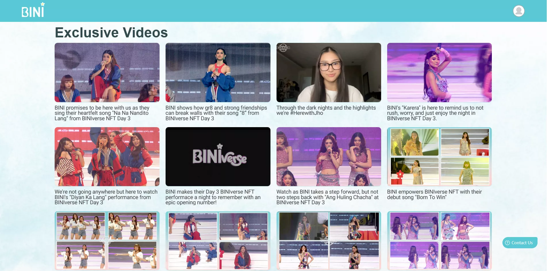
An alternative layout for BINI's exclusive membership site.
BINI Exclusive Members Site Alt Layout (Outdated) by boydreamboy
Details
Authorboydreamboy
LicenseNo License
Categoryhttps://fandom.abs-cbn.com/bini/members
Created
Updated
Size4.3 kB
Statistics
Learn how we calculate statistics in the FAQ.
Failed to fetch stats.
Description
Notes
- This stylesheet no longer applies since they re-designed the site and it's okay. So there's no need for this.
- Please don't swipe horizontally at the Exclusive Videos section 😂
Source code
/* ==UserStyle==
@name         BINI Exclusive Members Site Alt Layout
@version      20241008.14.14
@namespace    https://userstyles.world/user/boydreamboy
@description  An alternative layout for BINI's exclusive membership site.
@author       boydreamboy
@license      No License
==/UserStyle== */

@-moz-document url("https://fandom.abs-cbn.com/bini/members") {
/* no corsiva */
.font-corsiva,
.MuiTypography-h2 {
    font-family: "Helvetica" !important;
    font-weight: bold;
    font-size: 2em
}

/* replace Exclusive videos */
div.px-6 p.font-corsiva {
    visibility: hidden;
    position: relative;
}
div.px-6 p.font-corsiva::after {
    visibility: visible !important;
    position: absolute;
    left: 0;
    content: "Exclusive Videos";
}

/* wiiiiiide */
.container {
    max-width: 80% !important;
}

/* reset display of each section */
.container > div {
    display: block;
    margin-top: 0px !important;
    margin-bottom: 50px !important;
    padding-left: 0px !important;
    padding-right: 0px !important;
}

/* reset style and align exclusive drops section */
.container > div:nth-child(3) > div:nth-child(1) {
    background-color: transparent;
/*     display: grid; */
/*     grid-template-columns: 1fr 1fr 1fr 1fr; */
}
/* .container > div:nth-child(3) > div:nth-child(1) > div:nth-child(1){
    grid-column: 1 / span 3;
}
.container > div:nth-child(3) > div:nth-child(1) > div:nth-child(2){
    grid-column: 4 / span 1;
}
.container > div:nth-child(3) > div:nth-child(1) > div{
    width: 100% !important;
}*/
.container > div:nth-child(3) > div:nth-child(1) img {
    border-radius: 10px;
    height: auto !important;
}

.container > div:nth-child(3) div{
    display: inline-block;
/*     max-width: 100% !important; */
}

/* remove padding of bini memeverse */
.MuiContainer-root.MuiContainer-maxWidthXl.css-zsio2v {
    padding: 0px;
}

/* vods container layout */
.px-6 .swiper-wrapper {
    display: grid;
    gap: 10px;
/*     column-gap: 20px;
    row-gap: 5px; */
    grid-template-columns: 1fr 1fr 1fr 1fr;
}

/* reset and max width of vods  */
.swiper-slide {
    display: initial;
    width: 100% !important;
}

/* vod titles */
/* credits to /u/reacenti */
.swiper-slide p {
    font-size: 1em !important;
    position: absolute;
    z-index: -999;
    bottom: 0;
    padding: 0px 12px;
    width: 100%;
}
/* vod titles reveal */
/* credits to /u/reacenti */
.swiper-slide:hover p{
    transition: all 0.1s ease !important;
    z-index: 1;
    -webkit-line-clamp: initial !important;
    max-height: initial !important;
    padding: 8px 10px;
    background: #E7FEFF;
    box-shadow: 0 -10px 30px rgba(0, 0, 0, .3);
    border: 3px solid rgba(33, 141, 151, .3);
    border-radius: 10px;
}

/* reset display of boxes under slide items */
.swiper-slide div {
    display: initial;
}

/* vod thumbnails */
.swiper-slide img.aspect-video {
    border-radius: 10px;
    box-shadow: 0 1px 2px rgba(88, 201, 212, 0.3);
    transition: all .1s ease-in-out;
    height: 15em;
}
/* vod thumbnails shadow on hover */
.swiper-slide:hover img.aspect-video {
    box-shadow: 0 5px 15px rgba(88, 201, 212, .5);
    border: 3px solid rgba(88, 201, 212, 0.3);
}
.swiper-slide img{
    width: 100% !important;
}

/* hides swipe button */
button > svg {
    display: none !important;
}

/* forms */
iframe {
    height: 800px;
}

/* vods layout in smaller screens */
@media screen and (max-width: 992px) {
    .px-6 .swiper-wrapper {
        gap: 10px;
        grid-template-columns: 1fr 1fr 1fr;
    }
    /* vod titles */
    .swiper-slide p {
        margin-top: 10px;
        font-size: 1rem;
        line-height: 1rem;
    }
}
@media screen and (max-width: 600px) {
    .px-6 .swiper-wrapper {
        gap: 5px;
        grid-template-columns: 1fr 1fr;
    }
    .container {
        max-width: 100% !important;
    }
    div.container:first-child > div {
        margin-bottom: 10px !important;
    }
}

/* removes play icon on chrome */
@supports (-webkit-font-smoothing: antialiased) {
    .absolute.bottom-0.p-2.w-full.flex.items-center.justify-between {
        display: none;
    }
}
}