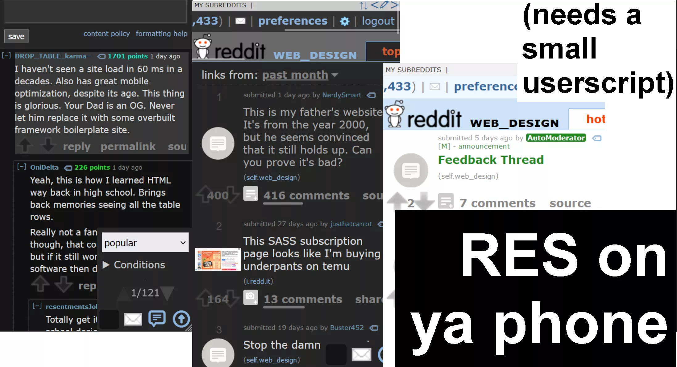
A mobile layout for RES. Needs a small userscript.
Mobile RES Reddit by o_o
Details
Authoro_o
LicenseNo License
Categoryreddit
Created
Updated
Code size26 kB
Code checksuma3a376a7
Statistics
Learn how we calculate statistics in the FAQ.
Failed to fetch stats.
Description
Notes
That userscript
Install it here. It just changes a single tag to make Old Reddit render correctly; this userstyle does all of the heavy lifting :)
Features
- Styled posts
- Styled comments
- Expandos
- Big upvote buttons
- Big expand/collapse comment buttons (just tap the left side of them)
- Responsive - only enables when your screen is small
- Style sort dropdown
- Righty mode with frequently used buttons moved to the right (like upvotes and expandos)
- RES's button overlays and comment navigator
Roadmap
- Style post and comment author
- Style RES video player
- An entirely separate userstyle to tweak Old Reddit, like hiding comment scores or only allowing certain sorts
- Styling RES's UI (like notifications and settings)
Changelog
- 1.4.1
- Fixed userscript link 404ing
- Fixed "Reddit chat scale %" option
- 1.4.0
- Styled the top subreddit header navigaton
- Scaled down and made the New Reddit chat fit
- Made RES notifications look nicer
- Styled RES subreddit list popup
- Fixed tracking pixel covering the entire top of the screen
- 1.3.0
- Made expando button full-width on posts.
- 1.2.1
- Fix vertical overflow
- Make search bar be full-width
- 1.1.0
- Added scroll snapping for some horizontal scrolling buttons
- Made some unstyled buttons bigger
- Fixed the comment source viewer
- Fixed overflow when replying to a nested comment
- Added ability to collapse comment by just tapping the top
- 1.0.1
- Added righty mode
- Made comments more compact
- Added support for RES's comment navigator
- Styled dropdowns
- Styled comment textbox
- Styled RES's floaters and comment navigator
- Made RES settings smaller (it's all iframed on an extension page...not much i can do about that)
Source code
Source code has over 10K characters, so we truncated it. You can inspect the full source code on install link./* ==UserStyle==
@name Mobile RES Reddit
@namespace dabric.xyz/post/mobile-res-reddit
@version 1.4.1
@description A mobile layout for RES
@author dabric
@preprocessor stylus
@var checkbox righty-mode "Layout: Righty mode" 0
@var number chat-scale "Reddit chat scale %" 60
==/UserStyle== */
@-moz-document domain("reddit.com") {
@media (max-width: 600px) {
:root {
--mobile-background-color: white;
--mobile-score-shadow: 0px 0px 8px #fff;
--mobile-score-color-unvoted: #838383;
--mobile-score-color-likes: #cf4511;
--mobile-score-color-dislikes: #7b7bd3;
--mobile-sprite-upvotes-size-x: 140px;
--mobile-sprite-upvotes-size-y: 1731px;
--mobile-sprite-up-x: -21px;
--mobile-sprite-up-y: -1676px;
--mobile-sprite-down-x: -108px;
--mobile-sprite-down-y: -1654px;
--mobile-sprite-upmod-x: -42px;
--mobile-sprite-upmod-y: -1676px;
--mobile-sprite-downmod-x: -0px;
--mobile-sprite-downmod-y: -1676px;
}
body.res-nightmode {
--mobile-background-color: hsl(0, 0%, 15%);
--mobile-score-shadow: 0px 0px 10px hsl(0, 0%, 15%);
--mobile-dropdown-background-color: hsl(0, 0%, 20%);
--mobile-dropdown-border-color: hsl(0, 0%, 30%);
--mobile-score-color-unvoted: rgb(100, 100, 100);
--mobile-score-color-likes: #ff4500;
--mobile-score-color-dislikes: hsl(210, 50%, 70%);
--mobile-sprite-upvotes-size-x: 45px;
--mobile-sprite-upvotes-size-y: 28px;
--mobile-sprite-up-x: -15px;
--mobile-sprite-up-y: 0px;
--mobile-sprite-down-x: -15px;
--mobile-sprite-down-y: -14px;
--mobile-sprite-upmod-x: 0px;
--mobile-sprite-upmod-y: 0px;
--mobile-sprite-downmod-x: 0px;
--mobile-sprite-downmod-y: -14px;
}
// vote button style
mobile-vote-button() {
margin: 0;
width: 100% !important;
display: flex;
align-items: center;
justify-content: space-between;
box-sizing: border-box;
position: relative;
border-right: 4px solid transparent;
> * {
flex-shrink: 0;
}
size = 32;
resize-dimension(number) {
return "calc((%s / 15) * %s)" % (number size)
}
.score {
position: absolute;
width: 100%;
height: 100%;
text-align: center;
display: flex !important;
align-items: center;
justify-content: center;
text-align: center;
pointer-events: none
font-size: 1rem;
text-shadow: var(--mobile-score-shadow);
&.unvoted {
color: var(--mobile-score-color-unvoted) !important;
}
&.likes {
color: var(--mobile-score-color-likes) !important;
}
&.dislikes {
color: var(--mobile-score-color-dislikes) !important;
}
}
:is(&.likes, &.dislikes) > .score.unvoted {
display: none !important
}
&:not(.likes) > .score.likes {
display: none !important
}
&:not(.dislikes) > .score.dislikes {
display: none !important
}
.arrow {
width: size px;
height: size px;
margin: 0;
generate-arrow(class) {
&.{class} {
background-position: resize-dimension("var(--mobile-sprite-%s-x)" % class) resize-dimension("var(--mobile-sprite-%s-y)" % class) !important;
background-size: resize-dimension(var(--mobile-sprite-upvotes-size-x)) resize-dimension(var(--mobile-sprite-upvotes-size-y));
}
}
generate-arrow(up)
generate-arrow(down)
generate-arrow(upmod)
generate-arrow(downmod)
}
}
action-buttons() {
display: flex;
width: 100%;
overflow: auto;
align-items: center;
gap: 10px;
font-size: 1rem;
scroll-snap-type: x mandatory;
> * {
scroll-snap-align: start;
}
if righty-mode {
flex-direction: row-reverse;
}
}
// make everything in a column layout
body {
display: flex;
flex-direction: column;
}
// make buttons bigger
button {
min-width: 80px;
min-height: 32px;
}
// the sections
body > {
#header {
order: 1
}
.side {
order: 3;
}
.content {
order: 2;
}
.footer-parent {
order: 4;
}
.debuginfo {
order: 5;
}
// tracking pixel?
#hsts_pixel {
position: absolute;
pointer-events: none;
}
// "GET REDDIT MOBILE"
.mobile-web-redirect-bar {
display: none;
}
}
// make header stack
#header {
display: flex;
flex-direction: column;
#header-bottom-left {
order: 2;
}
#header-bottom-right {
position: static;
order: 1;
border-radius: 0;
}
}
// enlarge subreddits
#sr-header-area {
overflow: auto !important;
height: 24px;
font-size: 14px;
display: flex;
align-items: stretch;
padding: 0 10px;
gap: 14px;
scroll-snap-type: x mandatory;
scroll-padding: 10px;
#srLeftContainer, #RESShortcutsViewport, #RESStaticShortcuts, #RESShortcuts {
display: contents;
}
#srDropdownContainer {
height: 100%;
}
a, .srSep {
min-width: 50px;
width: fit-content;
text-align: center;
display: flex;
height: 100%;
align-items: center;
justify-content: center;
flex-shrink: 0;
scroll-snap-align: start;
}
.separator {
display: none;
}
.srSep {
margin: 0;
min-width: 0;
}
#RESShortcutsEditContainer {
display: none;
}
}
// res subreddit list
#srList {
font-size: 14px;
width: 100vw;
box-sizing: border-box;
th {
padding: 5px;
}
td {
padding: 7px 10px !important;
}
}
// enlarge header
#header-bottom-right {
> * {
font-size: 1rem;
flex-shrink: 0
}
display: flex;
flex-direction: row;
width: 100%;
overflow: auto;
padding: 8px 8px;
box-sizing: border-box;
}
// prevent header overflow
#header-bottom-right {
max-width: 100%;
overflow: auto;
box-sizing: border-box;
}
// prevent tab overflow
#header-bottom-left {
max-width: 100%;
overflow: auto;
}
// enlarge tabs
#header-bottom-left {
font-size: 1rem;
padding: 0 8px;
padding-left: 0
box-sizing: border-box;
display: flex;
align-items: end;
position: relative;
scroll-snap-type: x mandatory;
scroll-padding: 5px;
> *, > .tabmenu > * {
scroll-snap-align: start;
}
> * {
flex-shrink: 0;
}
#header-img, .pagename {
order: -3;
}
// this is weirdly hard to just
// make this a stretch to the top?
.pagename {
display: flex;
align-self: stretch;
align-items: stretch;
> a {
display: flex;
align-items: end;
}
}
.tabmenu {
display: contents;
> li a {
padding: 5px 8px;
display: block;
min-width: 80px;
text-align: center;
box-sizing: border-box;
}
// make the selected tab appear first.
// use negatives to not conflict with res
// order: 0'ing their tabs
li {
order: -1;
}
li.selected {
order: -2
}
}
}
// hide listing chooser
.listing-chooser {
display: none;
}
body.with-listing-chooser > .content {
margin-left: 0 !important;
}
body > .content {
margin: 0 !important;
}
// style sidebar
body > .side {
width: calc(100% - 10px);
margin: 0 5px
#search > input[type=text] {
width: 100%;
}
}
// style footer
body > .footer-parent {
margin: 0 !important;
.footer {
display: flex;
flex-direction: column;
max-width: calc(100% - 15px*2)
.col {
border: none;
}
}
.bottommenu {
margin: 0 5px;
}
}
// style debug info
body > .debuginfo > .content {
display: inline;
}
// reddit chat
.chat-app-window.regular {
right: unset;
scale = chat-scale * 0.01;
left: 0;
bottom: 0;
width: (100 / scale)%;
height: (80 / scale)%;
trans...