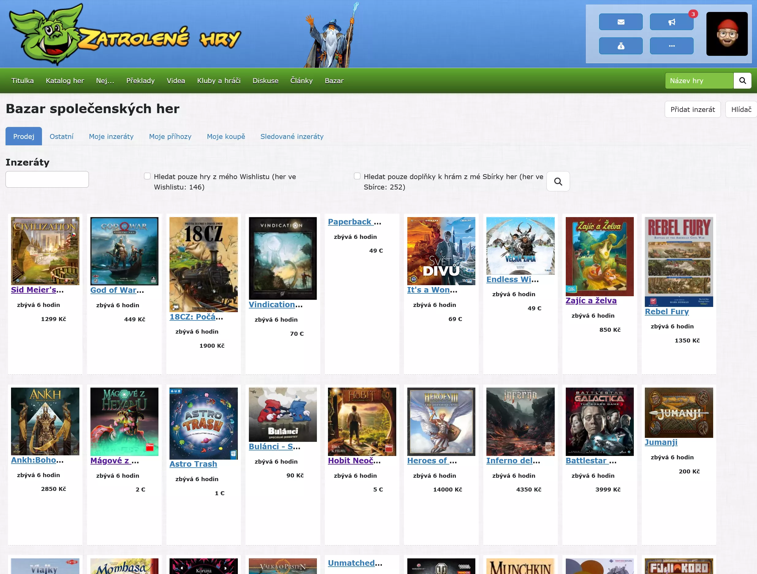
full screen mode for zatrolenehry.cz
Zatrolene hry - bazar list by chemix
Details
Authorchemix
LicenseMIT
Categoryzatrolenehry.cz
Created
Updated
Code size3.0 kB
Code checksumadd52870
Statistics
Learn how we calculate statistics in the FAQ.
Failed to fetch stats.
Description
Notes
Userstyle doesn't have notes.Source code
/* ==UserStyle==
@name         Zatrolene hry - bazar list
@version      20240925.15.03
@namespace    honzacerny.com
@description  full screen mode for
@author       Jan Honza Cerny aka chemiX
@license      MIT
==/UserStyle== */

@-moz-document regexp("^https:\\/\\/www\\.zatrolene-hry\\.cz\\/bazar\\/(\\?.*)?$") {
#right-column {
    display: none !important;
}

html body div.container div.row div.col-lg-9 p.alert.alert-info {
    display: none !important;
}

html body div.container > div.row > div.col-lg-9 > div.row {
    display: none !important;
}

html > body > div:nth-of-type(2) > div:nth-of-type(2) > div:first-of-type > p:nth-of-type(2) {
    position: absolute;
    right: 0;
    top: 0;
}

html > body > div:nth-of-type(2) > div:nth-of-type(2) > div:first-of-type {
    position: relative;
}

/* form search improve */
html > body > div:nth-of-type(2) > div:nth-of-type(2) > div:first-of-type > div:nth-of-type(2) > form > div:nth-of-type(2),
html > body > div:nth-of-type(2) > div:nth-of-type(2) > div:first-of-type > div:nth-of-type(2) > form > div:nth-of-type(6),
html > body > div:nth-of-type(2) > div:nth-of-type(2) > div:first-of-type > div:nth-of-type(2) > form > div:nth-of-type(5),
html > body > div:nth-of-type(2) > div:nth-of-type(2) > div:first-of-type > div:nth-of-type(2) > form > div:nth-of-type(7) {
    display: none !important;
}
html > body > div:nth-of-type(2) > div:nth-of-type(2) > div:first-of-type > div:nth-of-type(2) > form {
    display: flex !important;
}

html > body > div:nth-of-type(2) > div:nth-of-type(2) > div:first-of-type > div:nth-of-type(2) > form > div:first-of-type > label {
    display: none !important;
}


html > body > div:nth-of-type(2) > div:nth-of-type(2) > div:first-of-type {
    width: 100% !important;
}

html > body > div:nth-of-type(2) > div:nth-of-type(2) > div:first-of-type > div:nth-of-type(2) > nav:first-of-type {
    display: none !important;
}

.list-item {
    border: 2px solid #fff;
    padding: 5px;
    background: white;
    width: 18% !important;
    float: left;
    height: 350px;
    margin: 5px;
}

.list-item h3 {
    font-size: 16px !important;
    text-wrap: nowrap;
    text-overflow: ellipsis;
    overflow: hidden;
}

.list-item h4 {
    font-size: 12px !important;
}

.list-item > div {
    display: flex;
    flex-direction: column;
}

.list-item > .row > .col-3 {
    width: 100%;
}

.list-item .col-5,
.list-item .col-7 {
    width: 100%;
}

.list-item .col-6 {
    display: none !important;
}


html body div.container div.row div.col-lg-9 div nav.my-4 {
    clear: left;
}


/* full screen */
.container {
    max-width: 100%;
}

.list-item {
    width: 18% !important;
    height: 350px;
}

@media screen and (min-width: 1450px) {
    .container {
        max-width: 100%;
        max-width: 2000px;
    }
    .list-item {
        width: 10% !important;
        height: 350px;
    }
}
}