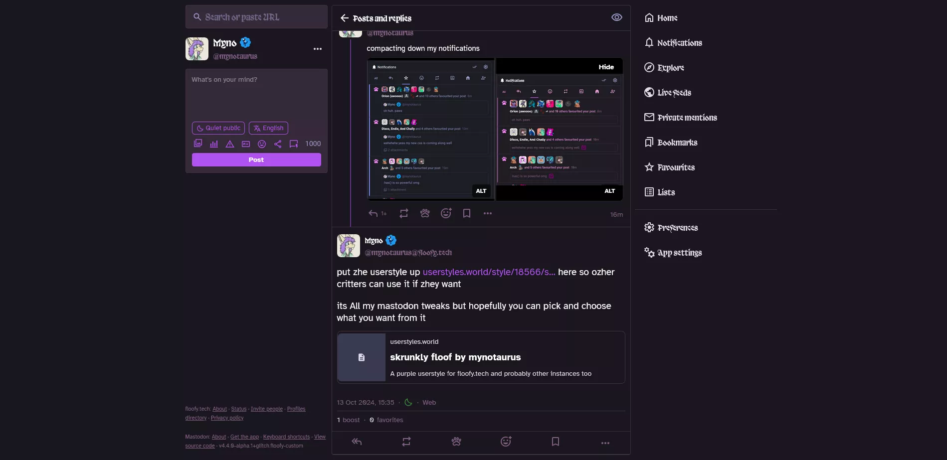
A purple userstyle for floofy.tech and probably other instances too
skrunkly floof by mynotaurus
Details
Authormynotaurus
LicenseNo License
Categoryfloofy.tech
Created
Updated
Code size14 kB
Code checksum4482d26c
Statistics
Learn how we calculate statistics in the FAQ.
Failed to fetch stats.
Description
Notes
youll need to install these fonts yourself due to CSP issues importing them automatically:
- https://velvetyne.fr/fonts/Trickster/
- https://github.com/googlefonts/atkinson-hyperlegible
- https://fonts.google.com/specimen/DM+Mono (less important, just for small UI details)
Source code
Source code has over 10K characters, so we truncated it. You can inspect the full source code on install link./* ==UserStyle==
@name skrunkly floof
@namespace github.com/openstyles/stylus
@version 1.0.7
@description A purple userstyle for floofy.tech and probably other instances too
@author Myno
==/UserStyle== */
@-moz-document domain("floofy.tech") {
/* COLOR AND FONT HELL
fonts used: https://velvetyne.fr/fonts/Trickster/
https://fonts.google.com/specimen/Pirata+One as a backup for trickster
https://github.com/googlefonts/atkinson-hyperlegible
https://fonts.google.com/specimen/DM+Mono
i cant download fonts for you on floofy.tech!! so you need these installed on your machine for them to work!
*/
:root {
--dropdown-border-color: #313543;
--dropdown-background-color: rgba(25,23,31,.9);
--dropdown-shadow: 0 20px 25px -5px rgba(0,0,0,.25),0 8px 10px -6px rgba(0,0,0,.25);
--modal-background-color: #241f2b;
--modal-border-color: #403143;
--background-border-color: #403143;
--background-filter: blur(10px) saturate(180%) contrast(75%) brightness(70%);
--background-color: #1a171f;
--background-color-tint: rgba(25,23,31,.9);
--surface-background-color: #241f2b;
--surface-variant-background-color: #352938;
--surface-variant-active-background-color: #352938;
}
.icon-with-badge__badge, .compose-form__submit > button, .privacy-dropdown__option.active, .dropdown-button.active, .admin-wrapper .sidebar ul .simple-navigation-active-leaf a, .button, .simple_form button, .glitch.local-settings__navigation__item.active, .account__section-headline a.active::before, .account__section-headline button.active::before, .notification__filter-bar a.active::before, .notification__filter-bar button.active::before, .react-toggle.react-toggle--checked:hover:not(.react-toggle--disabled) .react-toggle-track, .react-toggle--checked .react-toggle-track, .pillbar-button:not([disabled]).active:focus, .pillbar-button:not([disabled]).active:hover, .pillbar-button:not([disabled]).active, .compose-form__actions .icon-button.active, .language-dropdown__dropdown__results__item.active, .poll__chart.leading, .loading-bar {background: #b052f0}
.button:active, .button:focus, .button:hover, .simple_form button:hover, .status__content .status__content__spoiler-link:hover, .status__content .status__content__spoiler-link:active, .status__content .status__content__spoiler-link:focus {background: #904290}
.compose-form .autosuggest-textarea__textarea, .compose-form .spoiler-input__input, .compose-form__highlightable, .search__input, .poll__option input[type="text"], .account-role {background-color:#352938}
.poll__chart, .status__content .status__content__spoiler-link {background-color: #826085}
.focusable:focus {background-color:rgba(255, 99, 187, 0.05);}
input {accent-color: #b052f0}
.column-link.active, .ui__header__links a.button, .notification__message .icon, .column-header.active .column-header__icon, .compose-form__actions .icon-button, .dropdown-button, .notification-ungrouped--direct .notification-ungrouped__header, .notification-ungrouped--direct .status__prepend, .status__wrapper-direct .notification-ungrouped__header, .status__wrapper-direct .status__prepend, .compose-form .spoiler-input__input, .compose-form__poll__select__value, .account__domain-pill, .account-role, .notification-bar-action, .edit-indicator__content a.unhandled-link, .reply-indicator__content a.unhandled-link, .status__content a.unhandled-link, .status__content__translate-button, .about__section__title, .prose a, a {color: #b052f0}
.account__header__bio .account__header__fields dd, .hashtag-bar, .notification-group__main__header__label, .notification-group__embedded-status__content, .notification-group__embedded-status .reply-indicator__attachments, .notification-ungrouped__header, .notification__filter-bar button, .notification-group__embedded-status p {color: #e1a6e3;}
.account__header__tabs__name h1 small, .status__display-name, .account .account__display-name, .compose-form__actions .icon-button.disabled, .compose-form__actions .icon-button:hover, .compose-form__actions .icon-button:active, .compose-form__actions .icon-button:focus, .account__header__bio .account__header__fields dt, .account__action-bar__tab > span, .status__info__icons, .icon-button, .status__relative-time, .notification-group__main__header__label time, .display-name__account, .detailed-status__meta, .link-footer p, .link-footer p a, .about__header p {color: #826085;}
.status__wrapper-direct, .status__wrapper-direct:focus, .detailed-status__wrapper-direct .detailed-status, .detailed-status__wrapper-direct .detailed-status__action-bar, .account__domain-pill {
background: rgba(140,60,255,.10);
}
.poll__option input[type="text"]:focus, .account-role, .account__action-bar__tab.active {border-color: #b052f0;}
.notification.unread::before, .status__wrapper.unread::before {
border-inline-start: 4px solid #b052f0;
}
.status__line {
border-inline-start: 2px solid #b052f080;
}
.icon-button.star-icon.active {
color: #ec8cff;
}
.active > .icon-retweet, .notification-group__icon > .icon-repeat {
color: #80f;
}
.icon-button.active[aria-label="React"], .notification-group__icon > .icon-react {
color: #f08;
}
.notification-group__icon > .icon-person-add {
color: #a8e;
}
.notification-group--unread::before {
border-inline-start: 4px solid #848;
}
.column-header__wrapper.active::before {
background: radial-gradient(ellipse,rgba(255, 50, 60, 0.23) 0,rgba(140,50,255,0) 60%);
}
body {
font-family: "Atkinson Hyperlegible","mastodon-font-sans-serif",sans-serif;
}
time {
font-family: "DM Mono","Atkinson Hyperlegible","mastodon-font-sans-serif",sans-serif;
}
.column-header__title, .column-link, .status__display-name, .notification__message, .account__contents, .display-name, .status__content__spoiler-link {
font-family: "Trickster","Pirata One", "mastodon-font-sans-serif", serif;
}
.status__content__spoiler-link {text-transform: none; font-size: 14px;}
.mention {
font-weight: 700;
background: #b052f0;
border-radius: 20px;
color: black !important;
padding: 2px 5px 2px 5px;
}
.dropdown-button, .dropdown-button.active {
border: 1px solid #b052f0;
}
.ui__header__logo {
filter: hue-rotate(20deg);
}
.search {margin-bottom: 16px; font-family: "Trickster","Pirata One","mastodon-font-sans-serif", serif;}
/*VARIOUS QOL TWEAKS*/
.account__contents {
font-size: 120%;
}
a.button-secondary > span {
display: none !important;
}
.compose-form__highlightable {
overflow-x: clip;
}
.compose-form__scrollable {
max-height: 50vh;
overflow-y: auto;
min-height: 30px;
}
.reply-indicator__content { overflow-y: auto;}
.compose-form__footer, .compose-form__actions, .compose-form__highlightable {gap: 5px;}
.compose-form { gap: 16px;}
.link-footer {font-size: 11px; padding-top: 10px;}
.columns-area__panels {gap: 8px;}
.columns-area__panels__pane:first-of-type {margin-left: 30px;}
.status__content__text sub, .status__content__text sup {
font-size: 0.7em;
opacity: 0.8;
}
/* NOTIFICATIONS */
.notification-group__embedded-status {
gap: 0px;
opacity: 0.5;
max-height: 22px;
overflow: hidden;
flex-direction: row;
}
.notification-group__embedded-status .reply-indicator__attachments {
margin: 0;
margin-left: 10px;
background-color: #f0fa;
color: black;
padding:2px;
border-radius:5px;
display:inline-block;
width: max-content;
}
.notification-group__embedded-status .reply-indicator__attachments > span {
display: none;
}
.notification-group__embedded-status__account {
display:none;
}
.notification-group__embedded-status__content > * {
text-wrap: nowrap;
white-space: nowrap !important;
}
.notification-ungrouped__header {
margin-bottom: 6px;
}
.notification-ungrouped--mention {
background-color: #3037;
border: 2px dotted #f0f7;
border-radius:5px;
}
.notification-ungrouped--direct {
background-color: #6037;
}
.notification-group--unread:has(.icon-star)::before {
border-inline-start: 4px solid #ec8cff80;
}
.notification-group--unread:has(.icon-repeat)::before {
border-inline-start: 4px solid #80f8;
}
.notification-group--unread:has(.icon-react)::before {
border-inline-start: 4px solid #f088;
}
.notification-group--unread:has(.icon-person-add)::before {
border-inline-start: 4px solid #a8e8;
}
.notification-ungrouped--unread::before {
border-inline-start: 4px solid #f0f;
}
.notification-group__avatar-group{
height: 36px;
}
.notification-group__avatar-group > a > .account__avatar {
height:36px !important;
width:36px !important;
}
.notification-group__main__header__label > span {
text-wrap: nowrap;
text-overflow: ellipsis;
}
/* FAVOURITES TAB PAW FIX */
button[title="Favourites"]::after, button[title="Favourites"].active::after {
display: inline-block;
content: '';
width: 28px;
height: 28px;
background-color: #e1a6e3;
mask-size: 100%;
margin: 0 auto;
}
button[title="Favourites"].active::before {
border-radius: 4px 4px 0 0;
bottom: -1px;
content: "";
...