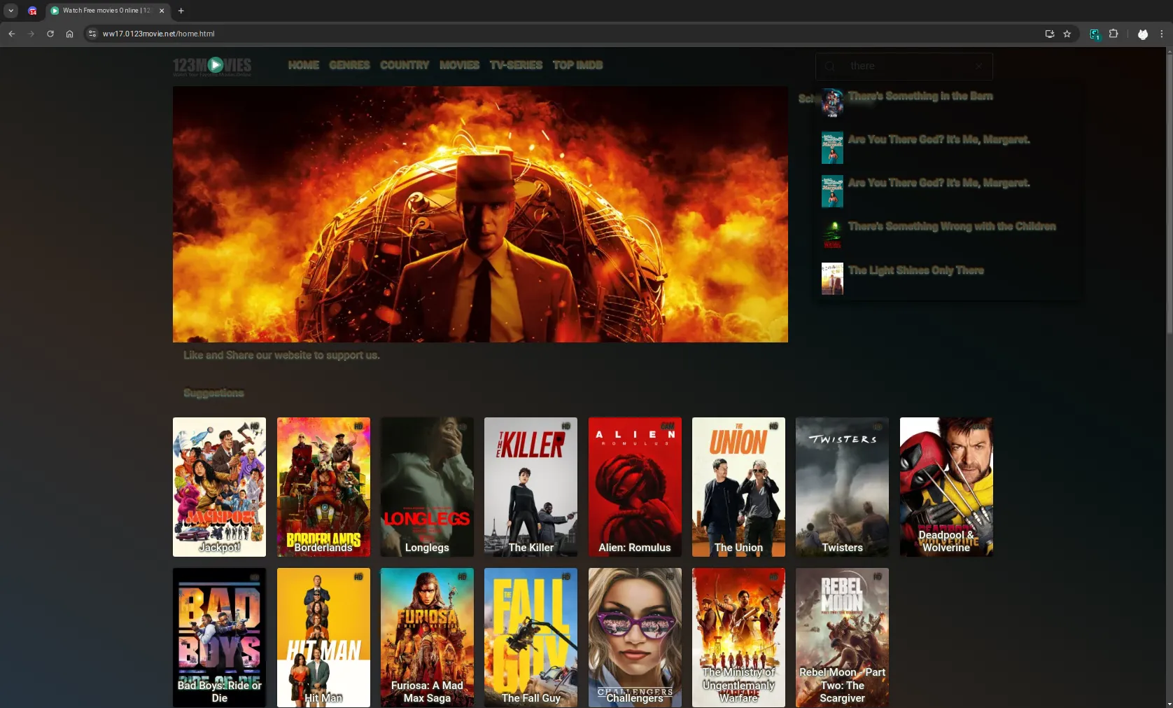
This is a universal site that works on all three websites (who knew sites cloning each other's content would actually be helpful for once :0)
123movies/moviejoy/solarmovie - Dark Rusty Slate by osirisgothra
Details
Authorosirisgothra
LicenseCC Zero - Public Domain
Categoryhttps://ww17.0123movie.net
Created
Updated
Code size3.8 kB
Code checksum83c91b7f
Statistics
Learn how we calculate statistics in the FAQ.
Failed to fetch stats.
Description
Notes
an as-is style, use at your own discretion
Source code
/* ==UserStyle==
@name           solarmovie.to - darkest
@namespace      github.com/openstyles/stylus
@version        1.0.2
@description    movie site style for solarmovies, 123movies, 0123movie.net, moviejoy, etc
@author         osirisgothra
==/UserStyle== */

@-moz-document regexp("https://.*(ogp\.me|solarmovie.to|0123movie\.net|solarmovie\.to|moviejoy\.).*") {

	/*	1.0.0 Initial release
	    1.0.1 added glass backgrounds to menus
		1.0.2 tuned some fonts and added some minor effects, updated site styles/tags
	*/


  *,header,footer, footer *, body > footer, main,.text-bg-dark,.bg-light
    {
        border-color: transparent !important;
        background-color: #0000 !important;
        background-image: none !important;
        box-shadow: none !important;
    }
    @keyframes bgslow
    {
        0%, 100% {
            backdrop-filter: hue-rotate(0deg);
        }
        50% {

            backdrop-filter: hue-rotate(360deg);
        }
    }
    body
    {
           animation: bgslow 21s infinite ease-in-out;
        transform-origin: top;
        background-image: linear-gradient(30deg,#182027,#2f2620,#081213,#0f0502) !important;
        background-size: 100% 100%;
        background-attachment: fixed;
    }
    #search-result-top
    {
        background: #00000029 !important;
        backdrop-filter: blur(5px);
        box-shadow: 0px 2px 16px black !important;
        width: 150% !important;
    }
    iframe,header,nav,navigation,div,a
    {
        color: transparent !important;
        background: linear-gradient(#a6a6a6 0% 40%, #468388 47% 100% ) !important;
        background-clip: text !important;

        text-shadow: 1px 1px 1px #5b462a0f, 1.5px 1.5px 1px #2d707554, -0px 0px 1px #55290045, 0px 0px 1px #0f05024f !important;


    }
	@keyframes drift
	{
		0% { --drift: -6px; --drifth: 1px; }
		10% { --drift: -7px; --drifth: 2px; }
		15% { --drift: -6px; --drifth: 3px; }

			 25% { --drift: -5px; --drifth: 4px; }
			 35% { --drift: -4px; --drifth: 5px; }
			 45% { --drift: -3px; --drifth: 6px; }


			 50% { --drift: -2px; --drifth: 7px; }
			 60% { --drift: -1px; --drifth: 6px; }
			 70% { --drift: -1.5px; --drifth: 5px; }

		     75% { --drift: -2px; --drifth: 4px; }
		     85% { --drift: -3px; --drifth: 3px; }
		     95% { --drift: -4px; --drifth: 2px; }

		100% { --drift: -5px; --drifth: 1px; }

	}
    a:hover, div#search-result-top a:hover > div
    {

        transition: 0.5s;
        color: transparent !important;
        background: linear-gradient(#fff,#ffbaba) !important;
        background-clip: text !important;
		--drift: -4px;
		--drifth: 1px;
		animation: drift 2s infinite linear;
		animation-fill-mode: both;
        text-shadow: 1px 0px 2.5px #ffcb8626, 0px 1px 3.5px #167b82, -1px -1px 2.5px #cea8842e,
			calc( (var(--drifth)*2) - 7px)
			calc( (var(--drift)*2) + 7px) 2.5px#ffffff4a !important;
    }
    div#search-result-top a:hover
    {
        background: #0000005b !important;
        background-clip: content-box !important;
    }


	div#navtop div.offcanvas-body > ul > li:has(a.nav-link.dropdown-toggle.show)
	{
		padding-bottom: 0px !important;
		margin-bottom: 0px !important;
		background-color: #171717f2 !important;
		border: none !important;
		border-radius: 20px 20px 0px 0 !important;
		box-shadow: 0px 13px 13px #182027ba !important;

		opacity: 100%;
	}

	div#navtop li>ul
	{


		border-radius: 0px 20px 20px 20px !important;
		background: linear-gradient(#171717f2,rgba(55, 55, 55, .83)) !important;
		padding-top: 0px !important;
		margin-top: 0px !important;
		border: none !important;
		box-shadow: 0px 13px 13px #182027ba !important;
		opacity: 100%;

	}


}