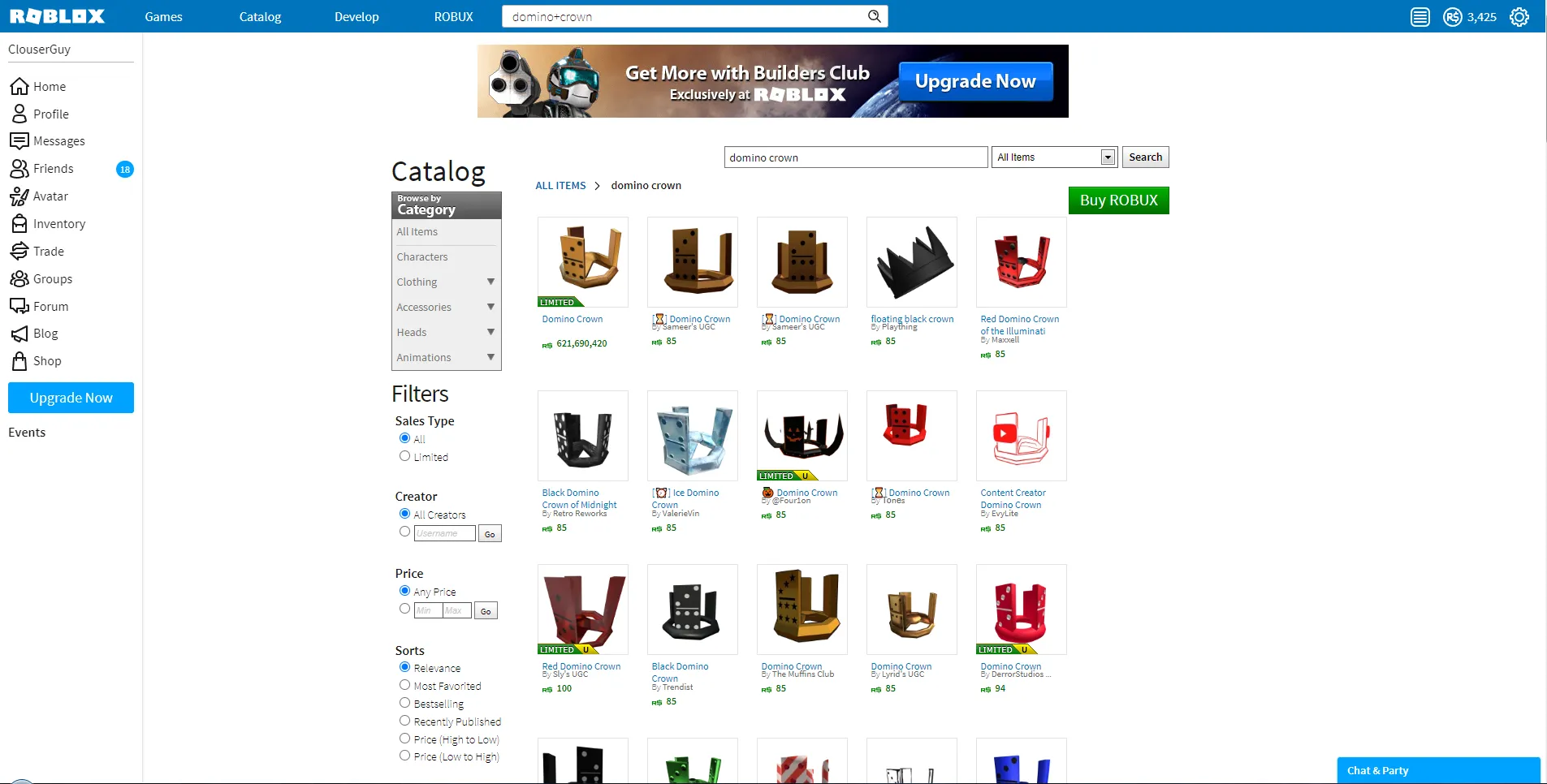
Brings Back Early Style Of Catalog With Flaws Requires RLOT (Experimental) By @TersisWilvin To Work As Intended
Old Catalog Page (FIXED) by Vue2016
Details
AuthorVue2016
LicenseN/A
Categorywww.roblox.com
Created
Updated
Code size30 kB
Code checksumcc6f51bb
Statistics
Learn how we calculate statistics in the FAQ.
Failed to fetch stats.
Description
Notes
Userstyle doesn't have notes.Source code
Source code has over 10K characters, so we truncated it. You can inspect the full source code on install link./* ==UserStyle==
@name Old Catalog Page (FIXED)
@namespace github.com/openstyles/stylus
@version 1.0.9
@description Brings Back Early Style Of Catalog With Flaws Requires RLOT (Experimental) By @TersisWilvin To Work As Intended
@author Vue2016
@preprocessor less
==/UserStyle== */
@-moz-document url-prefix("https://www.roblox.com/catalog") {
[data-internal-page-name="Catalog"]:has(.catalog-container .search-bars h1 a) {
background-color: #ffffff!important;
outline: none!important;
}
[data-internal-page-name="Catalog"] .content {
max-width: 990px;
min-width: 970px;
padding: 15px;
margin: 0 auto;
min-height: 1540px;
background-color: #ffffff!important;
outline: none!important;
}
[data-internal-page-name="Catalog"] .radio label{
position: relative;
}
[data-internal-page-name="Catalog"] .leaderboard-abp {
margin-top: 4px;
}
[data-internal-page-name="Catalog"] .catalog-container {
padding: 10px;
width: 990px;
margin-left: auto;
margin-right: auto;
min-height: 1660px;
}
[data-internal-page-name="Catalog"] .catalog-container .catalog-results .featured-items-heading > span {
font-size: 30px;
font-weight: normal;
color: #0074BD;
font-family: 'Source Sans Pro',
Arial,
Helvetica,
sans-serif;
letter-spacing: -1px;
}
#main-view h1, .catalog-container .heading {
font-size: 0px;
a {
position: relative;
top: 18px;
}
}
div.grid-item-container.item-card.list-item:nth-of-type(5) {
display: none;
}
div.grid-item-container.item-card.list-item:nth-of-type(1) {
width: 100%;
height: 100%;
}
.container-main .catalog-full-screen .catalog-results .item-cards-stackable .item-card .item-card-thumb-container, .container-main .splash.catalog-full-screen .catalog-results .item-cards-stackable .item-card .item-card-thumb-container {
padding: 0%!important;
}
#react-items-container {
margin-top: 0;
}
.container-main .catalog-full-screen .catalog-results .item-cards-stackable .item-card {
width: 120px;
font-family: 'Source Sans Pro',Arial,Helvetica,sans-serif;
margin-right: 15px;
height: 100%;
margin-bottom: -30px;
box-shadow: none;
border: none;
.item-card-thumb-container {
&, &:hover {
width: 112px;
height: 112px;
max-height: 112px;
border: 1px solid #e3e3e3;
border-radius: 0px;
}
}
.item-card-container .item-card-link:hover {
border: 1px solid #e3e3e3;
}
.item-card-container {
width: 112px;
padding-top: 9px;
padding-bottom: 21px;
padding-left: 8px;
border: 1px solid transparent;
&:has(.item-card-label.ng-hide) {
padding-bottom: 8px;
}
}
}
.container-main .catalog-full-screen .catalog-results .item-card-container {
box-shadow: none;
}
.grid-item-container.item-card.list-item {
box-shadow: none;
}
.thumbnail-2d-container, .item-card-thumb-container {
background-color: transparent;
border-color: transparent;
}
[data-internal-page-name="Catalog"] #results .item-card-container .item-card-name {
color: #0074BD;
font-size: 12px;
font-family: 'Source Sans Pro',
Arial,
Helvetica,
sans-serif;
height: 100%;
max-height: unset;
width: 102px;
font-weight: 400!important;
}
#catalog-react-container .item-card-container .item-card-name > .text-overflow {
max-height: unset;
overflow: unset;
white-space: normal;
}
.item-card-container .item-card-name:hover {
cursor: pointer;
text-decoration: none;
}
.creator-name-container a.creator-name.text-link {
text-decoration: none;
}
.item-card-container .item-card-link {
cursor: pointer;
}
[data-internal-page-name="Catalog"] .item-card-container .text-robux-tile, .item-card-container .item-card-label > .strike-through {
color: #060;
font-weight: bold;
font-size: 12px;
}
[data-internal-page-name="Catalog"] .item-card-container .icon-robux-16x16, .item-card-container .item-card-label > .icon-robux-gray-16x16, .breadcrumb-filter-name .icon-robux-gray-16x16 {
background-position: 0 0;
background-image: url(/images/Icons/img-robux.png);
background-size: 12px;
top: 5px;
position: relative;
height: 12px;
}
.breadcrumb-filter-name .icon-robux-gray-16x16 {
background-size: unset;
width: 18px;
background-position: unset;
}
.item-card-container .item-card-label, .item-card-container .item-card-secondary-info .text-overflow, .item-card-container .item-card-secondary-info .text-link {
color: #666;
font-size: 11px;
}
.item-card-container .item-card-label > span > a, .item-card-container .item-card-secondary-info .text-link {
color: var(--linkcol);
}
[data-internal-page-name="Catalog"] .item-card-container .item-card-price {
position: relative;
top: -9px;
}
.item-card-secondary-info {
position: relative;
top: -5px;
}
.container-main .catalog-full-screen .catalog-results .item-cards-stackable .item-card .item-card-container:hover {
border: 1px solid var(--borders);
position: relative;
width: 129px;
transition: none;
height: unset;
cursor: default;
background: white;
z-index: 1;
}
.btr-catalog .btr-item-card-more {
background: transparent;
box-shadow: none;
bottom: -1px;
left: 5px;
transition: none;
}
.btr-catalog .item-card-container .btr-item-card-more .btr-updated-label {
color: var(--pureblack);
}
.item-card-container .icon-limited-unique-label {
background-position: -12px -8px;
border-radius: 0px;
left: -1px;
background-image: url('https://images.rbxcdn.com/d649b9c54a08dcfa76131d123e7d8acc.png');
}
.item-card-container .icon-limited-label {
background-position: -12px -8px;
border-radius: 0px;
left: -1px;
background-image: url('http://images.rbxcdn.com/793dc1fd7562307165231ca2b960b19a.png');
}
.item-card-container .item-card-label > span[ng-bind="'Label.Card.PriceWas' | translate"] {
text-transform: lowercase;
font-weight: bold;
font-size: 12px;
color: green;
}
.item-card-container .item-card-label > .strike-through {
text-decoration: none;
}
.breadcrumb-container li.breadcrumb-filter {
padding: 0px;
margin: 0px;
margin-top: 3px;
}
.breadcrumb-container li .breadcrumb-link, .breadcrumb-container li.breadcrumb-filter .breadcrumb-filter-name {
font-size: 14px;
font-weight: 600;
color: var(--textcol);
font-family: 'Source Sans Pro',
Arial,
Helvetica,
sans-serif;
}
.breadcrumb-container li:first-child .breadcrumb-link {
text-transform: uppercase;
font-weight: bold;
}
.breadcrumb-container:has(li[class=""]) li .breadcrumb-link:first-child, #catalog-react-container .breadcrumb-container:has(.icon-right-16x16) li:first-child .breadcrumb-link {
color: #095fb5;
}
.breadcrumb-container li .breadcrumb-link:first-child:hover {
text-decoration: underline;
}
.breadcrumb-container li.breadcrumb-filter .breadcrumb-filter-name {
text-transform: unset;
margin-right: 6px;
margin-left: 6px;
}
.breadcrumb-container li .breadcrumb-link:hover {
text-decoration: none;
}
.catalog-container .search-bars .input-group .buy-robux {
border: 1px solid #007001;
background-color: #007001;
background-image: url(/images/Buttons/StyleGuide/bg-btn-green.png);
z-index: 999 ;
background-position: left -96px;
border-radius: 0px;
font-size: 0;
color: #fff;
font-family: 'Source Sans Pro',Arial,Helvetica,sans-serif;
padding: 1px 13px 3px 13px;
line-height: 27px;
height: 34px;
margin-right: 54px;
position: absolute;
bottom: -52px;
right: -54px;
.light-theme.gotham-font &, .light-theme.builder-font & {
&, &:hover, &:focus, &:active, &:link {
font-size: 0
}
}
&:after {
content: 'Buy ROBUX';
font-size: 20px;
}
&:hover {
background-position: left -128px;
}
}
[data-internal-page-name="Catalog"] #avatar-shop-keyword-input {
width: 325px;
height: 27px;
border-radius: 0px;
font-family: 'Source Sans Pro',
Arial,
Helvetica,
sans-serif;
font-size: 14px;
font-weight: 400!important;
padding: 2px 5px;
color: var(--textcol);
border: 1px solid #777;
}
.catalog-container .simplebar-mask:not(.shopping-cart-modal-container .simplebar-mask) {
width: 150px;
}
.catalog-container .sticky .search-options-scrollbar-container .simplebar-track, #search-options-scrollbar-container #mCSB_1_scrollbar_vertical, #search-options-scrollbar-container #mCSB_2_scrollbar_vertical, .catalog-container .catalog-results .buy-robux {
display: none;
}
.catalog-container .sticky .topic-container {
position: ...