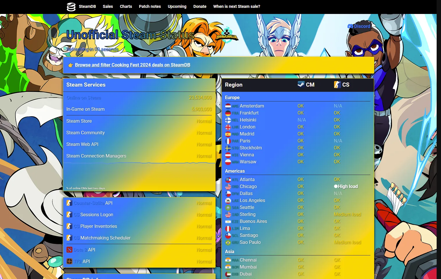
SteamStat.us - Brawlhalla Theme with Advanced CSS
SteamStat.us - Brawlhalla by Nick2bad4u
Imported and mirrored from https://github.com/Nick2bad4u/UserStyles/raw/refs/heads/main/SteamStat.us-Re-Remastered-Brawlhalla.user.css
Details
AuthorNick2bad4u
LicenseUnLicense
Categorysteamstat
Created
Updated
Code size5.4 kB
Code checksuma628206
Statistics
Learn how we calculate statistics in the FAQ.
Failed to fetch stats.
Description
Notes
Userstyle doesn't have notes.Source code
/* ==UserStyle==
@name         SteamStat.us - Brawlhalla
@version      20241115.16.06
@namespace    typpi.online
@description  SteamStat.us - Brawlhalla Theme with Advanced CSS
@homepageURL  https://github.com/Nick2bad4u/UserStyles
@supportURL   https://github.com/Nick2bad4u/UserStyles/issues
@author       Nick2bad4u
@license      UnLicense
==/UserStyle== */
@-moz-document domain("steamstat.us") {
	/* Main title styling with Brawlhalla colors */
	.title {
		margin: 10px 0;
		background: linear-gradient(
			135deg,
			#0078ff 30%,
			#ffd700 70%
		);
		color: #0078ff;
		font-weight: 700;
		font-size: 2.6em;
		text-align: center;
		/* Brawlhalla Blue */
		text-shadow: 2px 2px 0 rgb(0 0 0 / 21%);
		-webkit-text-stroke-width: 2px;
		-webkit-text-stroke-color: black;
		/* Blue to Gold gradient */
		background-clip: text;
		-webkit-text-fill-color: transparent;
		display: flex;
		position: relative;
		justify-content: center;
		align-items: center;
		animation: title-animation 2s ease-in-out
			infinite alternate;
	}

	/* Animation for the title */
	@keyframes title-animation {
		0% {
			transform: scale(1);
		}

		100% {
			transform: scale(1.05);
		}
	}

	/* Logo addition with scaling effect */
	.title::after {
		display: inline-block;
		transition: transform 0.3s ease;
		margin-left: 10px;
		background: url('https://static.wikia.nocookie.net/brawlhalla_gamepedia/images/1/14/Brawlhalla_Logo_100M_Full.png')
			no-repeat center;
		background-size: contain;
		width: 200px;
		height: 60px;
		content: '';
	}

	.title:hover::after {
		transform: scale(1.2);
	}

	/* Link styling with hover effect */
	a {
		transition:
			color 0.3s ease,
			text-shadow 0.3s ease;
		color: #0078ff;
		font-weight: 700;
		/* Brawlhalla Blue */
		text-decoration: none;
		text-shadow: 1px 1px 0 rgb(0 0 0 / 40%);
	}

	a:hover {
		color: #ffd700;
		/* Brawlhalla Gold */
		text-decoration: underline;
		text-shadow: 1px 1px 3px rgb(0 0 0 / 60%);
	}

	/* Status colors with Brawlhalla theme */
	.good {
		transition: color 0.3s ease;
		color: #ffd700;
		/* Brawlhalla Gold */
		text-shadow: 1px 1px 2px rgb(0 0 0 / 60%);
	}

	.minor {
		transition: color 0.3s ease;
		color: #ffffff;
		font-weight: 700;
		/* White for minor status */
		text-shadow: 1px 1px 2px rgb(0 0 0 / 60%);
	}

	.major {
		transition: color 0.3s ease;
		color: #0078ff;
		font-weight: 700;
		/* Brawlhalla Blue */
		text-shadow: 1px 1px 2px rgb(0 0 0 / 60%);
	}

	/* Refresh button styling with hover effect */
	#js-refresh {
		transition:
			color 0.3s ease,
			transform 0.3s ease;
		color: #0078ff;
		font-weight: bolder;
		/* Brawlhalla Blue */
		text-shadow: 0 0 2px rgb(0 0 0);
	}

	#js-refresh:hover {
		/* Brawlhalla Gold */
		transform: scale(1.1);
		color: #ffd700;
	}

	/* Container with blue background and gold accents */
	.services,
	#psa,
	noscript {
		position: relative;
		/* White text */
		transition:
			box-shadow 0.3s ease,
			background 0.3s ease;
		box-shadow: 0 4px 8px rgb(0 0 0);
		/* Brawlhalla Blue */
		border: 1px solid #ffd700;
		/* Brawlhalla Gold border */
		border-radius: 3px;
		background: linear-gradient(
			135deg,
			#0078ff 30%,
			#ffd700 70%
		);
		color: #ffffff;
		font-size: 1em;
		line-height: 1.5;
		text-shadow: 0 0 2px rgb(0 0 1);
	}

	.services:hover,
	#psa:hover,
	noscript:hover {
		box-shadow: 0 4px 12px rgb(0 0 0 / 50%);
		background: rgb(0 0 0 / 94%);

		/* Blue on hover */
	}

	/* Body styling with blue and gold gradient */
	body {
		transition: background 0.3s ease;
		margin: 0;
		background: url('https://cms.brawlhalla.com/c/uploads/2023/05/AllUnlocked_1920x1080.jpg')
			repeat-y;
		color: #0078ff;
		font-weight: 300;
		font-size: 16px;
		/* Brawlhalla Blue */
		font-family: Roboto, Arial, sans-serif;
		/* Blue to Gold gradient */
		text-shadow: 1px 1px 3px rgb(0 0 0);
	}

	body:hover {
		background: url('https://cms.brawlhalla.com/c/uploads/2023/05/AllUnlocked_1920x1080.jpg')
			repeat-y;
		/* White to Blue gradient */
	}

	/* Tooltip customization with smooth transition */
	[data-tooltip]::before {
		position: absolute;
		top: 0;
		left: 2%;
		visibility: hidden;
		opacity: 0%;
		z-index: 1;
		transition:
			visibility 0s,
			opacity 0.3s ease-in-out;
		border-radius: 6px;
		background: #0078ff;
		/* Brawlhalla Gold text */
		padding: 8px;
		width: 96%;
		content: attr(data-tooltip);
		/* Brawlhalla Blue background */
		color: #ffd700;
		font-style: italic;
		font-weight: 300;
		font-size: 0.9em;
		text-shadow: 1px 1px 3px rgb(0 0 0 / 40%);
	}

	[data-tooltip]:hover::before {
		visibility: visible;
		opacity: 100%;
	}

	/* Advanced feature: Gradient border with transition */
	.gradient-border {
		position: relative;
		border-radius: 5px;
		background-color: #ffd700;
		padding: 10px;
		/* Brawlhalla Gold */
		color: #ffffff;
		/* White text */
		font-weight: 700;
		text-align: center;
	}

	.gradient-border::before {
		position: absolute;
		z-index: -1;
		animation: gradient-border 3s linear infinite;
		inset: 0;
		border-radius: 5px;
		background: linear-gradient(
			45deg,
			#ffd700,
			#0078ff,
			#ffd700,
			#0078ff
		);
		/* Gold to Blue */
		background-size: 400% 400%;
		content: '';
	}

	/* Animation for gradient border */
	@keyframes gradient-border {
		0% {
			background-position: 400% 0%;
		}

		50% {
			background-position: 0% 100%;
		}

		100% {
			background-position: 400% 0%;
		}
	}
}