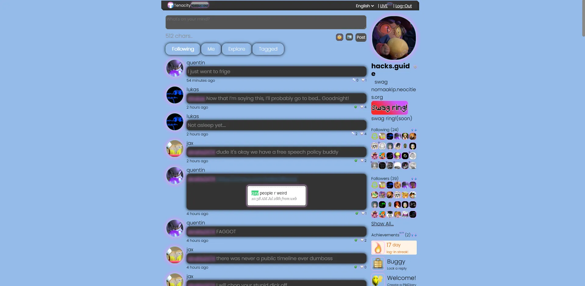
modern pikidiary :swag:
modern PikiDiary (Tenacity 5.0) by Nomaakip
Details
AuthorNomaakip
LicenseGPL-3
Categorypikidiary.lol
Created
Updated
Code size10 kB
Code checksum1bf2931a
Statistics
Learn how we calculate statistics in the FAQ.
Failed to fetch stats.
Description
Notes
swag
Source code
Source code has over 10K characters, so we truncated it. You can inspect the full source code on install link./* ==UserStyle==
@name Modern PikiDiary (Tenacity 5.0)
@namespace https://swagweb.neocities.org
@description Modern Pikidiary (Tenacity 5.0)
@author nomaakip
@version 1.6.3
@license MIT
*/
@-moz-document url-prefix("https://pikidiary.lol/") {
@import url('https://fonts.googleapis.com/css2?family=Poppins:ital,wght@0,100;0,200;0,300;0,400;0,500;0,600;0,700;0,800;0,900;1,100;1,200;1,300;1,400;1,500;1,600;1,700;1,800;1,900&display=swap');
/* ==UserStyle==
@name Modern PikiDiary (Tenacity 5.0)
@namespace Modern PikiDiary
@description swag
@author nomaakip
@license MIT
==/UserStyle== */
* {
font-family: "Poppins", sans-serif;
font-weight: 300;
font-style: normal;
}
body, body.dark, footer,body.dark main, main {
background: rgb(238,174,202);
background: radial-gradient(circle, rgba(238,174,202,1) 0%, rgba(148,187,233,1) 100%);
}
.posts-cont, .post-box, .avatar-cont, .bar {
background:none;
}
.prof-view div {
border-radius:8px;
}
div {
border-radius:8px;
}
.tab-cont {
gap:10px;
}
::-webkit-scrollbar {
width: 10px;
}
::-webkit-scrollbar-track {
background: #f1f1f100;
border-radius: 10px;
}
::-webkit-scrollbar-thumb {
background: #888;
border-radius: 10px;
}
.post-button {
animation: all 1s ease-in-out;
}
.post-content {
color: #ffffff69;
background-color: #333 !important;
border-radius: 10px;
box-shadow: 0px 0px 10px #000;
animation: fadein 1s;
-webkit-animation: fadein 1s;
-moz-animation: fadein 1s;
-o-animation: fadein 1s;
-ms-animation: fadein 1s;
}
body.dark .follow-card,.follow-card {
background: rgba(148,187,233,1);
}
button {
border-radius: 7px;
border:none;
background-color: #535353;
color: #e8e8e8;
cursor: pointer;
animation: fadein 1s;
-webkit-animation: fadein 1s;
-moz-animation: fadein 1s;
-o-animation: fadein 1s;
-ms-animation: fadein 1s;
}
.action-button {
border-radius:8px;
border: none;
color: #ffffff69;
background: #535353;
animation: fadein 1s;
-webkit-animation: fadein 1s;
-moz-animation: fadein 1s;
-o-animation: fadein 1s;
-ms-animation: fadein 1s;
}
.avatar {
border-radius: 70px;
box-shadow: 0px 0px 15px #f585ff;
animation: fadein 1s;
-webkit-animation: fadein 1s;
-moz-animation: fadein 1s;
-o-animation: fadein 1s;
-ms-animation: fadein 1s;
}
.avatar-small {
border-radius: 70px;
box-shadow: 0px 0px 15px #f585ff;
animation: fadein 1s;
-webkit-animation: fadein 1s;
-moz-animation: fadein 1s;
-o-animation: fadein 1s;
-ms-animation: fadein 1s;
}
.post-content > span > .ping {
color: #f585ff !important;
animation: fadein 1s;
-webkit-animation: fadein 1s;
-moz-animation: fadein 1s;
-o-animation: fadein 1s;
-ms-animation: fadein 1s;
}
.post-content > span {
color:white;
}
.action-button-gray {
background: #535353;
border:none;
margin-top:10px;
border-radius: 10px;
animation: fadein 1s;
-webkit-animation: fadein 1s;
-moz-animation: fadein 1s;
-o-animation: fadein 1s;
-ms-animation: fadein 1s;
}
.post-box > form > textarea {
background-color: #535353;
color: #fff;
border-radius: 8px;
animation: fadein 1s;
-webkit-animation: fadein 1s;
-moz-animation: fadein 1s;
-o-animation: fadein 1s;
-ms-animation: fadein 1s;
}
.post-content > span > a {
border-radius: 8px;
filter: blur(3px);
transition: all 0.3s ease;
animation: fadein 1s;
-webkit-animation: fadein 1s;
-moz-animation: fadein 1s;
-o-animation: fadein 1s;
-ms-animation: fadein 0.5s;
}
.post-content > span > a:hover {
filter: none;
animation: fadein 1s;
-webkit-animation: fadein 1s;
-moz-animation: fadein 1s;
-o-animation: fadein 1s;
-ms-animation: fadein 1s;
}
select {
background-color: #535353;
border-radius:8px;
color: #fff;
margin-right:5px;
animation: fadein 1s;
-webkit-animation: fadein 1s;
-moz-animation: fadein 1s;
-o-animation: fadein 1s;
-ms-animation: fadein 1s;
}
img {
border-radius:8px;
border:none !important;
filter: drop-shadow(0px 0px 5px #f585ff);
animation: fadein 1s;
-webkit-animation: fadein 1s;
-moz-animation: fadein 1s;
-o-animation: fadein 1s;
-ms-animation: fadein 1s;
}
img[src="/img/header-eyes.png"] {
display:none;
}
img[src="/img/header.png"] {
content: url(https://raw.githubusercontent.com/Nomaakip/Nomaakip.github.io/refs/heads/main/images/es.png);
width:80px;
height:27px;
margin-top:-3px;
box-shadow: none;
animation: fadein 1s;
-webkit-animation: fadein 1s;
-moz-animation: fadein 1s;
-o-animation: fadein 1s;
-ms-animation: fadein 1s;
}
img[src="/img/nikki.svg"] {
content: url(https://raw.githubusercontent.com/Nomaakip/Nomaakip.github.io/refs/heads/main/images/es.png);
box-shadow: none;
animation: fadein 1s;
-webkit-animation: fadein 1s;
-moz-animation: fadein 1s;
-o-animation: fadein 1s;
-ms-animation: fadein 1s;
}
.beta-logo {
box-shadow:none;
display:none;
}
img[src="/img/icons/upload.webp"] {
box-shadow:none;
animation: fadein 1s;
-webkit-animation: fadein 1s;
-moz-animation: fadein 1s;
-o-animation: fadein 1s;
-ms-animation: fadein 1s;
}
.button {
margin-top:5.176px;
background: #535353;
color: #fff;
border:none;
border-radius: 8px;
box-shadow:none;
transition: all .3s ease-in-out;
animation: fadein 1s;
-webkit-animation: fadein 1s;
-moz-animation: fadein 1s;
-o-animation: fadein 1s;
-ms-animation: fadein 1s;
}
.button:hover {
border:none;
background: hsl(271, 100%, 48%);
color: #fff;
}
input {
border: none;
color: #fff;
border-radius: 8px;
background-color: #535353;
animation: fadein 1s;
-webkit-animation: fadein 1s;
-moz-animation: fadein 1s;
-o-animation: fadein 1s;
-ms-animation: fadein 1s;
}
img[src="/img/icons/upload.webp"] {
box-shadow: none;
animation: fadein 1s;
-webkit-animation: fadein 1s;
-moz-animation: fadein 1s;
-o-animation: fadein 1s;
-ms-animation: fadein 1s;
}
#emoji-button {
margin-top:5.6px;
transition: all .3s ease-in-out;
animation: fadein 1s;
-webkit-animation: fadein 1s;
-moz-animation: fadein 1s;
-o-animation: fadein 1s;
-ms-animation: fadein 1s;
border:none !important;
}
#emoji-button:hover {
background: hsla(197, 100%, 63%, 1);
border:none;
}
.action-button-gray:hover {
border:none;
background: hsl(356, 100%, 36%);
color: #fff;
}
.action-button-gray {
transition: all .3s ease-in-out;
animation: fadein 1s;
-webkit-animation: fadein 1s;
-moz-animation: fadein 1s;
-o-animation: fadein 1s;
-ms-animation: fadein 1s;
}
@keyframes fadein {
0% { opacity: 0; }
100% { opacity: 1; }
}
.footer, .footer > div {
background: rgb(238,174,202);
background: radial-gradient(circle, rgba(238,174,202,1) 0%, rgba(148,187,233,1) 100%);
border: 1px solid #ffff;
}
.footer {
border-radius: 8px 8px 0 0;
}
.dropdown-cont, .dropdown-container {
transition: all .3s ease-in-out;
}
}
.tab {
padding: 5px 20px 0px 20px;
border-bottom-color: rgb(0,0,0,0);
background: none;
background: linear-gradient(135deg, rgba(255,255,255,0.1)rgba(255,255,255,0)) ;
border: 1px solid rgba(255,255,2555,0.18);
box-shadow: 0 0px 10px 0 rgba(0,0,0,37);
backdrop-filter: blur(10px);
border-radius: 15px;
color: #ffff;
font-family: "Poppins", sans-serif;
font-weight: 200;
font-style: normal;
text-align:center;
align-items: center;
justify-content: center;
animation:2s all ease-in-out;
}
.tab.active{
border-bottom-color: rgb(0,0,0,0);
background: none;
background: linear-gradient(135deg, rgba(255,255,255,0.1)rgba(255,255,255,0)) ;
border: 1px solid rgba(255,255,2555,0.18);
backdrop-filter: blur(10px);
box-shadow: 0 0px 10px 0 rgba(0,0,0,37);
border-radius: 15px;
color: #ffff;
font-family: "Poppins", sans-serif;
font-weight: 200;
font-style: normal;
text-align:center;
align-items: center;
justify-content: center;
animation:2s all ease-in-out;
}
.tab-cont {
padding: 5px 0px 5px 0px;
}
.live-ring {
width: 61px;
height: 61px;
position: absolute;
top: 0;
left: 0;
border: 2px solid #D02222;
box-sizing: border-box;
animation: pulse 1s infinite;
z-index: 1;
}
@keyframes pulse {
0% {
scale: 0;
opacity: 0;
}
20% {
scale: 1;
opacity: 1;
}
80% {
scale: 1.3;
opacity: 0;
}
100% {
scale: 1.3;
opacity: 0;
}
}
.tab:hover {
-webkit-box-shadow:2px 2px 2px rgba(85,85,85,0.6);
}
.code-block {
border-...