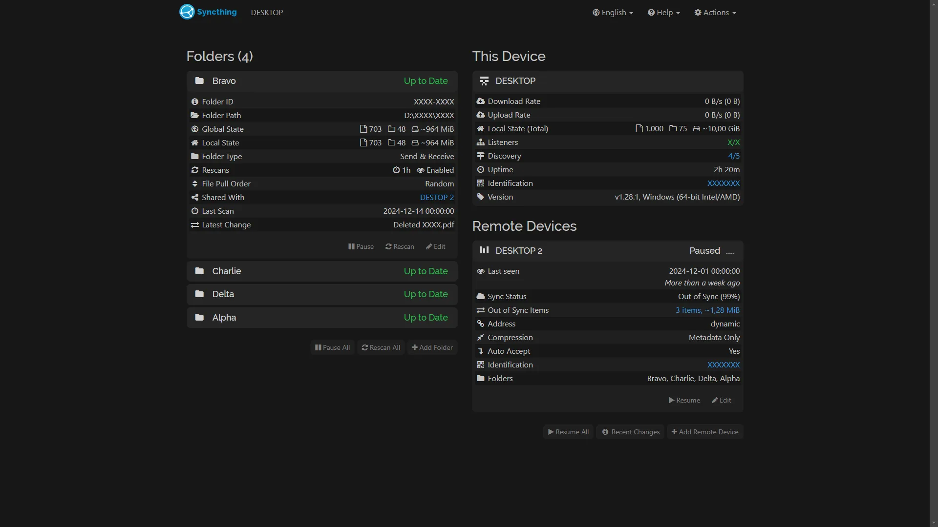
A sleek, modern dark theme with deep charcoal and black, smooth grey accents, and smooth curves, offering readability and comfort for nighttime browsing.
Syncthing Modern Dark by GDKAYKY
Details
AuthorGDKAYKY
LicenseCC Zero
Categoryhttp://127.0.0.1
Created
Updated
Code size5.2 kB
Code checksum47eeb513
Statistics
Learn how we calculate statistics in the FAQ.
Failed to fetch stats.
Description
Notes
Userstyle doesn't have notes.Source code
/* ==UserStyle==
@name         Syncthing Modern Dark
@version      12.27.2024
@namespace    https://userstyles.world/user/Kayky
@description  A sleek, modern dark theme with deep charcoal and black, vibrant neon accents, and smooth gradients, offering readability and comfort for nighttime browsing.
@author       Kayky
@license      CC0-1.0
==/UserStyle== */

@-moz-document url-prefix("https://127.0.0.1"), url-prefix("http://127.0.0.1"), url-prefix("127.0.0.1") {
body {
        color: #c4c4c4 !important;
        background-color: #141414 !important;
  }
  a:hover,a:focus,a.focus{
        outline: none !important;
  }


  /* navbar */
  .navbar {
        background-color: #141414 !important;
        border-width: 0px !important;
  }
  .navbar-text, .dropdown>a, .dropdown-menu>li>a, .hidden-xs>a, .navbar-link {
        color: #aaa !important;
  }
  .navbar-brand {
        margin-left: 0;
        padding-left: 0;
  }

  .dropdown-menu {
        border-width: 0px !important;
        border-radius: 8px !important;
        top: calc(100% + 10px);
	    background-color: #202020 !important;
  }
  .dropdown-menu>li>a:hover, .dropdown-menu>li>a:focus {
        color: #000 !important;
        border-radius: 8px !important;
	      background-color: #d1d1d1 !important;
  }
  .open>.dropdown-toggle, .dropdown-toggle:hover {
        border-color: #181818 !important;
	      background-color: #222 !important;
  }
  .divider {
        height: 0px !important;
  }
  li.hidden-xs:hover, .navbar-link:hover, .navbar-link:focus {
        outline: none !important;
        border-color: #333 !important;
	      background-color: #222 !important;
  }
  .dropdown-menu>.active>a {
        color: #000 !important;
        border-radius: 8px !important;
        background-color: #d1d1d1 !important;
  }


  /* main panel */
  .panel {
        background-color: #1f1f1f !important;
        border-radius: 8px !important;
	      border-width: 0px !important;

  }
  .panel-default {
        border-color: #723030 !important;
        border-radius: 8px !important;

  }
  .panel-default>.panel-heading {
        color: #d4d4d4 !important;
	      border-color: #222 !important;
        border-radius: 8px !important;
        background-color: #252525 !important;
  }
  .panel-footer {
        background-color: #1f1f1f !important;
        border-radius: 8px !important;
	      border-width: 0 !important;
  }
  .table-striped>tbody>tr:nth-of-type(odd) {
	      background-color: #161717 !important;
          border-radius: 8px !important;
  }
  .panel-group .panel-heading+.panel-collapse>.panel-body, .panel-group .panel-heading+.panel-collapse>.list-group {
	      border-top: 1px solid #222 !important;
   }
  .identicon>rect {
        fill: #d4d4d4 !important;
  }


  /* buttons */
  .btn {
        border-radius: 8px !important;
        border-width: 0px !important;
  }
  .btn:hover, .btn:focus, .btn.focus {
        outline: none !important;
  }
  .btn-default {
        color: #808080 !important;
        background-color: #202020 !important;
  }
  .btn-default:hover, .btn-default:focus, .btn-default.focus {
        color: #000 !important;
        background-color: #d4d4d4 !important;
  }
  .btn-primary {
        background-color: #217dbb !important;
  }
  .btn-primary:hover, .btn-primary:focus, .btn-primary.focus {
        background-color: #3498db !important;
  }
  .btn-warning {
        background-color: #c29d0b !important;
  }
  .btn-warning:hover, .btn-warning:focus, .btn-warning.focus {
        background-color: #f1c40f !important;
  }
  .btn-danger {
        background-color: #d62c1a !important;
  }
  .btn-danger:hover, .btn-danger:focus, .btn-danger.focus {
        background-color: #e74c3c !important;
  }


  /* modal dialogs */
  .modal-header {
        border-color: #222 !important;
        background-color: #222;
  }
  .modal-content {
        border-color: #666 !important;
        border-width: 2px !important;
        background-color: #111 !important;
  }
  .modal-footer {
        border-color: #111 !important;
        background-color: #111 !important;
  }
  .alert-warning {
        background-color: #c29d0b !important;
  }
  .alert-danger {
        background-color: #d62c1a !important;
  }
  .help-block {
        color: #aaa !important;
  }
  .form-control {
        color: #aaa !important;
        border-color: #444 !important;
	      background-color: black !important;
  }
  code.ng-binding{
        color: #f99 !important;
        background-color: #444 !important;
  }
  .well, .form-control[readonly="readonly"] { /* read-only fields*/
        color: #444 !important;
        border-color: #444 !important;
	      background-color: #111 !important;
  }


  /* buttons for pagination */
  .pagination>li>a, .pagination>li>span {
        background-color: #333 !important;
        border-color: #484848 !important;
  }
  .pagination>li>a:hover, .pagination>li>a:focus, .pagination>li>a.focus {
        background-color: #484848 !important;
  }

}