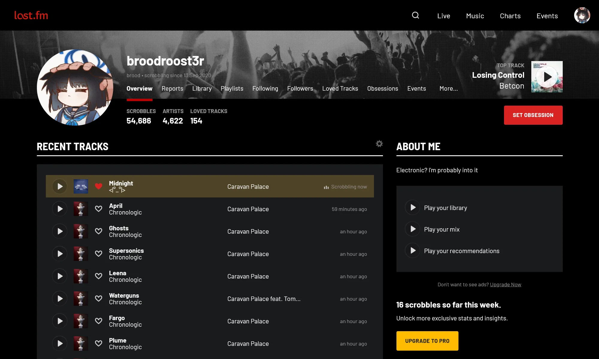
dark style inspired by/in the style of the new listening report page
black last.fm by rumpff
Details
Authorrumpff
LicenseNo License
Categorylast.fm
Created
Updated
Size20 kB
Statistics
Learn how we calculate statistics in the FAQ.
Failed to fetch stats.
Description
Notes
Compatible with no pro ads
Source code
Source code has over 10K characters, so we truncated it. You can inspect the full source code on install link./* ==UserStyle==
@name black last.fm
@namespace github.com/openstyles/stylus
@version 1.0.7
@description style inspired by the new listening report page
@author broodroost3r
@preprocessor stylus
@var checkbox useNewFont "Use the new condensed headers" 1
@var checkbox useCustomAnimations "Custom Animations" 1
==/UserStyle== */
@-moz-document regexp("^https?://(www\\.)?last\\.fm/(?!user/[^/]+/listening-report).*") {
:root {
--color-background: #000
--color-main-red: #d92323;
--color-text: #fafafa
--color-text-secondary: #999;
--color-highlight: #4E4427;
--color-thin-divider: #ebebeb33
}
/* Font overrides */
if useNewFont {
h2,
.section-controls h3,
.section-with-separator > h3 {
font-family: Barlow Semi Condensed, Open Sans, Lucida Grande, Helvetica Neue, Helvetica, Arial, Sans-serif !important;
text-transform: uppercase;
}
}
/* else {
h1,
h2,
h3,
h4,
h5,
h6 {
/* remove uppercase from reports for consistency *
text-transform: none !important;
}
} */
/* main text color */
body,
.header-info-secondary,
.btn-secondary,
.recs-feed-inner-wrap .context,
.shout-user a,
legend,
.header-follower-btn {
color: var(--color-text) !important;
}
a {
color: #5da7e6;
}
.header--overview,
.adaptive-skin-container,
.page-content,
.section-with-separator::after {
background-color: var(--color-background);
}
.btn-secondary {
background-color: #222;
}
.btn-secondary:hover {
background-color: #282828 !important;
}
.btn-shortcut {
color: #ccc;
box-shadow: inset 0 0 0 1px rgba(174, 174, 174, .6);
}
.btn-shortcut:hover {
color: #fff !important;
box-shadow: inset 0 0 0 1px rgba(255, 255, 255, .6) !important;
}
.btn-shortcut::before {
filter: invert(.78)
}
.subscribe-cta {
color: var(--color-background);
}
/* spinner */
.loading,
.data-loading {
filter: invert(1);
}
/* play icons */
.chartlist-play-button:before,
.recs-feed-playlink:before,
.stationlink:before,
.section-playlink:before {
filter: invert(1);
background-color: hsla(180, 8%, 90%, .23) !important;
/* box-shadow: inset 0 0 0 2px #000 !important;
/* border */
}
.chartlist-play-button:hover:before,
.recs-feed-playlink:hover:before,
.stationlink:hover:before,
.section-playlink:hover:before {
filter: invert(1);
background-color: #26dcdcff !important;
/* box-shadow: inset 0 0 0 2px #26dcdc !important;
/* border */
}
/* icon buttons */
.share-button-profile,
.section-settings-toggle,
.dropdown-menu-clickable-button,
.playlisting-playlists-edit-icon:before,
.pagination-next a:before,
.pagination-previous a:before {
filter: invert(.87);
}
/* blue alert box */
.alert-info {
background-color: #32363d;
}
/* table */
.responsive-table tr {
box-shadow: inset 0 -1px #222;
}
.responsive-table tr:nth-child(2n) td {
background-color: #222;
}
.responsive-table td,
.responsive-table th {
box-shadow: inset 0 -2px #222;
}
/* dropdown menus */
.dropdown-menu-clickable {
background: var(--color-background);
box-shadow: 0 1px 10px rgba(46, 46, 46, .3),0 0 0 1px rgb(72, 72, 72);
}
.dropdown-menu-clickable:before {
filter: invert(1)
}
.dropdown-menu-clickable-item {
color: #fff
}
.dropdown-menu-clickable-item:hover {
color: #fff;
background: #222 !important;
}
.dropdown-menu-clickable-item--selected {
color: var(--color-main-red)
}
.dropdown-menu-clickable-item--selected:hover {
color: var(--color-main-red)
}
/* default track/album/artist/user image */
img[src$="4128a6eb29f94943c9d206c08e625904.jpg"],
img[src$="c6f59c1e5e7240a4c0d427abd71f3dbb.jpg"],
img[src$="2a96cbd8b46e442fc41c2b86b821562f.jpg"],
img[src$="818148bf682d429dc215c1705eb27b98.png"] {
filter: invert(.9);
}
/* chartlist bar */
.chartlist-count-bar-slug {
background-color: #431e16;
}
a:hover .chartlist-count-bar-slug,
a:focus .chartlist-count-bar-slug {
background-color: #7c2917 !important;
}
/* arrow icon */
.chartlist-row:hover a .chartlist-count-bar-value::after {
filter: invert(1);
}
textarea,
input {
background-color: #1a1b1e !important;
padding: 4px 8px !important;
color: #fff !important;
}
/* alert box */
.alert-warning {
background-color: #361501 !important;
}
/* user page */
.col-main * h2,
.col-sidebar * h2,
.section-controls h3,
.section-with-separator > h3 {
margin-left: 0px !important;
border-bottom: 2px solid #fafafa;
font-size: 24px;
font-weight: 700;
line-height: 30px;
line-height: 42px;
}
.content-top * {
background-color: var(--color-background) !important;
}
.content-top:after {
border: none !important;
}
/* "your progess" tabs */
.your-progress-component .buffer-2 .tab-container {
background: #262626;
}
.your-progress-component .buffer-2 .tab-container .selector {
background: #484848;
}
/* "your progess" bars */
.your-progress-chart .highcharts-container .highcharts-root .highcharts-series-group .highcharts-series-0 .highcharts-point {
fill: var(--color-main-red);
stroke: var(--color-main-red);
}
.your-progress-chart .highcharts-container .highcharts-root .highcharts-series-group .highcharts-series-1 .highcharts-point {
fill: #444;
stroke: #444;
}
.your-progress-label-position {
fill: #fff;
}
.your-progress-component .buffer-3 .description {
color: #666;
}
/* more... popup */
.navlist-hidden-list:before {
filter: invert(0.87);
}
.navlist-hidden-list {
background: #1a1b1e;
border: 2px solid #393b42;
}
.navlist-hidden-list a {
color: #fff !important;
}
.navlist-hidden-list a:hover {
background: #3d3e44 !important;
}
.chartlist {
background: #1a1b1e !important;
padding: 24px 20px;
}
.chartlist-row:after {
border: none;
}
.chartlist-row:hover {
background: #2c2e31;
}
.chartlist-row--highlight,
.chartlist-row--now-scrobbling {
background-color: var(--color-highlight);
}
.chartlist-row--highlight:hover,
.chartlist-row--now-scrobbling:hover {
background-color: #726338;
}
.stationlinks {
background: #1a1b1e;
padding: 24px 20px;
}
.stationlink:after {
border: none !important;
}
.listening-report-promo {
background-color: var(--color-background) !important;
border: 1px solid #202020 !important;
}
.listening-report-promo:hover {
background-color: #1e1e1f !important;
}
/* arrow after date */
.listening-report-promo-date::after {
filter: none !important;
}
#report-promo-animation-target-week--desktop svg g g g:nth-child(2n) path,
#report-promo-animation-target-week--mobile svg g g g:nth-child(2n) path,
{
fill: #742e30 !important;
}
#report-promo-animation-target-week--desktop svg g g g:nth-child(n + 9) path,
#report-promo-animation-target-week--mobile svg g g g:nth-child(n + 9) path,
{
fill: #ffacac !important;
stroke: #ffacac !important;
}
/* charts */
.two-column-layout .container {
background: none;
}
.globalchart-item {
background-color: var(--color-background);
box-shadow: 0 1px var(--color-thin-divider), inset 0 -1px #191919 !important;
}
.globalchart-item:first-child {
background: rgba(0, 0, 0, .5);
color: #fff;
margin-top: -48px;
}
/* user libary */
.highcharts-axis-labels text {
fill: #fff !important;
}
.highcharts-background {
fill: var(--color-background);
}
.highcharts-bar-series a rect {
fill: rgba(255, 82, 82, .68)
}
.metadata-title {
font-size: 14px !important;
font-weight: 700;
line-height: 18px !important;
border-bottom: none !important;
color: var(--color-text-secondary);
}
.date-heading {
color: var(--color-text);
}
/* user playlists */
.playlisting-create-option {
background: #1a1b1e;
border: 2px solid #393b42;
}
.playlisting-create-option:hover {
border-color: #5f6371;
box-shadow: 0 3px 9px 0 #393b42;
}
.playlisting-playlist-author-name {
color: #fff !important;
}
/* user events */
.events-list-anhv1 td:first-child {
padding-left: 20px;
padding-bottom: 20px;
}
.events-list-anhv1 td,
.events-list-anhv1 th {
box-shadow: inset 0 -1px #1a1b1e;
padding: 6px 10px;
background: #1a1b1e !important;
}
/* inbox */
.inbox-notifications__item * {
border: none !important;
}
.inbox-notifications__item--hover {
box-shadow: inset 0 -1px #131313 !important;
}
.inbox-notifications__item--highlight {
background-color: #1f2737 !important;
box-shadow: inset 0 -1px #ebebeb99;
}
.inbox-notifications .inbox-notifications__item--hover:hover {
background-colo...