A dark theme for UCA's Campus Virtual.
Dark UCA by warbacon
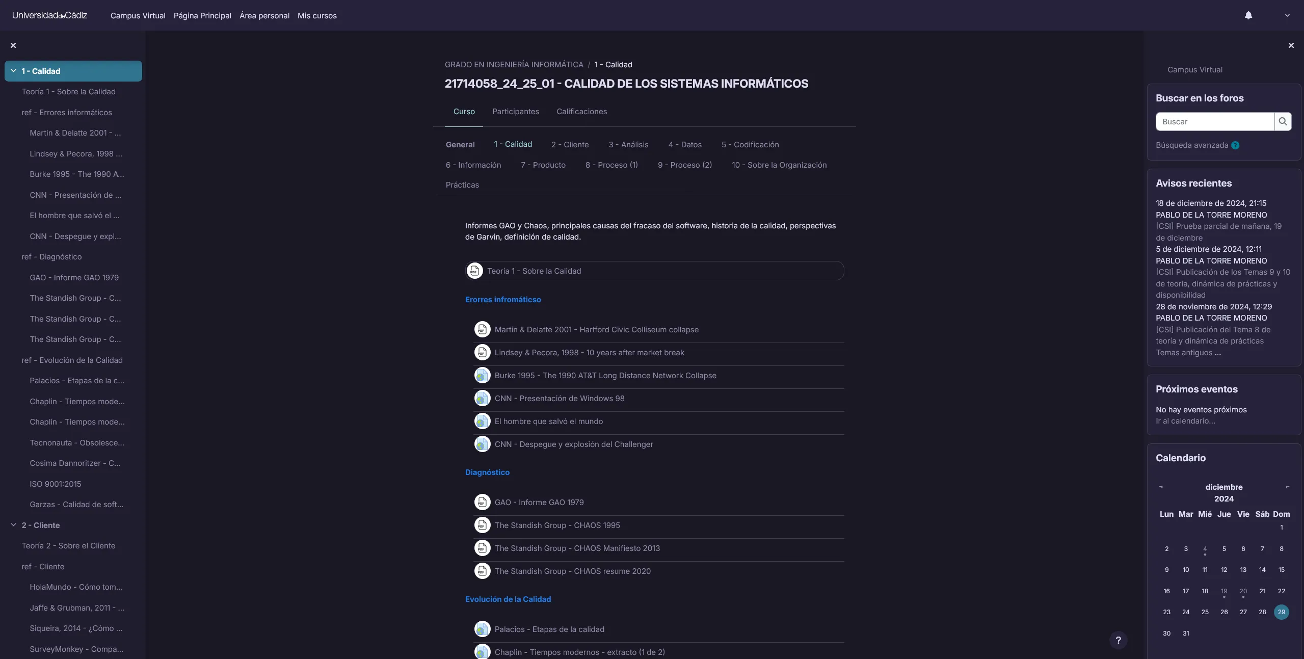
Details
Authorwarbacon
LicenseMIT
Categoryuca.es
Created
Updated
Code size20 kB
Code checksum2a6ac7bc
Statistics
Learn how we calculate statistics in the FAQ.
Failed to fetch stats.
Description
Notes
Userstyle doesn't have notes.Source code
Source code has over 10K characters, so we truncated it. You can inspect the full source code on install link./* ==UserStyle==
@name Dark UCA
@version 20241229.18.39
@namespace https://userstyles.world/user/Warbacon
@description A dark theme for UCA's Campus Virtual.
@author Warbacon
@license MIT
==/UserStyle== */
@-moz-document regexp("https://av.*\\.uca\\.es/moodle/.*") {
@import url('https://fonts.googleapis.com/css2?family=Inter:ital,opsz,wght@0,14..32,100..900;1,14..32,100..900&display=swap');
:root {
/* Base theme */
--rp-base: #191724;
--rp-surface: #1f1d2e;
--rp-overlay: #26233a;
--rp-muted: #6e6a86;
--rp-subtle: #908caa;
--rp-text: #e0def4;
--rp-love: #eb6f92;
--rp-gold: #f6c177;
--rp-rose: #ebbcba;
--rp-pine: #31748f;
--rp-foam: #9ccfd8;
--rp-iris: #c4a7e7;
--rp-highlight-low: #21202e;
--rp-highlight-med: #403d52;
--rp-highlight-high: #524f67;
/* Moon theme */
--rp-moon-base: #232136;
--rp-moon-surface: #2a273f;
--rp-moon-overlay: #393552;
--rp-moon-muted: #6e6a86;
--rp-moon-subtle: #908caa;
--rp-moon-text: #e0def4;
--rp-moon-love: #eb6f92;
--rp-moon-gold: #f6c177;
--rp-moon-rose: #ea9a97;
--rp-moon-pine: #3e8fb0;
--rp-moon-foam: #9ccfd8;
--rp-moon-iris: #c4a7e7;
--rp-moon-highlight-low: #2a283e;
--rp-moon-highlight-med: #44415a;
--rp-moon-highlight-high: #56526e;
/* Dawn theme */
--rp-dawn-base: #faf4ed;
--rp-dawn-surface: #fffaf3;
--rp-dawn-overlay: #f2e9e1;
--rp-dawn-muted: #9893a5;
--rp-dawn-subtle: #797593;
--rp-dawn-text: #575279;
--rp-dawn-love: #b4637a;
--rp-dawn-gold: #ea9d34;
--rp-dawn-rose: #d7827e;
--rp-dawn-pine: #286983;
--rp-dawn-foam: #56949f;
--rp-dawn-iris: #907aa9;
--rp-dawn-highlight-low: #f4ede8;
--rp-dawn-highlight-med: #dfdad9;
--rp-dawn-highlight-high: #cecacd;
--dark: var(--rp-text);
color-scheme: dark;
}
::selection {
background: rgba(49, 116, 143, 0.5);
}
/* Base elements */
body,
.main-inner,
#region-main,
.secondary-navigation .navigation,
.moremenu .nav-tabs,
.table {
background-color: var(--rp-base) !important;
color: var(--rp-text) !important;
font-family: Inter Variable, Inter, -apple-system, BlinkMacSystemFont, "Segoe UI", sans-serif;
}
/* Borders */
hr {
border-top-color: var(--rp-highlight-med);
}
/* Tables */
.table th,
.table td {
border-color: var(--rp-highlight-med) !important;
}
/* Notifications */
.preferences-container .preference-table,
.notification-area,
.notification-area .control-area {
border-color: var(--rp-highlight-med) !important;
}
/* User report */
.path-grade-report-user .user-grade th.category a.toggle-category i,
.grade-report-user .user-grade th.category a.toggle-category i {
color: var(--rp-text);
}
.path-grade-report-user .user-report-container,
.grade-report-user .user-report-container,
.path-grade-report-user .user-grade thead th,
.grade-report-user .user-grade thead th,
.path-grade-report-user .user-grade td,
.path-grade-report-user .user-grade .baggt,
.path-grade-report-user .user-grade .baggb,
.grade-report-user .user-grade .baggt,
.grade-report-user .user-grade .baggb {
background-color: var(--rp-surface);
}
.path-grade-report-user .user-grade th.category,
.grade-report-user .user-grade th.category,
.path-grade-report-user .user-grade th.column-itemname:not(.header,
.category,
.baggt,
.baggb),
.grade-report-user .user-grade th.column-itemname:not(.header,
.category,
.baggt,
.baggb),
.path-grade-report-user .user-grade td.item,
.grade-report-user .user-grade td.item {
background-color: var(--rp-base);
border: 1px solid var(--rp-highlight-low);
}
/* Navigation */
.navbar.fixed-top {
border-bottom: none;
background-color: var(--rp-overlay);
& .divider {
background-color: var(--rp-highlight-med);
}
}
.primary-navigation .navigation .nav-link {
color: inherit !important;
border-top: 5px solid transparent;
&:hover,
&:focus {
color: inherit !important;
border-top: 5px solid var(--rp-text) !important;
}
}
.primary-navigation .navigation .nav-link.active {
color: inherit !important;
border-top: 5px solid var(--rp-text) !important;
border-bottom: none !important;
}
.navbar-light .navbar-nav .nav-link {
color: var(--rp-text);
}
/* Drawer */
.drawer {
background-color: var(--rp-surface);
}
/* Card */
.card {
background-color: var(--rp-overlay);
border: 1px solid var(--rp-highlight-med);
}
.card-footer {
border-color: var(--rp-highlight-med);
}
/* Calendar */
.maincalendar .calendarmonth td.today .day-number-circle {
color: var(--rp-text);
background-color: var(--rp-pine);
}
@media (min-width: 768px) {
section:not(#region-main) .block.block_calendar_month .maincalendar .calendartable.calendarmonth td.clickable:not(.today):hover .day-number-circle {
background-color: var(--rp-highlight-high);
}
}
/* Course index */
.courseindex .courseindex-item {
.courseindex-link,
.courseindex-chevron {
color: var(--rp-subtle);
&:hover {
color: var(--rp-text) !important;
}
}
&:hover,
&:focus {
.courseindex-link,
.courseindex-chevron {
color: var(--rp-text) !important;
}
}
&.pageitem {
background-color: var(--rp-pine);
&:hover {
background-color: var(--rp-dawn-pine);
}
}
}
.courseindex .courseindex-item.dimmed .courseindex-link,
.courseindex .courseindex-item.dimmed .courseindex-chevron {
color: var(--rp-muted);
}
/* Lists */
.list-group-item {
color: var(--rp-text) !important;
border: none;
background-color: var(--rp-surface);
&-action:hover,
&-action:focus {
background-color: var(--rp-overlay);
}
&.active {
background-color: var(--rp-pine) !important;
}
}
.list-group-item-action:hover,
.list-group-item-action:focus,
.list-group-item-action:active {
background-color: var(--rp-overlay);
}
/* Course content */
#frontpage-available-course-list .coursebox,
#frontpage-course-list .coursebox,
.course-search-result .coursebox {
border: 1px solid var(--rp-highlight-med);
}
.description .course-description-item {
background-color: var(--rp-surface);
}
/* Personal calendar */
.maincalendar .calendarmonth .clickable:hover {
background-color: var(--rp-highlight-med);
}
/* My courses */
.card.block_myoverview {
background-color: var(--rp-base);
}
.block .block-cards {
span.categoryname,
.btn-link {
color: var(--rp-text);
}
}
/* Calendar events */
.calendar_event_course {
background-color: var(--rp-rose);
color: var(--rp-base);
}
.modal-content {
background-color: var(--rp-base);
border: 1px solid var(--rp-highlight-med);
}
.modal-footer {
border-color: var(--rp-highlight-med);
}
/* Profile editor */
.mform fieldset {
border-color: var(--rp-highlight-med);
}
/* Popovers */
.popover,
.popover-header {
background-color: var(--rp-overlay) !important;
color: var(--rp-text) !important;
border: 1px solid var(--rp-highlight-med);
}
.popover-header {
border-bottom: 1px solid var(--rp-highlight-med);
}
.popover-body {
color: var(--rp-text) !important;
}
.bs-popover-top > .arrow::after,
.bs-popover-auto[x-placement^="top"] > .arrow::after {
border-top-color: var(--rp-overlay) !important;
}
.popover-region-container {
border-color: var(--rp-highlight-med);
background-color: var(--rp-overlay);
}
.popover-region-header-container {
border-color: var(--rp-highlight-med);
}
.popover-region-footer-container {
border-color: var(--rp-highlight-med);
background-color: transparent;
color: var(--rp-text);
}
.popover-region-toggle::before,
.popover-region-toggle::after {
border-bottom: 10px solid var(--rp-highlight-med);
}
/* Links */
a,
a:hover {
color: var(--rp-subtle);
}
a:not([class]):focus,
.aalink:focus {
background-color: var(--rp-highlight-med);
color: var(--rp-text);
box-shadow: none;
}
/* Blockquote */
blockquote {
color: var(--rp-subtle);
border-color: var(--rp-text);
}
/* Navigation tabs */
.secondary-navigation .navigation {
border-bottom: 1px solid var(--rp-highlight-med);
}
.nav-tabs {
border-bottom: 1px solid var(--rp-highlight-med);
.nav-link.active {
background-color: transparent;
}
}
.secondary-navigation .nav-tabs {
.nav-link {
border: 1px solid transparent;
&:hover:not(.active) {
border-bottom: 1px solid var(--rp-highlight-med);
}
&.active {
border-bottom: 1px solid var(--rp-foam);
color: var(--rp-foam) ...