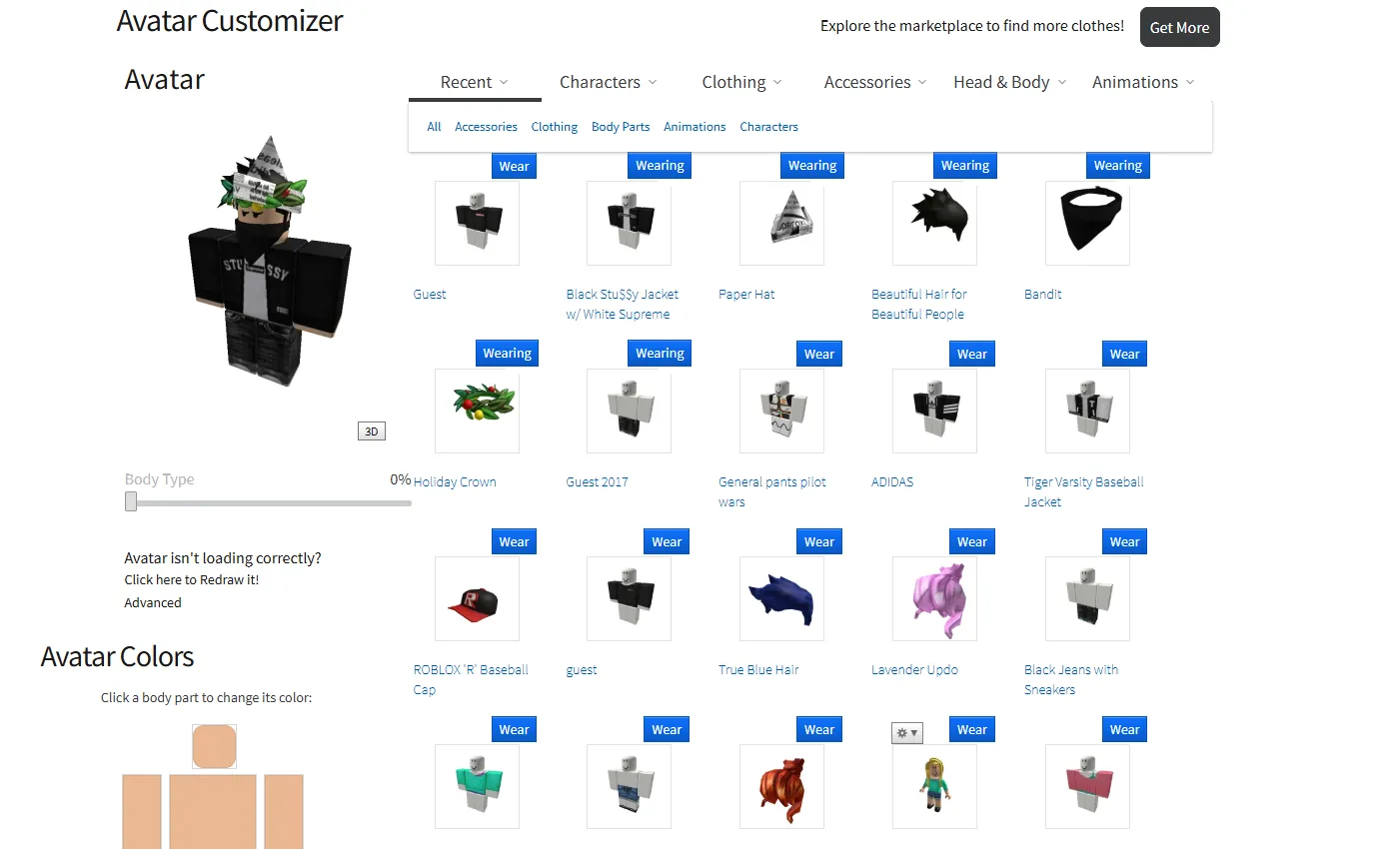
Roblox 2016 avatar editor
Roblox 2016 avatar editor by BLSROBL
Details
AuthorBLSROBL
LicenseNo License
Categoryroblox 2016
Created
Updated
Code size50 kB
Code checksum37011a6a
Statistics
Learn how we calculate statistics in the FAQ.
Failed to fetch stats.
Description
Notes
I'm keep working on this
Source code
Source code has over 10K characters, so we truncated it. You can inspect the full source code on install link./* ==UserStyle==
@name Roblox 2016 avatar editor
@namespace userstyles.world
@version 2.0.1
==/UserStyle== */
@-moz-document domain("userstyles.world") {
* {
color: crimson;
}
}
@-moz-document url-prefix("https://userstyles.world/docs/") {
h1, h2, h3 {
color: tan;
}
}
/* Avatar Editor */
@font-face { font-family: "Source Sans Pro"; src: local("Source Sans Pro Bold"), local("SourceSansPro-Bold"), url("http://themes.googleusercontent.com/static/fonts/sourcesanspro/v5/toadOcfmlt9b38dHJxOBGFkQc6VGVFSmCnC_l7QZG60.woff") format("woff"); font-style: normal; font-weight: 700; }
@font-face { font-family: "Source Sans Pro"; src: local("Source Sans Pro Semibold"), local("SourceSansPro-Semibold"), url("http://themes.googleusercontent.com/static/fonts/sourcesanspro/v5/toadOcfmlt9b38dHJxOBGJ6-ys_j0H4QL65VLqzI3wI.woff") format("woff"); font-style: normal; font-weight: 600; }
@font-face { font-family: "Source Sans Pro"; src: local("Source Sans Pro"), local("SourceSansPro-Regular"), url("http://themes.googleusercontent.com/static/fonts/sourcesanspro/v5/ODelI1aHBYDBqgeIAH2zlBM0YzuT7MdOe03otPbuUS0.woff") format("woff"); font-style: normal; font-weight: 400; }
.items-list .item-card .item-card-menu.active {
width: 125px;
background-color: #EFEFEF;
border: 1px solid #777;
border-radius: 0;
font: 12px normal Arial,Helvetica,sans-serif;
height: 94px;
position: absolute;
top: 152px;
left: -7px;
text-align: left;
z-index: 1000;
padding: 0px 0;
}
.items-list .item-card .item-card-menu button:not(:hover) {
background-image: none !important;
display: block;
font-family: Arial;
font-size: 12px;
height: 23px;
text-align: left;
text-decoration: none;
color: black !important;
padding: 0px 8px;
margin: 0;
}
.items-list .item-card .item-card-menu button:hover {
background-color: #d8d8d8;
width: 123px;
position: relative;
}
.items-list .item-card .item-card-menu button {
background-image: none;
background-color: transparent;
border: 0;
font-family: Arial;
font-size: 12px;
height: 23px;
text-align: left;
margin: 0;
padding: 0px 8px;
width: 125px;
}
/* Old Font */
*
{
font-family: "Source Sans Pro", Arial,Helvetica,sans-serif !important;
}
/* ~/CSS/Fonts/SourceSansPro-Google.css */
@font-face {
font-family: 'Source Sans Pro';
font-style: normal;
font-weight: 300;
src: local('Source Sans Pro Light'), local('SourceSansPro-Light'),
url(https://fonts.gstatic.com/s/sourcesanspro/v9/toadOcfmlt9b38dHJxOBGMVNtom4QlEDNJaqqqzqdSs.woff) format('woff');
}
@font-face {
font-family: 'Source Sans Pro';
font-style: normal;
font-weight: 400;
src: local('Source Sans Pro'), local('SourceSansPro-Regular'), url(https://fonts.gstatic.com/s/sourcesanspro/v9/ODelI1aHBYDBqgeIAH2zlNHq-FFgoDNV3GTKpHwuvtI.woff) format('woff');
}
@font-face {
font-family: 'Source Sans Pro';
font-style: normal;
font-weight: 600;
src: local('Source Sans Pro Semibold'), local('SourceSansPro-Semibold'), url(https://fonts.gstatic.com/s/sourcesanspro/v9/toadOcfmlt9b38dHJxOBGCmgpmuQqK2I-L2S9cF65Ek.woff) format('woff');
}
/* Character Customizer */
html {
background-color: #fff;
}
.text-label {
color: #B8B8B8 !important;
font-weight: 400;
}
div#container-main {
background: #fff !important;
}
.light-theme .content {
background-color: #fff;
color: #191919;
}
thumbnail-2d.item-card-thumb.ng-isolate-scope {
width: 58% !important;
}
.items-list .item-card .item-card-name {
display: inline-block;
max-width: 100%;
color: #0055B3;
font-weight: 400;
}
.items-list .item-card .item-card-thumb {
min-height: 84%;
position: relative;
top: 2px;
border-radius: 0px;
left: 21px;
cursor: default;
}
.items-list.avatar-item-list .item-card.six-column {
width: 16.6%;
margin-right: 20px;
}
.avatar-editor-header h1 {
display: inline-block;
font-weight: 1000;
letter-spacing: -1px;
line-height: 32px;
font-size: 0;
}
.items-list .item-card .item-card-thumb-container::before {
display: inline-block !important;
width: auto !important;
content: "Wear";
font-size: 14px;
cursor: pointer;
text-align: center;
color: #fff;
border: 1px solid #0852b7;
background-color: #0852b7 !important;
background-image: url(http://static.rbxcdn.com/images/Buttons/StyleGuide/bg-btn-blue.png) !important;
padding: 1px 7px 0px;
border-radius: 0px;
visibility: visible !important;
background-position: left -96px !important;
position: relative;
left: 79px;
transition: none;
opacity: 1 !important;
}
.items-list .item-card .item-card-equipped::before {
display: inline-block !important;
width: auto !important;
content: "Remove";
font-size: 14px;
cursor: pointer;
text-align: center;
height: 26.781px !important;
color: #fff;
border: 1px solid #0852b7;
background-color: #0852b7;
background-image: url(http://static.rbxcdn.com/images/Buttons/StyleGuide/bg-btn-blue.png);
padding: 1px 7px 0px;
vertical-align: middle;
background-position: left -96px;
position: relative;
left: 62px;
top: -1px;
}
.light-theme .item-card-container .item-card-equipped {
height: 127px;
border: none;
background-color: #0000 !important;
}
.items-list .item-card .item-card-name {
display: inline-block;
max-width: 100%;
color: #0055B3;
font-weight: 400;
font-size: 14px;
}
.items-list .item-card .item-card-thumb-container {
position: relative;
box-sizing: border-box;
width: 126px;
height: 126px;
cursor: default;
background: #0000;
}
#avatar-container > div > div > div.left-wrapper-placeholder > div > div.section-content.remove-panel::before {
content: "Avatar";
font-size: 26px;
font-weight: 400;
margin-left: -11px;
}
.avatar-thumbnail {
width: 352px;
height: 352px;
left: -37px;
visibility: visible;
position: relative;
}
.light-theme .avatar-back {
visibility: hidden;
}
span.toggle-three-dee.btn-control.btn-control-small.ng-binding:hover {
background-position: bottom !important;
}
span.toggle-three-dee.btn-control.btn-control-small.ng-binding {
background-image: url(https://static.rbxcdn.com/images/StyleGuide/btn-control-small-tile.png) !important;
padding: 0 6px !important;
line-height: 1.428 !important;
font-size: 12px;
border-color: #777;
min-height: 0px;
border-radius: 0px;
}
.light-theme .pill-toggle {
background-color: #ffffff;
}
.light-theme .pill-toggle input:checked+label {
background-color: #00aff2;
}
.light-theme .layer {
background-color: #ffffff;
}
span.text-overflow.font-caption-body.ng-binding.ng-scope.text-robux-tile {
display: none;
}
.text-overflow.item-card-creator.recommended-creator.ng-scope {
display: none;
}
.light-theme .item-card-container .item-card-name {
margin-bottom: 4px;
max-height: 45px;
height: auto;
font-size: 14px !important;
color: #0055B3;
}
.light-theme .item-card .item-card-thumb-container:before {
background: #0000;
}
.light-theme .item-card-container .item-card-thumb-container {
border: 0;
background-color: #0000;
border-color: #fff;
}
.light-theme .thumbnail-2d-container {
background: #0000 !important;
}
.icon-settings-16x16 {
background-position: 0 0px;
background-image: url(https://static.rbxcdn.com/images/BuildPage/btn-gear_sprite_27px.png) !important;
width: 100px;
height: 22px;
border-radius: 0;
z-index: 200;
}
.icon-settings-16x16:hover, a:hover .icon-settings-16x16, button:hover .icon-settings-16x16 {
background-position: 0 -21.5px;
}
.left-wrapper, .left-wrapper-placeholder:before {
content: "Avatar";
padding: 5px 5px 0 8px;
height: 34px;
width: 300px;
font-size: 30px;
color: #191919;
font-weight: normal;
display: block;
cursor: text;
line-height: 22px;
}
.avatar-editor-header h1 {
display: inline-block;
font-size: 0px;
}
.redraw-avatar {
display: flex;
flex-direction: column;
}
.redraw-avatar a[ng-click="redrawThumbnail()"]:before {
content: "Click here to "
}
.redraw-avatar a[ng-click="redrawThumbnail()"]:after {
content: " it!"
}
.redraw-avatar .text-link[ng-click="openAdvancedAccessories();"] {
margin-top: -12px;
}
.dark-theme .item-card .item-card-thumb-container::before {
border-radius: 0px;
}
thumbnail-2d[ng-class="\{\'shimmer\'\:avatarCallLimiter\.itemCardsDisabled\}"]{width:58%!important}.items-list .item-card .item-card-thumb{position:relative;top:2px;left:21px;cursor:default}.items-list.avatar-item-list .item-card.six-column{width:16.6%;margin-right:20px}.avatar-editor-header h1{display:inline-block;font-weight:1000;letter-spacing:-1px;line-height:32px;font-size:0}.items-list .item-card .item-card-thumb-container::before{display:inline-block!important;content:"Wear";font-size:14px;cursor:pointer;color:#fff;border:1px solid #0852b7;background-color:#0852b7!important;background-image:url(http://static.rbxcdn.com/images/Buttons/StyleGuide/bg-btn-blue.png)!important;padding:1px 7px 0;position:relative;left:78px;opacity:1!important}.items-list .item-card .item-card-name{color:#0055B3;font-size:14px}.light-theme .avatar-back{background:transparent}span.toggle-three-dee.btn-control.btn-control-small.ng-binding{background-image:url(https://static.rbxcdn.com/images/StyleGuide/btn-control-small-tile.png);padding:0 6px;line-height...