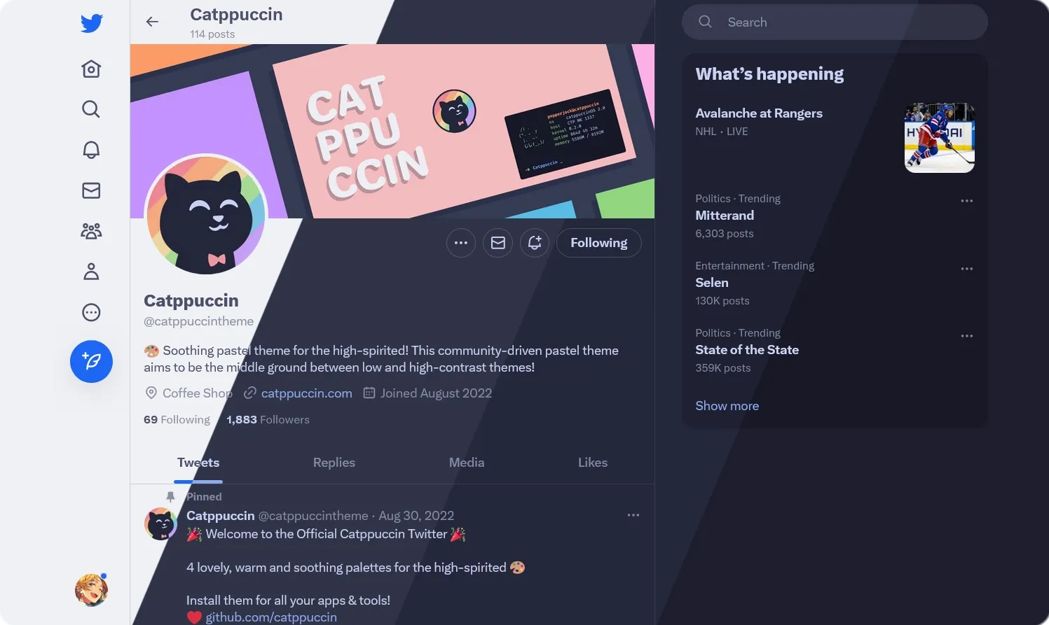
Catppuccin for X
Catppuccin for X(Twitter) by Monokii
Details
AuthorMonokii
LicenseMIT
CategoryX
Created
Updated
Code size28 kB
Code checksum7fed77e2
Statistics
Learn how we calculate statistics in the FAQ.
Failed to fetch stats.
Description
Notes
"Set Twitter's built-in theme to Lights out with the blue accent. Also requires the :has() selector."
Source code
Source code has over 10K characters, so we truncated it. You can inspect the full source code on install link./* ==UserStyle==
@name Twitter Catppuccin
@namespace github.com/catppuccin/userstyles/styles/twitter
@homepageURL https://github.com/catppuccin/userstyles/tree/main/styles/twitter
@version 2024.12.31
@supportURL https://github.com/catppuccin/userstyles/issues?q=is%3Aopen+is%3Aissue+label%3Atwitter
@description Soothing pastel theme for Twitter
@author Catppuccin
@license MIT
@preprocessor less
@var select lightFlavor "Light Flavor" ["latte:Latte*", "frappe:Frappé", "macchiato:Macchiato", "mocha:Mocha"]
@var select darkFlavor "Dark Flavor" ["latte:Latte", "frappe:Frappé", "macchiato:Macchiato", "mocha:Mocha*"]
@var select accentColor "Accent" ["rosewater:Rosewater", "flamingo:Flamingo", "pink:Pink", "mauve:Mauve*", "red:Red", "maroon:Maroon", "peach:Peach", "yellow:Yellow", "green:Green", "teal:Teal", "blue:Blue", "sapphire:Sapphire", "sky:Sky", "lavender:Lavender", "subtext0:Gray"]
@var checkbox colorizeLogo "Colorize Logo" 0
@var checkbox darkenShadows "Darken Shadows on Dark Themes" 1
==/UserStyle== */
@-moz-document domain("twitter.com"), domain("x.com") {
:root {
@media (prefers-color-scheme: light) {
#catppuccin(@lightFlavor);
}
@media (prefers-color-scheme: dark) {
#catppuccin(@darkFlavor);
}
}
#catppuccin(@flavor) {
@rosewater: @catppuccin[@@flavor][@rosewater];
@flamingo: @catppuccin[@@flavor][@flamingo];
@pink: @catppuccin[@@flavor][@pink];
@mauve: @catppuccin[@@flavor][@mauve];
@red: @catppuccin[@@flavor][@red];
@maroon: @catppuccin[@@flavor][@maroon];
@peach: @catppuccin[@@flavor][@peach];
@yellow: @catppuccin[@@flavor][@yellow];
@green: @catppuccin[@@flavor][@green];
@teal: @catppuccin[@@flavor][@teal];
@sky: @catppuccin[@@flavor][@sky];
@sapphire: @catppuccin[@@flavor][@sapphire];
@blue: @catppuccin[@@flavor][@blue];
@lavender: @catppuccin[@@flavor][@lavender];
@text: @catppuccin[@@flavor][@text];
@subtext1: @catppuccin[@@flavor][@subtext1];
@subtext0: @catppuccin[@@flavor][@subtext0];
@overlay2: @catppuccin[@@flavor][@overlay2];
@overlay1: @catppuccin[@@flavor][@overlay1];
@overlay0: @catppuccin[@@flavor][@overlay0];
@surface2: @catppuccin[@@flavor][@surface2];
@surface1: @catppuccin[@@flavor][@surface1];
@surface0: @catppuccin[@@flavor][@surface0];
@base: @catppuccin[@@flavor][@base];
@mantle: @catppuccin[@@flavor][@mantle];
@crust: @catppuccin[@@flavor][@crust];
@accent: @catppuccin[@@flavor][@@accentColor];
color-scheme: if(@flavor = latte, light, dark);
::selection {
background-color: fade(@accent, 30%);
}
input,
textarea {
&::placeholder {
color: @subtext0 !important;
}
}
body.LightsOut {
--border-color: @surface0;
--color: @overlay1;
--color-emphasis: @text;
--hover-bg-color: @surface0;
// shadows
.r-qo02w8,
.r-15ce4ve {
@default-shadow:
fade(@text, 20%) 0 0 15px,
fade(@text, 15%) 0 0 3px 1px;
@black-shadow:
rgba(0, 0, 0, 0.4) 0 0 15px,
rgba(0, 0, 0, 0.35) 0 0 3px 1px;
box-shadow: @default-shadow;
& when (@darkenShadows = 1) {
box-shadow: if(@flavor = latte, @default-shadow, @black-shadow);
}
}
.r-1tbvlxk {
@default-shadow: drop-shadow(fade(@text, 25%) 1px -1px 1px);
@black-shadow: drop-shadow(rgba(0, 0, 0, 0.5) 1px -1px 1px);
filter: @default-shadow;
& when (@darkenShadows = 1) {
filter: if(@flavor = latte, @default-shadow, @black-shadow);
}
}
.r-1uusn97 {
@default-shadow:
fade(@text, 20%) 0 0 5px,
fade(@text, 15%) 0 1px 4px 1px;
@black-shadow:
rgba(0, 0, 0, 0.4) 0 0 5px,
rgba(0, 0, 0, 0.35) 0 1px 4px 1px;
box-shadow: @default-shadow;
& when (@darkenShadows = 1) {
box-shadow: if(@flavor = latte, @default-shadow, @black-shadow);
}
}
}
body,
.PageContainer,
#placeholder {
background-color: @base !important;
color: @text;
}
#ScriptLoadFailure span {
color: @text;
}
[style*="scrollbar-color: rgb(62, 65, 68) rgb(22, 24, 28)"] {
scrollbar-color: @accent transparent !important;
scrollbar-width: thin;
}
// bg color
[data-testid="primaryColumn"],
.r-kemksi {
background-color: @base;
}
// arrow on account switcher
.r-cqee49 {
color: @base;
}
// top nav bg color
.r-5zmot {
background-color: fade(@base, 75%);
}
// element hover (when on base)
.r-1hdo0pc,
.r-pjtv4k {
background-color: fade(@text, 10%);
}
// element active (when on base)
.r-11gmi9o {
background-color: fade(@text, 20%);
}
.r-1cuuowz {
background-color: fade(@text, 3%);
}
// text
.r-1nao33i {
color: @text;
}
// white text, seems to appear on accent colors
.r-jwli3a {
color: if(@flavor = latte, #fff, @crust);
// cw svg
&:has(
path[d="M3.693 21.707l-1.414-1.414 2.429-2.429c-2.479-2.421-3.606-5.376-3.658-5.513l-.131-.352.131-.352c.133-.353 3.331-8.648 10.937-8.648 2.062 0 3.989.621 5.737 1.85l2.556-2.557 1.414 1.414L3.693 21.707zm-.622-9.706c.356.797 1.354 2.794 3.051 4.449l2.417-2.418c-.361-.609-.553-1.306-.553-2.032 0-2.206 1.794-4 4-4 .727 0 1.424.192 2.033.554l2.263-2.264C14.953 5.434 13.512 5 11.986 5c-5.416 0-8.258 5.535-8.915 7.001zM11.986 10c-1.103 0-2 .897-2 2 0 .178.023.352.067.519l2.451-2.451c-.167-.044-.341-.067-.519-.067zm10.951 1.647l.131.352-.131.352c-.133.353-3.331 8.648-10.937 8.648-.709 0-1.367-.092-2-.223v-2.047c.624.169 1.288.27 2 .27 5.415 0 8.257-5.533 8.915-7-.252-.562-.829-1.724-1.746-2.941l1.438-1.438c1.53 1.971 2.268 3.862 2.33 4.027z"]
) {
color: @text;
}
}
// borders
.r-1kqtdi0,
.r-1roi411 {
border-color: @surface0;
}
.r-1igl3o0 {
border-bottom-color: @surface0;
}
.r-2sztyj {
border-top-color: @surface0;
}
.r-1aihyag {
border-right-color: @surface0;
}
.r-1wyyjkm {
border-left-color: @subtext0; // border when replying to a dm
}
// is this post relevant to you?
.r-1ccsd61,
.r-xzxzvz {
border-color: @surface2;
}
.r-gu4em3,
.r-1bnu78o,
.r-z32n2g, // search bar
.r-1m3jxhj {
background-color: @surface0;
}
// base color border
.r-1xc7w19 {
border-color: @base;
}
// active border for dms
.r-1pbtemp {
border-right-color: @accent;
}
// accent color borders
.r-vhj8yc {
border-color: @accent;
}
// magnifying glass in search bar
.r-1bwzh9t {
color: @overlay1;
}
// right side content
.r-g2wdr4 {
background-color: @mantle;
}
.r-14wv3jr {
border-color: @mantle;
}
// bg color accent
.r-l5o3uw {
background-color: @accent;
.r-jwli3a {
color: if(@flavor = latte, #fff, @crust);
}
}
// accent element when hovered
.r-1vtznih {
background-color: darken(@accent, 10%);
.r-jwli3a {
color: if(@flavor = latte, #fff, @crust);
}
}
.r-1peqgm7 {
background-color: fade(@accent, 10%);
}
// accent element when active
.r-yuvema {
background-color: darken(@accent, 15%);
.r-jwli3a {
color: if(@flavor = latte, #fff, @crust);
}
}
.r-r18ze4 {
background-color: fade(@accent, 20%);
}
// white elements when hovered
.r-jc7xae {
background-color: darken(@text, 4%);
}
// white elements when active
.r-6wtuen {
background-color: darken(@text, 8%);
}
// tooltips
.r-1pr99xn {
background-color: @surface1;
}
// new notifications
.r-1eltapf {
background-color: fade(@sapphire, 10%);
}
// polls
.r-eok2q2 {
background-color: fade(@accent, 60%);
}
// box shadow around active poll input box
.r-9cip40 {
box-shadow: @accent 0 0 0 1px;
}
// spaces
.r-1blqq69 {
border-color: @mauve;
}
// reactions on dms
.r-qazpri {
color: @overlay1;
}
@keyframes r-1wvy3k1 {
0% {
box-shadow: fade(@mauve, 40%) 0;
}
100% {
box-shadow: fade(@mauve, 0%) 0;
}
}
[style="background-image: linear-gradient(61.63deg, rgb(45, 66, 255) -15.05%, rgb(156, 99, 250) 104.96%);"] {
background-image: linear-gradient(
61.63deg,
@blue -15.05%,
@mauve 104.96%
) !important;
}
// tweet textbox placeholder
.draftjs-styles_0 .public-DraftEditorPlaceholder-root {
color: @overlay0;
}
// who can reply? bg
.r-rgqbpe {
background-color: fade(@blue, 10%);
}
// circles
.r-s224ru {
background-color: @green;
}
.r-h7o7i8 {
background-color: fade(@green, 10%);
}
// live indicator
.r-4nw3r4,
.r-1dgebii {
background-color: @red;
}
// live border
.r-b5kvu3 {
border-color: @red;
}
// red transparent bg (appears with "unfollow" hover)
.r-qqmkd0 {
background-color: fade(@red, 10%);
}
// red bg on hover
.r-12d83nn {
background-color: darken(@red, 10%);
}
// red bg when active
.r-oybae9 {
background-color: darken(@red, 15%);
}
.r-11mg6pl {
border-color: if(@flavor = latte, #fff, @crus...