kaleidawave.github.io
kaleidawave.github.io by doeixd
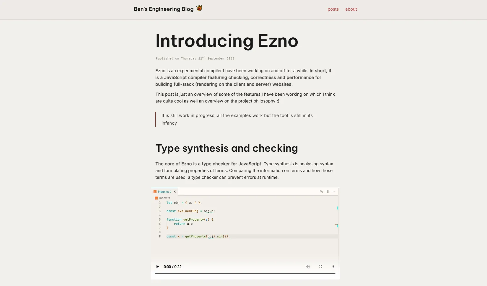
Details
Authordoeixd
LicenseNo License
Categorykaleidawave.github.io
Created
Updated
Code size6.5 kB
Code checksum53d3cde1
Statistics
Learn how we calculate statistics in the FAQ.
Failed to fetch stats.
Description
Notes
kaleidawave.github.io
Source code
/* ==UserStyle==
@name           kaleidawave.github.io
@namespace      github.com/openstyles/stylus
@version        1.0.0
@description    A new userstyle
@author         Me
==/UserStyle== */
@-moz-document domain("kaleidawave.github.io") {
    :root:not(.dark) {
        --subtle-border: hsl(43 18% 87% / 98%);
        --stand-out: hsl(255 79% 50% / 1);
        --darker-bg: hsl(43 21% 91% / 1);
        --muted-accent: hsl(5 79% 29% / 1);
    }
    :root.dark {
        --subtle-border: hsl(240 6% 22% / 1);
        --color-fg-default: var(--text-color);
        --darker-bg: hsl(240deg 3.23% 13.08% / 60%);
        --stand-out: hsl(106.19deg 63.27% 55.1%);
    }
    * {
        -webkit-font-smoothing: subpixel-antialiased;
    }
    :root:not(.dark) header {
        border-bottom: 2px solid hsl(from var(--subtle-border) h s 84%);
        background-color: hsl(36deg 16% 91% / 68%);
        backdrop-filter: blur(44px);
    }
    :root:not(.dark) footer {
        border-top: 2px solid hsl(from var(--subtle-border) h s 84%);
    }
    main {
        margin-bottom: 100px;
    }
    a:hover {
        cursor: pointer;
        text-decoration: underline;
    }
    .post {
        max-width: 69ch;
        margin: auto;
    }
    .post .center {
        text-align: center;
        font-weight: inherit;
        padding: 24px 67px;
        background: var(--darker-bg);
        line-height: 1.5;
        text-wrap-style: pretty;
        /* white-space: break-spaces; */
        margin: 3rem 0;
        letter-spacing: 0.5px;
        color: var(--stand-out);
    }
    em {
        position: relative;
        left: -2px;
        letter-spacing: -0.1px;
        opacity: 0.9;
        /* font-size: 100.6%; */
        /* font-weight: 400; */
    }
    pre,
    code {
        overflow-x: clip;
    }
    li > code,
    p > code,
    h1 > code,
    h2 > code,
    h3 > code,
    h4 > code,
    h5 > code,
    h6 > code {
        padding: 2px 6px;
        border: 0.5px solid var(--subtle-border);
        border-radius: 7px;
        margin-inline: 2px
    }
    code:has(.shiki-container) div,
    code:has(.shiki-container),
    pre:has(.shiki-container) {
        border-radius: 12px;
        height: min-content;
        display: inline-block;
    }
    :is(pre):has(.shiki-container) {
        margin: 0.6rem 0 !important;
        font-size: 14.7px;
        border: 0.5px solid var(--subtle-border);
    }
    .post blockquote {
        border-left-width: 2px;
        margin: 21px 0;
        padding: 0px 27px;
        line-height: 1.75;
        letter-spacing: 0.4px;
        opacity: 0.85;
    }
    .post blockquote > p {
        margin: 0;
        padding-right: 38px;
    }
    .post time {
        margin-top: 0;
        margin-bottom: 20px;
        font-size: 8.8pt;
        font-family: monospace;
        letter-spacing: 0.9px;
        padding-left: 2.5px;
        color: hsl(43 34% 15% / 51%);
    }
    .post > :is(h1, h2, h3, h4, h5, h6):not(.center) {
        text-wrap: pretty;
        cursor: pointer;
        line-height: 1.46;
    }
    .post h1.title {
        font-size: 65px;
        letter-spacing: -0.8px;
        text-wrap: balance;
        line-height: 1.4;
    }
    .post h2,
    .post h1:not(.title) {
        font-size: 40px;
        margin-top: 2.22rem;
        letter-spacing: -0.2px;
    }
    .post h3 {
        font-size: 30px;
        margin-top: 1.81rem;
        letter-spacing: -0.3px;
    }
    .post h4 {
        font-size: 23px;
        margin-top: 1.3rem;
        letter-spacing: -0.1px;
    }
    .post p strong {
        opacity: 0.80;
        letter-spacing: 0.5px;
    }
    .post ol {
        padding-left: 4ch
    }
    header nav > ul {
        gap: 0.9rem;
        letter-spacing: 0.1px;
    }
    footer nav ul > li:not(:first-child) {
        padding-left: 20px;
    }
    footer nav ul {
        gap: 20px;
    }
    .post > p {
        letter-spacing: 0.1px;
        text-wrap: pretty;
    }
    @media screen and (min-width: 780px) {
        .posts {
            max-width: min(80vw, 1056px);
        }
        .posts > ul > li p {
            font-size: 14px;
            opacity: 0.9;
            letter-spacing: 0.2px;
            padding-bottom: 5px;
            line-height: 1.5;
            text-wrap-style: balance;
        }
    }
    .posts time {
        font-size: 10.3px;
        opacity: 0.65;
        letter-spacing: 0.3px;
        padding-left: 1.2px;
        padding-bottom: 0.5px;
    }
    .posts > ul {
        gap: 19px;
        padding-inline: 1.35rem;
    }
    .posts > ul > li h5 {
        font-size: 22px;
        line-height: 1.25;
    }
    .posts > ul > li > :not(.post-image) {
        padding-inline: 2.5px;
    }
    .posts > ul > li {
        display: flex;
        flex-direction: column;
        justify-content: space-between;
        border-radius: 11px;
    }
    .posts > ul > li > .post-image {
        border-radius: 11px 11px 0 0;
    }
    .width-box:not(:has(.post)) p {
        line-height: 1.5;
        text-wrap: pretty;
        letter-spacing: 0.1px;
    }
    main .width-box:not(:has(.post)) {
        max-width: 70ch;
        margin-inline: auto;
    }
    hr {
        opacity: 0.25
    }
    footer nav ul > li:not(:first-child) {
        border-left-color: hsl(from var(--muted-accent) h s l / 0.35)
    }
    :root:not(.dark) .posts > ul > li {
        border: 1px solid var(--subtle-border);
    }
    .posts h3 {
        font-size: 28px;
        font-weight: lighter;
        text-align: center;
        letter-spacing: 0.8px;
        padding-bottom: 14px;
        opacity: 0.8;
    }
    * {
        accent-color: var(--accent)
    }
    @media screen and (min-width: 480px) {
        body:has(.posts.list-view) header .width-box {
            width: 100%;
            max-width: min(80vw, 1025px);
        }
        body:not(:has(.posts.list-view)) header .width-box {
            width: 100%;
            max-width: min(80vw, 71ch);
        }
    }
    .post h6 {
        margin: 0.1rem 0;
        font-size: 13.7px;
        line-height: 1.5;
        letter-spacing: 0.4px;
    }
    .post h5 {
        font-size: 17.25px;
        margin-top: 14pt;
    }
    ol,
    ul {
        margin-inline: 1px;
    }
    .post a code {
            padding: 2px 6px;
    border: 0.5px solid hsl(from var(--accent) h s l / 0.2);
    border-radius: 7px;
    margin-inline: 2px;
    }

    @media screen and (min-width: 480px) {
    .post img, .post video, .post pre:not(.shiki) {
        max-height: revert !important;
    }
}
}