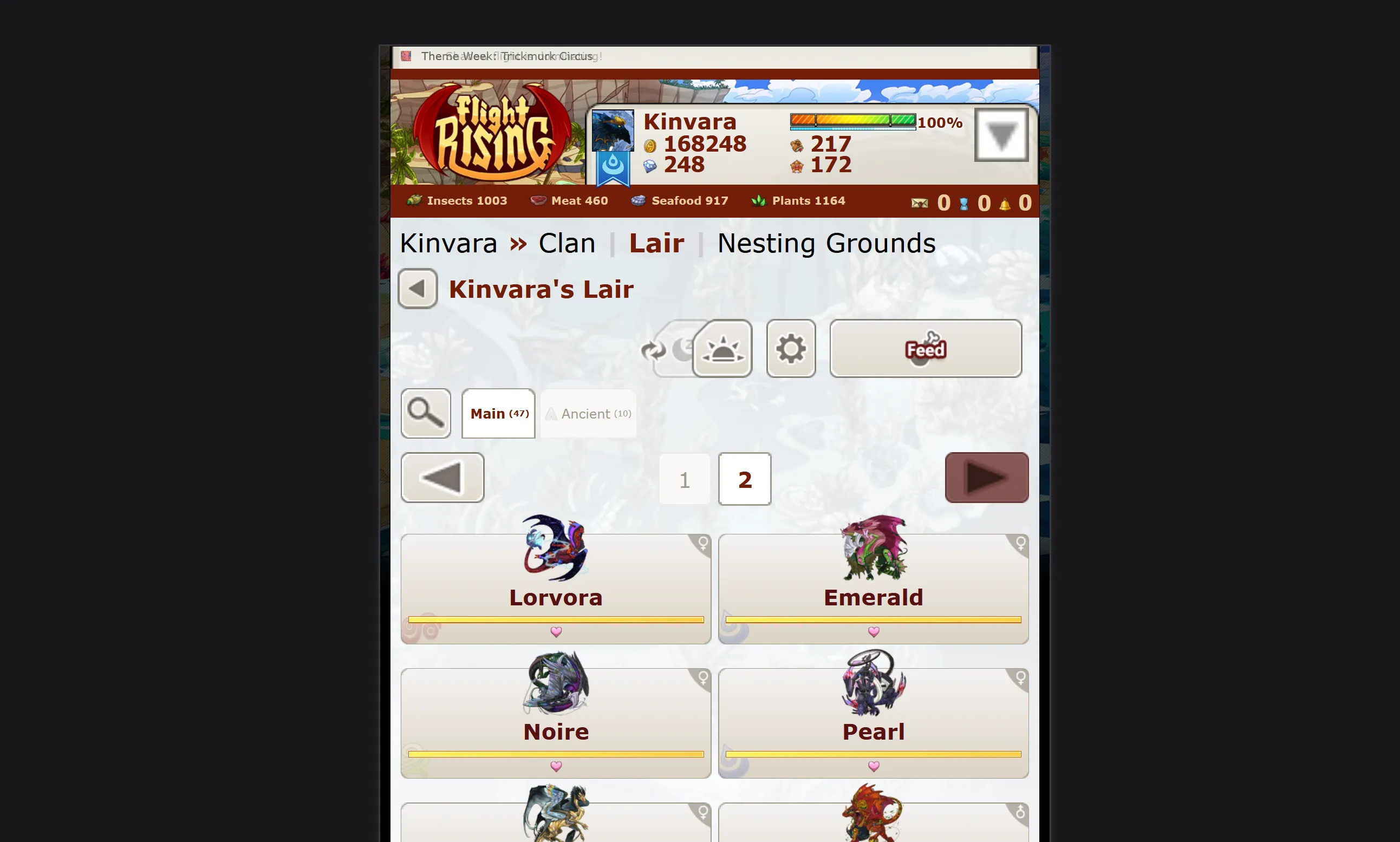
UI adjustments that make Flight Rising easier to use on mobile screens. This is still a work in progress.
Flight Rising Mobile by Kinvara
Details
AuthorKinvara
LicenseNo License
Categorywww1.flightrising.com
Created
Updated
Code size59 kB
Code checksum2b4a02a2
Statistics
Learn how we calculate statistics in the FAQ.
Failed to fetch stats.
Description
Notes
You can send me a message on Flight Rising if you have any feedback or questions about this extension: https://www1.flightrising.com/clan-profile/13953.
Source code
Source code has over 10K characters, so we truncated it. You can inspect the full source code on install link./* ==UserStyle==
@name Flight Rising Mobile
@version 20250408.15.38
@namespace https://userstyles.world/user/Kinvara
@description UI adjustments that make Flight Rising easier to use on small screens. This is still a work in progress.
@author Kinvara
@license No License
==/UserStyle== */
@-moz-document url-prefix("https://www1.flightrising.com/") {
body {
overflow-x: hidden;
input {
font-size: 2.4rem;
}
select {
font-size: 2.4rem;
-moz-appearance: none;
-webkit-appearance: none;
appearance: none;
option {
font-size: 1rem;
}
}
#pagetut {
display: none;
}
.itemtip,
.item-tooltip,
.common-tooltip-box {
display: none !important;
pointer-events: none !important;
}
.lair-tabs,
.common-tabs {
.common-tab-filter,
#lair-page-filter-toggle {
margin-right: 15px;
img {
width: 60px;
}
}
.common-tab,
.lair-tab {
display: flex;
align-items: center;
justify-content: center;
height: 74px;
border-width: 2px;
.common-tab-name,
.lair-tab-name {
font-size: 1.25rem;
}
}
}
.common-pagination,
.common-js-pagination,
.lair-pagination {
min-height: 72px;
.common-pagination-arrow,
.lair-pagination-arrow {
height: 72px !important;
width: 72px !important;
display: flex;
align-items: center;
justify-content: center;
padding: 0;
}
.common-pagination-pages,
.lair-pagination-pages {
height: 100%;
display: flex;
justify-content: center;
.common-pagination-page,
.lair-pagination-page {
.common-screen-reader {
opacity: 0;
}
}
a,
span {
height: 100%;
display: flex;
align-items: center;
justify-content: center;
width: 72px;
font-size: 2rem;
}
}
}
.common-ui-button-group {
height: 72px;
.common-ui-button {
height: calc(100% - 8px) !important;
display: flex;
align-items: center;
justify-content: center;
min-width: 60px;
}
}
.ui-dialog-titlebar {
height: 72px;
font-size: 2rem;
span,
div,
a {
font-size: inherit;
}
.ui-button {
top: 15px;
height: 60px;
width: 60px;
}
}
.ui-dialog {
left: 15px !important;
min-width: calc(100% - 40px);
#newitem {
display: flex;
flex-direction: column;
align-items: center;
#pinkerton-item-description {
width: 100%;
}
}
.common-dialog,
.ui-dialog-content,
.ui-widget-content {
max-height: none !important;
font-size: 1.5rem;
padding: 10px 15px;
span,
div,
p,
a {
font-size: 2rem;
}
button,
input {
height: 72px;
font-size: 2rem;
}
.dialog-button-tray {
display: flex;
row-gap: 15px;
column-gap: 15px;
button,
input {
height: 72px;
width: 100%;
font-size: 2rem;
}
}
#baldwin-preview-container {
display: flex;
flex-direction: column;
#baldwin-preview-icon {
position: relative;
display: flex;
justify-content: center;
align-items: center;
top: auto;
left: auto;
span {
.baldwin-fullsize-item {
width: 108px;
height: 108px;
img {
width: 100%;
height: 100%;
}
}
}
#baldwin-preview-icon-cooldown {
width: auto;
top: auto;
}
}
#baldwin-preview-blurb {
padding: 0;
.baldwin-item-icon {
display: flex;
width: auto;
height: auto;
span,
img {
position: relative;
top: auto;
right: auto;
bottom: auto;
left: auto;
}
img {
width: 108px;
height: 108px;
}
span {
font-size: 2rem;
}
}
}
}
#itemprev {
display: flex;
flex-direction: column;
align-items: center;
select {
width: 100%;
}
#prevcaption {
width: 100%;
}
#preview-footer {
width: 100%;
}
#preview-image {
margin-top: 15px;
}
}
#transmute-confirm-dialog-inner {
span,
p,
strong,
div {
position: relative;
right: auto;
left: auto;
bottom: auto;
top: auto;
height: auto;
}
#transmute-confirm-blurb {
height: auto;
}
#transmute-confirm-button-tray {
position: relative;
right: auto;
left: auto;
bottom: auto;
top: auto;
height: auto;
#transmute-confirm-ok {
margin: 0;
padding: 0;
width: 100%;
}
#transmute-confirm-cancel {
margin: 0;
padding: 0;
width: 100%;
margin-top: 30px;
}
}
}
#fromhoard {
width: calc(100% - 20px);
#inner {
width: 100%;
height: 80vh;
#additm {
div {
width: 100%;
position: relative;
}
#attch,
#cancl {
position: relative;
width: 100%;
margin: 30px 0 0 0;
}
#itembox {
margin: 30px 0;
#item-chooser {
width: 100%;
height: 100%;
position: relative;
#item-chooser-controls {
width: calc(100% - 100px);
height: 100%;
left: auto;
right: 0;
top: auto;
span {
position: relative;
}
select {
height: 100%;
font-size: 2rem;
width: 72px;
}
.generic-hoard-remove {
height: 100%;
width: 50%;
right: 0;
}
}
}
}
#itembox,
#swaptabs,
span,
select,
input,
div {
right: auto;
left: auto;
bottom: auto;
top: auto;
}
#swaptabs {
a {
font-size: 2rem;
}
}
#itempage {
height: 100%;
.item-attachment {
width: 150px;
margin-left: 50px;
a {
img {
width: 150px;
height: 150px;
}
}
}
}
}
}
}
}
#bonding-dialog {
.bonding-dialog-main {
display: flex;
column-gap: 15px;
}
.bonding-dialog-text {
width: auto;
}
}
}
.container {
.banner {
height: 250px;
background-color: #731d08;
background-position: 0 48px;
#logo {
bottom: 48px;
width: 280px;
top: auto;
}
#loginarea {
height: 48px;
background-image: none;
background-color: #731d08;
display: flex;
align-items: center;
.users-online {
height: 100%;
bottom: auto;
right: auto;
top: auto;
left: auto;
display: flex;
align-items: center;
.online,
.time {
font-size: 2rem;
height: 100%;
top: auto;
span,
a {
font-size: 2rem;
margin-right: 0;
img {
width: 24px;
height: 24px;
}
}
}
.time {
span:first-child {
top: 4px;
}
}
.online {
top: 4px;
left: 190px;
}
.statdiv {
bottom: auto;
height: 100%;
span {
font-size: 2rem;
}
}
div:has(> #messcnt) {
right: 200px !important;
img {
height: 40px;
width: 50px;
padding-bottom: 0;
}
}
.statdiv {
display: flex;
align-items: center;
a {
display: flex;
align-items: center;
height: 100%;
span {
height: 100%;
}
}
img {
padding-bottom: 0;
}
}
#friends,
#alerts {
img {
height: 40px;
width: 40px;
}
}
#friends {
right: 105px !important;
}
#alerts {
#alertm {
#alert {
#alerticon {
height: 100%;
background-size: cover;
}
}
}
}
}
}
#usertab,
#ticker {
span,
div,
a {
font-size: 1rem;
}
}
#ticker {
background-size: cover;
width: 100%;
height: 32px;
font-size: 1.25rem;
}
#energybar {
left: 300px;
top: 15px;
#target {
left: 130px;
color: #731d08;
font-size: 1.25rem;
}
}
#usertab {
background-size: cover;
width: 70%;
display: flex;
height: 120px;
bottom: 48px;
[data-tooltip-source="#loginbar-treasure-tooltip"] {
top: 40px !important;
}
[data-tooltip-source='#loginbar-bstcount-tooltip'] {
top: 40px !important;
left: 300px !important;
}
[data-tooltip-source='#loginbar-gems-tooltip'] {
top: 80px !important;
}
[data-tooltip-source='#loginbar-achievement-points-tooltip'] {
top: 80px !important;
left: 300px !important;
}
.tabstat {
width: 220px !important;
height: auto;
a {
font-size: 2rem;
span {
font-size: 2rem;
}
}
}
#namespan {
width: calc(100% - 100px);
a {
span {
font-size: 2rem;
}
}
div:first-of-type {
position: absolute !important;
right: 0 !important;
width: 80px;
#logbutton {
position: relative !important;
left: auto !important;
right: 0 !important;
bottom: auto !important;
width: 100%;
height: auto;
img {
width: 100%;
}
}
}
}
}
}
#loginarea {
width: 100%;
.users-online {
width: 100%;
.time,
.online {
display: none;
}
#logincontent {
width: 100%;
left: auto;
right: auto;
height: 100%;
pointer-events: none;
position: relative;
#lair-supplies {
margin: 0 0 0 15px;
}
.lair-supply {
font-size: 2rem;
height: 48px;
line-height: 48px;
padding: 0 60px 0 32px;
}
}
}
}
.content-header-sub {
display: none;
}
.content-header {
font-size: 2.2rem;
text-shadow: 1px 1px 2px #fff;
}
#content {
.contentcontainer {
display: flex;
flex-direction: column-reverse;
.leftcolumn {
display: flex;
flex-wrap: wrap;
width: 100%;
.content {
...