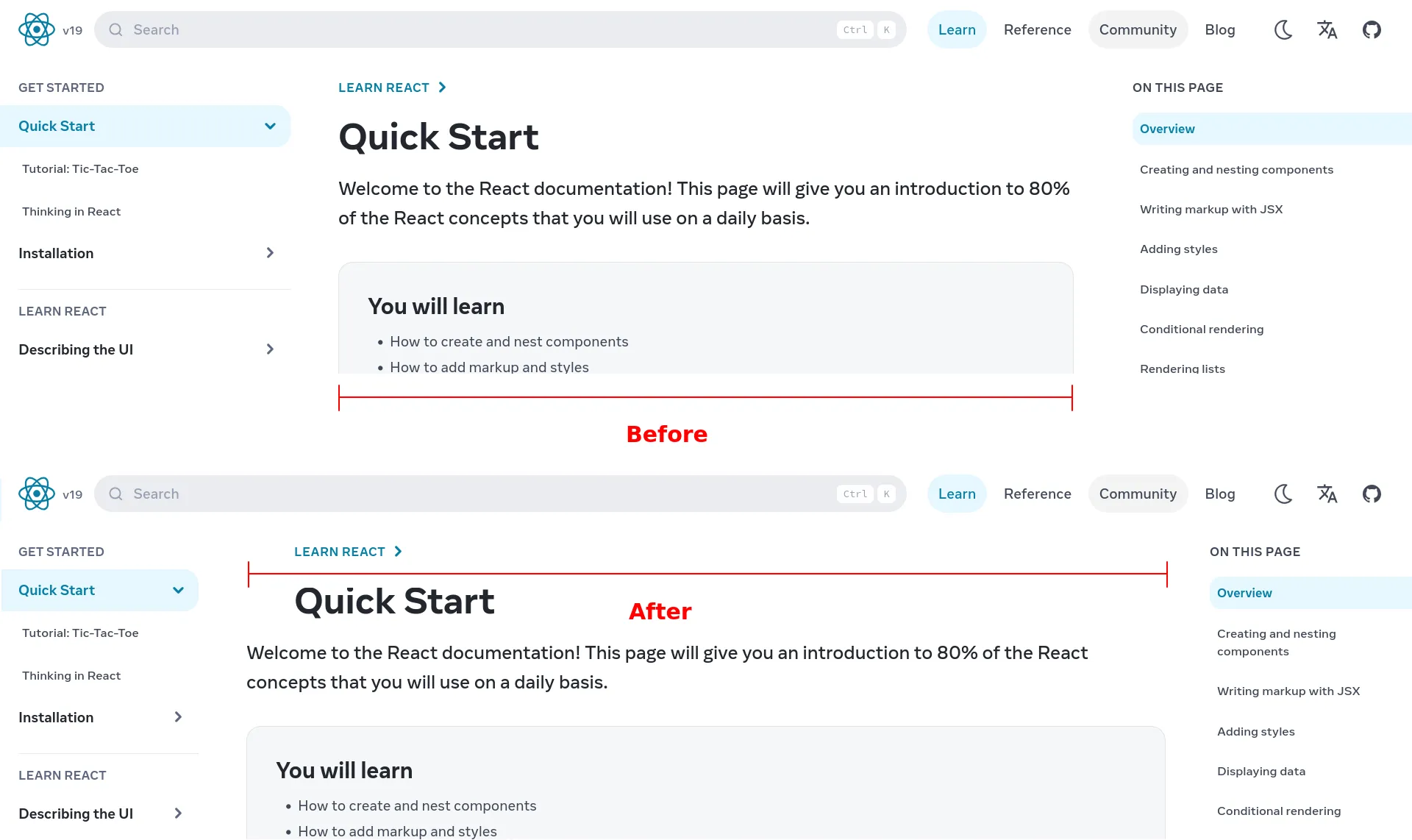
Reduces the padding and the size of sidebars on the sides to give more space for the content.
react.dev more space for content by tburette
Details
Authortburette
LicenseMIT
Categorydev.learn
Created
Updated
Code size1.3 kB
Code checksum74cd7911
Statistics
Learn how we calculate statistics in the FAQ.
Failed to fetch stats.
Description
Notes
Userstyle doesn't have notes.Source code
/* ==UserStyle==
@name           react.dev more space for content
@namespace      github.com/tburette/
@version        1.0.0
@description    Reduces the padding and the size of sidebars on the sides to give more space for the content.
@author         tburette <contact@thomasburette.com> (https://github.com/tburette/)
@homepageURL    https://github.com/tburette/userstyledev.learn
@supportURL     https://github.com/tburette/userstyledev.learn/issues
@license        MIT
==/UserStyle== */

@-moz-document url-prefix(https://react.dev/learn),
    url-prefix("https://react.dev/reference"),
    url-prefix("https://react.dev/community")
    {
    @media (min-width: 1024px) {
        #__next > .grid.grid-cols-only-content {
          grid-template-columns: 14.75rem auto;
        }

        #__next > .grid.grid-cols-only-content .overflow-y-scroll {
          width: unset;
        }

        main article .ps-0 > .px-5 {
          padding-inline: 2rem;
        }

        main article .ps-0 > .px-5 > div > div {
          max-width: unset;
        }

        aside > div.fixed {
          display: none;
        }
      }

      @media (min-width: 1536px) {
        #__next > .grid.grid-cols-only-content {
          grid-template-columns: 14.75rem auto 14.75rem;
        }
      }
}