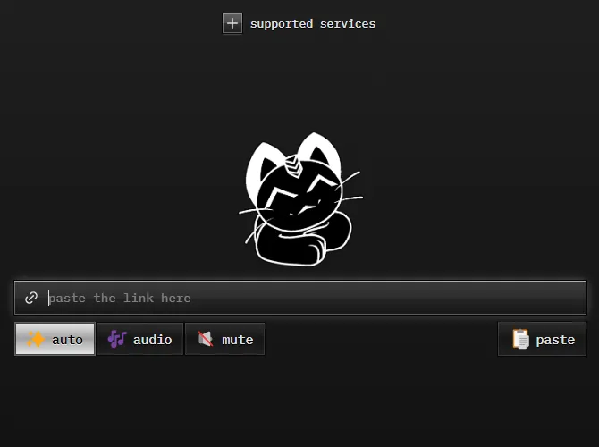
Skeuomorphic theme for cobalt.
Skeuomorphic cobalt.tools by magnum22
Details
Authormagnum22
LicenseNo License
Categorycobalt.tools
Created
Updated
Code size15 kB
Code checksum91892af3
Statistics
Learn how we calculate statistics in the FAQ.
Failed to fetch stats.
Description
Notes
Currently only supports dark theme.
Source code
Source code has over 10K characters, so we truncated it. You can inspect the full source code on install link./* ==UserStyle==
@name Skeuomorphic cobalt.tools
@version 20250217.20.27
@namespace https://userstyles.world/user/magnum22
@description Skeuomorphic theme for cobalt.
@author magnum22
==/UserStyle== */
@-moz-document domain("cobalt.tools") {
:focus-visible {
box-shadow: inset 0 0 0 1px hsl(213, 75%, 62%),
inset 0 0 15px hsl(213, 75%, 42%) !important;
}
.active:focus-visible {
box-shadow: inset 0 0 0 1px hsl(213, 75%, 62%),
inset 0 0 15px hsl(213, 75%, 42%) !important;
}
#content.svelte-9086m3.svelte-9086m3 {
background: linear-gradient(hsl(0, 0%, 12%),
hsl(0, 0%, 7%));
border-top-left-radius: 0;
border-bottom-left-radius: 0;
}
#sidebar.svelte-nq9nfb {
background: linear-gradient(to right,
hsl(0, 0%, 10%),
hsl(0, 0%, 15%));
box-shadow: inset 0 0 0 1px hsla(0, 0%, 100%, .1),
0 0 0 1px hsla(0, 0%, 0%, .9);
text-shadow: 0 -1px hsl(0, 0%, 0%);
}
.sidebar-tab.svelte-9r57ym {
border-radius: 0px;
padding: 7px;
margin: 5px
}
.sidebar-tab.active.svelte-9r57ym {
background: linear-gradient(hsla(0, 0%, 100%, .7),
hsla(0, 0%, 100%, .6) 49%,
hsla(0, 0%, 100%, .5) 50%,
hsla(0, 0%, 100%, .7));
box-shadow: inset 0 0 0 1px hsla(0, 0%, 0%, .8),
0 0 0 1px hsla(0, 0%, 100%, .3),
0 1px 10px hsla(0, 0%, 100%, .4);
text-shadow: 0 1px hsla(0, 0%, 100%, .8);
}
.sidebar-tab.active.svelte-9r57ym:hover {
background: linear-gradient(hsla(0, 0%, 100%, .7),
hsla(0, 0%, 100%, .6) 49%,
hsla(0, 0%, 100%, .5) 50%,
hsla(0, 0%, 100%, .7));
box-shadow: inset 0 0 0 1px hsla(0, 0%, 0%, .8),
0 0 0 1px hsla(0, 0%, 100%, .3),
0 1px 12px hsla(0, 0%, 100%, .4);
text-shadow: 0 1px hsla(0, 0%, 100%, .8);
}
.sidebar-tab.svelte-9r57ym:hover {
background: linear-gradient(hsla(0, 0%, 100%, .0),
hsla(0, 0%, 100%, .1) 49%,
hsla(0, 0%, 100%, .05) 50%,
hsla(0, 0%, 100%, .0));
box-shadow: inset 0 0 0 1px hsla(0, 0%, 100%, .2),
0 0 0 1px hsla(0, 0%, 0%, .9),
0 1px 7px hsla(0, 0%, 100%, .3);
text-shadow: 0 1px hsl(0, 0%, 0%);
}
.sidebar-tab.svelte-9r57ym:active {
background: linear-gradient(hsla(0, 0%, 100%, .4),
hsla(0, 0%, 100%, .3) 49%,
hsla(0, 0%, 100%, .2) 50%,
hsla(0, 0%, 100%, .0));
box-shadow: inset 0 0 0 1px hsla(0, 0%, 100%, .3),
0 0 0 1px hsla(0, 0%, 0%, .9),
0 1px 7px hsla(0, 0%, 100%, .5);
text-shadow: 0 1px hsl(0, 0%, 0%);
}
#services-button.svelte-1c261yq.svelte-1c261yq {
border-radius: 0px;
}
#services-button.svelte-1c261yq.svelte-1c261yq:hover {
background: linear-gradient(hsla(0, 0%, 100%, .2),
hsla(0, 0%, 100%, .05),
hsla(0, 0%, 100%, .1));
box-shadow: inset 0 0 0 1px hsla(0, 0%, 100%, .3),
0 0 0 1px hsla(0, 0%, 0%, .9);
border-radius: 0;
text-shadow: 0 1px hsl(0, 0%, 0%);
}
.expand-icon.svelte-1c261yq.svelte-1c261yq {
background: linear-gradient(hsla(0, 0%, 100%, .3),
hsla(0, 0%, 100%, .2) 49%,
hsla(0, 0%, 100%, .1) 50%,
hsla(0, 0%, 100%, .0));
box-shadow: inset 0 0 0 1px hsla(0, 0%, 100%, .3),
0 0 0 1px hsla(0, 0%, 0%, .9),
0 1px 2px hsla(0, 0%, 100%, .5);
border-radius: 0px;
}
#services-popover.svelte-1c261yq.svelte-1c261yq {
background: linear-gradient(hsla(0, 0%, 100%, .1),
hsl(0, 0%, 10%) 20%);
box-shadow: inset 0 0 0 1px hsla(0, 0%, 100%, .2),
0 1px 20px hsla(0, 0%, 100%, .1),
0 0 0 1px hsla(0, 0%, 0%, .9);
border-radius: 3px;
}
.service-item.svelte-1c261yq.svelte-1c261yq {
background: linear-gradient(hsla(0, 0%, 100%, .2),
hsl(0, 0%, 15%) 30%);
box-shadow: inset 0 0 0 1px hsla(0, 0%, 100%, .1),
0 0 0 1px hsla(0, 0%, 0%, .9);
border-radius: 3px;
text-shadow: 0 1px hsl(0, 0%, 0%);
padding: 5px;
margin: 0 2px;
}
.expanded.svelte-1c261yq #services-disclaimer.svelte-1c261yq { text-shadow: 0 1px hsl(0, 0%, 0%); }
#input-container.svelte-1kokkg7 {
background: linear-gradient(hsla(0, 0%, 100%, .15),
hsla(0, 0%, 100%, .1) 49%,
hsla(0, 0%, 100%, .07) 50%,
hsla(0, 0%, 100%, .0));
box-shadow: inset 0 0 0 1px hsla(0, 0%, 100%, .2),
inset 0 1px hsla(0, 0%, 100%, .2),
0 0 0 1px hsla(0, 0%, 0%, .9),
0 0 7px hsla(0, 0%, 100%, .2);
border-radius: 0;
}
#input-container.svelte-1kokkg7:hover {
background: linear-gradient(hsla(0, 0%, 100%, .2),
hsla(0, 0%, 100%, .15) 49%,
hsla(0, 0%, 100%, .1) 50%,
hsla(0, 0%, 100%, .0));
box-shadow: inset 0 0 0 1px hsla(0, 0%, 100%, .2),
inset 0 1px hsla(0, 0%, 100%, .2),
0 0 0 1px hsla(0, 0%, 0%, .9),
0 0 7px hsla(0, 0%, 100%, .3);
border-radius: 0;
text-shadow: 0 1px hsl(0, 0%, 0%);
}
#input-container.focused.svelte-1kokkg7 {
box-shadow: inset 0 0 0 1px hsla(0, 0%, 100%, .3),
inset 0 1px hsla(0, 0%, 100%, .4),
0 0 0 1px hsla(0, 0%, 0%, .9),
0 0 12px hsla(0, 0%, 100%, .3);
outline: 0
}
#download-button.svelte-m5le8h:hover {
background: linear-gradient(hsla(0, 0%, 100%, .25),
hsla(0, 0%, 100%, .15) 49%,
hsla(0, 0%, 100%, .1) 50%,
hsla(0, 0%, 100%, .1));
box-shadow: inset 0 0 0 1px hsla(0, 0%, 100%, .2),
inset 0 1px hsla(0, 0%, 100%, .2),
0 0 0 1px hsla(0, 0%, 0%, .9),
0 0 7px hsla(0, 0%, 100%, .3);
border-radius: 0;
}
#download-button.svelte-m5le8h {
border: none;
border-radius: 0;
}
#download-button.svelte-m5le8h:dir(rtl) {
border-radius: 0;
}
#input-container.focused #download-button.svelte-m5le8h {
border: 0;
}
#clear-button {
background-color: transparent;
box-shadow: none;
}
#clear-button:hover {
background: linear-gradient(hsla(0, 0%, 100%, .25),
hsla(0, 0%, 100%, .15) 49%,
hsla(0, 0%, 100%, .1) 50%,
hsla(0, 0%, 100%, .0));
box-shadow: inset 0 0 0 1px hsla(0, 0%, 100%, .2),
0 0 0 1px hsla(0, 0%, 0%, .7);
}
.switcher.svelte-17ow1lm {
border-radius: 0;
gap: 4px;
padding: 1px 1px;
}
.switcher.svelte-17ow1lm:not(.big) :not(.button:first-child) {
margin-left: -2px;
}
button, .button {
background: linear-gradient(hsla(0, 0%, 100%, .1),
hsla(0, 0%, 100%, .0) 49%,
hsla(0, 0%, 100%, .05)) 50%;
box-shadow: inset 0 0 0 1px hsla(0, 0%, 100%, .1),
0 0 0 1px hsla(0, 0%, 0%, .7);
border-radius: 0px;
border: none;
text-shadow: 0 1px hsl(0, 0%, 0%);
}
button, .button:hover {
background: linear-gradient(hsla(0, 0%, 100%, .1),
hsla(0, 0%, 100%, .05) 49%,
hsla(0, 0%, 100%, .1)) 50%;
box-shadow: inset 0 0 0 1px hsla(0, 0%, 100%, .15),
0 0 0 1px hsla(0, 0%, 0%, .7);
border-radius: 0px;
border: none;
}
.button.active {
background: linear-gradient(hsla(0, 0%, 100%, .9),
hsla(0, 0%, 100%, .6) 49%,
hsla(0, 0%, 100%, .6) 50%,
hsla(0, 0%, 100%, .9));
box-shadow: inset 0 0 0 1px hsla(0, 0%, 0%, .7),
0 0 0 1px hsla(0, 0%, 100%, .3),
0 1px 3px hsla(0, 0%, 100%, .1);
text-shadow: 0 1px hsla(0, 0%, 100%, .7);
border: none;
border-radius: 0px;
}
.switcher.big.svelte-17ow1lm .button {
border-radius: 0;
}
.switcher.big.svelte-17ow1lm {
background: transparent;
box-shadow: none;
padding: 2px;
gap: 3px;
}
.switcher.big.svelte-17ow1lm .button:not(:focus-visible) {
box-shadow: inset 0 0 0 1px hsla(0, 0%, 0%, .7),
0 0 0 1px hsla(0, 0%, 100%, .3);
}
#subnav-section.svelte-1oe11q0, #subnav-section-categories.svelte-1oe11q0 {
padding: 3px;
text-shadow: 0 1px hsl(0, 0%, 0%);
}
.tab-icon.svelte-10nqyaq {
background-color: transparent;
box-shadow: inset 0 0 0 1px hsla(0, 0%, 100%, .3),
inset 0 1px 5px hsl(0, 0%, 0%),
0 0 0 1px hsl(0, 0%, 0%);
}
.tab-icon.svelte-10nqyaq.svelte-10nqyaq {
border-radius: 0;
}
.subnav-tab.svelte-10nqyaq.svelte-10nqyaq {
padding: 3px;
margin: 3px 0;
background: transparent;
border-radius: 0;
overflow: hidden;
text-decoration: none;
text-decoration-line: none;
cursor: default;
}
.subnav-tab.svelte-10nqyaq.svelte-10nqyaq:hover {
background: linear-gradient(hsla(0, 0%, 100%, .1),
hsla(0, 0%, 100%, .0) 49%,
hsla(0, 0%, 100%, .05)) 50%;
box-shadow: inset 0 0 0 1px hsla(0...