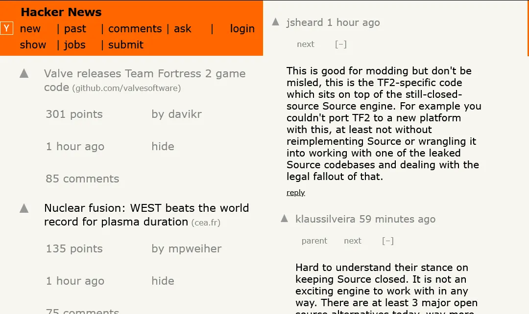
a simple mobile layout for hacker news, enlarging buttons for easier tapping
hacker news mobile by o_o
Details
Authoro_o
LicenseNo License
Categorynews.ycombinator
Created
Updated
Code size3.9 kB
Code checksuma1e1405e
Statistics
Learn how we calculate statistics in the FAQ.
Failed to fetch stats.
Description
Notes
Userstyle doesn't have notes.Source code
/* ==UserStyle==
@name           hacker news mobile
@namespace      dabric.xyz/posts/hacker-news-mobile
@version        1.0.0
@description    a simple mobile layout for hacker news
@author         Me
==/UserStyle== */

@-moz-document domain("news.ycombinator.com") {
  * {
    box-sizing: border-box;
  }

  :root:has(head > link[rel=stylesheet][href*="news"]) {

    table:has(>tbody>tr>td>.pagetop) {


      .pagetop {
        font-size: 14px;
        line-height: 22px;

        a {
          display: inline-block;
          min-width: 44px;
        }
      }
    }

    tbody:has(> .athing.submission) {
      display: flex;
      flex-direction: column;
    }

    --upvote-width: 44px;

    td:has(.morelink) {
      display: block;
      padding: 2px 8px;

      .morelink {
        display: block;
      }
    }

    .athing.submission {
      display: flex;
      width: 100%;

      gap: 8px;
      padding: 2px 8px;
      position: relative;
      align-items: stretch;


      .votelinks, td:has(> img[src="s.gif"]) {
        width: var(--upvote-width);
        height: unset !important;

        order: 1;

        center {
          display: contents;
        }

        a {
          width: 100%;
          height: 100%;
          display: flex;
          align-items: top;
          justify-content: center;
          margin: 0;
        }

        .votearrow {
          width: 16px;
          height: 16px;
          margin: 0;
          transform: unset;
          background-size: 100% 100%;
        }
      }


      .title:has(.rank) {
        width: min-content;
        display: block;
        order: 2;
        pointer-events: none;
        user-select: none;
        width: var(--upvote-width);
        text-align: center;
        position: absolute;
        z-index: 1;

        display: none;
      }

      .title:has(.titleline) {
        order: 3;
        width: 100%;
        display: block;
      }

      & + tr {
        padding: 2px 8px;

        --option-padding: 8px;

        margin-left: calc(var(--upvote-width) + 4px - var(--option-padding));

        .subline {
          display: contents;
        }

        .subtext, .subline {
          font-size: 0;
        }

        .subtext {


          & > *:not(:empty, .subline), & > .subline > *:not(:empty) {
            font-size: 11pt;
            line-height: 44px;

            padding: 0 var(--option-padding);

            min-width: 50%;

            a {
              display: block;
              width: 100%;
            }
          }

          .hnuser::before {
            content: "by ";
          }

          flex-wrap: wrap;
          display: flex;
          overflow: auto;
        }

        .age + * {
          display: block;
        }
      }
    }


    .athing.comtr {
      scroll-margin-top: max(calc(50vh - 50px), 30vh);

      .reply a {
        min-width: 44px;
        min-height: 22px;
      }

      .votelinks:not(*) {
        a {
          width: 44px;
          height: 44px;

          .votearrow {
            width: 16px;
            height: 16px;
            margin: 0;
            transform: unset;
            background-size: 100% 100%;
          }
        }
      }


      .comhead {
        display: block;
        width: 100%;
        font-size: 1em;

        .navs {
          display: flex;
          flex-wrap: wrap;
          gap: 4px;

          font-size: 0;

          > * {
            font-size: 8pt;
            line-height: 44px;
            min-width: 44px;
            text-align: center;
          }


        }
      }
    }
  }
}