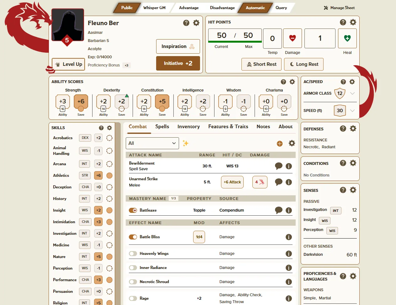
Temporary light mode extension for Roll20's D&D2024 sheet.
Temporary Light Mode for Roll20 D&D2024 by NBrooks-Roll20
Details
AuthorNBrooks-Roll20
LicenseNo License
Categoryapp.roll20.net, advanced-sheets.production.roll20preflight.net
Created
Updated
Code size15 kB
Code checksuma8c46747
Statistics
Learn how we calculate statistics in the FAQ.
Failed to fetch stats.
Description
Notes
Userstyle doesn't have notes.Source code
Source code has over 10K characters, so we truncated it. You can inspect the full source code on install link./* ==UserStyle==
@name advanced-sheets.production.roll20preflight.net
@namespace github.com/openstyles/stylus
@version 1.1.0
@description Temporary Light Mode for Roll20's D&D2024
@author Roll20
==/UserStyle== */
@-moz-document domain("advanced-sheets.production.roll20preflight.net") {
body:has(.dnd-sheet) {
background-image: none;
background-color: #EAE7D8;
}
html:has(.dnd-sheet) {
--panel-bg: #FCFAF7;
--inner-card-bg: #FCFAF7;
--surface-tile1: #FCFAF7;
--surface-dark2: red;
--border-box-primary-bg: #FCFAF7;
--stat-card-background: #F1ECE6;
--shadowed-card-background: white;
--border-box-primary-border: black;
--button-primary-base: #8E5620;
--default-button-bg: #8E5620;
--default-button-focus-border: #8E5620;
--secondary-button-bg: white;
--outlined-button-border: #8E5620;
--outlined-button-hover-bg: #F4E2CF;
--secondary-outlined-button-border: #8E5620;
--secondary-outlined-button-hover-bg: #F4E2CF;
--tertiary-button-text-color: #292218;
--tertiary-button-hover-bg: #F4E2CF;
--tertiary-button-focus-bg: #F4E2CF;
--tertiary-button-focus-border: #8E5620;
--inline-button-text-color: #292218;
--roll-button-hover-border: #8E5620;
--info-button-bg: #615139;
--clickable-icon-color: #292218;
--clickable-icon-hover: #615139;
--exp-increase-icon-color: darkgreen;
--exp-decrease-icon-color: darkred;
--card-title-font-color: black;
--card-label-font-color: black;
--card-label-background-dark: white;
--card-label-border-color: #8E5620;
--panel-border-color: #8E5620;
--bastion-panel-shadow-color: white;
/*
Text colors
*/
--text-color: #292218;
--color-text: #292218;
--secondary-text-color: #292218;
--title-text-color: #292218;
--accent-text-color: #8E5620;
--value-text-color: #292218;
--label-text-color: #292218;
--secondary-gray-text: #292218;
--dnd-gray-text: #292218;
--placeholder-text-color: #292218;
--warning-text-color: orangered;
--secondary-l25-text: #292218;
--spellcasting-name-text-color: #292218;
--spellcasting-popover-description-text-color: #292218;
--effect-accent-color: orangered;
--effect-affects-color: #292218;
--panel-header-font-color: #292218;
--panel-subheader-font-color: #615139;
--defenses-text-category: #292218;
--defenses-text-list: #292218;
--defenses-text-empty-placeholder: dimgray;
--stat-card-text-color: #292218;
--passive-stat-value-text-color: #292218;
--skill-name-font-color: #292218;
--challenge-level-color: #FCFAF7;
--resource-max-color: #292218;
--healthy-hp-bar-color: darkgreen;
--healthy-hp-bar-background: #CCE7D8;
/*
Inputs:
input: main inputs like text, numbers, dropdowns, etc.
range: anything that "fills up" like exhaustion and spell slots
switch: the on/off toggles next to things like effects
checkbox: checkboxes
radio: toggles at the top of the sheet
dropdown: dropdowns, including typeaheads
*/
--range-background-unfilled: #FCFAF7;
--range-background-filled: darkred;
--range-text-unfilled-color: #292218;
--range-text-filled-color: white;
--input-border: #615139;
--input-hover-border: #8E5620;
--input-focus-border: #8E5620;
--switch-active-color: #B16C28;
--switch-inactive-color: #D3CEBB;
--checkbox-border-color: #B16C28;
--checkbox-active-color: #B16C28;
--checkbox-checkmark-color: white;
--default-radio-inactive-bg: white;
--default-radio-inactive-text: #292218;
--default-radio-hover-border: #6A4118;
--default-radio-active-bg: #8E5620;
--default-radio-active-border: #6A4118;
--default-radio-active-text: white;
--default-radio-active-glowies: 0px 0px 8px 0px #0000004d,
0px 0px 4px 0px #0000001a, 1px 1px 8px 0px #00000099;
--select-hover-glowies: 0px 0px 8px 0px #000000a2, 0px 0px 4px 0px #0000005e,
1px 1px 8px 0px #000000b6;
--dropdown-button-focus-border-color: #8E5620;
--dropdown-button-hover-border-color: #8E5620;
--dropdown-button-border-color: #8E5620;
--dropdown-options-text-color: #292218;
--dropdown-option-hover-bg: #F9F4EC;
--dropdown-option-selected-bg: #8E5620;
--dropdown-option-selected-text: #E6E6E6;
--panel-settings-icon-default: #292218;
--panel-settings-icon-hover: dimgray;
--inspired-bg: #AE1612;
--not-inspired-bg: white;
--character-level-color: white;
--character-level-bg: #AE1612;
--proficient-proficiency-fill: #DFA770;
--untrained-proficiency-circle: #6A4118;
--untrained-proficiency-fill: transparent;
--expert-circle: #B16C28;
--ability-border: #B16C28;
--statblock-button-hover-border: #B16C28;
/*
Tables (ex. repeating lists)
*/
--table-row-hover-border: inset 0 0 3px #B16C28;
--header-row-background: #D3CEBB;
--header-text-color: #615139;
--table-section-header-color: #AE1612;
--hit-dc-color: #664400;
--hit-damage-color: #AE1612;
--healing-color: #006A30;
/*
Anything that hides information or shows up on top of others
Modals/popovers/snackbars/etc
*/
--modal-header-font-color: #292218;
--modal-subheader-font-color: #292218;
--modal-close-circle-color: #292218;
--modal-close-x-color: white;
--modal-primary-button-color: #8E5620;
--modal-secondary-button-hover: #F4E2CF;
--modal-input-label-color: black;
--modal-header-secondary-button-color: #F4E2CF;
--modal-header-secondary-outline-button-hover: #F4E2CF;
--modal-divider-color: #8E5620;
--default-tabs-active-bg-color: #B16C28;
--default-tabs-active-text-color: #F9F4EC;
--popover-background: #F9F4EC;
--popover-text: #292218;
--popover-text-bold: #8E5620;
--popover-border-color: #8E5620;
--popover-border-color-red: #8E5620;
--popover-header-background: #F9F4EC;
--popover-header-text: #292218;
--popover-header-border-bottom-color: #8E5620;
--popover-tooltip-text: #292218;
--popover-tooltip-background: #F9F4EC;
--scrollbar-color: #F9F4EC;
--menu-background: #F9F4EC;
--menu-hover-background: #8E5620;
--menu-hover-text: #E6E6E6;
--layout-swap-toggle-color: #292218;
--collapse-button-bg-color: #BDAA8F;
--collapse-button-text-color: #292218;
--collapse-chevron-color: #292218;
--snackbar-error-background: #EB9797;
--snackbar-warning-background: #F4E2CF;
--snackbar-warning-text-color: #292218;
--snackbar-happy-background: #CCE7D8;
/*
Chips for components
*/
--component-chip-color: #292218;
--component-chip-color-primary: mistyrose;
--component-chip-color-secondary: papayawhip;
--component-chip-color-tertiary: papayawhip;
--component-chip-background: #F1ECE6;
--component-chip-background-secondary: #F9F4EC;
--component-chip-color-primary-red: mistyrose;
--spell-item-source-color: darkgoldenrod;
/*
One-off tab needs (about, inventory)
*/
--purse-background-color: #F9F4EC;
--purse-label-color: #292218;
--purse-toggle-button-color: #292218;
--purse-toggle-button-hover-color: dimgray;
--about-characteristics-table-bg: #F9F4EC;
--about-characteristics-value-color: #292218;
--about-label-text-color: #292218;
--hit-dice: gray;
--used-hit-dice: dimgray;
--npc-feature-button-icon-color: #292218;
--senses-text-list: #292218;
--languages-text-list: #292218;
--npc-text-list-secondary: #292218;
/*
Button overrides where necessary
*/
.poly-button--primary-base span,
.poly-button--modal-footer-primary span,
.stat-block-abilities__saving-throw button[data-prof="Proficient"] span,
.poly-chip--statblock-bonus-badge span {
color: white !important;
}
.poly-button--default button,
.poly-button--rollable button,
.poly-button--healing button,
.poly-button--damage button,
.poly-button--action button,
.poly-button--hit-dc button {
background: #F9F4EC;
border: 1px solid #B16C28;
}
.poly-button--compact-saving-throw button:hover,
.stat-block-abilities__modifier button:hover,
.stat-block-abilities__saving-throw button:hover {
filter: brightness(105%) !important;
}
.hp__heal-harm-button button {
background: none;
border: 1px solid #8E5620;
}
/*
Text Color Overrides
*/
.span--item-row-title,
.action-item__name,
.mastery-item__name {
color: #292218;
}
.stat-block-abilities__modifier span {
color: #FCFAF7;
}
.poly-button--stat-block-text button:hover {
color: #6A4118;
}
.poly-select--roll-mode {
span {
color: #FCFAF7;
}
svg {
fill: #FCFAF7;
}
}
/*
Icon color overrides
*/
.poly-button--info path,
.info__level-up path,
.hp__rests path,
.condition__icon path,
.poly-icon--exhaustion path,
.manage-spells-row__icon-button path {
fill: #615139 !important;
stroke: #615139 !important;
}
.poly-button--info:hover path {
fill: #B16C28 !important;
stroke: #B16C28 !important;
}
.poly-button--gear path,
.poly-icon--help path,
.poly-button--help path {
fill: #615139 !important;
stroke: #615139 !important;
}
.poly-button--gear:hover path,
.poly-button--help:hover path,
.poly-icon--help:hover path {
fill: #B16C28 !important;
...