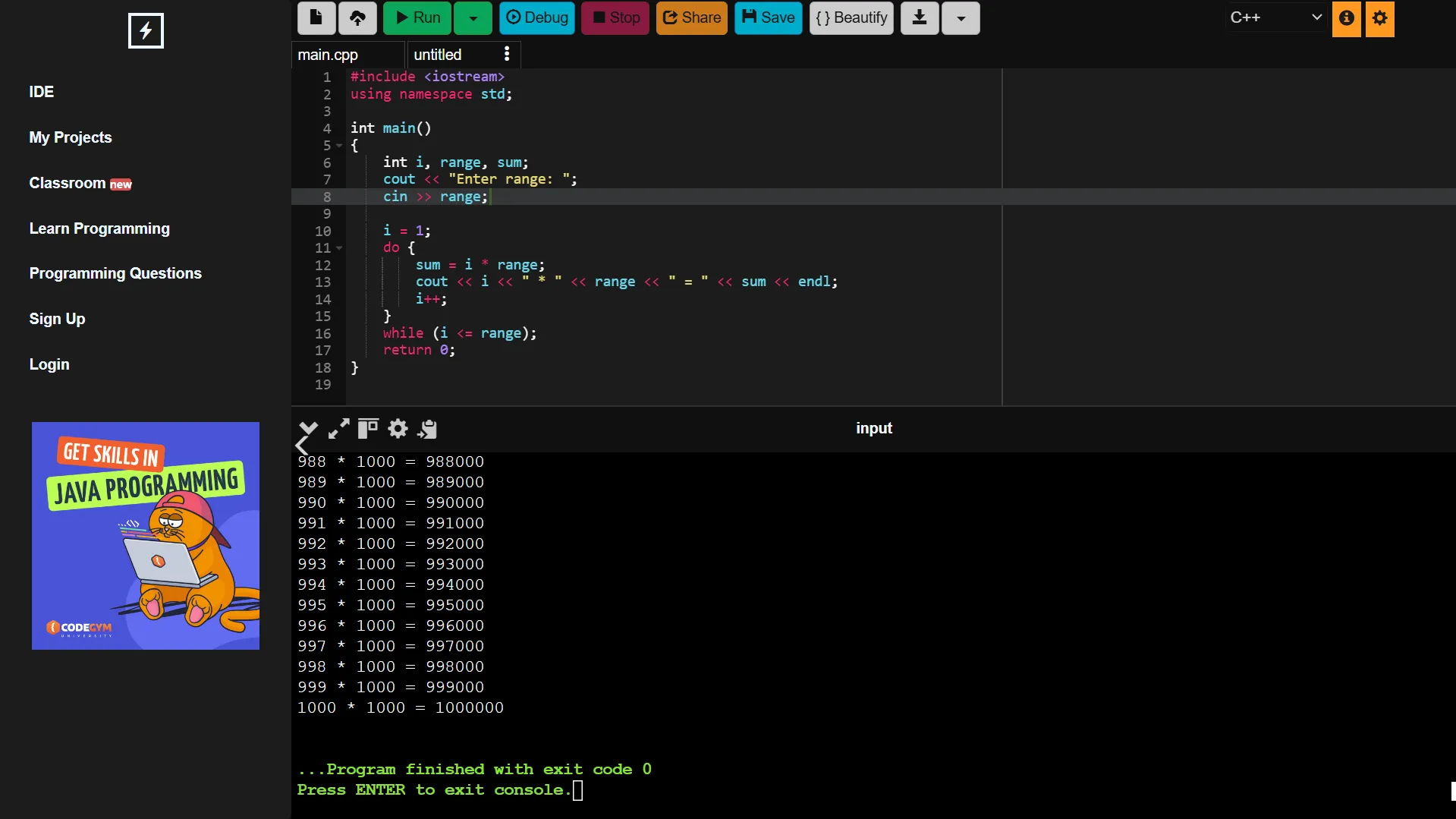
main editor screen is updated (prior to 2022 version, still work in progress)
editor note: code is messy indeed.
monokai theme for onlinegdb by DankestFke
Details
AuthorDankestFke
LicenseNo License
Categoryonlinegdb.com
Created
Updated
Code size7.9 kB
Code checksum96d85824
Statistics
Learn how we calculate statistics in the FAQ.
Failed to fetch stats.
Description
Notes
v00.01
Code is still messy, only changed editor parts.
Source code
/* ==UserStyle==
@name         Online GDB Monokai theme edited
@namespace    USO Archive
@author       random nes, feb
@description  Monokai theme for www.onlinegdb.com, edited by feb. messy code still in progress
@version      20250309.00.01
@license      NONE
@preprocessor uso
==/UserStyle== */
@-moz-document domain("onlinegdb.com"){

:root{

  	--mwhite:#f6f6f6;
  	--mpink:#f92772;
  	--mblue:#66d9ee;
  	--morange:#fe9720;
  	--mpurple:#ae81ff;
  	--myellow:#e6da74;
  	--mgreen:#a6e22e;
  	--mblack:#1c1c1c;
  	--mgrey: #323232;

}

.ace-idle-fingers{
  	color: var(--mwhite);
  	background: var(--mblack);
}

.ace_editor{
	font-family: monospace;
}

.ace-idle-fingers .ace_keyword, .ace-idle-fingers .ace_meta{
	color: var(--mpink);
}

.ace-idle-fingers .ace_constant, .ace-idle-fingers .ace_constant.ace_character, .ace-idle-fingers .ace_constant.ace_character.ace_escape, .ace-idle-fingers .ace_constant.ace_other, .ace-idle-fingers .ace_support.ace_constant{
	color: var(--mpurple);
}

.ace_paren, .ace_rparen{
	color: var(--mwhite);
}

.ace_identifier{
	color: var(--mblue);
}

.ace-idle-fingers .ace_keyword, .ace-idle-fingers .ace_meta{
	color: var(--mpink);
}

.ace-idle-fingers .ace_string{
	color: var(--myellow);
}

.ace-idle-fingers .ace_support.ace_function{
	color: var(--mpink);
}

span.ace_support.ace_type{
  	color: var(--mblue);
}

.ace_line #text{
	color: var(--mgreen);
}

.ace-idle-fingers .ace_gutter {
	background: #101010;
  	color: #808080;
}

.col-sm-12, #editor-container {
	background: #101010 !important;
}

    #multi_editor_container div[style*="757575"] {
        background: #101010 !important;
    }

    #multi_editor_container li {
        height: max-content;
        overflow: visible;
    }

    #multi_editor_container a[data-toggle*="tab"] {
        background: #101010;
        border: 1px solid #3b3b3b !important
    }

    #multi_editor_container .active a[data-toggle*="tab"] {
        border: 1px solid #ffffff33 !important;
    }

.glyphicon-cloud-upload:before, .glyphicon-file:before{
	color: #101010;
}

    #control-bar {
        margin-bottom: 5px;
    }

    .editor_text_panes {
        top: 60px;
    }

#control-bar button{
	border-radius: 4px;
    margin-left: 0;
    margin-right: 2px;
  	color: #101010;
}

#control-bar button{
	filter: brightness(0.8);
}

#debug-bar .btn, #debug-bar button, #title-bar button {
    color: var(--mblack) !important;
    padding: 5px;
}

.btn-success{
	background: #0cd070;
}

.btn-success:hover{
	background: #0cd070;
	filter: brightness(0.8);
}

.btn-primary{
	background: #00d8ff;
}

.btn-primary:hover{
	background: #00d8ff;
	filter: brightness(0.8);
}

.btn-danger{
	background: #f92772;
}

.btn-danger:hover{
	background: #f92772;
	filter: brightness(0.8);
}

.btn-warning{
	background: #fe9720;
}

.btn-warning:hover{
	background: #fe9772;
	filter: brightness(0.8);
}

.btn-info, .btn-info:focus{
	border-color: #ccc !important;
    background: #fff !important;
}

.btn-info:hover{
	border-color: #ccc;
    background: #fff;
	filter: brightness(0.8);
}

.form-control, select{
	background: #101010;
  	border: rgb(28, 28, 28) solid 1px;
  	color: white;
    opacity: .8;
    border-radius: 4px !important;
}

    .form-control:focus, select:focus {
        border: rgb(28, 28, 28) solid 1px;
        border-radius: 4px !important;
        box-shadow: unset;
        opacity: 1
    }


/* sidebar */

    #header_logo .to_be_hidden {
        display: none !important;
    }

#left-component {
    border-top-right-radius: 6px;
    border-bottom-right-radius: 6px;
    overflow: unset;

    background-color: rgb(28,28,28) !important
}

    a:focus, a:hover {
        color: var(--mgrey)
    }

#left-component[style*="100%"] {
    width: 20% !important;
}

.to_be_hidden[style*="block"]> *:first-child, .to_be_hidden footer {
        display: none !important;
}

    .nav-tabs {
        border: unset !important;
    }

    #left-component .nav {
        display: flex;
        flex-direction: column;
        background: transparent !important;
    }

    #left-component .nav li {
        text-align: left;
        box-sizing: border-box;
        border-bottom: unset;
        margin: 5px 10px;
    }

    #left-component .nav li a {
        margin: 0 auto;
        border-radius: 4px;
        padding: 5px 15px;
        transition: all .1s;
    }

    #btn_close_header {
        display: block!important;
        right: -20px;
    }

    .glyphicon-menu-left {
        background: transparent !important;
        filter: grayscale()
    }

    .split-pane-component * {
        padding: unset
    }

    .split-pane-component[style*="50px"] #btn_close_header {
        rotate: 180deg;
    }

    .split-pane-component[style*="50px"] .glyphicon-flash::after {
    content: "";
    position: fixed;
    top: 50%;
    left: 50px;
    height: 60px;
    width: 20px;
    z-index: 0;
    }

    #left-component div:first-child {
        border-top-right-radius: 4px;
        background-color: rgb(28,28,28) !important;
    }

/* native inline idk what this is */

#native-inline {
    display: none;
}


/* console */
    #right-right-component {
        margin: unset;
    }

    #right-left-component, #console-wrapper {
        background: #101010;
    }

    #right-component {
        background-color: rgb(28,28,28)
    }

    #my-divider1 {
        height: 1px;
    }

    #my-divider2 {
        width: 1px;
    }

    #my-divider2 * {
        padding: unset;
    }

    #my-divider1, #my-divider2 {
        background: var(--mgrey)
    }

    #bottom-component {
        background-color: #101010;
        overflow-x: hidden;
    }

    #bottom-component::-webkit-scrollbar {
        display: none;
    }

    #popup-terminal-settings {
        left: 100px !important
    }

    #console-content {
        top: 40px;
    }

    #console-content, .well {
        background: rgb(28,28,28);
        border-left: unset;
        border-right: unset;
        border-color: #ffffff11;
        color: var(--mwhite);
    }

    #console-content input {
        color: var(--mblack)
    }


    li.tab-input.active a, li.tab-input.active a:hover   {
        color: var(--mwhite);
        background-color: #101010 !important;
        border: none !important;
        padding: 10px 5px
    }

    .pan_control_button_bar {
        top: 0;
        left: 5px
    }

    .pan_control_button_bar .control_btn {
        color: var(--mwhite) !important;
        opacity: .8;
        font-size: 18px
    }


    #console-fadder {
        background-color: rgba(2,2,2,.5);
    }

    #console-fadder img {
        filter: grayscale(1) invert();
        position: relative;
        top: 50px;
    }

    #console-fadder .msg-wrapper {
        display: none
    }

    #interactive-terminal-container {
        background: black;
    }

    #console-content {
    border-left: 5px solid black;
}

    .xterm-viewport::-webkit-scrollbar {
        width: 5px;
    }

    .xterm-viewport::-webkit-scrollbar-thumb {
        background-color: white;
    }


/*  popup    */

    #popup-terminal-settings div:first-child, #popup-settings div:nth-child(2) {
        border-radius: 4px
    }

/* ad hider */

#ad_unit_bottom_wrapper {
    display: none !important
}

}