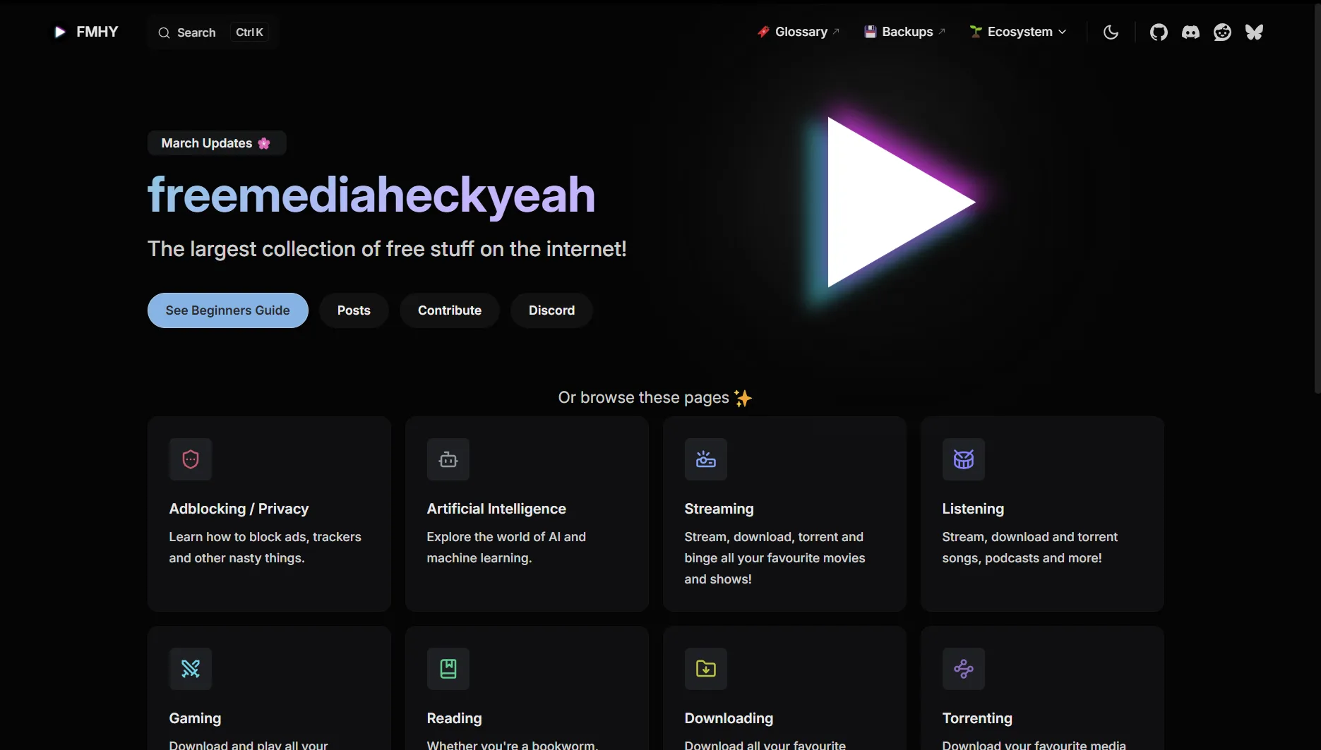
OLED dark theme for FMHY
FMHY at night by zettaexa
Details
Authorzettaexa
LicenseNo License
Categoryfmhy.net, fmhy.xyz
Created
Updated
Code size2.4 kB
Code checksumb5321f36
Statistics
Learn how we calculate statistics in the FAQ.
Failed to fetch stats.
Description
Notes
Use dark theme before applying this theme
Source code
/* ==UserStyle==
@name           fmhy at night
@namespace      github.com/zettaexa/userstyles
@version        1.0.0
@description    OLED dark theme for FMHY
@author         zetta
@advanced text hue "Hue" 207
@advanced color pick "Color Picker" hsl(207, 65%, 68%)
@advanced select soc "Hide Socials/Appearance Buttons?" ["flex", "none"]

==/UserStyle== */

@-moz-document domain("fmhy.net"), domain("fmhy.xyz") {
    .dark {
    --vp-c-brand-1: hsl(/*[[hue]]*/, 65%, 68%);
    --vp-c-brand-2: hsl(/*[[hue]]*/, 63%, 61%);
    --vp-c-brand-3: hsl(/*[[hue]]*/, 53%, 48%);
    --vp-c-brand-soft: hsl(/*[[hue]]*/, 65%, 78%);
    --vp-c-bg: rgb(5, 5, 5);
    --vp-c-bg-alt: rgb(9, 9, 9);
    --vp-c-bg-soft: #121316bf;
    --vp-c-bg-elv: rgba(23, 23, 23, .8);
    --vp-custom-block-info-bg: hsla(/*[[hue]]*/, 30%, 8%, .6);
    --vp-custom-block-info-border: hsl(/*[[hue]]*/, 33%, 35%);
    --vp-custom-block-info-text: hsl(/*[[hue]]*/, 66%, 87%);
    --vp-custom-block-info-text-deep: hsl(/*[[hue]]*/, 66%, 87%);
    --vp-custom-block-tip-bg: #08110fbf;
    --vp-custom-block-tip-border: #a6ffe3;
    --vp-custom-block-tip-text: #a6ffe3;
    --vp-custom-block-tip-text-deep: hsl(150, 70%, 80%);
    --vp-custom-block-warning-bg: #110e05bf;
    --vp-custom-block-warning-border: hsl(46, 98%, 77%);
    --vp-custom-block-warning-text: hsl(46, 98%, 77%);
    --vp-custom-block-warning-text-deep: hsl(46, 98%, 77%);
    --vp-custom-block-danger-bg: #140505bf;
    --vp-custom-block-danger-border: hsl(0, 96%, 89%);
    --vp-custom-block-danger-text: hsl(0, 96%, 89%);
    --vp-custom-block-danger-text-deep: hsl(0, 96%, 89%);
    --vp-c-border: #19191a;
    --vp-c-divider: #1a1a1a;
    --vp-c-gutter: #000000;
}

.dark {
    --vp-c-text-1: rgba(255, 255, 255, .9);
    --vp-c-text-2: rgba(255, 255, 255, .8);
}


.social-links[data-v-32ba3fde] {
    display: /*[[soc]]*/;
}

.VPNavBarAppearance[data-v-c62c6eed] {
    display: /*[[soc]]*/;
}

:root {
    --vp-button-alt-bg: #141414c9;
    --vp-button-alt-text: #f0eeee;
    --vp-button-alt-hover-bg: #2f2f2f9c;
    --vp-button-alt-hover-text: #f0eeee;
    --vp-home-hero-image-background-image: linear-gradient(-45deg, #0c0c0c 50%, #1e1e1e 50%);
    --vp-c-tip-1: var(--vp-c-green-1);
    --vp-c-tip-2: var(--vp-c-brand-2);
    --vp-c-tip-3: var(--vp-c-brand-3);
}

.custom-block.tip a:hover,.custom-block.tip a:hover>code {
    color: var(--vp-c-green-2)
}

}