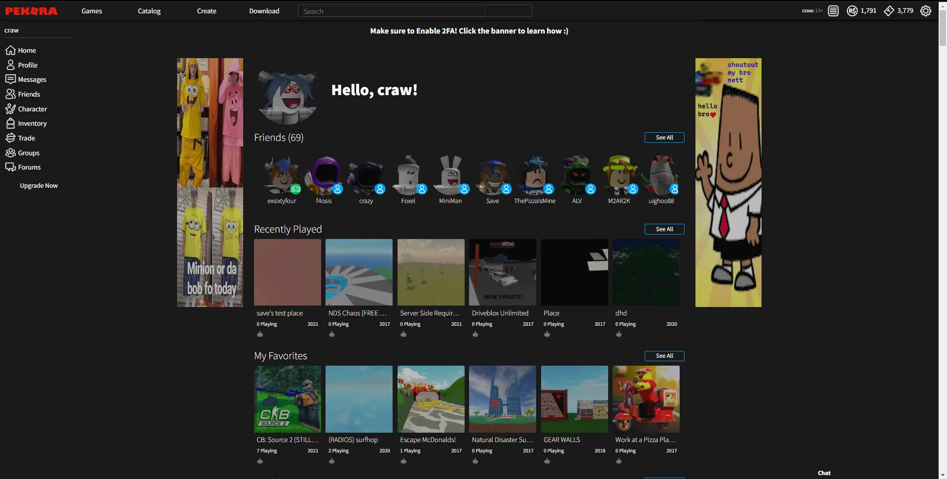
Dark theem for site pekora.zip
Pekora Dark by crawqxx
Details
Authorcrawqxx
LicenseNo License
Categorypekora.zip
Created
Updated
Code size9.1 kB
Code checksumdf15a11c
Statistics
Learn how we calculate statistics in the FAQ.
Failed to fetch stats.
Description
Notes
Got bugs? DM me: @cnxd (discord)
Source code
/* ==UserStyle==
@name         pekora fixed dark mode :3
@version      2025.17.03
@namespace    ?
==/UserStyle== */

@-moz-document domain("pekora.zip") {
html {
    background: url(" ") #1A1A1A/* u can add your own bg image i js dont like them */
    !important
}


* {
    color: #999 !important;
    text-shadow: 0 0 3px #000 !important;
    box-shadow: none !important;
    background-color: transparent !important;
    border-color: #444 !important;
    border-top-color: #444 !important;
    border-bottom-color: #444 !important;
    border-left-color: #444 !important;
    border-right-color: #444 !important
}
body {
    background: transparent !important
}
*:before,
*:after {
    background-color: transparent !important;
    border-color: #444 !important
}

a,
a * {
    color: #409B9B !important;
    text-decoration: none !important
}
a:hover,
a:hover *,
a:visited:hover,
a:visited:hover *,
span[onclick]:hover,
div[onclick]:hover,
[role="link"]:hover,
[role="link"]:hover *,
[role="button"]:hover *,
[role="menuitem"]:hover,
[role="menuitem"]:hover *,
.link:hover,
.link:hover * {
    color: #F0F0F0 !important;
    text-shadow: 0 0 5px rgba(255, 255, 200, 0.9) !important
}
a:visited,
a:visited * {
    color: #fff !important
}
a.highlight,
a.highlight *,
a.active *,
.selected,
.selected *,
[href="#"] {
    background: rgba(0, 0, 0, .87) !important;
    color: #DDD !important;
    font-weight: bold !important
}

a.active {
    background: rgba(0, 0, 0, .0) !important;
}

h1,
h2,
h3,
h4,
h5,
h6,
h1 *,
h2 *,
h3 *,
strong,
[id*="headline"],
[class*="headline"],
[id*="header"],
[class*="header"],
[class*="header"] td {
    color: #DDD !important
}
a h1,
a h2,
a h3,
a h4,
a h5,
a h6,
h1 a,
h2 a,
h3 a,
a strong,
a[id*="headline"],
a[class*="headline"],
a[id*="header"],
a[class*="header"] {
    text-decoration: underline !important
}
[class*="error"],
[class*="alert"],
code,
span[onclick],
div[onclick] {
    color: #900 !important
}

::-moz-selection {
    background: #377 !important;
    color: #000 !important
}
::selection {
    background: #377 !important;
    color: #000 !important
}
:focus {
    outline: none !important
}


/*----- MENU & CO BACKGROUND-COLORS -----*/
div[style="display: block;"],
div[role="navigation"] {
    background: rgba(0, 0, 0, .5) !important
}

table {
    background: rgba(40, 30, 30, .6) !important;
    border-radius: 6px !important
}
table > tbody > tr:nth-child(even),
table > tbody > tr > td:nth-child(even) {
    background-color: rgba(0, 0, 0, .2) !important
}

iframe,
embed,
nav,
label [onclick],
nav ul,
div[style*="position:"][style*="left:"][style*="visible"],
div[style*="z-index:"][style*="left:"][style*="visible"],
div[style*="-moz-user-select"],
div[role="menu"],
div[role="dialog"],
span[class*="script"] div,
[id*="menu"],
[id*="Menu"],
[class*="popup"],
[class="title"],
ul[style*="display:"],
ul[style*="visibility:"] ul,
[id*="nav"] ul,
[class*="nav"] ul,
ul[class*="menu"],
a[onclick][style*="display"],
a[id*="ghosteryfirefox"],
#ghostery-purple-bubble,
#translator-popup,
.menu,
.tooltip,
.hovercard,
.vbmenu_popup {
    background: rgba(5, 5, 5, .0) !important;
    border-radius: 5px;
    box-shadow: 1px 1px 5px #000 !important
}
header,
#header,
footer,
#footer {
    background: rgba(19, 19, 19, .9) !important;
    box-shadow: 0 0 5px #000 !important
}
body > #dialog,
body > .xenOverlay {
    background: rgba(19, 19, 19, .96) !important;
    background-clip: padding-box !important;
    box-shadow: 0 0 15px #000, inset 0 0 0 1px rgba(200, 200, 200, .5), inset 0 0 5px #111 !important;
    border: 10px solid rgba(99, 99, 99, .7) !important;
    border-radius: 0 !important;
}
[id*="overlay"],
[id*="lightbox"],
blockquote {
    background-color: rgba(35, 35, 35, .9) !important;
    border-radius: 5px
}
pre,
dl,
.Message code {
    background-color: rgba(5, 5, 5, .5) !important
}


input,
select,
button,
[role="button"],
a.button,
a.submit,
a.BigButton,
a.TabLink,
.install[onclick] {
    -moz-appearance: none !important;
    -webkit-appearance: none !important;
    transition: border-color 0.3s !important;
    color: #BBB !important;
    text-shadow: 0 1px #000 !important;
    border: 2px solid #333 !important;
    border-radius: 4px !important;
    background: rgba(0, 0, 0, 0);
    box-shadow: 0 0 2px rgba(0, 0, 0, .9) !important
}
a[href="javascript:;"],
a[class*="button"]:not(:empty),
a[id*="button"]:not(:empty),
a[id*="Button"]:not(:empty),
div[class*="button"][onclick] {
    transition: border-color 0.3s !important;
    background: #060606 !important;
    color: #BBB !important;
    text-shadow: 0 1px #000 !important;
    border-color: #333 !important;
    box-shadow: 0 0 2px rgba(0, 0, 0, .9) !important
}
a[href="javascript:;"]:hover,
a[class*="button"]:not(:empty):hover,
a[id*="button"]:hover,
a[id*="Button"]:not(:empty):hover,
div[class*="button"][onclick]:hover {
    background: #151515 !important;
    color: #FFF !important
}
input *,
select *,
button *,
a.button *,
a.submit * {
    color: #BBB !important;
    text-shadow: none !important
}
input:hover,
input[type="button"]:hover,
select:hover,
button:hover,
[role="button"]:hover,
a.button:hover,
a.submit:hover,
a.BigButton:hover,
a.TabLink:hover {
    border: 2px solid #555 !important;
    border-top-color: #555 !important;
    border-bottom-color: #555 !important;
    border-left-color: #555 !important;
    border-right-color: #555 !important
}
input:focus,
select:focus {
    box-shadow: 0 0 5px #077 !important
}
input *:hover * {
    color: #F0F0F0 !important;
    text-shadow: 0 0 2px #FFF !important
}
input[disabled],
select[disabled],
button[disabled],
input[disabled]:hover,
select[disabled]:hover,
button[disabled]:hover,
input[disabled]:focus,
select[disabled]:focus,
button[disabled]:focus {
    opacity: 0.5 !important;
    border-color: #333 !important
}

input[type="checkbox"] {
    border-radius: 1px !important
}
input[type="radio"],
input[type="radio"]:focus {
    border-radius: 100% !important
}
input[type="checkbox"],
input[type="radio"] {
    min-width: 12px;
    min-height: 12px
}
input[type="checkbox"]:checked,
input[type="radio"]:checked {
    border-color: #077 !important;
    box-shadow: 0 0 5px #077 !important
}

select {
    padding-right: 15px !important;
    background: url(data:image/png;base64,iVBORw0KGgoAAAANSUhEUgAAAAcAAAAECAYAAABCxiV9AAAAAXNSR0IArs4c6QAAAARnQU1BAACxjwv8YQUAAAAJcEhZcwAADsMAAA7DAcdvqGQAAAAeSURBVBhXY5g5c+Z/BiwALo6uAEMDTACXSWgSDAwA4jATh950E30AAAAASUVORK5CYII=) no-repeat right 4px center #060606 !important;
    transition: border-color 0.3s, background-position 0.3s !important
}


button:active,
input[type="submit"]:active,
input[type="button"]:active,
a.button:active,
a[class*="button"]:not(:empty):active,
a.submit:active,
a.BigButton:active,
a.TabLink:active,
.Active .TabLink {
    background: #292929 !important;
    color: #FFF !important
}

textarea {
    -moz-appearance: none !important;
    -webkit-appearance: none !important;
    background: rgba(0, 0, 0, .3) !important;
    border-radius: 3px !important;
    border: 1px solid #000 !important;
    box-shadow: inset 0 0 8px #000 !important;
    transition: border-color, background, 0.3s !important
}
textarea,
textarea * {
    color: #C8C8C8 !important;
    text-shadow: 0 0 1px gray !important
}
textarea:hover,
textarea:focus:hover {
    border-color: #333 !important
}
textarea:focus {
    background: rgba(0, 0, 0, .5) !important;
    border-color: #222 !important
}
textarea:focus,
textarea:focus > * {
    text-shadow: none !important;
    box-shadow: none !important
}

option,
optgroup {
    -moz-appearance: none !important;
    -webkit-appearance: none !important;
    background: none !important;
    color: #666 !important
}
optgroup {
    background: #222 !important;
    color: #DDD !important
}
option:not([disabled]):hover,
option:focus,
option:checked {
    background: linear-gradient(#333, #292929) !important;
    color: #DDD !important
}


body,
*:not(:empty):not(html):not(span):not(a):not(b):not(option):not(select):not(img):not([style="display: block;"]):not([onclick*="open"]):not([onclick*="s_objectID"]):not([class*="stars"]):not([id*="stars"]):not([id="rating"]):not([class="rating"]):not([class*="SPRITE"]):not([id*="SPRITE"]):not([class*="item"]):not([id*="item"]):not([class*="thumb"]):not([class*="icon"]):not([class*="photo"]):not(.view):not(.text):not([id*="lbImage"]):not([class*="cc-in"]):not([class*="gr-body"]):not([id*="watch"]):not(#globalsearch) {
    background: none !important;
    color: white !important
}

img {
    opacity: .7 !important;
    transition: opacity .2s
}
img:hover,
a:hover img,
#mpiv-popup {
    opacity: 1 !important
}
}