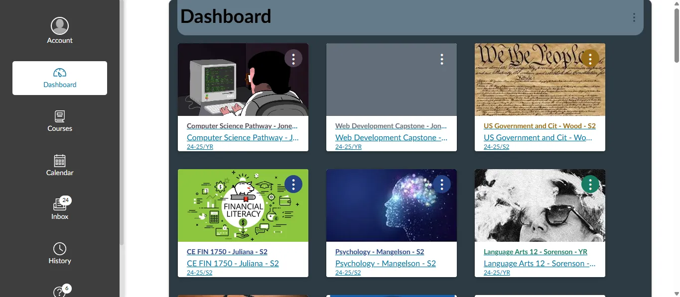
A Material Theme for Instructure.com (Canvas)
Material Themed Instructure.com (Canvas) by PaulGamerBoy101
Details
AuthorPaulGamerBoy101
LicenseAll Rights Reserved
Categorywashk12.instructure.com
Created
Updated
Code size22 kB
Code checksum99778c21
Statistics
Learn how we calculate statistics in the FAQ.
Failed to fetch stats.
Description
Notes
Must Replace Placement URL With Your Canvas URL.
Source code
Source code has over 10K characters, so we truncated it. You can inspect the full source code on install link./* ==UserStyle==
@name Material Themed Instructure
@namespace washk12.instructure.com
@version 1.0.0
@description Custom Material Theme for Instructure
@author PaulGamerBoy101
@license MIT
==/UserStyle== */
@-moz-document domain("washk12.instructure.com") {
/* --- Sidebar Navigation (Fixed Left) --- */
#header {
position: fixed;
left: 0;
top: 0;
bottom: 0;
width: 250px;
background: #3e3e3e !important;
border-right: 2px solid #E0E0E0 !important;
padding: 15px;
box-shadow: 2px 0px 5px rgba(0, 0, 0, 0.1);
overflow-y: auto;
z-index: 1000;
/* Keeps the navbar on top */
}
/* --- Main Content Adjustment --- */
body {
padding-left: 250px;
/* Pushes everything in the body to the right of the navbar */
}
/* --- Main Content --- */
#content {
padding: 20px;
width: 100%;
box-sizing: border-box;
margin-left: -10px !important;
/* Slightly adjusted to the left */
}
/* --- Navbar Header --- */
#header h2 {
font-size: 18px !important;
color: #f32121 !important;
margin-bottom: 15px;
font-weight: 600;
text-align: center;
}
/* --- Navigation Links --- */
#header ul {
list-style: none;
padding: 0;
margin: 0;
}
#header li {
padding: 10px;
transition: background 0.3s ease-in-out;
}
#header li a {
color: #424242 !important;
text-decoration: none;
font-size: 16px;
font-weight: 500;
display: block;
padding: 10px;
border-radius: 5px;
}
#header li:hover {
background: rgba(33, 150, 243, 0.1) !important;
border-left: 4px solid #f32121 !important;
}
/* --- Scrollbar Customization --- */
#header::-webkit-scrollbar {
width: 8px;
}
#header::-webkit-scrollbar-track {
background: #E0E0E0;
}
#header::-webkit-scrollbar-thumb {
background: #c1c1c1;
border-radius: 10px;
}
#header::-webkit-scrollbar-thumb:hover {
background: #807e7e;
}
/* --- Animation for Smooth Appearance --- */
@keyframes fadeIn {
from {
opacity: 0;
transform: translateX(-10px);
}
to {
opacity: 1;
transform: translateX(0);
}
}
#header {
animation: fadeIn 0.4s ease-in-out;
}
#content-main > div:nth-child(7) {
border-radius: 15px !important;
/* Rounds the corners of the div */
overflow: hidden;
/* Ensures content doesn't overflow outside the rounded corners */
box-shadow: 0 4px 8px rgba(0, 0, 0, 0.1);
/* Optional: adds a subtle shadow around the div */
padding: 20px;
/* Optional: adds some padding inside the div */
}
#attByClass {
border-top-left-radius: 15px !important;
/* Rounds the top-left corner */
border-top-right-radius: 15px !important;
/* Rounds the top-right corner */
overflow: hidden;
/* Ensures content doesn't spill out of the rounded corners */
box-shadow: 0 4px 8px rgba(0, 0, 0, 0.1);
/* Optional: adds a subtle shadow around the div */
padding: 20px;
/* Optional: adds some padding inside the div */
}
#attTotal {
border-bottom-left-radius: 15px !important;
/* Rounds the bottom-left corner */
overflow: hidden;
/* Ensures content doesn't spill out of the rounded corners */
box-shadow: 0 4px 8px rgba(0, 0, 0, 0.1);
/* Optional: adds a subtle shadow around the div */
padding: 20px;
/* Optional: adds some padding inside the div */
}
#termTarTotal {
border-bottom-right-radius: 15px !important;
/* Rounds the bottom-left corner */
}
#quickLookup > table:nth-child(2) {
border-radius: 15px !important;
/* Rounds the bottom-left corner */
}
#gpa_info > tbody:nth-child(1) > tr:nth-child(1) > td:nth-child(1) {
border-top-left-radius: 15px !important;
/* Rounds the bottom-left corner */
}
#gpa_info > tbody:nth-child(1) > tr:nth-child(1) > td:nth-child(2) {
border-top-right-radius: 15px !important;
/* Rounds the bottom-left corner */
}
#legend {
border-radius: 15px !important;
/* Rounds the corners of the div */
overflow: hidden;
/* Ensures content doesn't overflow outside the rounded corners */
box-shadow: 0 4px 8px rgba(0, 0, 0, 0.1);
/* Optional: adds a subtle shadow around the div */
padding: 20px;
/* Optional: adds some padding inside the div */
}
#content-main {
border: 1px solid #acacac !important;
/* Adds a border around the element */
border-radius: 15px !important;
/* Applies the same roundness to all corners */
overflow: hidden;
/* Ensures content doesn't spill out of the rounded corners */
padding: 20px;
/* Optional: adds some padding inside the element */
box-shadow: 0 4px 10px rgba(0, 0, 0, 0.1);
/* Adds a subtle shadow around the element */
}
#tools > li:nth-child(2) > a:nth-child(2) {
display: inline-block;
/* Makes the link behave like a block-level element, but only as wide as its content */
background-color: #f32121;
/* Button-like blue background */
color: white !important;
/* White text */
padding: 10px 20px;
/* Adds padding to make the button larger */
text-align: center;
/* Centers the text inside the button */
border-radius: 8px;
/* Rounds the corners to make it look like a pill-shaped button */
text-decoration: none !important;
/* Removes the default underline from the link */
font-size: 16px;
/* Sets a readable font size */
font-weight: 500;
/* Makes the font weight bold */
transition: background-color 0.3s ease, box-shadow 0.3s ease;
/* Adds smooth transitions on hover */
}
#tools > li:nth-child(2) > a:nth-child(2):hover {
background-color: #d21919;
/* Changes to a darker blue on hover */
box-shadow: 0 4px 8px rgba(0, 0, 0, 0.2);
/* Adds a subtle shadow on hover */
}
#tools > li:nth-child(3) > a:nth-child(2) {
display: inline-block;
/* Makes the link behave like a block-level element */
background-color: #f32121;
/* Button-like blue background */
color: white !important;
/* White text */
padding: 10px 20px;
/* Adds padding to make the button larger */
text-align: center;
/* Centers the text inside the button */
border-radius: 8px;
/* Rounds the corners for a pill-shaped button */
text-decoration: none !important;
/* Removes the underline from the link */
font-size: 16px;
/* Sets a readable font size */
font-weight: 500;
/* Makes the font weight bold */
transition: background-color 0.3s ease, box-shadow 0.3s ease;
/* Smooth transition on hover */
}
#tools > li:nth-child(3) > a:nth-child(2):hover {
background-color: #d21919;
/* Changes to a darker blue on hover */
box-shadow: 0 4px 8px rgba(0, 0, 0, 0.2);
/* Adds a subtle shadow on hover */
}
#btnLogout {
display: inline-block;
/* Makes it behave like a block-level element */
background-color: #f32121;
/* Pinkish background for logout button */
color: white !important;
/* White text */
padding: 10px 20px;
/* Adds padding to make it larger */
text-align: center;
/* Centers the text inside the button */
border-radius: 8px;
/* Rounds the corners to make it pill-shaped */
text-decoration: none !important;
/* Removes underline */
font-size: 16px;
/* Sets a readable font size */
font-weight: 500;
/* Slightly bold text */
transition: background-color 0.3s ease, box-shadow 0.3s ease;
/* Smooth hover effect */
}
#btnLogout:hover {
background-color: #d21919;
/* Darker pink on hover */
box-shadow: 0 4px 8px rgba(0, 0, 0, 0.2);
/* Adds a subtle shadow on hover */
}
#userName {
background-color: #FAFAFA;
/* Same color as the background */
border: 2px solid #E0E0E0;
/* Adds a border around the card */
border-radius: 8px;
/* Round corners like the buttons */
padding: 10px 20px;
/* Slightly reduced padding to make the card smaller and align it better */
box-shadow: 0 4px 10px rgba(0, 0, 0, 0.1);
/* Adds a subtle shadow */
margin-top: 0px;
/* Slightly higher by reducing the margin-top */
margin-bottom: 10px;
/* Optional: space below the card */
display: inline-block;
/* Makes the card behave like a block-level element */
text-align: center;
/* Centers the text inside the card */
width: auto;
/* Makes the width fit the content */
font-size: 16px;
/* Ensures the text size matches the buttons */
font-weight: 500;
/* Slightly bold text */
}
#students-list {
background-color: #f32121;
/* Pinkish background for logout button */
}
#usercontext-bar {
background-color: #f32121;
/* Pinkish background for logout button */
}
/* Apply text color variants to all links inside #content-main, excluding specific spans */
#content-main a {
color: #2196F3 !important;
/* Blue text color */
text-decoration: none !important;
/* Removes underline */
font-size: 16px !important;
/* Sets a readable font size */
font-weight: 500 !important;
/* Slightly bold text */
transition: color 0.3s ease;
/* Smooth transition for text color change */
}
/* Add hover effect to change text color */
#content-main a:hover {
color: #1976D2 !important;
/* Darker blue text color on hover */
}
/* Manually set specific spans inside links to black color, font size 14px, and bold */
#GradesandAttendanceCTHS a > span:nth-child(1),
#GradesandAttendanceUOHS a > span:nth-child(1),
#StandardsGrades a > span:nth-child(1) {
color: black !important;
/* Black text color */
font-size: 14px !important;
/* Font size 14px */
...