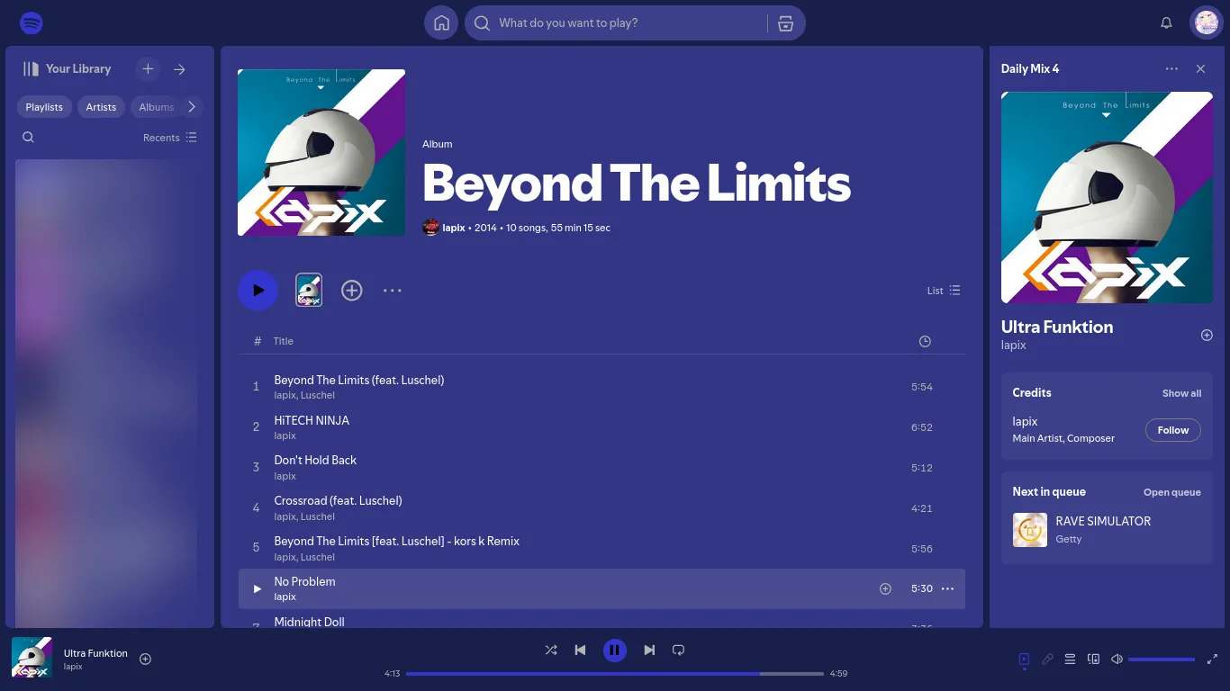
Flat theme with customizable colors
Spotify Custom Flat by cheldux
Details
Authorcheldux
LicenseMIT
Categoryopen.spotify.com
Created
Updated
Code size8.5 kB
Code checksuma97851b1
Statistics
Learn how we calculate statistics in the FAQ.
Failed to fetch stats.
Description
Notes
I'll probably check the Github repo from time to time if there's any issue.
No you can't change the color of the green moving bars when a song is playing it's a gif. nvm
Source code
/* ==UserStyle==
@name           Spotify Custom Flat
@namespace      github.com/openstyles/stylus
@license        MIT
@version        1.0.5
@description    Custom color theme for spotify
@author         cheldux
@preprocessor   stylus

@var checkbox hide_bg "Hide artists background picture" 0
@var checkbox use_custom_press "Use custom press color" 0
@var checkbox use_custom_bg "Use custom background color" 0
@var checkbox use_custom_border "Use custom border color" 0
@var color custom_color "Custom color" #214291
@var color custom_accent_color "Custom accent color" #2f5ed0
@var color custom_press_color "Custom press color" #2fd0c3
@var color custom_bg_color "Custom background color" #121212ff
@var color custom_border_color "Custom border color" #121212ff
@var range hue_shift_equalizer "Hue shift equalizer gif" [0, 0, 360, 1]
==/UserStyle== */
@-moz-document domain("open.spotify.com") {
    /*special thanks to regex and neovim*/
    /*I just kept parts of the official css
    that had their green colors and then
    changed them to the vars.
    I have zero idea what these selectors
    actually do.*/
    .KAZD28usA1vPz5GVpm63.RK45o6dbvO1mb0wQtSwq,
    .KAZD28usA1vPz5GVpm63.RK45o6dbvO1mb0wQtSwq:active:focus,
    .KAZD28usA1vPz5GVpm63.RK45o6dbvO1mb0wQtSwq:active:hover,
    .control-button--active:not(.control-button--disabled):active:focus,
    .control-button--active:not(.control-button--disabled):active:hover,
    .mWj8N7D_OlsbDgtQx5GW[role=menuitemradio][aria-checked=true] {
        color: custom_color;
    }

    .KAZD28usA1vPz5GVpm63.EHxL6K_6WWDlTCZP6x5w:after,
    .control-button--active-dot:after {
        background-color: custom_color;
    }

    .TywOcKZEqNynWecCiATc {
        --is-active-fg-color: custom_accent_color;
        --fg-color: custom_color;
    }

    .control-button--active {
        fill: custom_color;
        color: custom_color;
    }

    .KAZD28usA1vPz5GVpm63.RK45o6dbvO1mb0wQtSwq:focus,
    .KAZD28usA1vPz5GVpm63.RK45o6dbvO1mb0wQtSwq:hover,
    .control-button-heart[aria-checked=true],
    .control-button--active:not(.control-button--disabled):focus,
    .control-button--active:not(.control-button--disabled):hover {
        color: custom_accent_color;
    }

    /*that part was hand made for the
    elements that were still green or
    white, and also to remove all
    gradient parts of the UI.*/
    .encore-dark-theme,
    .encore-dark-theme .encore-base-set {
        --text-bright-accent: custom_color;
        --text-positive: custom_color;
        --essential-bright-accent: custom_color;
        --essential-positive: custom_color;
        if use_custom_bg {
            --background-base: custom_bg_color;
            /*hard to get the exact same colors
			but it's good enough*/
            --background-highlight: mix(custom_bg_color, #ffffff, 95%);
            --background-elevated-base: mix(custom_bg_color, #ffffff, 95%);
            --background-elevated-highlight: mix(custom_bg_color, #ffffff, 89%);
            --background-elevated-press: mix(custom_bg_color, #ffffff, 97%);
        }
        if use_custom_border {
            --background-press: custom_border_color;
        }
    }

    .encore-dark-theme .encore-bright-accent-set,
    .encore-dark-theme .encore-inverted-light-set {
        --background-base: custom_color;
        --background-highlight: custom_accent_color;
        if use_custom_press {
            --background-press: custom_press_color;
        }
        else {
            --background-press: mix(custom_color, custom_accent_color, 30%);
        }
    }

    .S4OmZ_IZexmZ5dasPqW5,
    .PeLrpasyfBW8ql_bmoAi,
    .PkOz5g82CaoKk1J3GX0e,
    .e-9640-button.e-9640-button-primary.encore-text-body-small-bold,
    .e-9640-button--leading.e-9640-button--small.e-9640-overflow-wrap-anywhere.encore-text-body-small-bold.hgbBnc.Button-sc-1dqy6lx-0 {
        display: none;
    }

    .T1xI1RTSFU7Wu94UuvE6,
    .EvIR4O7jOSbNmxtMdIQ0,
    .cj6vRk3nFAi80HSVqX91,
    .esBjsh {
        if use_custom_bg {
            background-color: custom_bg_color;
        }
        else {
            background-color: #121212;
        }
    }

    .hIFR8WDm_54EEIa1gwpC,
    .XVz4BMGP5zAEE5p90mYK,
    .Bdcf5g__Rug3TGqSdbiy,
    .aaFQbW0j0N40v_siz0kX::before {
        display: none !important;
    }

    .Z35BWOA10YGn5uc9YgAp,
    .kcRGDn::after {
        background-color: inherit;
        transition: none;
    }

    if use_custom_bg {
        .NbcaczStd8vD2rHWwaKv {
            background-color: mix(custom_bg_color, custom_color, 90%);
        }
    }

    .Z35BWOA10YGn5uc9YgAp:hover,
    .kcRGDn:hover::after {
        if use_custom_bg {
            background-color: mix(custom_bg_color, custom_color, 80%);
        }
        else {
            background-color: mix(#121212, custom_color, 80%);
        }
    }

    if use_custom_border {
        .ZQftYELq0aOsg6tPbVbV,
        .wp7mZFPzV7Qmo51F0NA_ {
            background-color: custom_border_color !important;
        }
    }

    .e-9640-logo {
        fill: custom_color;
    }

    .EmeHQXR87mUskYK6xEde {
        isolation: inherit;
    }

    .encore-internal-color-text-subdued {
        color: inherit;
    }

    /*I said flat*/
    .nYdM55iHFByRTzJUmx9X,
    .tippy-box[data-theme~=activation],
    .tp8rO9vtqBGPLOhwcdYv.BzunmwrVMyWGpopPJRt2:after,
    .NbcaczStd8vD2rHWwaKv,
    .vreceNX3ABcxyddeS83B,
    .hykQHtPI6EeFREwqRrOR,
    .R1LAYqlvoHyvSWVzo0lh,
    .JMFuNKBYyJzmnXyTJ5Bg,
    .FeEAKmWk_VtR7jCawvei,
    .V5kle5COkVEN5X6CkL7q,
    .xlLQHgpip3xYOwRYpwun,
    .GimJ6fo6WOYPyWNVpSr1,
    .b7r2WRiu5f9Q99qmyreh:hover .CVuGEUIxLkNKpMds8AFS,
    .b7r2WRiu5f9Q99qmyreh .CVuGEUIxLkNKpMds8AFS,
    .b7r2WRiu5f9Q99qmyreh .CVuGEUIxLkNKpMds8AFS:focus,
    .k4sYYpEpX2f7RMAPHv3F,
    ._w3sHVCUhYgvQar5WNHw:before,
    .woJQ5t2YiaJhjTv_KE7p,
    .GOcsybnoHYyJGQGDRuwj,
    .NI1OxoVdokxENPAjoeOk,
    .mxGhI8Lr7MoGOnFrbsUa.BHHXR8xc6m009ohY6aKU,
    ._EShSNaBK1wUIaZQFJJQ,
    ._2ajKWDiy6YvJu5wo8I1g.IpXjqI9ouS_N5zi0WM88,
    .DquSH3YjnaIIXMZiOvwA,
    .LAdTOeZ2QwKXGF4XAXZ8,
    .XvgFwKtvocRdadc47KE9:focus-visible,
    .XTygmcBFgNjoo0ckBBll,
    .JEd1tp9FdtDLBOCRSVe0,
    .H0HbpIM3UrcupWIAjLWu,
    .dFz3mTMCEntyqsdPM0FF,
    .ELSmDYJtrr7_ktB1jf97,
    .xT6oSRia2sXC94ckOTnF,
    .GSY8YnDV4YNR_W53fPhi,
    .JP0zpUy6bLRoJXWWX_Nd,
    :root,
    .e-9640-overlay,
    .e-9640-button,
    .e-9640-form-control,
    .e-9640-form-control[readonly],
    .e-9640-form-control--focus-bold,
    .e-9640-form-control--focus-light,
    .e-9640-form-control--hover,
    .e-9640-form-control:focus,
    .e-9640-form-control:hover,
    .e-9640-form-control:disabled,
    .e-9640-form-control:invalid,
    .e-9640-form-control[aria-invalid=true],
    .e-9640-form-control:invalid:focus,
    .e-9640-form-control[aria-invalid=true]:focus,
    .e-9640-form-control[aria-invalid=false],
    .e-9640-form-control[aria-invalid=false]:hover,
    .e-9640-form-control[aria-invalid=false]:focus,
    .e-9640-form-control--focus-light,
    .e-9640-form-control--use-focus-light:focus,
    .e-9640-form-control--use-focus-light:invalid:focus,
    .e-9640-form-control--use-focus-light[aria-invalid=true]:focus,
    .e-9640-form-control--focus-bold,
    .e-9640-form-control--use-focus-bold:focus,
    .e-9640-form-control--use-focus-bold[aria-invalid=false]:focus,
    .e-9640-button-primary:active .e-9640-button-primary__inner,
    .e-9640-form-input[type=file],
    .e-9640-form-input[type=file]:focus,
    .e-9640-form-input[type=file]:hover:focus,
    input:disabled + .e-9640-form-input-icon__icon,
    input[readonly] + .e-9640-form-input-icon__icon,
    .e-9640-table-container--is-sticky .e-9640-table-header-cell,
    .e-9640-tag[href],
    .e-9640-tag[href]:focus,
    .e-9640-tag[href]:hover,
    .e-9640-tag.e-9640-text-link[href],
    .e-9640-tag.e-9640-text-link[href]:focus,
    .e-9640-tag.e-9640-text-link[href]:hover,
    .Z35BWOA10YGn5uc9YgAp .zXwER4Lsqq_e7fVVaPkZ,
    .Z35BWOA10YGn5uc9YgAp .Kcb74zm1aMqGfPxTwO5s .vq0lsCoYrDUDvkuUIaRg,
    .qWtIAYA_A_mOQIlxBb02 > *,
    .mEYwOgcSR3UWyvz0OSVE,
    .PromotionDefaultNativeImage-module_image-container__gQhJp {
        box-shadow: none;
    }

    .a2NTH51fJWzWsds0OYv_::after {
        background: none;
    }

    if hide_bg {
        .under-main-view {
            display: none;
        }
    }

    /*filter for the bar gif*/
    .jxXIarsEHgz2HoaVCVzA,
    .DZJJ5SCypi2mREbjy5bx {
        filter: hue-rotate(hue_shift_equalizer deg);
    }
}