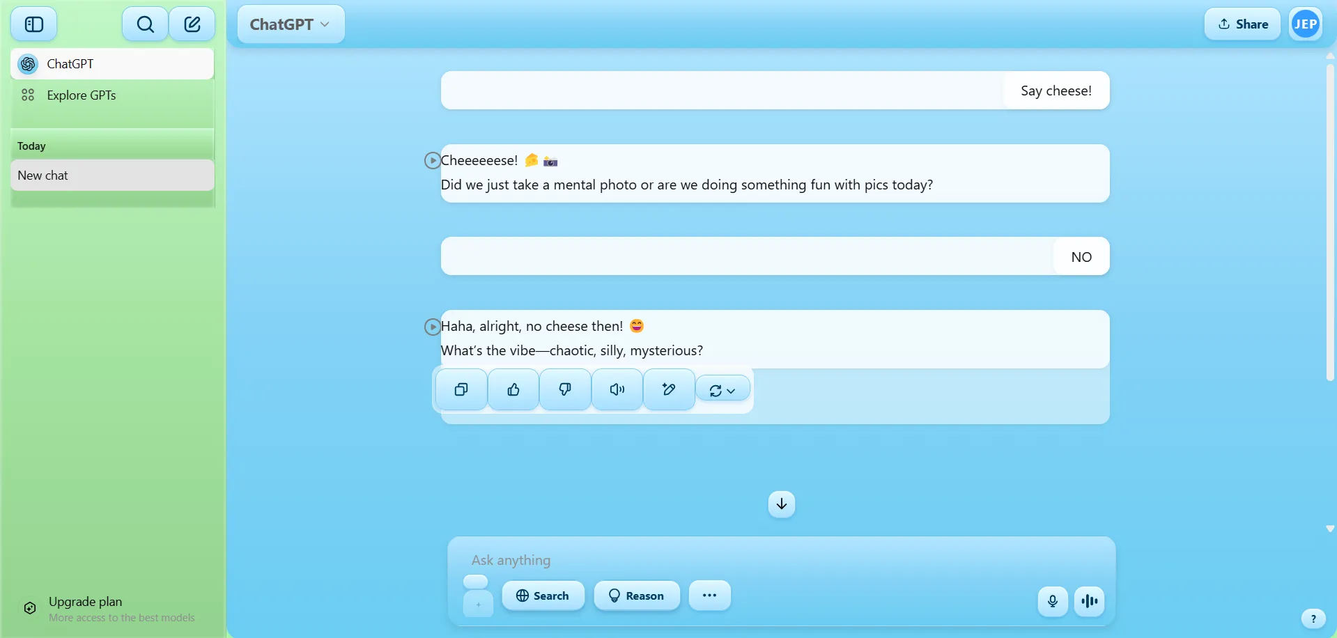
The userstyle will turn all backgrounds into Frutiger Aero Aesthetics
Frutiger Aero by Blucosmic
Details
AuthorBlucosmic
LicenseNo License
Categorychat.openai.com
Created
Updated
Code size4.6 kB
Code checksum55f03a1e
Statistics
Learn how we calculate statistics in the FAQ.
Failed to fetch stats.
Description
Notes
Must install Chrome- Stylus Extension
Source code
@-moz-document domain("chat.openai.com") /* ==UserStyle==
@name           Frutiger Aero Blue-Green - Daytime
@namespace      github.com/openstyles/stylus
@version        1.0.0
@description    A soft, glossy Frutiger Aero theme with blue and green accents for ChatGPT
@author         You :)
==/UserStyle== */
/* === Frutiger Aero Clean Base Theme for ChatGPT === */
/* Body: overall green/sky base */
body {
    background: linear-gradient(to bottom, #b3e5ff, #84d2f6, #6bcdf3, #8ff0cb, #b3ffb3);
    background-attachment: fixed;
    background-size: cover;
    background-repeat: no-repeat;
}

/* Main Chat Area */
main,
div[class*="main"],
div[class*="chat"],
div[class*="Conversation"],
div[class*="scrollable"] {
    background: linear-gradient(to bottom, #b3e5ff, #84d2f6, #6bcdf3);
    /* Blue gradient */
    backdrop-filter: blur(8px);
    border-radius: 16px;
    box-shadow: 0 4px 8px rgba(0, 0, 0, 0.1);
}

/* Optional: make inner chat bubbles more subtle white/glassy */
div[class*="message"] {
    background: rgba(255, 255, 255, 0.5);
    border-radius: 12px;
    backdrop-filter: blur(4px);
    box-shadow: 0 2px 6px rgba(0, 0, 0, 0.05);
}

button,
div[class*="Button"],
div[class*="iconButton"] {
    background: linear-gradient(to bottom, #e0f8ff, #a6dfff);
    border: 1px solid #7ecdf2;
    border-radius: 12px;
    box-shadow: inset 0 1px 2px rgba(255, 255, 255, 0.6),
    0 2px 4px rgba(0, 100, 200, 0.2);
    padding: 8px 14px;
    color: #003a5d;
    font-weight: bold;
    transition: all 0.2s ease;
    backdrop-filter: blur(3px);
}

/* On hover — adds highlight */
button:hover,
div[class*="Button"]:hover {
    background: linear-gradient(to bottom, #ffffff, #c4ecff);
    box-shadow: inset 0 1px 3px rgba(255, 255, 255, 0.9),
    0 3px 6px rgba(0, 100, 200, 0.25);
    transform: translateY(-1px);
}

/* Optional active click effect */
button:active,
div[class*="Button"]:active {
    background: linear-gradient(to bottom, #a6dfff, #e0f8ff);
    box-shadow: inset 0 2px 4px rgba(0, 0, 0, 0.15),
    0 1px 2px rgba(0, 100, 200, 0.2);
    transform: translateY(1px);
}

/* Align feedback buttons with the chat message bubble */
div[class*="message"] div[class*="buttonGroup"] {
    margin-left: 12px !important;
    /* Adjust this if your padding changes */
    justify-content: start !important;
}

nav[class*="sidebar"],
div[class*="sidebar"] {
    background: linear-gradient(to bottom, #c1f7c7, #a6e4a2, #92d28f) !important;
    backdrop-filter: blur(4px);
    border-right: 1px solid rgba(0, 0, 0, 0.05);
    box-shadow: inset 0 0 4px rgba(255, 255, 255, 0.6);
}

/* Optional: Sidebar icons hover effect */
nav[class*="sidebar"] button:hover,
div[class*="sidebar"] button:hover {
    background: rgba(255, 255, 255, 0.25) !important;
    border-radius: 12px;
}

/* Highlighted or active sidebar button */
div[role="button"][aria-selected="true"],
div[role="button"]:hover {
    background: linear-gradient(to bottom, #d2f0ff, #a7e0ff) !important;
    border: 2px solid #00aaff !important;
    box-shadow: 0 0 6px rgba(0, 170, 255, 0.5), inset 0 0 3px rgba(255, 255, 255, 0.6) !important;
    color: #003366 !important;
    border-radius: 12px !important;
    transition: all 0.2s ease-in-out !important;
}

/* Top "ChatGPT" box styling */
a.flex.items-center.gap-2.px-3.p-3 {
    background: linear-gradient(to bottom, #fff8b3, #f7e467) !important;
    border: 2px solid #e0c200 !important;
    border-radius: 12px !important;
    color: #665100 !important;
    box-shadow: 0 0 6px rgba(255, 230, 0, 0.4), inset 0 0 4px rgba(255, 255, 255, 0.5) !important;
    transition: all 0.2s ease-in-out !important;
}

/* ChatGPT logo button (first in sidebar) */
a.flex.items-center.gap-2.px-3.py-3.rounded-md {
    background: linear-gradient(to bottom, #fffaa5, #f7e467) !important;
    border: 2px solid #e0c200 !important;
    border-radius: 12px !important;
    color: #4c3f00 !important;
    box-shadow: 0 0 6px rgba(255, 230, 0, 0.4),
    inset 0 0 4px rgba(255, 255, 255, 0.4) !important;
    position: relative !important;
    overflow: hidden !important;
}

/* Glossy shine on top of the button */
a.flex.items-center.gap-2.px-3.py-3.rounded-md::before {
    content: '';
    position: absolute;
    top: 0;
    left: 0;
    width: 100%;
    height: 50%;
    background: linear-gradient(to bottom, rgba(255, 255, 255, 0.4), transparent);
    border-top-left-radius: 12px;
    border-top-right-radius: 12px;
    pointer-events: none;
}