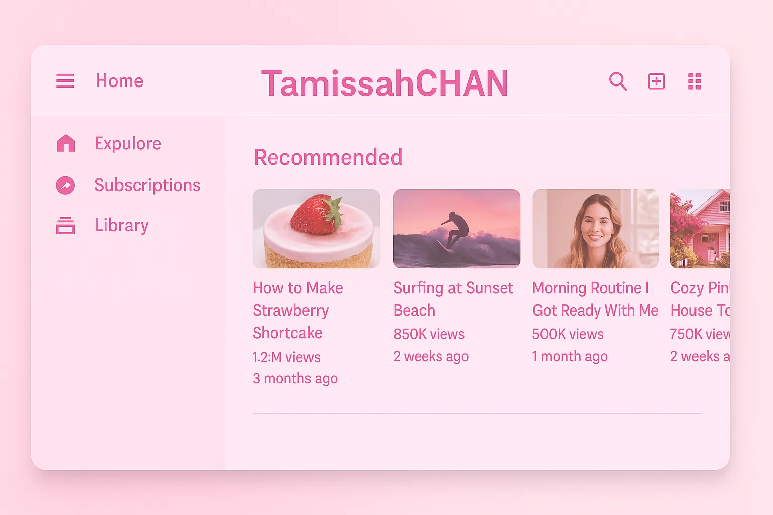
A soft and dreamy pink YouTube theme by TamissahCHAN 💖
Removes ads, customizes the logo, and gives YouTube a cute feminine vibe with matching fonts and colors.
YouTube Pink by TamissahCHAN by 15tamiss11
Details
Author15tamiss11
LicenseMIT License
CategoryYouTube
Created
Updated
Code size4.5 kB
Code checksuma33ff543
Statistics
Learn how we calculate statistics in the FAQ.
Failed to fetch stats.
Description
Notes
Created with love by TamissahCHAN ✨
Inspired by soft pink tones and kawaii vibes 💕
For personal use — feel free to tweak it!
Source code
/* ==UserStyle==
@name         YouTube Pink by TamissahCHAN
@version      20250413.21.57
@namespace    ?
@description  A soft and dreamy pink YouTube theme by TamissahCHAN 💖Removes ads, customizes the logo, and gives YouTube a cute feminine vibe with matching fonts and colors.
@license      MIT License
==/UserStyle== */

/* ==UserStyle==
@name           YouTube - Tamisa's Ultimate Cute Theme
@namespace      tmisa-theme
@version        2.1
@description    Ultra kawaii YouTube theme with animations and hearts by Tamisa
@author         تميسة
==/UserStyle== */

@-moz-document domain("youtube.com") {
/* خلفية الموقع */
  body, ytd-app {
    background: url("https://i.imgur.com/qN4lBEw.png") repeat;
    background-color: #ffd6ea !important;
    cursor: url("https://cur.cursors-4u.net/nature/nat-10/nat928.cur"), auto !important;
  }

  html::before {
    content: "";
    position: fixed;
    top: 0;
    left: 0;
    height: 100%;
    width: 100%;
    background-image: url("https://i.imgur.com/qN4lBEw.png");
    background-repeat: repeat;
    opacity: 0.15;
    z-index: -1;
  }

  /* لمعان متحرك */
  body::after {
    content: "";
    pointer-events: none;
    position: fixed;
    top: 0; left: 0;
    width: 100%;
    height: 100%;
    background: radial-gradient(circle, rgba(255,255,255,0.2) 1%, transparent 30%);
    animation: sparkle 5s infinite;
    z-index: 9999;
  }

  @keyframes sparkle {
    0%, 100% { background-position: 0 0; }
    50% { background-position: 100% 100%; }
  }

  /* استبدال شعار اليوتيوب بكلمة Premium */
  ytd-topbar-logo-renderer #logo {
    display: none !important;
  }

  ytd-topbar-logo-renderer::after {
    content: "Premium";
    font-family: 'Roboto', sans-serif !important;
    font-weight: 700 !important;
    font-size: 20px !important;
    color: #FF0000 !important;
    display: block;
    padding-left: 8px;
    padding-top: 4px;
  }

  /* الهيدر */
  #container.ytd-masthead, ytd-masthead {
    background-color: #ff91c3 !important;
    box-shadow: 0 2px 10px #ff66a3;
  }

  /* النصوص */
  #text, h1, h2, h3, h4, span, yt-formatted-string {
    color: #cc0066 !important;
    font-family: 'Comic Sans MS', cursive, sans-serif !important;
  }

  /* الأزرار */
  paper-button, tp-yt-paper-button {
    background: linear-gradient(45deg, #ff99cc, #ff66a3);
    color: white !important;
    border-radius: 12px !important;
    transition: all 0.3s ease-in-out;
    box-shadow: 0 0 10px #ffa6c9;
  }

  paper-button:hover, tp-yt-paper-button:hover {
    transform: scale(1.05) rotate(-1deg);
    box-shadow: 0 0 20px #ff69b4;
    animation: pulse 1s infinite;
  }

  @keyframes pulse {
    0%, 100% { box-shadow: 0 0 10px #ff69b4; }
    50% { box-shadow: 0 0 20px #ff1493; }
  }

  /* الصور تتحرك عند المرور */
  ytd-thumbnail img, ytd-rich-grid-media img {
    border: 3px solid #ff66a3 !important;
    border-radius: 16px !important;
    transition: transform 0.3s ease;
  }

  ytd-thumbnail img:hover {
    transform: scale(1.05) rotate(-1deg);
  }

  /* شريط التمرير (scrollbar) */
  ::-webkit-scrollbar {
    width: 12px;
  }

  ::-webkit-scrollbar-track {
    background: #ffe6f0;
    border-radius: 6px;
  }

  ::-webkit-scrollbar-thumb {
    background: #ff66a3;
    border-radius: 6px;
    box-shadow: 0 0 5px #ff99cc;
  }

  /* عد تنازلي كيوت قبل التشغيل */
  ytd-watch-flexy[theater] #movie_player::before {
    content: "✨ ٣ ... ٢ ... ١ ... تشغيل! ✨";
    position: absolute;
    top: 40%;
    left: 50%;
    transform: translate(-50%, -50%);
    color: #ff66a3;
    font-size: 24px;
    font-family: 'Comic Sans MS';
    background: rgba(255,255,255,0.7);
    padding: 10px 20px;
    border-radius: 20px;
    animation: countdown 3s ease-out;
    z-index: 999999;
  }

  @keyframes countdown {
    0% { opacity: 1; }
    90% { opacity: 1; }
    100% { opacity: 0; display: none; }
  }

  /* 💕 قلوب عند الضغط على اللايك */
  ytd-toggle-button-renderer.style-default-active[is-icon-button]::after {
    content: "💖💞💘💓💗";
    position: absolute;
    top: -10px;
    left: 50%;
    transform: translateX(-50%);
    animation: floatHearts 1s ease-in-out;
    font-size: 16px;
    pointer-events: none;
  }

  @keyframes floatHearts {
    0% { opacity: 1; transform: translateX(-50%) translateY(0); }
    100% { opacity: 0; transform: translateX(-50%) translateY(-30px); }
  }
}