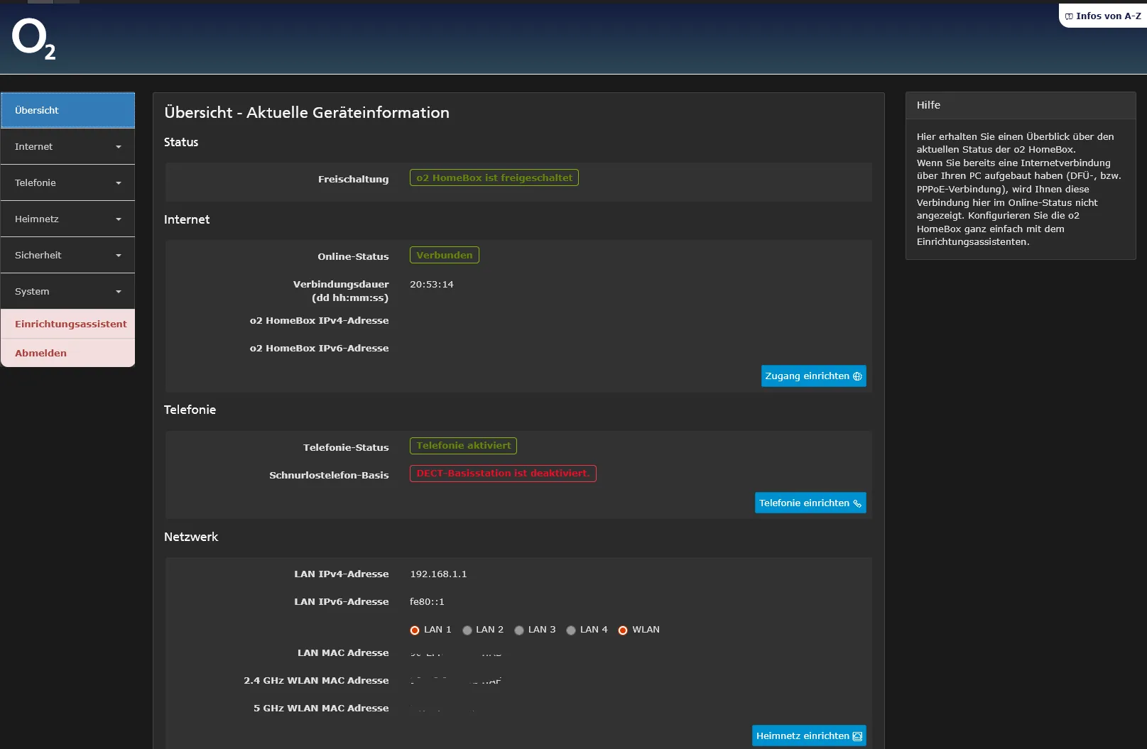
Userstyle CSS for o2 HomeBox 6641 updated UI
192.168.1.1 or o2.box
o2.box-dark by qbikedge
Details
Authorqbikedge
LicenseGPL-3.0
Categoryo2.box, Homebox, o2 HomeBox 6641, 192.168.1.1
Created
Updated
Code size7.3 kB
Code checksum24dddbb1
Statistics
Learn how we calculate statistics in the FAQ.
Failed to fetch stats.
Description
Notes
Userstyle doesn't have notes.Source code
/* ==UserStyle==
@name           o2.box o2 HomeBox 6641
@namespace      github.com/openstyles/stylus
@version        1.0.0
@description    A new userstyle
@author         Qubicedge
==/UserStyle== */
@-moz-document domain("192.168.1.1") {
    /* --- Dark Mode Styles --- */
    @media (prefers-color-scheme: dark) {

        .cmpHeader.o2-grad-sm {
            background-image: linear-gradient(to bottom, #131c3f 0, #2d4755 100%);
        }
        body {
            background-color: #1a1a1a;
            color: #e0e0e0;
        }

        a {
            color: #58a6ff;
            /* Helleres Blau für Links */
        }

        a:hover,
        a:focus {
            color: #80bfff;
        }

        hr {
            border-top-color: #444;
        }

        /* Überschriften */
        h1,
        h2,
        h3,
        h4,
        h5,
        h6,
        .h1,
        .h2,
        .h3,
        .h4,
        .h5,
        .h6 {
            color: #f5f5f5;
        }

        /* Panels */
        .panel {
            background-color: #2a2a2a;
            border-color: #444;
        }
        .panel-heading {
            background-color: #333;
            border-color: #444;
            color: #e0e0e0;
        }
        .panel-footer {
            background-color: #333;
            border-color: #444;
            color: #e0e0e0;
        }
        .panel-default {
            border-color: #444;
        }
        .panel-default > .panel-heading {
            background-color: #333;
            border-color: #444;
            color: #e0e0e0;
        }

        /* Tabellen */
        .table {
            background-color: transparent;
            /* Haupt-BG kommt von body/container */
            color: #e0e0e0;
        }
        .table > thead > tr > th,
        .table > tbody > tr > th,
        .table > tfoot > tr > th,
        .table > thead > tr > td,
        .table > tbody > tr > td,
        .table > tfoot > tr > td {
            border-color: #444;
        }
        .table-striped > tbody > tr:nth-of-type(odd) {
            background-color: #252525;
        }
        .table-hover > tbody > tr:hover {
            background-color: #383838;
        }
        .table-bordered {
            border-color: #444;
        }

        /* Formulare */
        .form-control {
            background-color: #333;
            border-color: #555;
            color: #e0e0e0;
        }
        .form-control:focus {
            border-color: #58a6ff;
            box-shadow: inset 0 1px 1px rgba(0, 0, 0, 0.075), 0 0 8px rgba(88, 166, 255, 0.6);
        }
        .form-control[disabled],
        .form-control[readonly],
        fieldset[disabled] .form-control {
            background-color: #444;
            opacity: 0.7;
        }
        .input-group-addon {
            background-color: #3a3a3a;
            border-color: #555;
            color: #ccc;
        }

        /* Buttons */
        .btn-default {
            color: #e0e0e0;
            background-color: #444;
            border-color: #555;
        }
        .btn-default:hover,
        .btn-default:focus,
        .btn-default.focus,
        .btn-default:active,
        .btn-default.active,
        .open > .dropdown-toggle.btn-default {
            color: #fff;
            background-color: #555;
            border-color: #777;
        }
        .btn-link {
            color: #58a6ff;
        }
        .btn-link:hover,
        .btn-link:focus {
            color: #80bfff;
        }

        /* Modals */
        .modal-content {
            background-color: #2a2a2a;
            border-color: #444;
        }
        .modal-header {
            border-bottom-color: #444;
        }
        .modal-footer {
            border-top-color: #444;
        }
        .close {
            color: #ccc;
            text-shadow: 0 1px 0 #000;
        }
        .close:hover,
        .close:focus {
            color: #fff;
        }

        /* Wells */
        .well {
            background-color: #252525;
            border-color: #444;
        }

        /* Breadcrumbs */
        .breadcrumb {
            background-color: #333;
            border-color: #444;
        }
        .breadcrumb > .active {
            color: #bbb;
        }
        .breadcrumb > li + li:before {
            color: #888;
        }

        /* List groups */
        .list-group-item {
            background-color: #2a2a2a;
            border-color: #444;
            color: #e0e0e0;
        }
        a.list-group-item,
        button.list-group-item {
            color: #e0e0e0;
        }
        a.list-group-item:hover,
        button.list-group-item:hover,
        a.list-group-item:focus,
        button.list-group-item:focus {
            background-color: #383838;
        }
        .list-group-item.active,
        .list-group-item.active:hover,
        .list-group-item.active:focus {
            background-color: #337ab7;
            /* Bootstrap primary color, anpassen wenn nötig */
            border-color: #337ab7;
            color: #fff;
        }
        .list-group-item.disabled,
        .list-group-item.disabled:hover,
        .list-group-item.disabled:focus {
            background-color: #444;
            color: #888;
        }

        /* Navbar (Beispiel für Default Navbar) */
        .navbar-default {
            background-color: #2a2a2a;
            border-color: #444;
        }
        .navbar-default .navbar-brand {
            color: #e0e0e0;
        }
        .navbar-default .navbar-brand:hover,
        .navbar-default .navbar-brand:focus {
            color: #fff;
        }
        .navbar-default .navbar-nav > li > a,
        .dropdown-menu > li > a {
            color: #ccc;
        }
        .navbar-default .navbar-nav > li > a:hover,
        .navbar-default .navbar-nav > li > a:focus {
            color: #fff;
            background-color: #383838;
        }
        .navbar-default .navbar-nav > .active > a,
        .navbar-default .navbar-nav > .active > a:hover,
        .navbar-default .navbar-nav > .active > a:focus {
            color: #fff;
            background-color: #337ab7;
            /* Primary */
        }
        .navbar-default .navbar-toggle {
            border-color: #555;
        }
        .navbar-default .navbar-toggle:hover,
        .navbar-default .navbar-toggle:focus {
            background-color: #383838;
        }
        .navbar-default .navbar-toggle .icon-bar {
            background-color: #ccc;
        }

        /* Spezifische o2 Klassen (Beispiele, müssen evtl. angepasst werden) */
        .cmpHeader {
            background: #222;
            /* Beispiel */
        }
        #assistant .progress .progress-bar.progress-bar-inactive {
            background: #4a6d7d;
            /* Dunkleres Blau */
        }
        fieldset {
            background: #f2f2f20a;
        }

        .dropdown-menu > li > a:focus,
        .dropdown-menu > li > a:hover {
            color: #fff;
            background-color: #383838;
        }
    }
}