Are you tired of the same boring colors on Gemini? Then try this modern color style based on the Dracula theme
Dracula for Gemini by druxorey
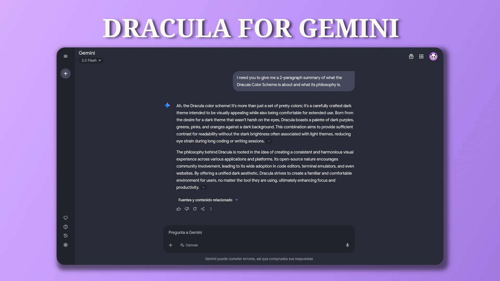
Details
Authordruxorey
LicenseGNU General Public License v3.0
CategoryGemini
Created
Updated
Code size3.8 kB
Code checksum830376e9
Statistics
Learn how we calculate statistics in the FAQ.
Failed to fetch stats.
Description
Notes
Official Dracula Theme Website: https://draculatheme.com/
Github Project: https://github.com/druxorey/dracula-for-stylus/blob/main/styles/dracula-for-gemini.css
Source code
/* ==UserStyle==
@name             Dracula for Gemini
@namespace        github.com/druxorey/dracula-for-stylus
@version          1.0.0
@description      Are you tired of the same boring colors on Gemini? Then try this modern color style based on the Dracula theme
@author           Druxorey
@license          GNU General Public License v3.0
@preprocessor     less
@var select dracula-style "Style" {
    "Dark": "dark",
    "Light": "light",
}
@var select accent-color "Accent Color" {
	"Red": "red",
	"Orange": "orange",
	"Yellow": "yellow",
	"Green": "green",
	"Blue": "blue",
	"Cyan": "cyan",
	"Purple": "purple",
	"Pink": "pink",
}

@var checkbox gemini-advanced "Disable Gemini Advance Pop Up" 0
==/UserStyle== */

@-moz-document url-prefix("https://gemini.google.com") {

	:root {
		--color-comment: #6272A4;

		--color-red-1: #FF6E6E;
		--color-red-2: #FF5555;
		--color-red-3: #E63C3C;
		--color-orange-1: #FFD185;
		--color-orange-2: #FFB86C;
		--color-orange-3: #E69F53;
		--color-yellow-1: #FFFFA5;
		--color-yellow-2: #F1FA8C;
		--color-yellow-3: #D8E173;
		--color-green-1: #69FF94;
		--color-green-2: #50FA7B;
		--color-green-3: #37EB62;
		--color-cyan-1: #A4FFFF;
		--color-cyan-2: #8BE9FD;
		--color-cyan-3: #72D0E4;
		--color-blue-1: #6DCCFF;
		--color-blue-2: #54B3FF;
		--color-blue-3: #3B9AE6;
		--color-purple-1: #D6ACFF;
		--color-purple-2: #BD93F9;
		--color-purple-3: #A47AE0;
		--color-pink-1: #FF92DF;
		--color-pink-2: #FF79C6;
		--color-pink-3: #E660AD;

		--color-accent-1: e("var(--color-@{accent-color}-1)");
		--color-accent-2: e("var(--color-@{accent-color}-2)");
		--color-accent-3: e("var(--color-@{accent-color}-3)");
	}

	:root {
		--color-background-1: #525568;
		--color-background-2: #44475A;
		--color-background-3: #353747;
		--color-background-4: #282A36;
		--color-background-5: #21222C;

		--color-foreground-1: #F8F8F2;
		--color-foreground-2: #D9DADF;
		--color-foreground-3: #B9BBCB;

		--color-shadow-1: #353747;
		--color-shadow-2: #21222C;
		--color-shadow-3: #1A1C24;

		background: var(--color-background-4) !important;
	}

	:where(.theme-host):where(.dark-theme) {
        --gem-sys-color--on-surface: var(--color-foreground-1);
		--gem-sys-color--surface: var(--color-background-4);
		--gem-sys-color--surface-container: var(--color-background-5);
		--gem-sys-color--surface-container-low: var(--color-background-4);

		--gem-sys-color--surface-container-high: var(--color-background-2) !important;
		--gem-sys-color--surface-container-high: var(--color-accent-2);
		--gem-sys-color--surface-container-high--rgb: 255, 255, 0;

		--gem-sys-color--surface-container-highest: var(--color-background-2);
		--gem-sys-color--surface-bright: red;

		--gem-sys-color--outline-variant: var(--color-background-5);
		--gem-sys-color--surface-variant: red !important;

		--gem-sys-color--primary: var(--color-accent-2);
		--gem-sys-color--primary-container: var(--color-accent-2);
		--gem-sys-color--on-primary: var(--color-background-2);
		--gem-sys-color--on-primary-container: var(--color-foreground-1);

		--gem-sys-color--secondary-container: red;
		--gem-sys-color--on-secondary-container: red;
		--gem-sys-color--surface--rgb: red;
	}

	:root .dark-theme {
		--bard-color-new-conversation-button: var(--color-background-2);
		--bard-color-bot-power-up-button-background: red;
		--bard-color-response-container-flipped-background: red;
	}

	.buttons-container.adv-upsell.ng-star-inserted {
		display: if(@gemini-advanced = 1, none, block);
	}

    .ng-tns-c470482074-3.ui-improvements-phase-1.with-toolbox-drawer.ng-star-inserted {
        background: var(--color-background-5);
    }
}