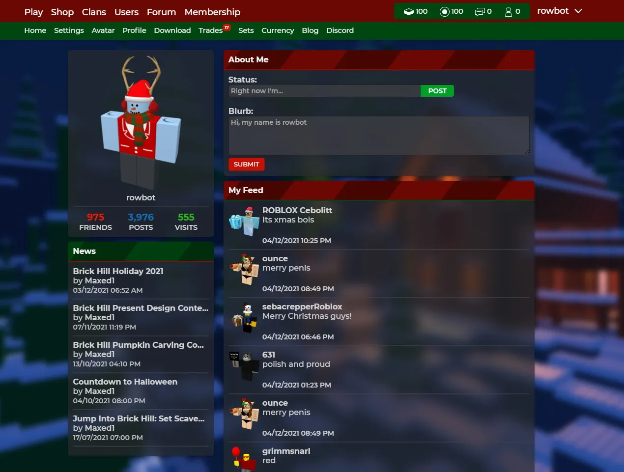
An experimental glass theme! It should work properly with both themes on the Brick-Hill settings page
Brick-Hill Christmas Dark Glass Theme by neobiel
Details
Authorneobiel
LicenseNo License
Categoryuserstyles
Created
Updated
Code size11 kB
Code checksum7e72b897
Statistics
Learn how we calculate statistics in the FAQ.
Failed to fetch stats.
Description
Notes
04-12-2021
- Theme is released
Source code
Source code has over 10K characters, so we truncated it. You can inspect the full source code on install link./* ==UserStyle==
@name Brick-Hill Christmas Dark Glass Theme
@namespace userstyles.world
@version 1.2.0
@description An experimental glass theme! It should work properly with both themes on the Brick-Hill settings page
@author Neobiel/Rowbot
@advanced dropdown BlurMode "Performance Mode (Enable if pages are lagging)" {
off "OFF" <<<EOT
.card .thumbnail.dark, .card .top:not(.absolute) { backdrop-filter: blur(20px); }
.card .content, .card .item-card-details, .card .item-content, .tabs .tab-body, .trade-picker, .item-card-container, .theme-default .new-theme input, .theme-default .new-theme textarea, .theme-default .new-theme button.clear, .theme-default .new-theme .button.clear, .modal .modal-content { background-color: #292A2DAB; backdrop-filter: blur(10px); }
.card .thumbnail.dark { background-color: #1D1E20AB }
.card .thumbnail { background-color: #ffffff54; backdrop-filter: blur(10px); }
button.tab-button.transparent:hover, .button.tab-button.transparent:hover { backdrop-filter: blur(10px); EOT;
on "ON" <<<EOT
.card .content, .card .item-card-details, .card .item-content, .tabs .tab-body, .trade-picker, .item-card-container, .theme-default .new-theme input, .theme-default .new-theme textarea, .theme-default .new-theme button.clear, .theme-default .new-theme .button.clear, .modal .modal-content { background-color: #292A2DAB; }
.card .thumbnail.dark { background-color: #1D1E20AB }
.card .thumbnail { background-color: #ffffff54; EOT;
}
==/UserStyle== */
@-moz-document domain("www.brick-hill.com") {
body {
color: #F0F0F0;
background-image: url(https://i.imgur.com/Ekm5ZjK.png);
background-attachment: fixed;
background-size: cover;
}
::-webkit-scrollbar {
width: 17px;
}
::-webkit-scrollbar-track {
background: #292A2DAB;
}
::-webkit-scrollbar-thumb {
background: #3E4044CC;
}
::-webkit-scrollbar-thumb:hover {
background: #4F5257CC;
}
/*this theme was made with love by rowbot :^)
if you need to use it for some reason, please contact me and we can talk about it
you can edit this theme for yourself though*/
/* *this code is unorganised as heck* */
/* navBar */
nav div.primary {
background-color: #6b0802;
color: #fff;
}
nav div.secondary {
background-color: #004611;
color: #eee;
}
nav .info {
background-color: #004611;
}
.red-text {
color: #ff1700;
font-weight: 700;
}
.card .name, .stat .title, .darker-grey-text, read-more-desc {
color: #d2d2d2;
}
.card .creator {
color: #dfdfdf;
}
.forum-tag {
background: #303133;
}
.forum-tag:after {
border-right-color: #303133;
}
.offsale-text {
color: #cacaca;
}
.select, select, input, textarea, .select-color-text {
color: #fff
}
.select option, select option {
color: #ffffff;
background: #2a2a2a;
}
.darkest-gray-text {
color: #d4d4d4;
}
.card .item-card-details, .card .item-content {
border-top: 1px solid #303133;
}
.line, hr {
border-top: 1px solid #414246ab;
border-bottom: 1px solid #414246ab;
}
.avatar-card.crate .img-holder {
border: 1px solid #414246ab;
}
.divide {
background-color: #414246ab;
}
.crate-types {
border-right: 2px solid #414246ab
}
.item-card-image {
border-bottom: 1px solid #303133;
}
.forum-bar a {
color: #fff
}
.blockquote, blockquote {
background-color: #41424633;
border-radius: 0px 5px 5px 0px;
}
.label {
color: #686868
}
.light-gray-text, .mr4, .report, .label, .forum-links a, .light-gray-text, .p2, .shop-categories .category a:hover, .shop-categories .category.active {
color: #BFBFBF;
}
.ablack-text {
color: #d2d2d2;
}
.label.dark, .dark-gray-text {
color: #d3d3d3
}
input.rigid, textarea.rigid, input, textarea, .select, select {
background-color: #414246ab;
border: 1px solid #232121;
}
.box.shaded, .profile-card.crate img, .crate-types .active, .crate-types :hover {
background-color: #414246ab;
}
.crate-types .active, .crate-types :hover, .trade-picker .trade.selected {
border-left: 4px solid #ce1b1b;
}
.outfit-overlay {
background-color: #343538;
}
.gray-text {
color: #d2d2d2;
}
.input-group {
border-color: #232121
}
.agray-text {
color: #dfdfdf;
}
.membership-buttons {
border: 1px solid #414246ab;
}
/*cards*/
/*[[BlurMode]]*/ }
.avatar-card.crate img {
background-color: #fdfdfd00;
}
.forum-bar .fa-angle-double-right {
color: #C51105;
}
.blockquote.blue, blockquote.blue {
border-color: #C51105;
}
.blockquote.green, blockquote.green {
border-color: #007D1F;
}
.blockquote.blue, blockquote.red {
border-color: #007D1F;
}
.blockquote.green, blockquote.orange {
border-color: #C51105;
}
.profile-card.award img, .profile-card.crate img {
border-color: #232121
}
.pages .page.active, .pages.green .page.active, .pages.red .page.active, .pages.orange .page.active {
color: #C51105;
}
.pages .page {
color: #007d1f;
}
.dropdown-arrow {
color: #dfdfdf
}
.item-card-container:hover {
background-color: #414246ab;
}
.trade-serial {
background-color: #595B62B5;
color: #B9B9B9
}
.toggle-user-desc:not(.open):after, .read-more-desc {
background-color: #0000
}
.hover-card.viewed, .trade-picker .trade.selected {
background-color: #4142463B;
}
.hover-card:hover, .profile-card:hover, .friend-card:hover, .crate-types :hover, .trade-picker .trade:hover {
background-color: #41424661;
}
/*cards top*/
.card .top:not(.absolute) {
color: #f2f2f2;
border-bottom: 2px solid;
border-color: #880c04;
background: url(https://i.imgur.com/G20mwd7.png);
background-position: left;
background-blend-mode: luminosity;
}
.card .top:not(.absolute).blue {
color: #f2f2f2;
background-color: #C51105;
border-color: #880c04
}
.card .top:not(.absolute).green {
color: #f2f2f2;
background-color: #007D1F;
border-color: #004611;
}
.card .top:not(.absolute).orange {
color: #f2f2f2;
background-color: #C51105;
border-color: #004611;
}
.card .top:not(.absolute).red {
color: #f2f2f2;
background-color: #007D1F;
border-color: #880c04;
}
.thread-label.blue {
background-color: #C51105;
}
.thread-label.green {
background-color: #007D1F;
}
.thread-label.orange {
background-color: #C51105;
}
.thread-label.red {
background-color: #007D1F;
}
/*buttons*/
button:not(.plain):not([disabled]).blue, .button:not(.plain):not([disabled]).blue {
color: #fff;
background-color: #C51105;
border-color: #950e05;
}
.theme-default .new-theme button.blue, .theme-default .new-theme .button.blue{
background: linear-gradient(0deg,#950e05 0%,#C51105 100%)
}
button:not(.plain):not([disabled]).red, .button:not(.plain):not([disabled]).red {
color: #fff;
background-color: #C51105;
border-color: #950e05;
}
button:not(.plain):not([disabled]).green, .button:not(.plain):not([disabled]).green {
color: #fff;
background-color: #009f28;
border-color: #007D1F;
}
button:not(.plain):not([disabled]).orange, .button:not(.plain):not([disabled]).orange {
color: #fff;
background-color: #009f28;
border-color: #007D1F;
}
.button.tab-button.transparent, button.tab-button.transparent {
background-color: transparent;
border-color: transparent;
color: #fff;
}
.input-group .input-button {
border-left: 1px solid #007D1F;
color: #ffffff;
background-color: #009f28;
}
.theme-default .new-theme input[type=radio]+label:after {
background-color: #009f28;
}
.theme-default .new-theme input[type=radio]:checked+label:before {
border: 2px solid #009f28;
}
/*tabs*/
.tabs .tab, .card .footer {
background-color: #141517AB;
border-top: #A3A5ACAD;
color: #a3a3a3;
border: 1px solid #0000;
}
.tabs .tab-body {
border: 1px solid #0000;
}
.tabs .tab.active {
background-color: #292A2DAB;
color: #D7D7D7;
border-bottom: 1px solid #e9ebf300;
}
.theme-default .new-theme tr:first-of-type {
border-bottom: 1px solid #6d6d6d;
}
.theme-default .new-theme tr {
background-color: #ffffffa3;
}
.theme-default .new-theme tr.selected {
background: linear-gradient(0deg,#007D1F 0%,#009f28 100%);
color: #fff;
}
.theme-default .new-theme .vertical-tabs li.active {
background: linear-gradient(0deg,#007D1F 0%,#009f28 100%)
}
.theme-default .new-theme tr:nth-of-type(even) {
background-color: #ffffff63;
}
.theme-default .new-theme .vertical-tabs li:hover {
background-color: #ffffff63
}
/* background: linear-gradient(0deg,#950e05 0%,#C51105 100%) */
/*alerts*/
.alert.warning {
background-color: #ef9526;
border: 1px solid #d0780c;
}
.alert.error {
background-color: #ef263d;
border: 1px solid #bd0e22;
}
.alert.success {
background-color: #23d160;
border: 1px solid #07a03d;
}
.w-full {
width: 100%;
color: #fff;
}
.text-gray-600 {
color: #000;
}
.outfit-overlay li:hover {
background-color: #009f28;
color: #fff
}
.outfit-overlay {
border-radius: 5px;
}
.theme-dark .item.filled[data-v-b18051c0] {
backdrop-filter: blur(100px)
}
.status-dot {
background-color: #6c6c6c
}
.status-dot.online {
background-color: #148f2c;
}
.theme-default .new-theme input, .theme-default .new-theme textarea, .theme-default .new-theme select {
border: 2px solid #fff;
}
.theme-default .new-theme .svg-black {
filter: invert(0)
}
.theme-default .new-theme input:not(.no-input-display)[type=checkbox]+label:before{
border-color: #fff;
}
.theme-default input:checked+label[data-v-e828ef64] {
color: #fff
}
.theme-default .new-theme input:not(.no-input-display)[type=checkbox]+label:after {
border-color: #009f28
}
.theme-dark .new-theme .button.blue {
background: linear-gradient(0deg,#930000 0%,#ff0000 100%);
}
.theme-default .new-theme .light-text {
color: #f0f0f0
}
.theme-default .item.filled {
background-c...