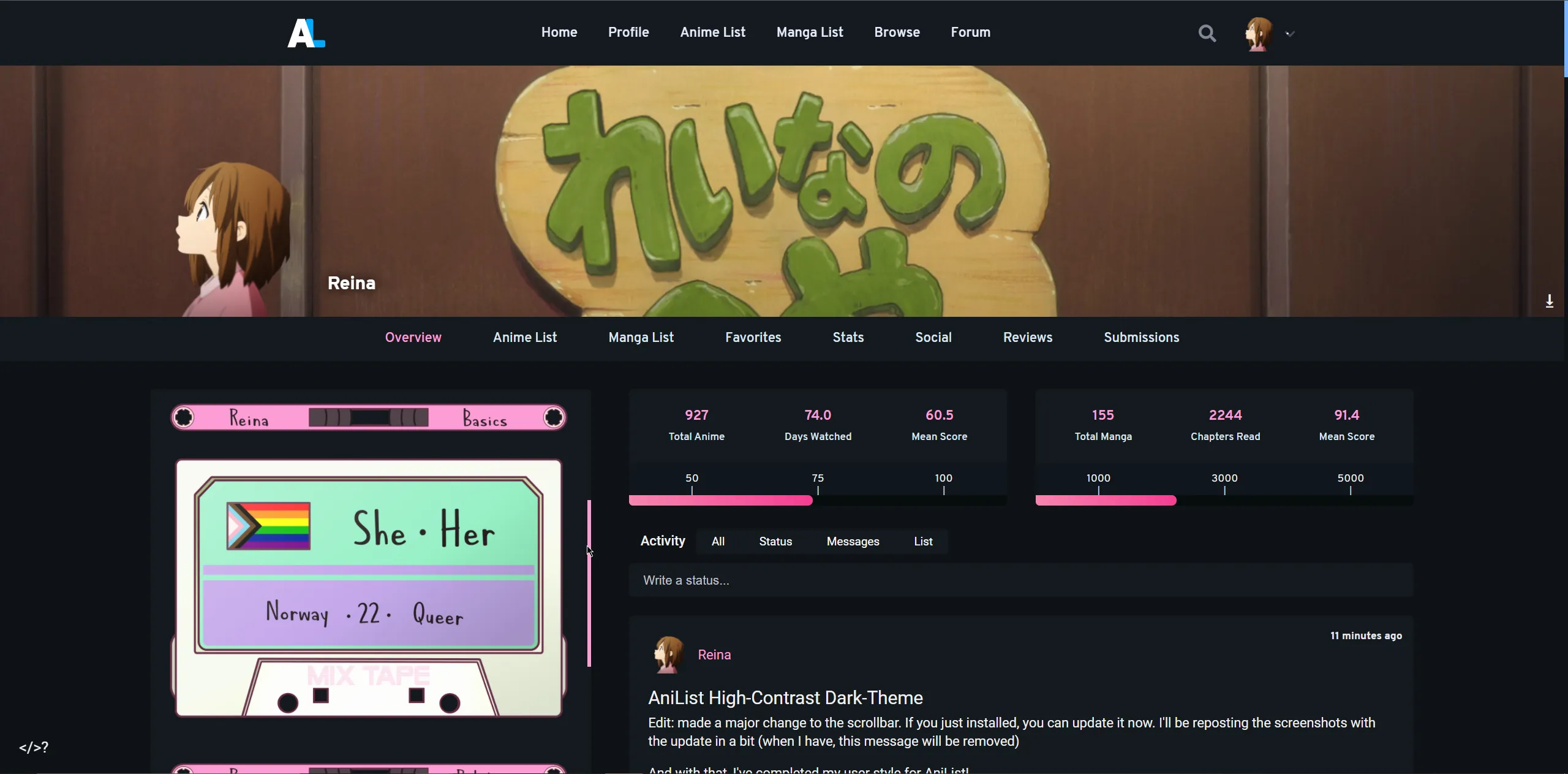
Major overhaul to the default dark-theme on AniList to improve accessibility for visual impairments where increased contrast is helpful but dark themes still preferred.
AniList High-Contrast Dark-Theme by reinachan
Imported and mirrored from https://github.com/Reinachan/AniList-High-Contrast-Dark-Theme/raw/main/High-Contrast-Dark-Theme.user.css
Details
Authorreinachan
LicenseMIT
Categoryanilist
Created
Updated
Code size18 kB
Code checksume607a19f
Statistics
Learn how we calculate statistics in the FAQ.
Failed to fetch stats.
Description
Notes
Userstyle doesn't have notes.Source code
Source code has over 10K characters, so we truncated it. You can inspect the full source code on install link./* ==UserStyle==
@name AniList High-Contrast Dark-Theme
@description Adjusts the dark-theme to have higher contrast and some other tweaks.
@author Reina
@namespace https://github.com/Reinachan
@homepageURL https://github.com/Reinachan/AniList-High-Contrast-Dark-Theme
@supportURL https://anilist.co/user/Reina/
@version 1.9.0
@license MIT
@preprocessor less
==/UserStyle== */
/* no-mobile-start */
@-moz-document domain("anilist.co"), domain("anichart.net") {
/* no-mobile-end */
:root {
--color-background: 14, 18, 22;
--color-blue: 120, 180, 255;
--color-shadow-blue: 0, 0, 0;
--color-foreground: 20, 25, 31;
--color-foreground-alt: 18, 23, 29;
--color-foreground-blue: 26, 33, 45;
--color-foreground-grey: 15, 22, 28;
--color-foreground-grey-dark: 6, 12, 13;
--color-background-300: 30, 42, 56;
--color-background-100: 19, 24, 32;
--color-background-200: 14, 18, 22;
--color-text: 240, 240, 240;
--color-text-light: 220, 230, 240;
--color-text-lighter: 230, 230, 240;
--color-text-bright: 255, 255, 255;
--color-blue-100: 247, 250, 252;
--color-blue-200: 236, 246, 254;
--color-blue-300: 201, 232, 255;
--color-blue-400: 143, 215, 255;
--color-blue-500: 111, 200, 255;
--color-blue-600: 61, 180, 242;
--color-blue-700: 8, 143, 214;
--color-blue-800: 12, 101, 166;
--color-blue-900: 11, 70, 113;
--color-blue-1000: 16, 61, 85;
--color-gray-1200: 251, 251, 251;
--color-gray-1100: 240, 243, 246;
--color-gray-1000: 221, 230, 238;
--color-gray-900: 201, 215, 227;
--color-gray-800: 173, 192, 210;
--color-gray-700: 139, 160, 178;
--color-gray-600: 116, 136, 153;
--color-gray-500: 100, 115, 128;
--color-gray-400: 81, 97, 112;
--color-gray-300: 30, 42, 56;
--color-gray-100: 21, 31, 46;
--color-gray-200: 11, 22, 34;
}
.site-theme-dark {
--color-blue: 120, 180, 255;
--color-shadow-blue: 8, 10, 16, 0.5;
--color-foreground: 20, 25, 31;
--color-foreground-alt: 18, 23, 29;
--color-background: 14, 18, 22;
--color-foreground-blue: 26, 33, 45;
--color-foreground-grey: 15, 22, 28;
--color-foreground-grey-dark: 6, 12, 13;
}
.site-theme-dark {
/* Notification Dropdown */
--color-background-300: 30, 42, 56;
--color-background-100: 19, 24, 32;
--color-background-200: 14, 18, 22;
/* Text */
--color-text: 240, 240, 240;
--color-text-light: 220, 230, 240;
--color-text-lighter: 230, 230, 240;
--color-text-bright: 255, 255, 255;
/* Blue Colours */
--color-blue-100: 247, 250, 252;
--color-blue-200: 236, 246, 254;
--color-blue-300: 201, 232, 255;
--color-blue-400: 143, 215, 255;
--color-blue-500: 111, 200, 255;
--color-blue-600: 61, 180, 242;
--color-blue-700: 8, 143, 214;
--color-blue-800: 12, 101, 166;
--color-blue-900: 11, 70, 113;
--color-blue-1000: 16, 61, 85;
}
/* Navbar */
#app {
.nav-unscoped {
background: rgb(20, 25, 31);
color: #eaeeff;
&.transparent {
background: rgba(20, 25, 31, 0.5);
color: #eaeeff;
&:hover {
background: rgb(20, 25, 31);
color: #eaeeff;
}
}
.dropdown::before {
border-bottom-color: rgb(var(--color-background-100));
}
}
}
.nav[data-v-e2f25004] {
background: #181a32;
}
.banner-image[data-v-e2f25004] {
filter: grayscale(50%);
}
/* Mobile and small screens adjustments */
.page-content > .container,
.page-content > .user > .container {
@media screen and (max-width: 760px) {
padding-left: 2px;
padding-right: 2px;
}
}
/* Increase font size */
@media screen and (max-width: 760px) {
html {
font-size: 11px;
}
}
/* Enable edit button on mobile */
@media screen and (max-width: 760px) {
.media.media-page-unscoped .sidebar {
display: grid;
gap: 20px;
margin-bottom: 20px;
> * {
grid-column: span 2;
}
.review.button {
grid-row: 1;
grid-column: 2;
width: 100%;
height: 40px;
margin: 0;
display: flex;
&.edit {
grid-column: 1;
span::after {
content: ' Database Entry';
}
}
}
.data {
margin-bottom: 0;
}
.rankings {
grid-row: 4;
display: grid;
gap: 10px;
.ranking {
margin-bottom: 0;
&.rated {
grid-column: 1;
}
&.popular {
grid-column: 2;
}
}
}
}
}
@media screen and (max-width: 450px) {
.media.media-page-unscoped .sidebar .rankings .ranking {
&.rated {
grid-column: 1;
grid-row: 1;
}
&.popular {
grid-column: 1;
grid-row: 2;
}
}
}
/* Profile page mobile edits */
@media screen and (max-width: 760px) {
.user.user-page-unscoped {
.overview .section .about {
padding: 10px;
}
}
}
@media screen and (max-width: 1040px) {
.tooltip {
display: none !important;
}
.user.user-page-unscoped {
.overview {
.desktop {
display: grid;
&.favourites.preview .favourites-wrap {
display: grid;
grid-auto-flow: column;
justify-content: unset;
width: unset;
margin: 0;
overflow-x: scroll;
a {
margin: 0;
margin-bottom: 10px;
&:last-of-type {
margin-right: 15px;
}
}
}
&.favourites.preview .favourites-wrap.studios {
display: flex;
flex-wrap: nowrap;
a {
flex-grow: 1;
flex-shrink: 0;
margin-bottom: 6px;
}
}
}
}
.overview > .section:nth-of-type(2) {
.stats-wrap {
display: none;
}
}
}
}
/* Coloured Text */
.name[data-v-5e514b1e] {
color: rgb(var(--color-blue));
}
.site-theme-dark .user-page-unscoped.pink {
--color-blue: 252, 157, 214;
}
/* Dropdown menu arrows */
.el-dropdown-menu.el-popper,
.el-select-dropdown.el-popper {
&[x-placement^='top'] .popper__arrow::after {
bottom: 0;
}
&[x-placement^='bottom'] .popper__arrow::after {
top: 0;
}
.popper__arrow,
.popper__arrow::after {
border-top-color: rgb(var(--color-foreground-grey-dark));
border-bottom-color: rgb(var(--color-foreground-grey-dark));
}
}
.el-dropdown-menu.el-popper.activity-extras-dropdown {
&[x-placement^='top'] .popper__arrow::after {
bottom: 0;
}
&[x-placement^='bottom'] {
transform: translateY(25px);
.popper__arrow {
top: -5px;
}
}
}
/* Dropdown menu */
.el-dropdown-menu.el-popper {
text-align: center;
background-color: rgb(var(--color-foreground-grey-dark));
box-shadow: 0 1px 10px 0 rgba(var(--color-shadow-blue));
&.el-dropdown-menu--medium {
width: 150px;
&.activity-extras-dropdown {
text-align: left;
}
.el-dropdown-menu__item:hover {
background-color: rgb(var(--color-foreground-alt)) !important;
}
}
.el-dropdown-menu__item--divided {
border-top: 3px solid rgb(var(--color-foreground-alt));
margin: auto;
&::before {
background-color: rgb(var(--color-foreground-grey-dark)) !important;
}
}
}
/* List editor dropdown menu */
.el-select-dropdown.el-popper {
background-color: rgb(var(--color-foreground-grey-dark)) !important;
}
.el-select-dropdown {
box-shadow: 0 1px 10px 0 rgba(var(--color-shadow-blue));
}
.el-select-dropdown__item.hover,
.el-select-dropdown__item:hover {
background-color: rgb(var(--color-background)) !important;
}
/* Activity Textareas */
.activity-edit .input.el-textarea textarea {
box-shadow: none;
// Set the transition speed to 0s so as to not have a scrollbar appear every time you press "enter".
will-change: height;
transition: height 0s;
}
/* Activity Feed Sort */
.feed-select,
.section-header {
.el-dropdown {
margin-right: 10px;
.feed-filter,
.el-dropdown-link {
display: none;
}
.el-dropdown-menu {
display: flex !important;
position: relative;
text-align: center;
margin: 0;
padding: 0;
box-shadow: none;
background-color: rgb(var(--color-foreground));
border-radius: 3px;
.el-dropdown-menu__item {
line-height: inherit;
font-size: 1.2rem;
font-weight: 400;
white-space: nowrap;
flex-grow: 1;
margin: 0;
padding: 6px 10px;
color: rgb(var(--color-text-lighter));
border-radius: 3px;
&:hover {
background-color: inherit;
color: rgb(var(--color-blue));
}
&.active,
&:active,
&:focus {
font-weight: 500;
background-color: rgb(var(--color-foreground-blue));
color: rgb(var(--color-text));
border-radius: 0;
&:hover {
background-color: rgb(var(--color-foreground-blue));
}
}
&:active:first-of-type,
&:first-of-type.active,
&:focus:first-of-type {
border-radius: 3px 0 0 3px;
}
&:active:last-of-type,
&:last-of-type.active,
&:focus:last-of-type {
border-radius: 0 3px 3px 0;
}
}
}
}
}
.overview .section-header {
align-items: center;
display: flex;
.el-dropdown {
margin-right: 0px;
margin-left: auto;
padding-right: 0;
}
}
/* Announcement */
.announcement {
background-color: rgb(var(--color-blue-800)) !important;
}
/* Date Picker */
.el-picker-panel {
border: 1px solid rgb(var(--color-foreground));
background-color: rgb(var(--color-foreground-grey-dark));
color: rgb(var(--color-text-bright));
.el-date-picker__header-label {
color: rgb(var(--color-text));
}
.el-picker-panel__icon-btn,
.el-date-table th {
color: rgb(var(--color-text-light));
}
.el-date-table {
td.current:not(.disabled) span {
background-color: rgb(var(--color-blue-700));
}
th {
border-bottom: 1px solid #60656c;
padding: 1px;
}
td.next-month,
td.prev-month {
color: #76777a;
}
tbody tr:nth-of-type(2) td {
padding-top: 10px;
}
}
.popper__arrow::after {
border-bottom-color: rgb(var(--color-foreground-grey-dark)) !important;
border-top-color: rgb(var(--color-foreground-grey-dark)) !important;
}
}
/* hoh styling */
#hohSettings {
.hohCategories {
display: flex;
flex-wrap: wrap;...