Shrink some elements on clients.henner.com (new UI as of May 2019).
Because project manager thinks that everyone is using its fat dirty fingers on a tablet, lazily lied in a couch.
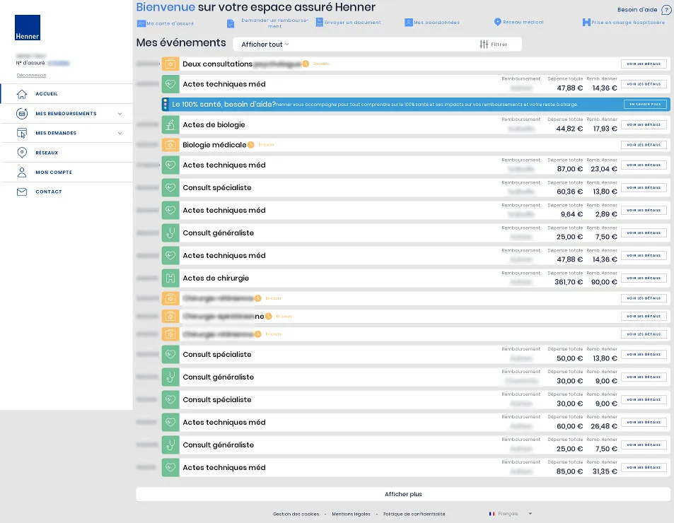
This style tries to render the site usable again with a mouse and a brain.
Henner — I am not a tablet by glandos
Details
Authorglandos
LicenseCC-BY
Categoryhenner
Created
Updated
Size4.5 kB
Statistics
Learn how we calculate statistics in the FAQ.
Failed to fetch stats.
Description
Notes
CHANGELOG
2021-12-17
Post Covid-19
Fix navbar and refund with references
2019-08-29
Shrink lateral menu to maximize horizontal space.
Unfortunately, some quirks appeared, especially when viewing some details. I will fix it later.
2019-06-11
Initial release
Source code
/* ==UserStyle==
@name           Henner — I am not a tablet
@namespace      henner.com
@version        1.1.0
@description    This style tries to render the site usable again with a mouse and a brain.
@author         glandos
==/UserStyle== */

@-moz-document domain("clients.henner.com") {
/**
 * Lateral menu
**/
div.main-menu:not(.kapoue) {
    position: sticky;
    width: unset;
    height: 100vh;
}

div.app--withMenu:not(.kapoue) div.app__main__content:not(.kapoue) {
    margin-left: unset;
}

.item-menu__button:not(.kapoue),
.item-menu__link:not(.kapoue) {
    padding: 1rem 3rem 1rem 5.2rem;
}

body .item-menu .item-menu__button .item-menu__icon,
body .item-menu .item-menu__link .item-menu__icon {
    left: 0.5rem;
    top: 0.4rem;
    margin: initial;
}

img.item-menu__arrow:not(.kapoue) {
    right: 0.5rem;
}

body .item-menu .item-menu__arrow {
    top: 1rem;
}

div.main-menu__brand:not(.kapoue) {
    margin: 1rem 4.2rem;
}

/*
 * Top items
 */
section.home:not(.kapoue) {
    padding-top: 0;
}

section.home__jumbotron:not(.kapoue) {
    max-width: unset;
    min-height: unset;
}

section.jumbotron:not(.kapoue) {
    padding: unset;
}

.jumbotron__header:not(.kapoue) {
    margin-bottom: 1rem;
}

img.jumbotron__header-logo:not(.kapoue) {
    display: none;
}

div.jumbotron__header-title:not(.kapoue) {
    max-width: unset;
}

img.jumbotron__nav__item-link__picto:not(.kapoue) {
    margin-bottom: unset;
    max-width: 3rem;
    margin-right: 0.5rem;
}

.jumbotron__nav__item-link > span.mat-button-wrapper {
    display: flex;
    align-items: center;
}

.jumbotron__nav__item-link:not(.kapoue) {
    padding: unset;
}

app-help-button.app__help:not(.kapoue) {
    right: 1px;
}

app-help-button.app__help > button.cta {
    padding: unset;
    height: unset;
    border-radius: unset;
}

mat-icon.cta__icon:not(.kapoue) {
    margin-left: unset;
}

/**
* Timeline
**/
section.home__timeline:not(.kapoue) {
    width: unset;
    margin: unset;
}

section.timeline:not(.kapoue) {
    width: unset;
}

div.timeline__filter:not(.kapoue) {
    margin-bottom: unset;
}

h1.home__timeline__title:not(.kapoue) {
    float: left;
    margin-right: 2rem;
    margin-bottom: unset;
}

ul.timeline__items:not(.kapoue)::before {
    display: none;
}

li.timeline__item:not(.kapoue) {
    display: flex;
    align-items: center;
}

li.timeline__item:not(.kapoue) + li.timeline__item:not(.kapoue) {
    margin-top: unset;
}

li.timeline__item > .ng-star-inserted:first-of-type {
    flex: 1;
}

li.timeline__item > .reference-number {
    position: absolute;
    left: 30%;
    margin: auto;
}

span.timeline__upper-info:not(.kapoue) {
    padding: unset;
    padding-left: unset !important;
    min-width: 9ch;
    -webkit-transform: unset;
    transform: unset;
}

section.henner-filter-panel:not(.kapoue) {
    height: unset;
}

article.card:not(.kapoue) {
    max-width: unset;
}

aside.card__aside:not(.kapoue) {
    width: unset;
    padding: 0 1rem;
}

mat-icon.card__aside__icon--mat-icon:not(.kapoue) {
    width: 3rem;
    height: 3rem;
}

section.card-body:not(.kapoue) {
    padding: 0.5rem 1rem !important;
    display: flex;
    justify-content: space-between;
    align-items: center;
}

header.card-body__header:not(.kapoue) {
    align-items: center;
}

main.card__main:not(.kapoue):hover {
    background: #eee;
}

main.card-body__main:not(.kapoue) {
    padding-top: unset;
    flex: 1;
    justify-content: flex-end;
}

div.card-content-right:not(.kapoue) {
    -webkit-transform: unset;
    transform: unset;
}

div.card-body__main__content-left:not(.kapoue) {
    display: flex;
    flex-direction: column;
    justify-content: center;
    align-items: center;
    margin-right: 2rem;
}

div.card-body__main__content-left > .card-body__main__text {
    font-size: 1.2rem;
    color: #7a838e;
}

div.card-body__main__content-left > p.card-body__main__text {
    font-size: 2rem;
    padding-top: 1rem;
}

p.card-body__main__text--grey:not(.kapoue) {
    margin: unset;
}

div.card-body__main__content-right {
    margin-right: 1rem;
}

p.card-content-right__item:not(.kapoue) {
    margin-right: 1rem;
}

footer.card-body__footer:not(.kapoue) {
    margin-top: 0 !important;
    flex: unset;
}
}