Goku dragon ball z
Goku Dragon Ball Z by superdonaldduck
Details
Authorsuperdonaldduck
LicenseNo License
CategoryRoblox
Created
Updated
Code size5.0 kB
Code checksumdc97e450
Statistics
Learn how we calculate statistics in the FAQ.
Failed to fetch stats.
Description
Notes
epik
Source code
/* ==UserStyle==
@name Empty @name replaces the default template - 1/18/2022, 2:30:08 PM
@namespace github.com/openstyles/stylus
@version 1.0.0
@description A new userstyle
@author Me
==/UserStyle== */
@-moz-document domain(roblox.com) {
body {
background: #ea6f0e !important;
}
.content {
background: #FFF0 !important;
}
#fb-root {
width: 100% !important;
height: 100% !important;
position: fixed !important;
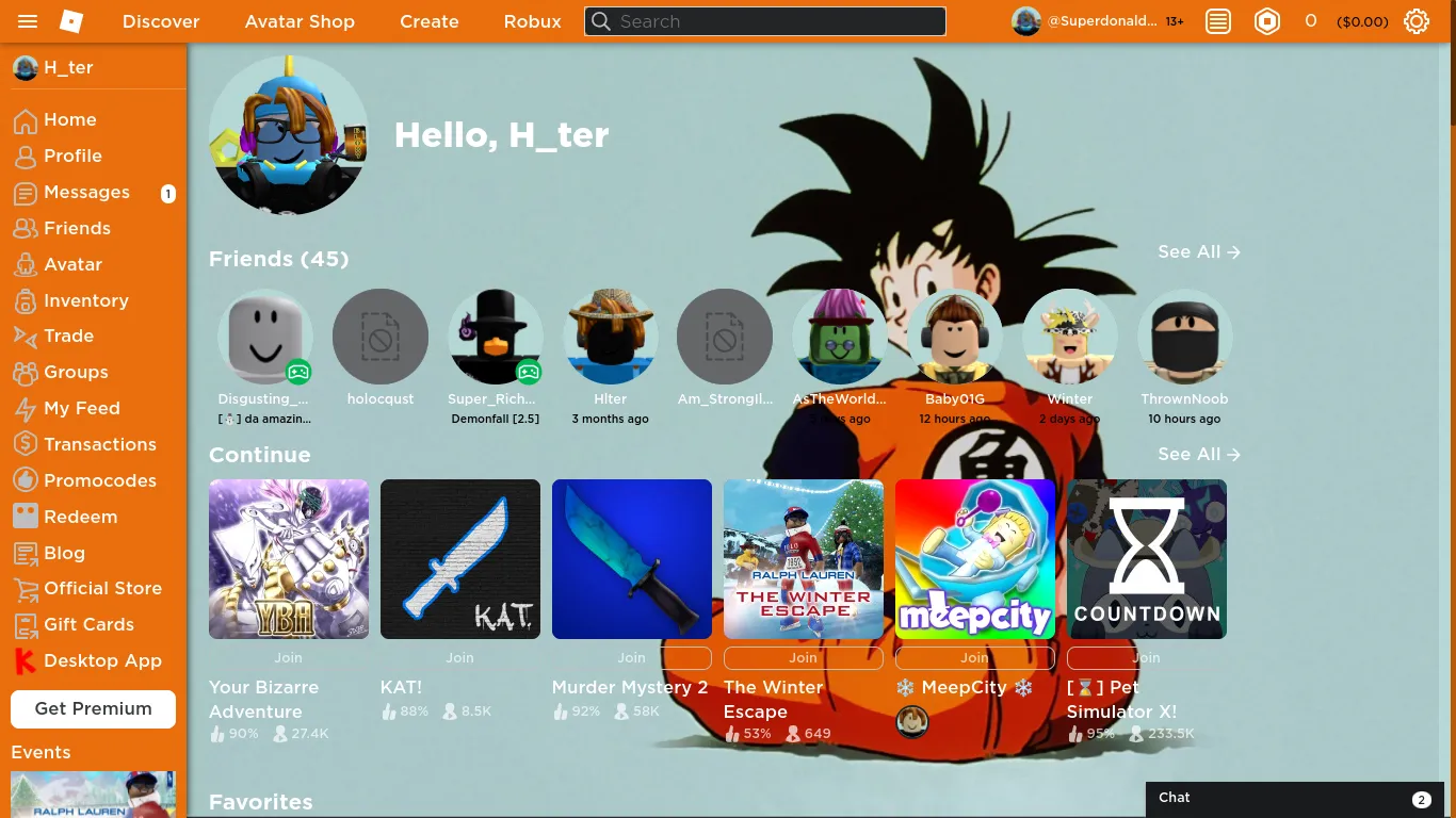
background-image: url(https://i.imgur.com/atbMuHf.png) !important;
/* Background */
background-size: cover !important;
background-attachment: fixed !important;
}
.dark-theme .section-content {
background-color: #e76e0e;
color: #000;
}
.dark-theme .rbx-tab .rbx-tab-heading {
background-color: #ea6f0e;
color: #000;
}
.dark-theme .rbx-tabs-horizontal .nav-tabs {
background-color: #ea6f0e;
color: #000;
}
.dark-theme .rbx-tabs-horizontal .rbx-tab.active .rbx-tab-heading {
color: #000;
background-color: #AECCCB;
box-shadow: inset 0 -4px 0 0 #000;
}
.dark-theme .text,
.dark-theme .text-date-hint,
.dark-theme .text-default,
.dark-theme .text-description,
.dark-theme .text-footer,
.dark-theme .text-info,
.dark-theme .text-label,
.dark-theme .text-secondary,
.dark-theme p {
color: #000;
}
.dark-theme .profile-avatar-right .profile-avatar-mask {
background-color: #ea6f0e;
color: #000;
}
.profile-avatar-left .enable-three-dee {
-webkit-user-select: none;
-moz-user-select: none;
-ms-user-select: none;
user-select: none;
border: 1px solid #ea6f0e;
background-color: #AECCCB;
border-color: #000000;
color: #000000;
cursor: pointer;
display: inline-block;
font-weight: 500;
height: auto;
text-align: center;
white-space: nowrap;
vertical-align: middle;
padding: 9px 9px;
font-size: 16px;
line-height: 100%;
border-radius: 1px;
position: absolute;
top: 12px;
right: 12px;
min-height: 32px;
}
.dark-theme .profile-accoutrements-container .profile-accoutrements-slider .accoutrement-item a {
background-color: #ea6f0e;
}
.dark-theme .avatar-container .avatar-card-image,
.dark-theme .avatar-container img {
background-color: #AECCCB;
}
.dark-theme .asset-thumb-container {
background-color: #AECCCB;
border: 0;
}
.dark-theme .layer {
background-color: #AECCCB;
}
.dark-theme .slide-switcher .slide-item-container .slide-item-container-right {
background-color: #000;
color: #AECCCB;
}
.dark-theme .slide-switcher .slide-item-container .slide-item-container-left {
background-color: #e36a0e;
}
.dark-theme .carousel-control {
background-color: #000;
border-color: #ea6f0e;
}
.dark-theme .border,
.dark-theme .border-bottom,
.dark-theme .border-left,
.dark-theme .border-right,
.dark-theme .border-top {
border-color: #000000;
}
.dark-theme .avatar .avatar-card-image {
background-color: #AECCCB;
}
.dark-theme .rbx-left-col {
box-shadow: 0 0 8px 0 #000;
background-color: #ea6f0e;
}
.dark-theme .rbx-header {
background-color: #ea6f0e;
border: solid #a51c1b00;
border-width: 0 0 1px;
box-shadow: 0 0 8px 0 #ca0a0a96;
}
.item-card-thumb-container,
.item-card-thumb-container .item-card-thumb,
.item-card-thumb-container div[class^=icon-],
.item-card-thumb-container span[class^=icon-] {
border-radius: 1px;
}
.avatar-thumbnail .toggle-three-dee {
-webkit-user-select: none;
-moz-user-select: none;
-ms-user-select: none;
user-select: none;
background-color: #ea6f0e;
color: #191919;
cursor: pointer;
display: inline-block;
font-weight: 500;
height: auto;
text-align: center;
white-space: nowrap;
vertical-align: middle;
padding: 9px;
font-size: 16px;
line-height: 100%;
border-radius: 1px;
border: 1px solid #000000;
position: absolute;
bottom: 12px;
right: 54px;
min-height: 32px;
}
.avatar-thumbnail .toggle-three-dee:focus,
.avatar-thumbnail .toggle-three-dee:hover {
background-color: #ea6f0e;
border-color: #ea6f0e;
color: #ea6f0e;
cursor: pointer;
}
.dark-theme .rbx-tabs-horizontal #horizontal-tabs .rbx-tab:not(.active) a:not(:hover) {
background-color: #AECCCB;
color: #ea6f0e;
}
.dark-theme .pill-toggle label {
color: #ea6f0e;
}
.dark-theme .input-group-btn .input-dropdown-btn {
background-color: #ea6f0e;
border-color: #E36A0E;
color: hsla(0, 0%, 100%, .7);
border-radius: 1px;
}
.dark-theme .input-group .input-field {
background-color: #AECCCB;
border-color: #E36A0E;
color: #AECCCB;
border-radius: 1px;
}
.dark-theme .avatar-card-container {
background-color: #AECCCB;
color: #ea6f0e;
}
.dark-theme .avatar-card-btns {
background-color: #AECCCB;
color: #ea6f0e;
}
.dark-theme .btn-secondary-md {
background-color: rgba(234, 111, 1, 0);
border-color: #ea6f0e;
color: hsla(0, 0%, 100%, .7);
border-radius: 1px;
}
.dark-theme .avatar-card-btns .accept-friend {
background-color: #ea6f0e;
border-color: #ea6f0e;
color: #FFF0;
border-radius: 1px;
}
}