Makes Discord work with smaller screens. No hovering, just makes every sidebar skinny by removing almost all the text.
Responsive Discord by wac
Details
Authorwac
LicenseGNU
Categorydiscord
Created
Updated
Code size4.4 kB
Code checksumd435b32f
Statistics
Learn how we calculate statistics in the FAQ.
Failed to fetch stats.
Description
Notes
This is still not a complete stylesheet and definitely has bugs. I'm just uploading it so I can test it on my phone more easily. The lack of "hover" is because I intend to use it on my phone.
Update February 27, 2022: Returned the "Mute" and "Deafen" buttons to the User Area. Now they actually work in a column. Also added a way to copy the username, though I may remove it in the next update if it causes any issues.
Minor update February 24, 2022: Added the "Close DM" and "Leave Group" buttons to the list of things that are hidden. I kept accidentally clicking them when I was on my phone.
Edit January 16, 2022: Not sure why, but this no longer seems to be working on my phone, specifically the widths. Install at own risk.
Update January 30, 2022: It works now. Not the same as it used to be, but it does the bare minimum of what it is supposed to. I changed a lot of selectors to target things like the [aria-label] attribute instead of class names. Hopefully that keeps things from breaking as much in the future. I also added a lot more comments. The old code is still preserved, but all commented out. Feel free to use it to make your own fixes. I will still be tweaking this code to my liking.
Downgrades compared to old code that no longer works:
- Only the messaging pages work, no settings pages or anything. I removed the "Settings" button as a result.
- Things are ugly, there are centering issues, and text overflow issues
You need to enable compact mode instead of the default mode, because it's so ugly
Some advice: If you are using this on a mobile device, Discord will not show the search bar in channels or DMs. You need to trick Discord into thinking you're on a desktop computer by using a User Agent Switcher.
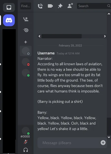
Update January 30 (again): I have fixed a lot of the display issues with messages. Some things are still off-centre. I haven't been able to move the timestamps to the end of the message in Compact mode, so those will look a bit off. Cozy mode looks good, though. I have updated the preview image.
Update January 31, 2022: You can now zoom in on images. This is an upgrade from the version that broke a while ago. Turns out there's a class applied to the image wrapper when you zoom in, and for some reason the way it's positioned prevents the user from clicking/tapping out of that view. Changing position to static fixed it instantly, at least on my device.
Source code
/* ==UserStyle==
@name         Responsive Discord
@version      20220228.00.06
@namespace    userstyles.world/user/wac
@description  Makes Discord work with smaller screens. No hovering, just makes every sidebar skinny by removing almost all the text.
@author       wac
@license      GNU
==/UserStyle== */

@-moz-document domain("discord.com") {
@media only screen and (max-width: 650px) {
    :root {
        --channelbar-width: 64px;
    }
    /* Most of these are hidden because clicking on them takes you to a
    screen you either can't use or can't exit (usually both) */
    [aria-label="Send a gift"],
    [aria-label="Open GIF picker"],
    [aria-label="Open sticker picker"],
    [aria-label="Select emoji"],
    [aria-label="Click to copy username"] .usernameContainer-3PPkWq,
    [aria-label="Create Invite"],
    [aria-label="User Settings"],
    [aria-label="Create Invite"],
    [aria-label="Edit Channel"],
    [aria-label="Add Reaction"],
    [aria-label="Create Thread"],
    [aria-label="Create Channel"],
    [aria-label="Close DM"],
    [aria-label="Leave Group"],
    #message-actions-thread {
        display: none !important;
    }
    /* Make the channels/friends sidebar narrower */
    .sidebar-1tnWFu {
        width: var(--channelbar-width, 72px) !important;
        overflow-x: auto !important;
    }
    /* Hide the "Members" list */
    .membersWrap-3NUR2t {
        display: none;
    }
    /* Fixes image zoom issues where you can't exit the zoom. */
    .fullscreenOnMobile-ixj0e3 {
        position: static;
        min-height: 5rem;
    }
    /* Makes images and embeds horizontally scrollable, so they don't just cut off. */
    .messageAttachment-CZp8Iv, .grid-1aWVsE {
        max-width: calc(100vw - 72px - var(--channelbar-width) - 16px - 12px);
        /* In order: screen width, server sidebar, channels sidebar, right padding, fix*/
        overflow: auto;
    }
    /* Quick fix for some popouts */
    .layerContainer-2v_Sit {
        overflow-x: auto;
    }
    /* Hide the text that says "Direct Messages" because you only need the "Add DM" button, really */
    .headerText-1qIDDT {
        display: none !important;
    }
    /* Center the "Add DM" button (the plus sign) */
    .privateChannelsHeaderContainer-1UWASm.container-q97qHp {
        justify-content: center;
    }
    /* Put the user profile and the "Settings" gear in a column. Center the avatar */
    [aria-label="User area"] .container-YkUktl,
    [aria-label="User area"] .container-YkUktl .flex-2S1XBF {
        flex-direction: column;
        height: fit-content;
    }
    [aria-label="Set Status"] {
        margin-right: 0;
        margin-top: 8px;
    }
    /* Hide the "Hashtag" and arrows */
    [aria-label="Text"],
    [aria-label="Text (NSFW)"],
    [aria-label="Text (Limited)"],
    .arrow-2HswgU,
    .headerChildren-2qV9P8 {
        display: none;
    }
    /* Removes excessive padding */
    .compact-2Nkcau .contents-2MsGLg {
        margin-left: 0;
        padding-left: 0;
    }
    .message-2CShn3 {
        padding-right: 0 !important;
    }
    .compact-2Nkcau .contents-2MsGLg {
        text-indent: 0;
    }
    [aria-roledescription="Message"] {
        padding-left: 1rem !important;
    }
    .content-1gYQeQ{
        /* Text channels */
        padding: 0;
        padding-left: 2px;
    }
    .wrapper-1S43wv {
        /* section headings */
        padding: 0;
        padding-left: 10px;
    }
    [aria-label="Upload a file or send invites"] {
        /* File attachment button */
        padding: 0 4px;
    }
    /* Hides the less important timestamps */
    .timestampVisibleOnHover-9PEuZS,
    .cozy-VmLDNB .timestamp-p1Df1m.alt-1dvXnH {
        display: none;
    }
    /* Hides avatars in messages (Cozy mode only) */
    .avatar-2e8lTP {
        display: none;
    }
    /* Fixes the "Events" display (prevents it from wrapping) */
    .name-28HaxV {
        height: 20px; /* value from line-height */
        white-space: nowrap;
        overflow: hidden;
        text-overflow: ellipsis;
    }
    /* Hides the "Create Thread" screen */
    .container-3XgAHv {
        display: none;
    }
    /* Moves upload file button to the right */
    .inner-NQg18Y {
        flex-direction: row-reverse;
    }
}
}