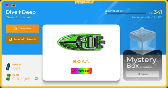
This theme makes many of the buttons and texts orange. I would welcome any thoughts on it. Enjoy.
My NT profile is https://www.nitrotype.com/racer/ethanmast
Imported and mirrored from https://raw.githubusercontent.com/uso-archive/data/flomaster/data/usercss/172617.user.css
Authordivedeep
LicenseCC0-1.0
Categorynitrotype
Created
Updated
Code size3.1 kB
Code checksum970f8cba
Learn how we calculate statistics in the FAQ.
Failed to fetch stats.
This theme makes many of the buttons and texts orange. I would welcome any thoughts on it. Enjoy.
My NT profile is https://www.nitrotype.com/racer/ethanmast
/* ==UserStyle==
@name         NitroType Orange
@namespace    USO Archive
@author       divedeep
@description  This theme makes many of the buttons and texts orange. I would welcome any thoughts on it. Enjoy.    My NT profile is https://www.nitrotype.com/racer/ethanmast
@version      20200205.01.34
@license      CC0-1.0
@preprocessor uso
==/UserStyle== */
@-moz-document domain("www.nitrotype.com") {
.btn--primary
{
    background: linear-gradient(to right, #ffa300, #ff8613);
    color: #fff
}
.btn--primary:hover
{
    background: linear-gradient(to right, #ffa300, #ff8613);
}
.btn--primary:focus
{
    background: linear-gradient(to right, #ffa300, #ff8613);
}

.theme--pDefault .profile-body
{
    color: #ff9100;
}

.card--a
{
    color: #ff9100;
}

.btn--ghost
{
    background: linear-gradient(90deg, #d62f2f 0%, #e900ff 25%, #00ff25 50%, #fffc00 75%, #ff0000 100%);
    color: #000
}
.btn--ghost:hover
{
    background: linear-gradient(90deg, #d62f2f 0%, #e900ff 25%, #00ff25 50%, #fffc00 75%, #ff0000 100%);
    color: #000
}
.btn--ghost:focus
{
    background: linear-gradient(90deg, #d62f2f 0%, #e900ff 25%, #00ff25 50%, #fffc00 75%, #ff0000 100%);
    color: #000
}

.btn.btn--outline:not(.is-active):not(.is-disabled):not(:disabled):not(.is-success):not(.is-failure):not(:hover)
{
    background-color: #b17910;
}

.btn.btn--outline:not(.is-active):not(.is-disabled):not(:disabled):not(.is-success):not(.is-failure):not(:hover).btn--light
{
    border: 1px solid #966321;
}

.btn--d
{
    background-color: #ea9613;
}
.btn--d
{
    border: 1px solid #b19010;
}
.btn--d:hover
{
    background-color: #ea9613;
}
.btn--d:focus
{
    background-color: #ea9613;
}

.btn--b
{
    background: linear-gradient(to right, #ffb800, #a98e0e);
}
.btn--b:hover
{
    background: linear-gradient(to right, #ffb800, #a98e0e);
}
.btn--b:focus
{
    background: linear-gradient(to right, #ffb800, #a98e0e);
}

.card--b
{
    color: #ffa900;
}

.tabs--a .tab.is-active
{
    color: #ffa900;
}
.tabs--a .tab:hover
{
    color: #ffa900;
}
.tabs--a .tab
{
    color: #ffa900;
}

.btn.is-active, .btn--stroke-i
{
    background-color: #eab412cc
}

.news-header
{
    color: #ffa900;
}

.btn--stroke-i
{
    background-color: #ce7b10;
}
.btn--stroke-i:hover
{
    background-color: #ce7b10;
}

.btn.btn--outline:not(.is-active):not(.is-disabled):not(:disabled):not(.is-success):not(.is-failure):not(:hover).btn--dark
{
    color: #b5b5b5;
}

.btn--dark:hover
{
    background: #a66e00;
}

.card--e
{
    color: #ff9100
}

.card--d
{
    color: #ff9100
}

.dropdown--account.is--online .dropdown-trigger
{
    color: #ffb500;
}

.dropdown--account .dropdown-link:hover
{
    background: #ffb500;
}

.dropdown--account .dropdown-item:last-of-type .dropdown-link:hover
{
    background: #e2ad06;
}

::selection
{
    background: #f58e1b;
    color: #000;
}

.notify
{
    background: #ff9300;
    color: #000
}
.notify:before
{
    background: #ff9300;
    color: #000
}
}