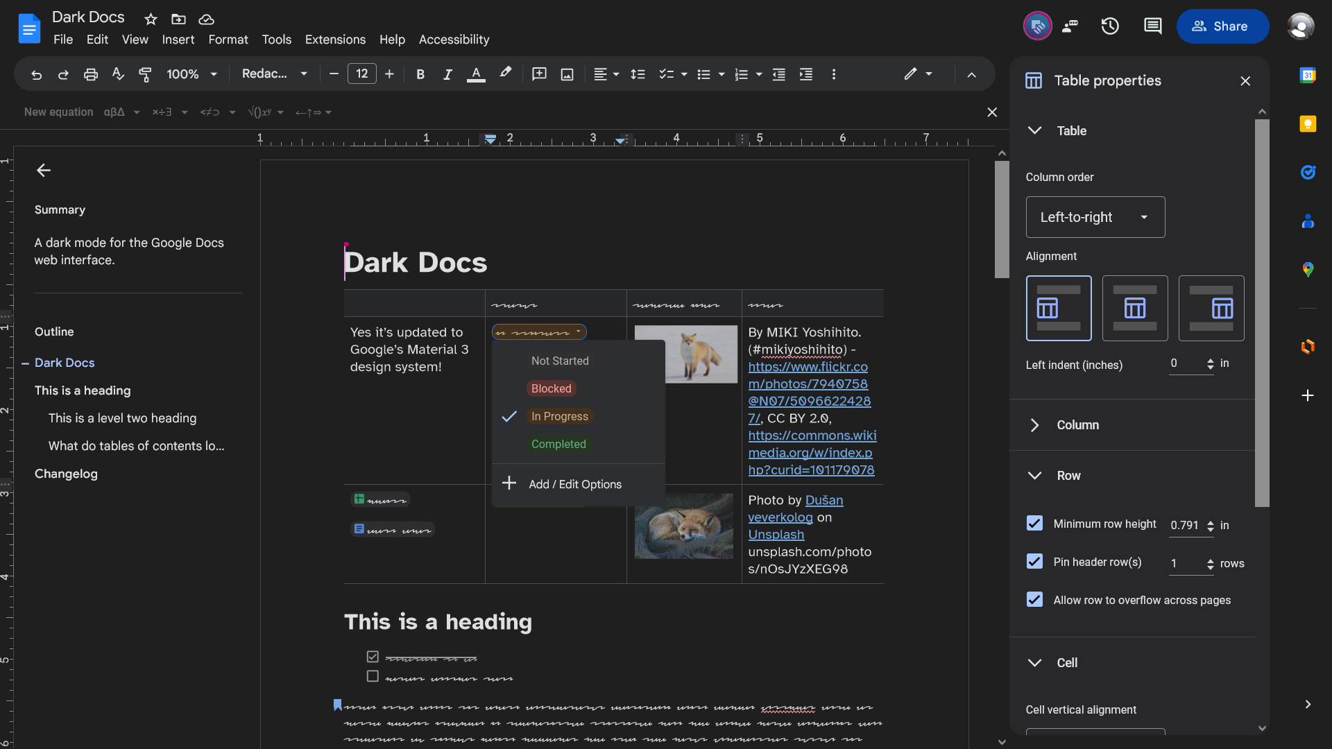
A dark theme for Google Docs web, based on the colors used in its Material You styled mobile apps.
Dark Docs by winghongchan
Details
Authorwinghongchan
LicenseGNU General Public License v3
Categorygoogle
Created
Updated
Code size313 kB
Code checksum1b4d3443
Statistics
Learn how we calculate statistics in the FAQ.
Failed to fetch stats.
Description
Notes
Latest updates
-
2025.02.18
- Fixed the collapsed document outline button.
- Fixed the Document details, Page setup, and Select a template dialogs.
- Made the blue indicators for updated, new, and premium menu items higher contrast.
-
2025.02.16
- Fixed the Google Images image picker.
-
2024.12.21
- Fixed the “Page setup”, “Borders and shading”, “Move (file)”, and “Add shortcut to Drive” dialogs.
- Fixed bugs that appeared when you tried to use the Document tabs feature.
- Optimized code for emoji picker.
Duet AI (Gemini?) features are not darkened because I did not subscribe to it. If you have access to it and are willing to contribute, please do so on GitHub.
Browser-specific notes
Chrome (and Edge, Vivaldi, &c.) users
By default, Dark Docs uses the Invert document filter so your document appears with an inverted colour scheme (approximately white on black). Since Google Docs renders each page as a single element, there doesn’t seem to be a way to un-invert images so that they look normal. If you must view images un-inverted, you may change the document filter to “Dim” or “None” in the configuration dialog.
Contributors
Source code
Source code has over 10K characters, so we truncated it. You can inspect the full source code on install link./* ==UserStyle==
@name Dark Docs
@namespace userstyles.world/user/winghongchan
@version 2025.02.18
@description A googley dark mode for Google Docs
@author Walter winghongchan
@homepageURL https://github.com/winghongchan/dark-docs
@supportURL https://github.com/winghongchan/dark-docs/issues
@license GPL-3.0-or-later
@preprocessor less
@var select document-filter "Document filter" {"none:None": "none", "dim:Dim": "contrast(80%) brightness(90%)", "invert:Invert*": "var(--darkfilter)"}
@var number document-contrast "Document contrast while inverted" [76, 40, 100, 1, "%"]
@var checkbox respect-pageless-document-color "[CURRENTLY BROKEN - PLEASE TURN OFF] Respect page color of pageless documents while a document filter is applied. May be laggy." 0
@var checkbox has-selector-missing-warning "Warn me if the :has() selector is not available in my browser." 1
==/UserStyle== */
/* Dark Docs is licensed under the GNU GPL v3
Dark Docs: a googley dark mode for Google Docs.
Copyright © 2024 Dark Docs contributors
This program is free software: you can redistribute it and/or modify it under the terms of the GNU General Public License as published by the Free Software Foundation, either version 3 of the License, or (at your option) any later version.
This program is distributed in the hope that it will be useful, but WITHOUT ANY WARRANTY; without even the implied warranty of MERCHANTABILITY or FITNESS FOR A PARTICULAR PURPOSE. See the GNU General Public License for more details.
Read a copy of this license at https://www.gnu.org/licenses/gpl-3.0.html
*/
/* Notice for Firefox ESR 115 users
Dark Docs uses the :has() selector, which was in an experimental state and wasn’t enabled by default until Firefox 121 was released. To enable it, go to about:config and set layout.css.has-selector.enabled to true.
To see how to check your Firefox version, visit http://mzl.la/182bDYq
Todo: remove this notice once ESR 115 becomes unsupported in Mar 2025. https://whattrainisitnow.com/release/?version=esr
*/
/* Notice for Chrome (or Vivaldi, Edge, &c.) users
Google Docs renders each page as a single <canvas> element, which may have made it impossible to un-invert images while using the Invert document filter in Dark Docs. If you need to view images un-inverted, you can switch to the Dim filter or turn off document filters: open the Stylus extension, click on the cog beside “Dark Docs”, and change the Document filter to “Dim” or “None”.
*/
@-moz-document url-prefix("https://docs.google.com/document/d/"), url-prefix("https://docs.google.com/document/u/"), regexp("https:\\/\\/docs\\.google\\.com\\/sharing\\/boq\\/driveshare\\?[\\s\\S]+origin=https%3A%2F%2Fdocs\\.google\\.com"), regexp("https:\\/\\/docs\\.google\\.com\\/drivesharing\\/driveshare\\?[\\S]+origin=https%3A%2F%2Fdocs\\.google\\.com"), regexp("https:\\/\\/docs\\.google\\.com\\/picker\\/v2\\/home\\?[\\s\\S]+&parent=https%3A%2F%2Fdocs\\.google\\.com[\\s\\S]+"), regexp("https:\\/\\/docs\\.google\\.com\\/picker\\/v2\\/home\\?req=.*%22Google%20Drive%22.*%22Replace%22.*%22replace-image%22.*&parent=https%3A%2F%2Fdocs\\.google\\.com&pfname=&rpctoken=[0-9]+"), regexp("(https:\\/\\/meet.google.com\\/_\\/frame\\?authUser=\\d+&frameType=2&origin=https%3A%2F%2Fdocs.google.com#cb=pip_frame)"), regexp("https:\\/\\/docs\\.google\\.com\\/picker\\/v2\\/home\\?req=.*%22explore-drive.*&parent=https%3A%2F%2Fdocs\\.google\\.com&pfname=&rpctoken=[0-9]+"), regexp("https:\\/\\/docs\\.google\\.com\\/picker\\/v2\\/home\\?req=.*%22Google%20Photos%22.*&parent=https%3A%2F%2Fdocs\\.google\\.com&pfname=&rpctoken=[0-9]+"), url-prefix("https://docs.google.com/viewer?a=v&pid=kix-pp&srcid=id%3D1lsgKVqNTqLPVvc5ZTz22EXHH4dOpGnHnZMykE-5ZKk0%2Cprint%3D1%2Cmp%3Df&chrome=false&pp=true&authuser=0"), regexp("https:\\/\\/docs\\.google\\.com\\/viewer\\?a=v&pid=(kix-pp|pch)&srcid=.*&chrome=false&pp=true&authuser=[0-9]+"), regexp("https:\\/\\/meet\\.google\\.com\\/_\\/frame\\?authuser=[0-9]+&frameType=2&origin=https%3A%2F%2Fdocs.google.com#cb=pip_frame"), regexp("https:\\/\\/meet\\.google\\.com\\/_\\/frame\\?authuser=[0-9]+&frameType=6&origin=https%3A%2F%2Fdocs\\.google\\.com#cb=pip_frame"), regexp("https:\\/\\/drive\\.google\\.com\\/picker\\/minpick\\/main\\?parent=https%3A%2F%2Fdocs\\.google\\.com&mreq=[\\S]+%22application%2Fvnd\\.google-apps\\.document%22[\\S]+") {
/* Variables */
:root {
// Colour
--ddocs-primary: #a8c7fa;
--ddocs-primary-icon: invert(100%) hue-rotate(180deg) brightness(75%) saturate(400%);
--ddocs-primary-hover: rgba(168, 199, 250, var(--ddocs-hover-state-layer-opacity)); // That’s right, standard (no fill or outline) icon buttons, when enabled (selected) and hovered, use a state layer of colour primary! Not on-primary-container or something. https://m3.material.io/components/icon-buttons/specs
--ddocs-primary-focus: rgba(168, 199, 250, var(--ddocs-focus-state-layer-opacity));
--ddocs-primary-pressed: rgba(168, 199, 250, var(--ddocs-pressed-state-layer-opacity));
--ddocs-on-primary: #062e6f;
--ddocs-on-primary-hover: #9bbaef;
--ddocs-on-primary-focus: #94b4e9;
--ddocs-on-primary-pressed: #94b4e9;
--ddocs-primary-container: #004a77;
--ddocs-on-primary-container: #c2e7ff;
--ddocs-on-primary-container-icon: invert(100%) hue-rotate(180deg) saturate(150%);
--ddocs-on-primary-container-hover: #0f5682;
--ddocs-on-primary-container-focus: #185d88;
--ddocs-on-primary-container-pressed: #185d88;
--ddocs-secondary: #7fcfff;
--ddocs-on-secondary: #003355;
--ddocs-secondary-container: #0842a0;
--ddocs-secondary-container-hover: #184fa8; // Determined the colour by overlapping the -on colour at 8% opacity on top of the container. Not a problem until Dark Docs begins support for custom colours.
--ddocs-secondary-container-focus: #2156ac;
--ddocs-on-secondary-container: #d3e3fd;
--ddocs-on-secondary-container-hover: rgba(211, 227, 253, var(--ddocs-hover-state-layer-opacity));
--ddocs-on-secondary-container-focus: rgba(211, 227, 253, var(--ddocs-focus-state-layer-opacity));
--ddocs-on-secondary-container-pressed: rgba(211, 227, 253, var(--ddocs-pressed-state-layer-opacity));
--ddocs-tertiary: #6dd58c;
--ddocs-on-tertiary: #0a3818;
--ddocs-on-tertiary-hover: #64c882;
--ddocs-on-tertiary-focus: #61c27e;
--ddocs-on-tertiary-pressed: #61c27e;
--ddocs-tertiary-container: #0f5223;
--ddocs-on-tertiary-container: #c4eed0;
--ddocs-error: #f2b8b5;
--ddocs-on-error: #601410;
--ddocs-error-container: #8C1D18;
--ddocs-on-error-container: #F9DEDC;
--ddocs-background: #1f1f1f;
--ddocs-on-background: #e3e3e3;
--ddocs-on-background-hover: rgba(227, 227, 227, var(--ddocs-hover-state-layer-opacity)); // Just the state layer.
--ddocs-on-background-focus: rgba(227, 227, 227, var(--ddocs-focus-state-layer-opacity));
--ddocs-on-background-pressed: rgba(227, 227, 227, var(--ddocs-pressed-state-layer-opacity));
--ddocs-surface: #1f1f1f;
--ddocs-surface-container-low: #28282a; // I’m stealing these from screenshots, so I don’t know the actual surface tint. (I tried to find it.)
--ddocs-surface-container: #2d2e31;
--ddocs-surface-container-high: #313336;
--ddocs-on-surface: #e3e3e3;
--ddocs-on-surface-disabled: rgba(227, 227, 227, 12%);
--ddocs-on-surface-hover: rgba(227, 227, 227, var(--ddocs-hover-state-layer-opacity));
--ddocs-on-surface-focus: rgba(227, 227, 227, var(--ddocs-focus-state-layer-opacity));
--ddocs-on-surface-pressed: rgba(227, 227, 227, var(--ddocs-pressed-state-layer-opacity));
--ddocs-surface-container-highest: #444746;
--ddocs-on-surface-variant: #c4c7c5;
--ddocs-on-surface-variant-hover: rgba(196, 199, 197, var(--ddocs-hover-state-layer-opacity));
--ddocs-on-surface-variant-focus: rgba(196, 199, 197, var(--ddocs-focus-state-layer-opacity));
--ddocs-on-surface-variant-pressed: rgba(196, 199, 197, var(--ddocs-pressed-state-layer-opacity));
--ddocs-outline: #8e918f;
--ddocs-outline-variant: #444746;
--ddocs-inverse-surface: #e3e3e3; // inverse colours taken from the “Signed in as” bar. Might be a relic of m2
--ddocs-inverse-on-surface: #3c4043;
--ddocs-inverse-on-surface-hover: #d5d6d6;
--ddocs-inverse-on-surface-focus: #cfcfd0;
--ddocs-inverse-on-surface-pressed: #cfcfd0;
--ddocs-surface-tint: #6750A4; // Definitely not this.
// State layers (a translucent overlay is placed over things that are hovered, focused, &c.)
--ddocs-hover-state-layer-opacity: 8%;
--ddocs-focus-state-layer-opacity: 12%;
--ddocs-pressed-state-layer-opacity: 12%;
--ddocs-dragged-state-layer-opacity: 16%;
// Shape
--ddocs-corner-none: 0rem;
--ddocs-corner-xs: 0.25rem;
--ddocs-corner-s: 0.5rem;
--ddocs-corner-m: 0.75rem;
--ddocs-corner-l: 1rem;
--ddocs-corner-xl: 1.75rem;
// Shadow
--ddocs-level2: 0px 2px 4px -1px rgba(0,0,0,0.2),0px 4px 5px 0px rgba(0,0,0,0.14),0px 1px 10px 0px rgba(0,0,0,0.12);
--ddocs-level3: 0px 5px 5px -3px rgba(0, 0, 0, 0.2),0px 8px 10px 1px rgba(0,0,0,0.14),0px 3px 14px 2px rgba(0,0,0,0.12);
--paleblue-icons: hue-rotate(3.6deg) saturate(32.2%) brightness(170%); /* To desaturate blue icons to make them more legible against a dark background. If it is an inline SVG, changing its fill color to palerblue is preferable. */
--palegreen-icons: hue-rotate(-2deg) saturate(38%) brightness(182%);
--white-icons: brightness(280%) saturate(10%);
--whiter-icons: brightness(325%);
--darkfilter: invert(100%) hue-rotate(180deg) contrast(@document-contrast);
--on: background-color 0.02s ease-in, border-color 0.06s ease, color 0.05s ease, filter 0.01s ease;
--of...